Learn what makes a landing page convert
Short guides on what to change on your page, with real examples you can copy today.
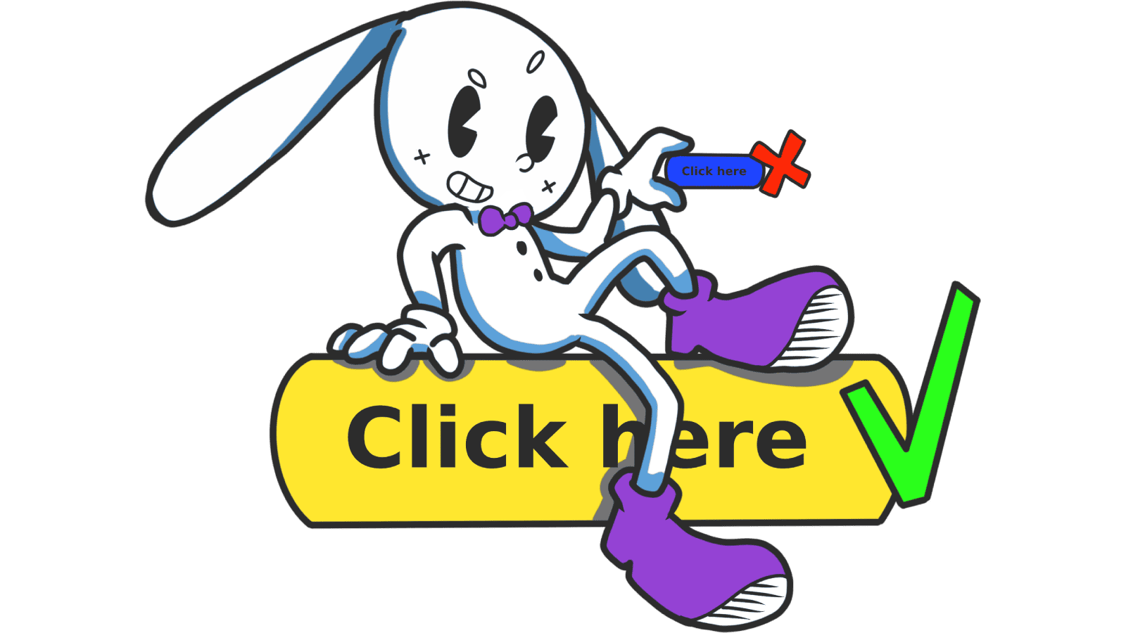
Buttons That Work: Why visitors do not click your CTA and how to fix it fast
Your CTA is right there but the click rate is flat. Buttons fail on contrast, copy, and size — here is the fix that lifts conversion without a redesign.
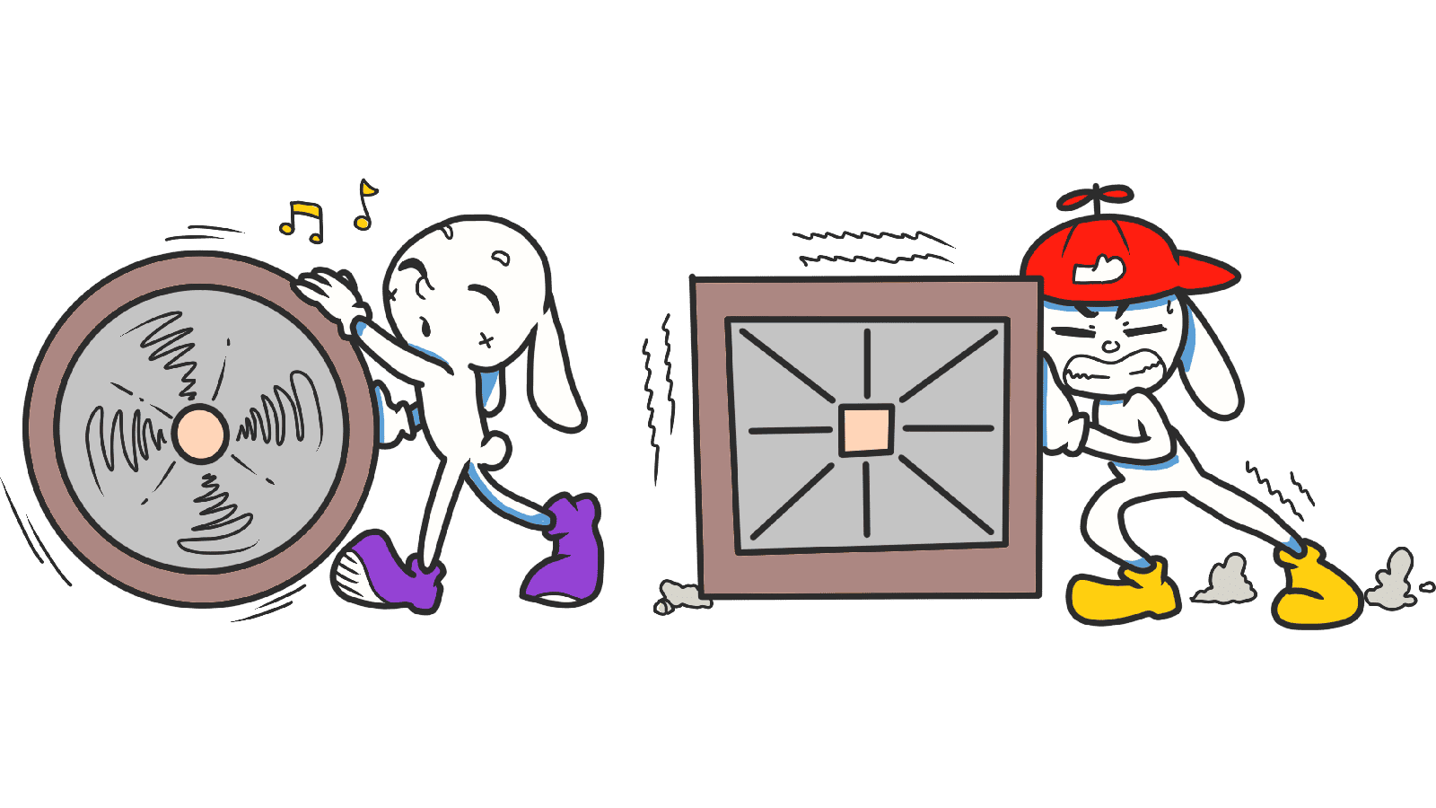
Jakob's Law: why your "original" landing page is confusing visitors
Visitors expect your page to work like every other site they use. Jakob's Law explains why being too creative with your UI quietly kills conversion.
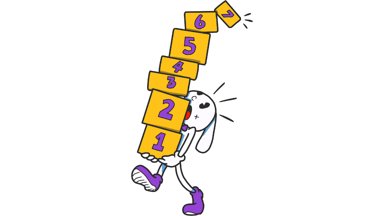
Miller's Law: why your landing page feels overwhelming (and visitors leave)
Visitors can only hold a few things in their head at once. Miller's Law shows why crammed navs and walls of text crush conversion — and how to chunk it down.
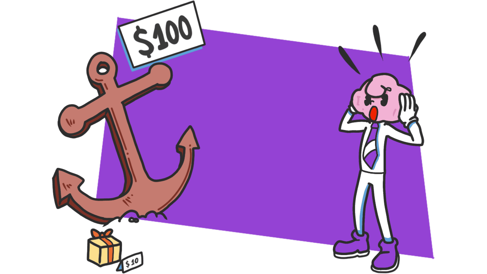
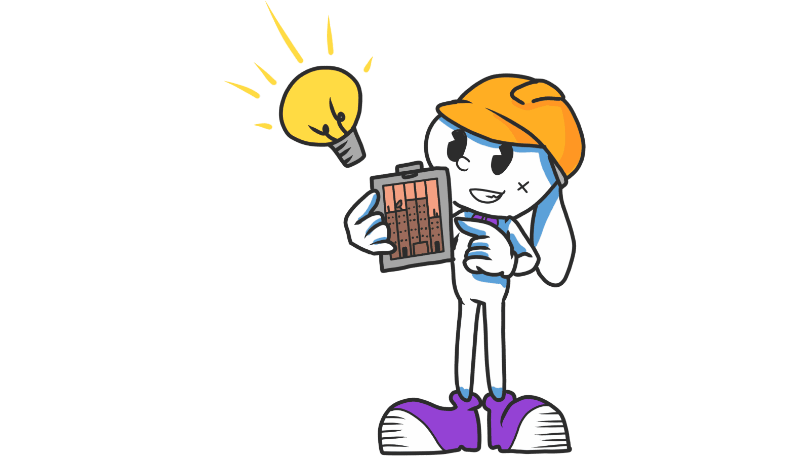
Anchoring Bias: Why the first number on your landing page changes how visitors judge every other number
Visitors do not evaluate your price in a vacuum. Whatever number they see first becomes the yardstick. Here is how to set anchors that make your offer feel like a steal.
Attention Bias: Why visitors look right past your best feature on your landing page
Visitors do not scan your page evenly. They hunt for the one thing they care about and ignore everything else. Here is how to put it where their eyes already are.
Authority Bias: Why your landing page looks sketchy to strangers (and what to fix first)
New visitors do not trust you yet. They scan for proof you are not a scam. Authority Bias is how you signal you are real before they read a single word.
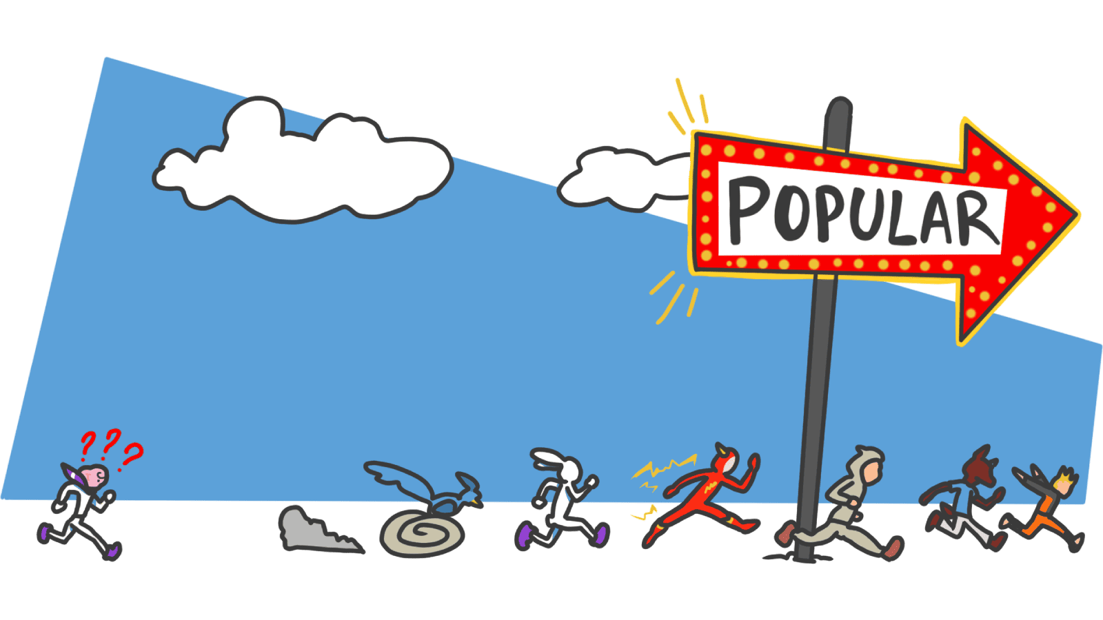
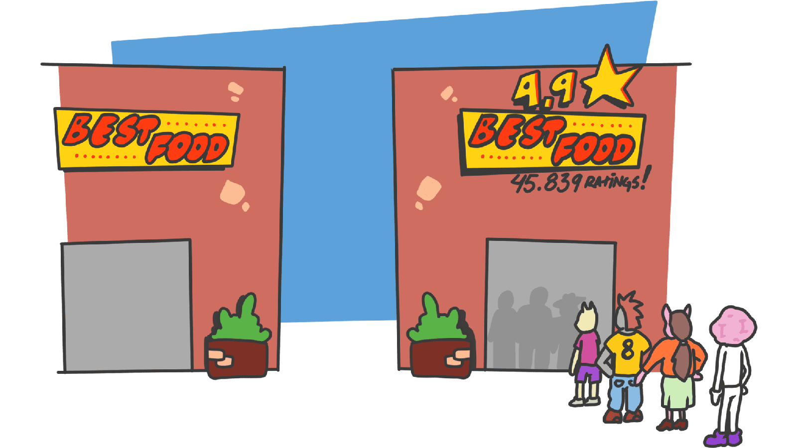
Bandwagon Effect: Why your landing page needs to show that other people already use you
Visitors do not want to be the first one. Show them they are not, and you remove half the hesitation. Here is how to use the bandwagon effect without faking it.
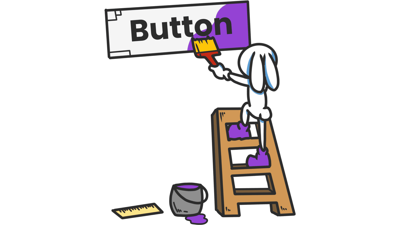
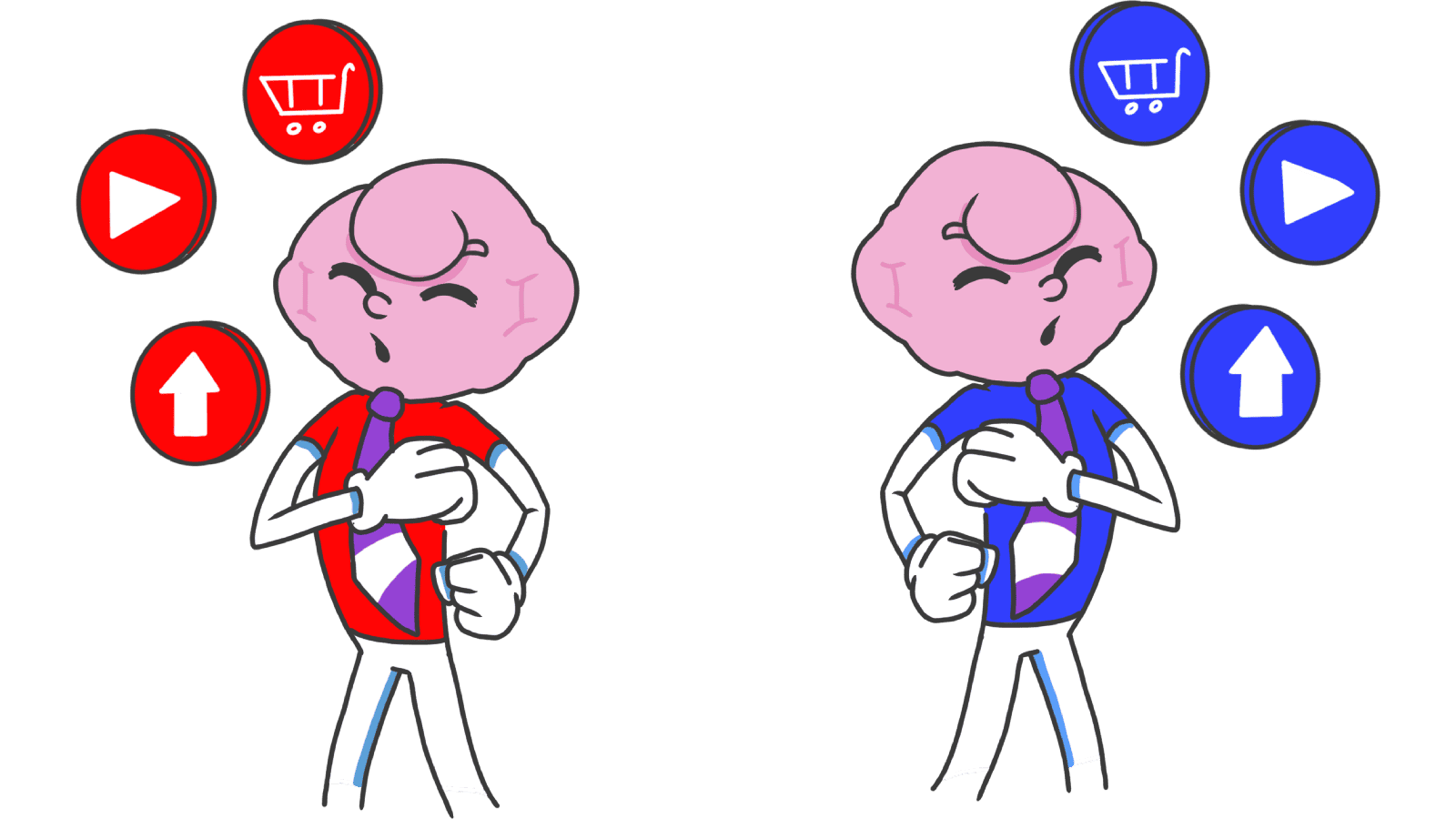
Button Structure: Why your CTA blends in and how to build a system that gets clicked
Visitors hesitate at your CTA because the button hierarchy is broken. Here is the structure — primary, secondary, states — that makes pages convert.
Cards: How to turn a wall of features into a grid visitors actually scan
Your feature section reads like a wall of text. Cards break it into scannable units — here is how to design them so visitors stop, read, and click.
Choice Overload: Why too many options on your landing page kill conversion
You think more choices give visitors freedom. They give them a reason to leave. Here is how to cut down options and lift conversion without losing flexibility.
Color Accessibility: Why your landing page colors might be locking visitors out
Your palette looks great on your monitor. But low contrast and color-only signals quietly lose visitors. Here is the check that fixes it.
Color Psychology: Why your landing page palette is sending the wrong message
Visitors decide if your page feels trustworthy in seconds — color does most of the talking. Here is how to pick a palette that converts instead of confusing.
Confirmation Bias: Why your landing page needs to mirror what visitors already believe
Visitors do not arrive with an open mind. They scan for proof of what they already think. Here is how to align your page so it feels right in the first 5 seconds.
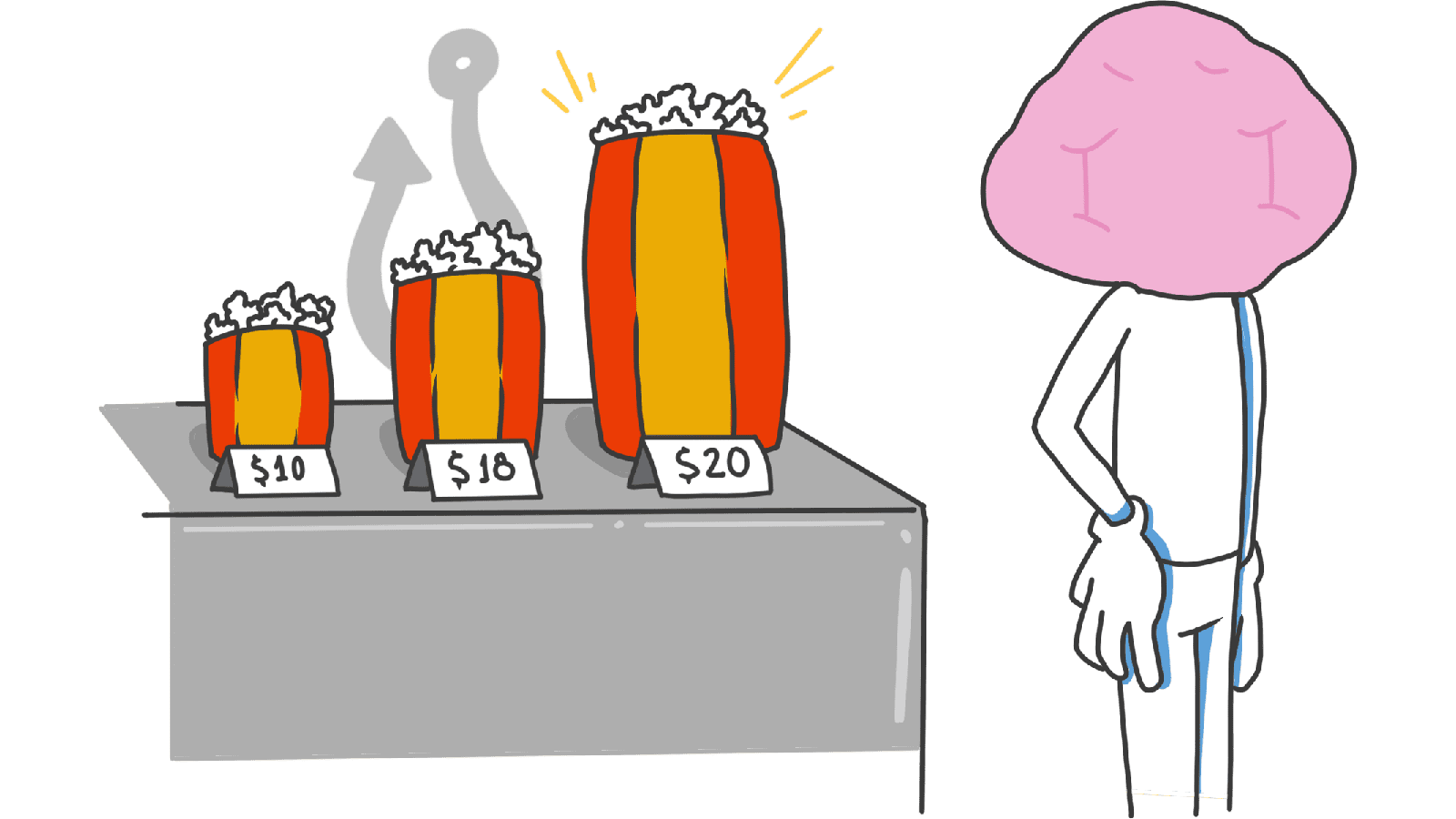
Contrast Effect: Why your pricing page needs an option visitors will not pick
Visitors do not judge your price in isolation. They compare. Without a contrast on your pricing page, the "right" plan never feels obviously right.
Decoy Effect: Why your pricing page needs a third option nobody picks
Two plans freeze visitors. Three plans, with one that looks slightly worse than your target, makes the choice obvious. Here is how to use the decoy effect ethically.
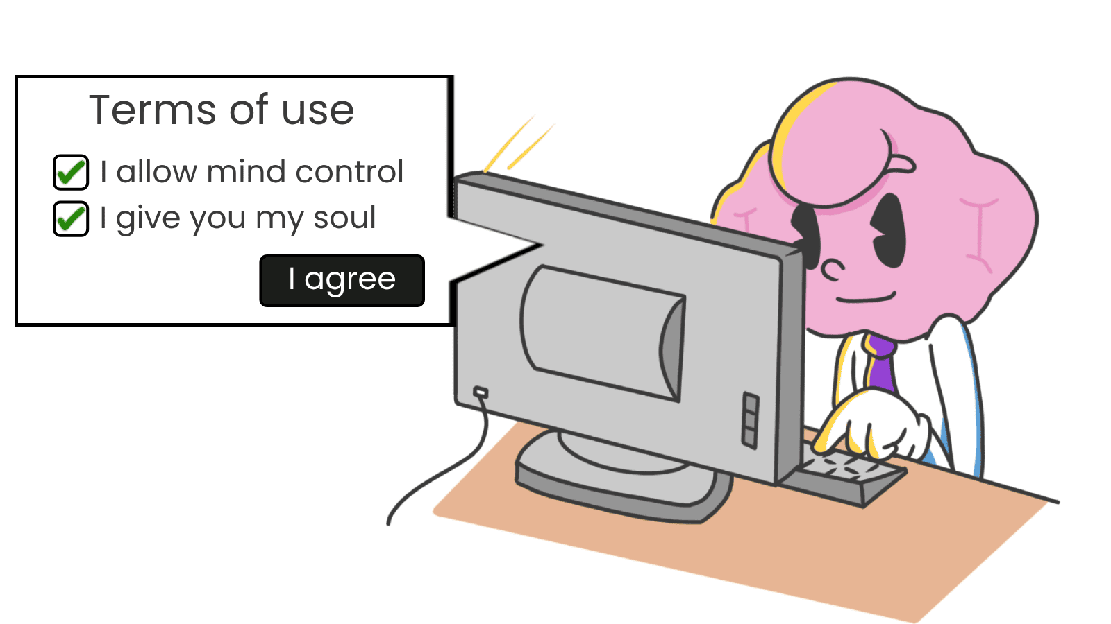
Default Effect: Why the option you pre-select on your landing page wins most of the time
Most visitors stick with whatever is already checked. That makes your default the most powerful design choice on the page. Here is how to set it without crossing into dark patterns.
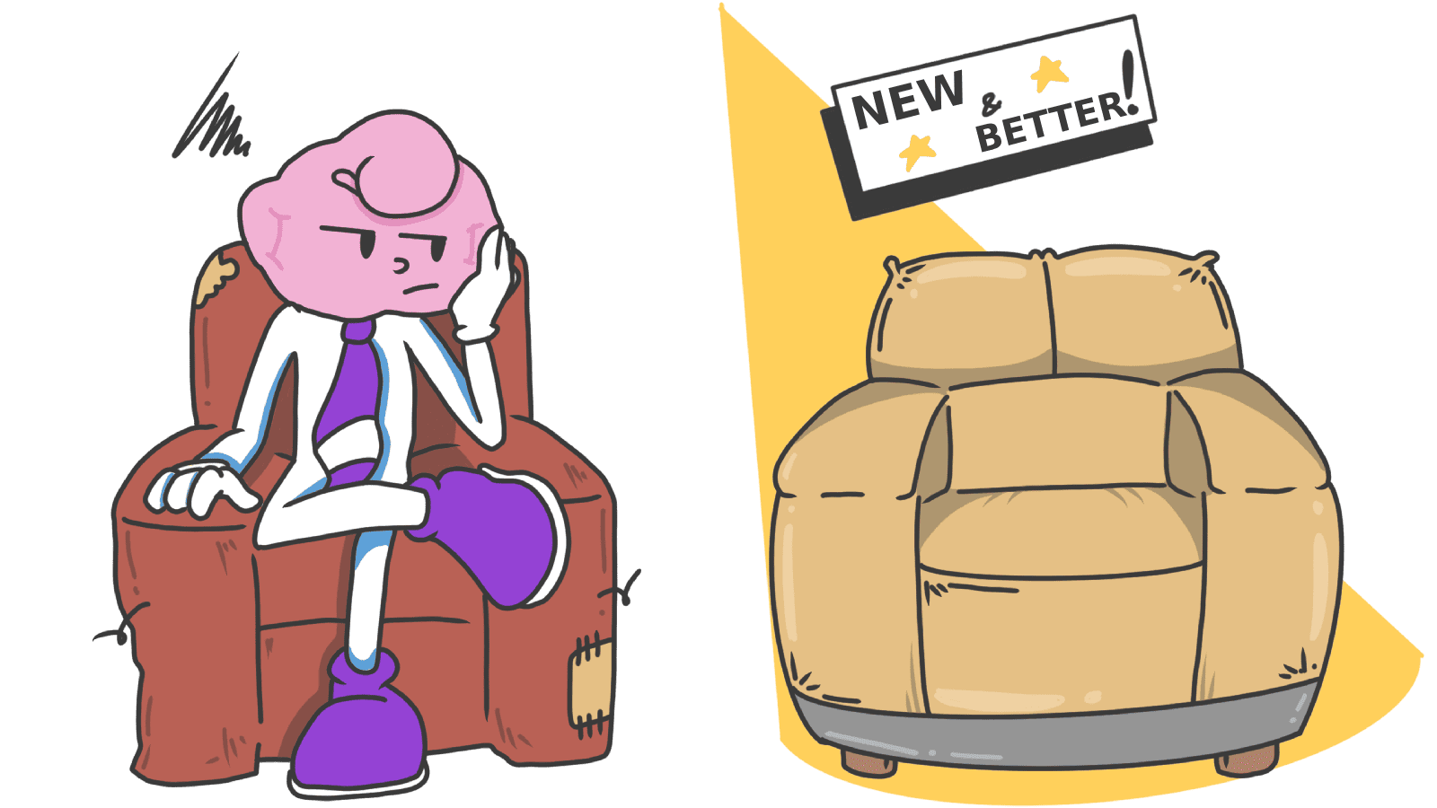
Aesthetic-Usability Effect: why your ugly landing page feels broken (even when it works)
Visitors decide your product is good or bad in 50ms. The Aesthetic-Usability Effect explains why beautiful pages feel easier — and convert better.
Whitespace: Why your landing page would convert better with less stuff on it
Most landing pages cram too much above the fold. Strategic whitespace makes the CTA pop and the page feel premium. Here is how to use it.

Endowment Effect: how to make visitors feel like your product is already theirs
Visitors value what they own. The Endowment Effect explains why free trials, personalization, and "your" copy turn casual signups into loyal users.
Feedback: Why visitors click your CTA twice (and sometimes leave thinking it is broken)
When a button does not respond, visitors click again, double-submit, or bounce. Here is how to give clear feedback and stop losing conversions to silence.
Fitts's Law: why visitors miss your CTA and bounce on mobile
Tiny buttons and CTAs hidden in the corner cost you signups. Fitts's Law explains why size and placement decide if visitors click — or leave.
The Power of Fonts: Why your landing page feels off and your typeface is the reason
Same words, different font, different conversion. Here is how to pick a typeface that matches your product and stops killing your hero section.

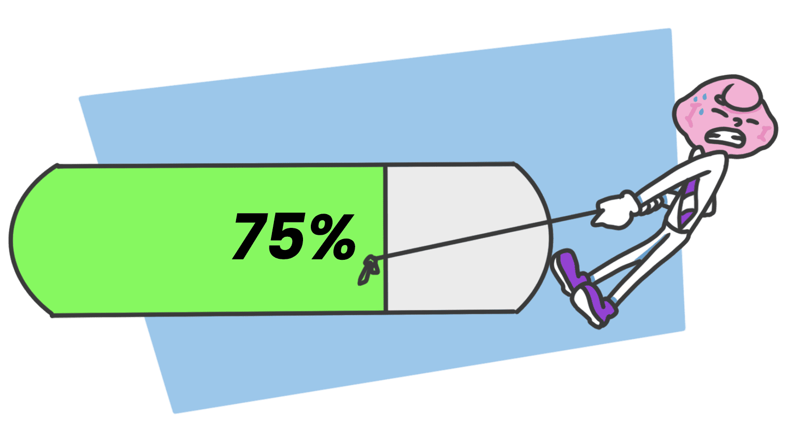
Form Structure: Why visitors abandon your signup halfway and how to keep them
Visitors start your form, type a few characters, and leave. Form structure decides if they finish — here is the layout and feedback that converts.
Framing Effect: how the words on your landing page change who clicks
Same offer, two phrasings — wildly different conversion. The Framing Effect explains why your copy moves more action than your design.
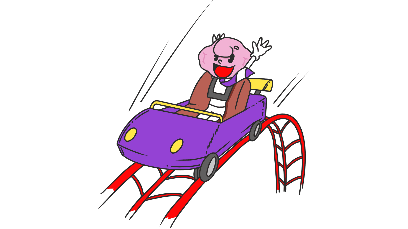
Animations: Why your landing page feels stiff (or like a carnival)
Motion done right makes your page feel polished. Done wrong it makes it feel slow or chaotic. Here is how to use animation without breaking conversion.
Gestalt principles: why your landing page feels messy (even when it isn't)
Visitors can't tell why your page feels off — but Gestalt principles can. Group, connect, and align your elements so the eye reads them in seconds.
Grid Systems: Why your landing page falls apart on different screen sizes
A landing page with no grid is a landing page that breaks on every device. Here is how to use a grid to keep your layout sharp and responsive.
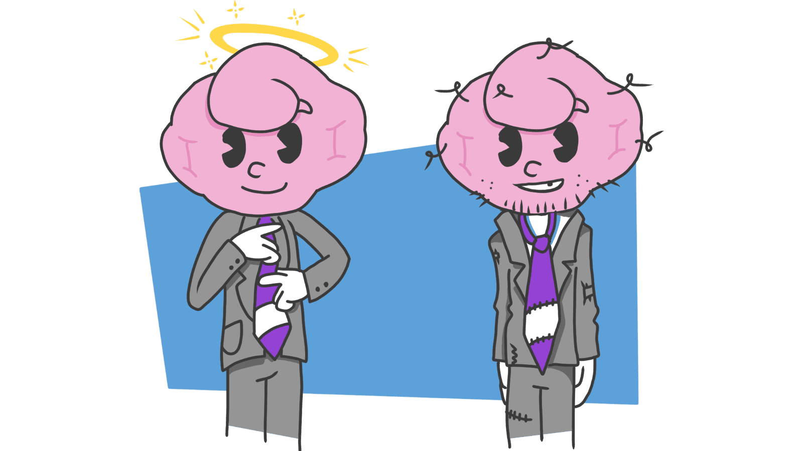
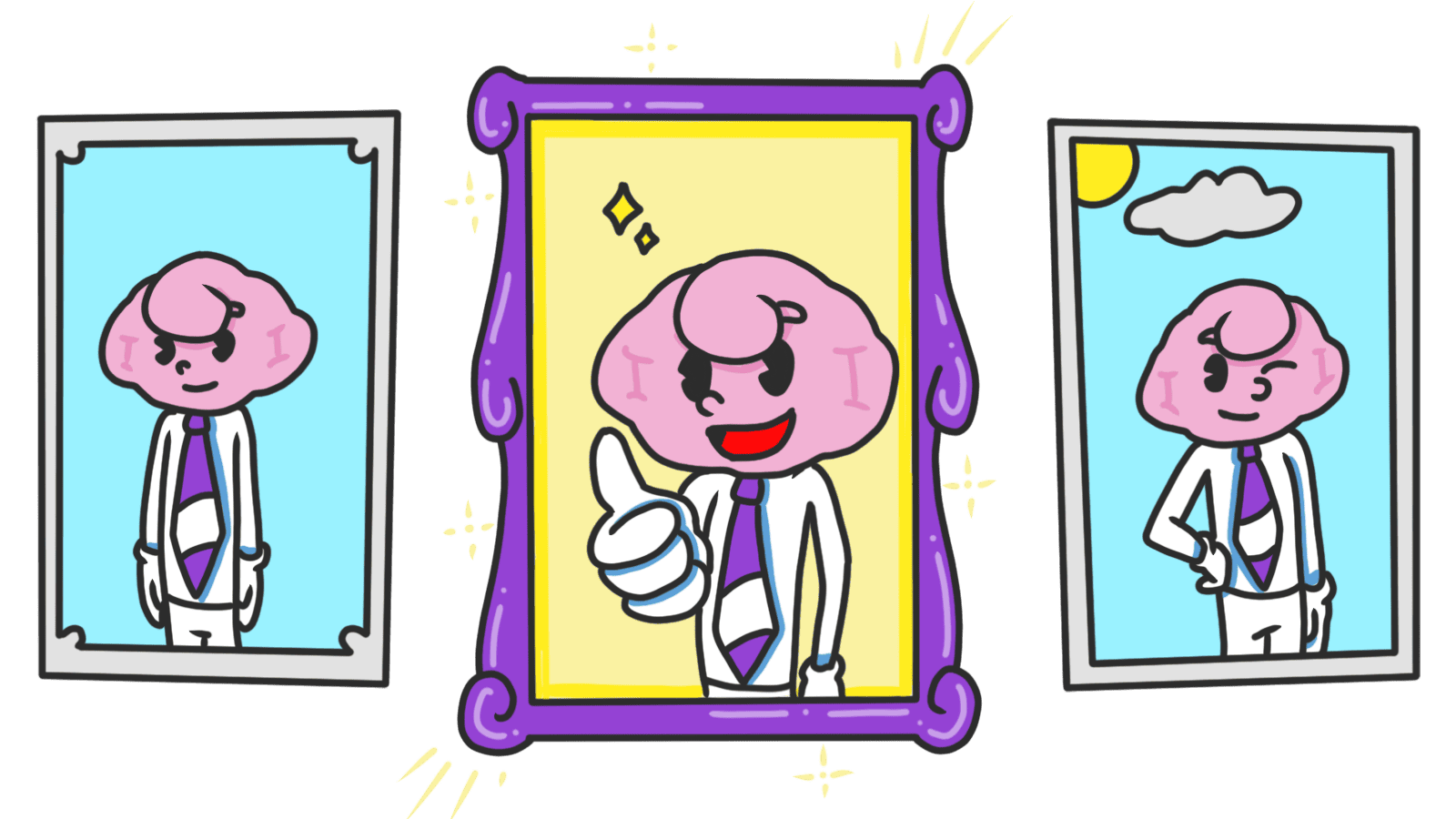
Halo Effect: Why your landing page looks "cheap" in the first 3 seconds
Visitors decide if your landing page is trustworthy in 3 seconds. Polish the first impression and the rest of the page benefits — here is what to focus on.
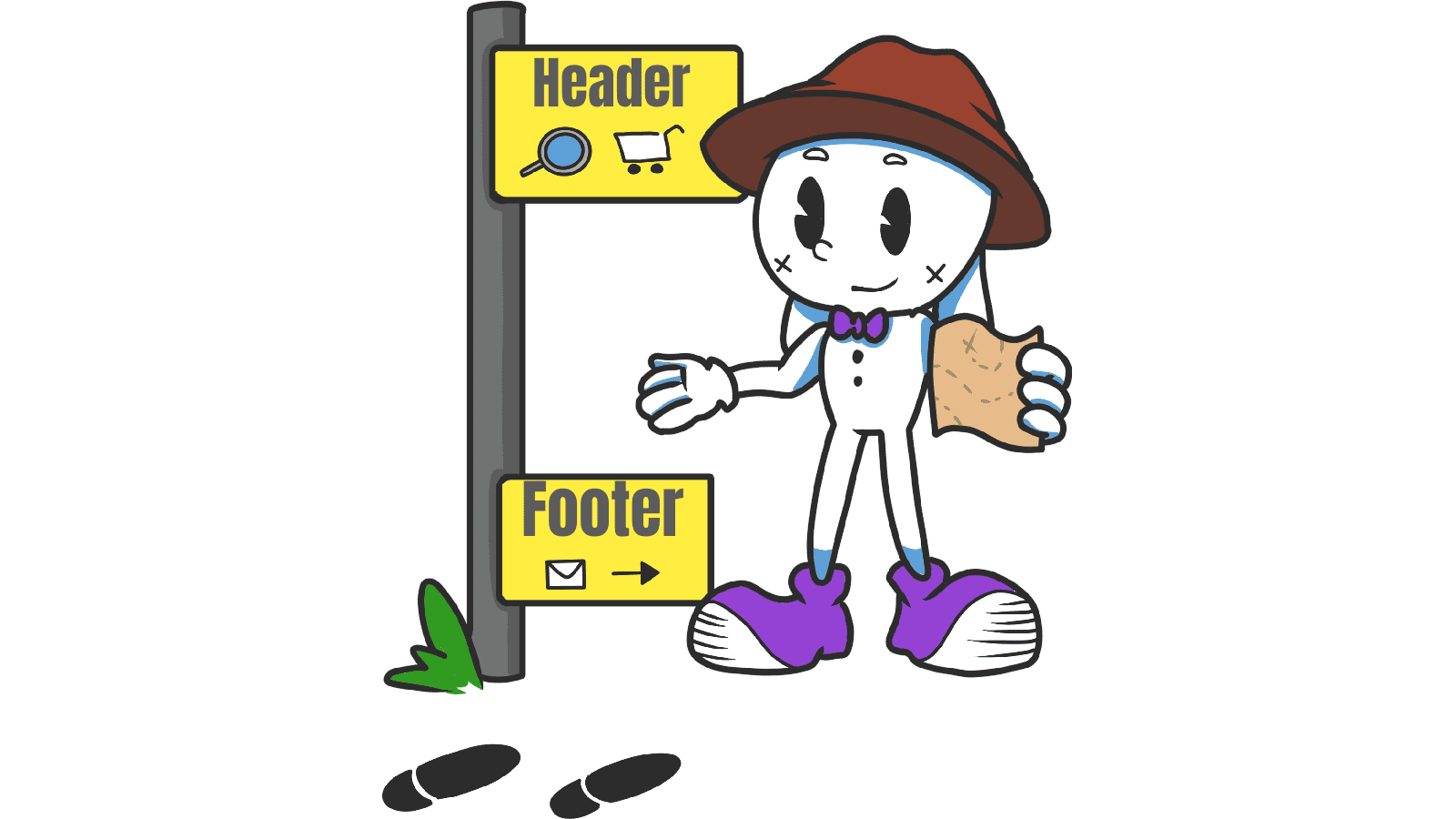
Header and Footer: How to anchor your site so visitors never feel lost
Visitors land deep on a blog post and bounce because there is no nav. Headers and footers anchor your site — here is how to build them so visitors stay.
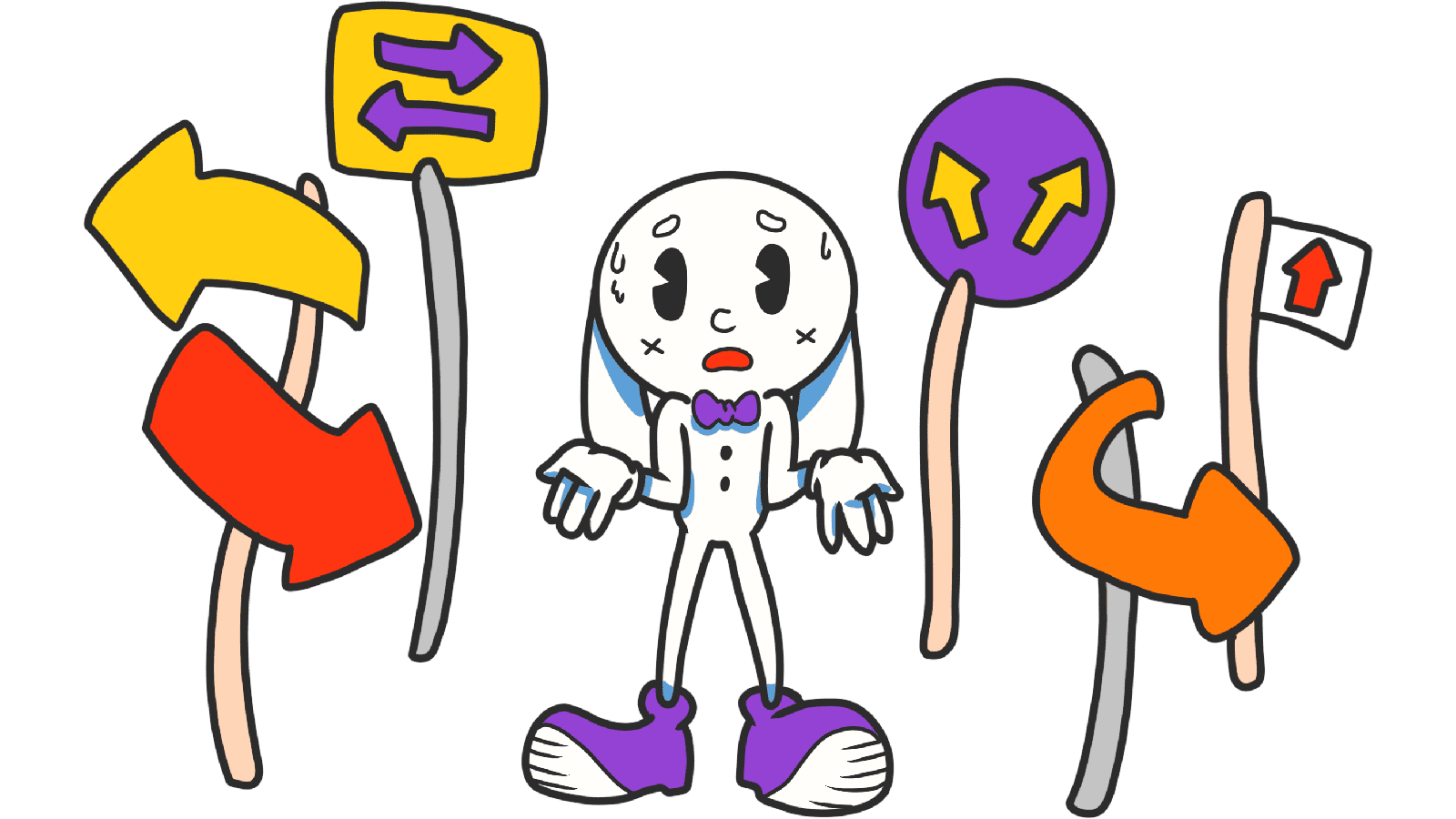
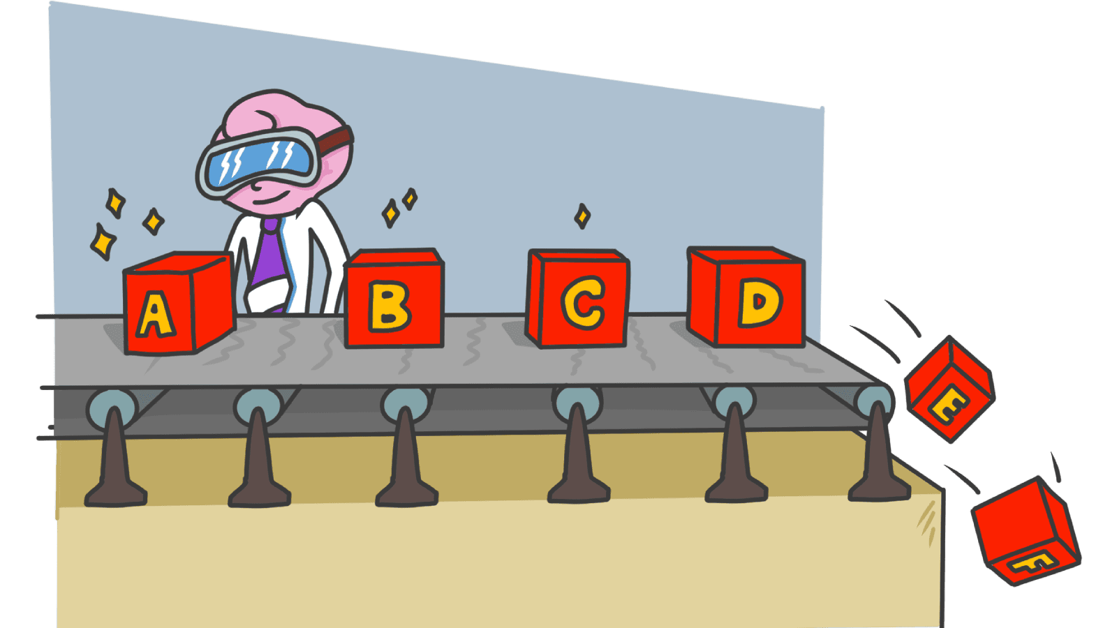
Hick's Law: why too many options on your landing page kill conversion
Your hero is crammed with links and visitors do nothing. Hick's Law explains why fewer choices convert better — here's how to fix your page.
Icons: Why your custom icon row confuses visitors and how to pick ones they get
Custom icons feel clever but visitors cannot decode them. Pick familiar metaphors and a single style — here is how to make icons earn their place.
Images: Why your hero stock photo is making your product feel cheap
Generic stock photos make visitors leave before reading your headline. Pick images that build trust — here is how to choose ones that lift conversion.
Form Design: Why visitors abandon your signup form halfway through
Forms are where signups go to die. Here is how to cut friction, group fields, and ship a form that actually finishes converting your traffic.
Isolation Effect: Why your CTA gets lost when everything on the page tries to stand out
If every section is bold, none of them are. The Isolation Effect is how you make one thing on your landing page impossible to miss.
Readability Rules: Why nobody reads past your hero on mobile
If visitors bounce before scrolling, your text is probably too small or too tight. Here are the four readability settings every landing page needs.
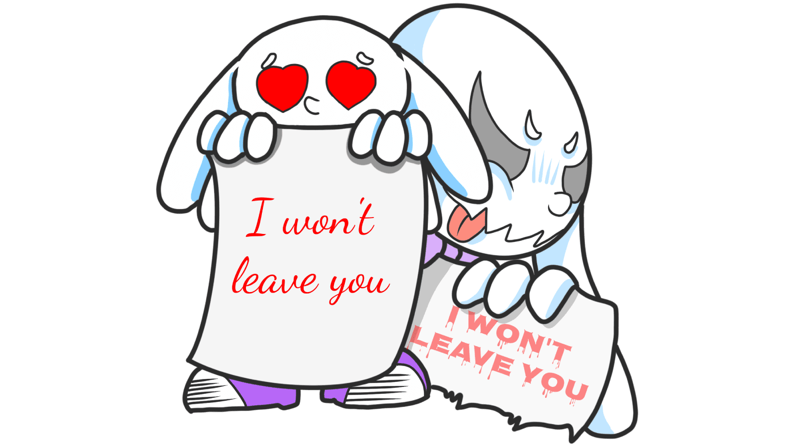
Loss Aversion: Why your landing page needs to name what visitors lose by leaving
Most landing pages only sell the upside. Visitors hesitate. Loss Aversion is the missing half of the engine — here is how to use it without crossing into dark patterns.
Navigation Menus: Why visitors cannot find your pricing and how to fix the menu
Visitors land, glance at your nav, and bounce because they cannot find pricing. Pick the right menu pattern — top bar, hamburger, dropdown, mega.
Modals: Why your popup is killing conversion and how to use them right
Visitors close your popup before reading it. Modals can lift conversion when used right — here is when to fire them and when to leave them off.
Nielsen's 5 UI checks: the basics that quietly kill your landing page conversions
Visitors bounce because tiny UI things feel broken. Nielsen's five core principles are the cheapest fixes for any landing page — here's how to apply them.
Peak-End Rule: why how your landing page ends decides if visitors come back
Visitors don't remember every scroll. They remember the high point and the ending. Peak-End Rule shows how to design moments that stick.
Recency Bias: Why the last thing on your landing page is what visitors remember
Visitors forget the middle of your page. They remember the start and the end. Here is how to design the last moment so it actually drives the click.
Responsive Design: Why your landing page falls apart on someone else’s phone
Your page looks great on your laptop and breaks on a real phone. Here is how to ship a layout that holds up on any device visitors actually use.
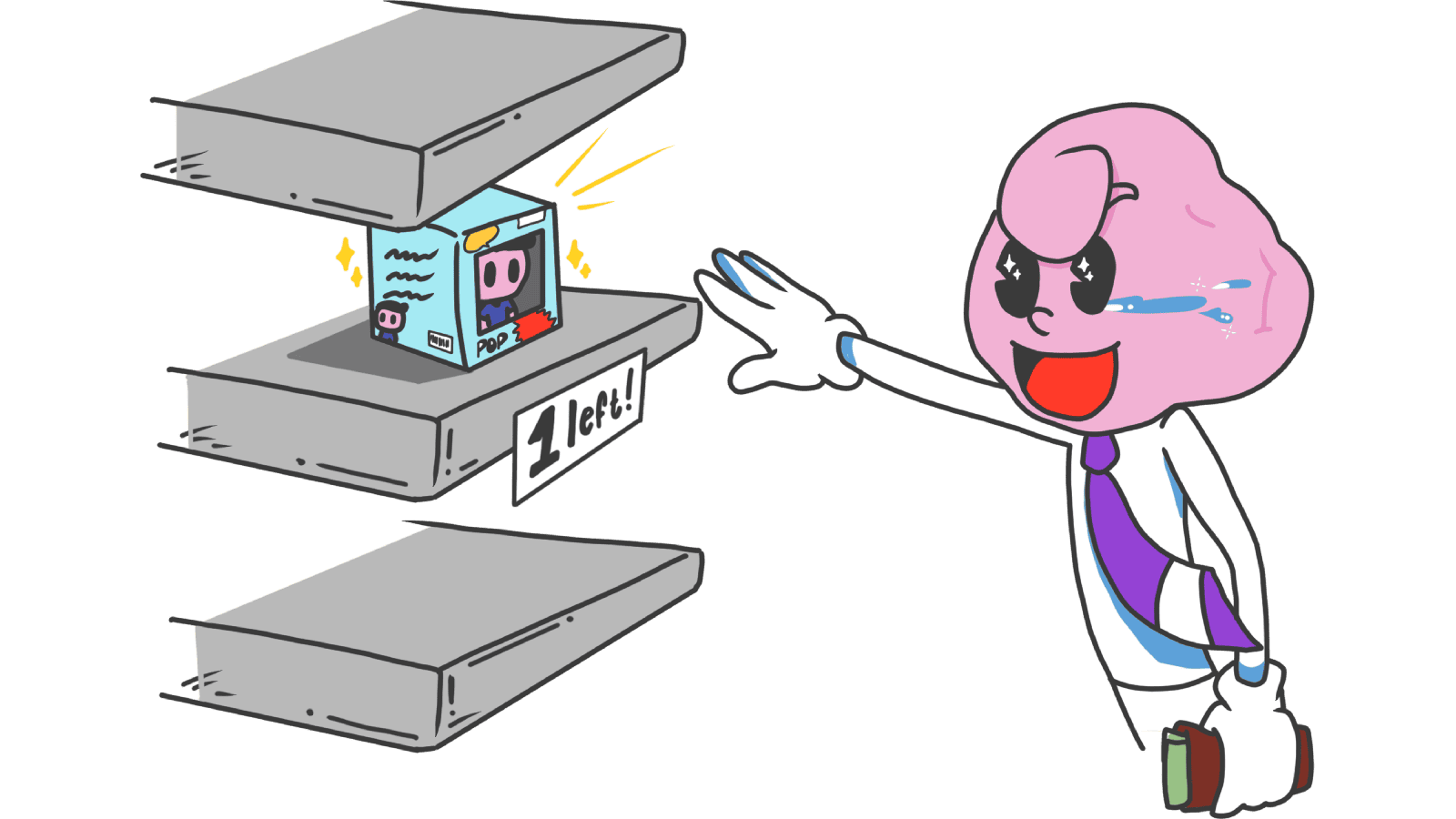
Scarcity: how to use limits on your landing page without looking sleazy
Real scarcity drives action. Fake scarcity destroys trust. Here is how to use the scarcity principle on your landing page without crossing into dark patterns.
Social Proof: why your landing page looks sketchy without it (and how to fix it)
Strangers don't trust your claims — they trust other strangers. Social Proof shows you exactly which trust signals turn skeptical visitors into signups.
Status Quo Bias: Why "10x better" still loses to "what they already use"
Visitors stick with their broken current tool because switching feels risky. Here is how to design a landing page that lowers the cost of saying yes.
Sunk Cost Fallacy: Why visitors stay with broken tools — and how to free them
Visitors stay with bad products because they already invested time. Here is how to design a landing page that turns sunk cost into a reason to switch.
Zeigarnik Effect: Why unfinished signups pull visitors back to your page
Visitors who start a flow but do not finish stay haunted by it. Here is how to use unfinished tasks on your landing page to drive more conversions.
Zero-Risk Bias: Why "no credit card required" still beats "save 30%" on your CTA
Visitors prefer eliminating one risk completely over reducing many risks partially. Here is how to use that on your landing page to drive more clicks.