Hick's Law: why too many options on your landing page kill conversion
Your hero is crammed with links and visitors do nothing. Hick's Law explains why fewer choices convert better — here's how to fix your page.

Hick's Law: why too many options on your landing page kill conversion
You launched your landing page and crammed every feature, plan, and link into the hero. You wanted to "give visitors all the info." Now they're scrolling for 30 seconds and leaving without doing anything.
That's Hick's Law punishing you. The more options you stack on a page, the longer it takes someone to decide — and the more likely "decide later" becomes "decide never."
The trick isn't to chop features. It's to stop showing all of them at once.
What Hick's Law actually says
Two psychologists named Hick and Hyman figured out in 1952 that decision time grows with every additional choice you put in front of someone. Not linearly — logarithmically. Three options is fast. Ten options is paralysis.
In landing page terms: every button, link, plan, and "learn more" you add makes the next visitor a tiny bit slower to act. Stack enough of them and they don't act at all.
"The secret of simplicity is eliminating the unnecessary so that the necessary may speak." — Hans Hofmann
This isn't about removing features from your product. It's about presenting one decision at a time.
Why this matters on a landing page
Most builders think the problem is that visitors don't see enough. The opposite is usually true.
Conversion
A checkout page with ten upsells, three shipping options, and four payment methods loses to a checkout page with one big "Pay" button. Every extra choice is a place where the visitor hesitates and bounces.
First impressions
You have about 5 seconds before someone decides if your page is worth reading. If those 5 seconds show a wall of buttons, the brain reads "too much work" and the tab closes.
Confidence
Less choice = more conviction. When the page tells visitors "this is the move," they trust the recommendation. When it says "here are 12 things, you decide," they pick none.
Is your interface overwhelming visitors?
Get an instant analysis of your page against 80+ conversion principles, including Hick's Law.
Scan Your Site FreeHow to use Hick's Law on your page
Cutting things is harder than adding things. That's why most landing pages drift toward clutter. Here's how to push back.
1. Identify the one job of each section
Every section on the page should do one thing. Hero = pitch + CTA. Pricing section = pick a plan. If your hero also has a feature grid and a logo wall and a video, it has zero focus.
2. Group related options (chunking)
If you genuinely need to show many options — say, a feature list — group them into 3–5 categories. Visitors can handle four buckets. They can't handle 20 raw items.
3. Make the primary action obvious
Use size, color, and position to tell visitors what to do first. Your "Start free" button shouldn't look the same as "Learn more." Pick a winner and let it shout.
4. Be consistent across the page
If primary buttons are filled blue everywhere, the visitor learns the pattern in two seconds. If you change styles per section, every page becomes a re-learning exercise.
5. Use progressive disclosure
A 15-field signup form is a wall. Three steps with five fields each is manageable. Same form, totally different feel — because each screen only asks one decision.
6. Watch real visitors
Open a session recording tool. If you see people hovering aimlessly, that's Hick's Law at work. They can't decide because you gave them too much.

Common ways builders break this
Over-simplifying
- The mistake: Stripping the page so hard the visitor doesn't know what the product does.
- The fix: Keep enough info for the visitor to understand the offer. Cut what doesn't help them decide.
Hiding everything in a hamburger menu
- The mistake: Tucking every link behind a hamburger to keep the UI "clean."
- The fix: Show the 3–5 most important destinations. Hide only the long-tail stuff.
Forgetting the power user
- The mistake: Reducing options to the point that returning users have to dig through nested menus to find what they used yesterday.
- The fix: Default to simple, but offer an "advanced" toggle when complexity is genuinely useful.
How real products use this

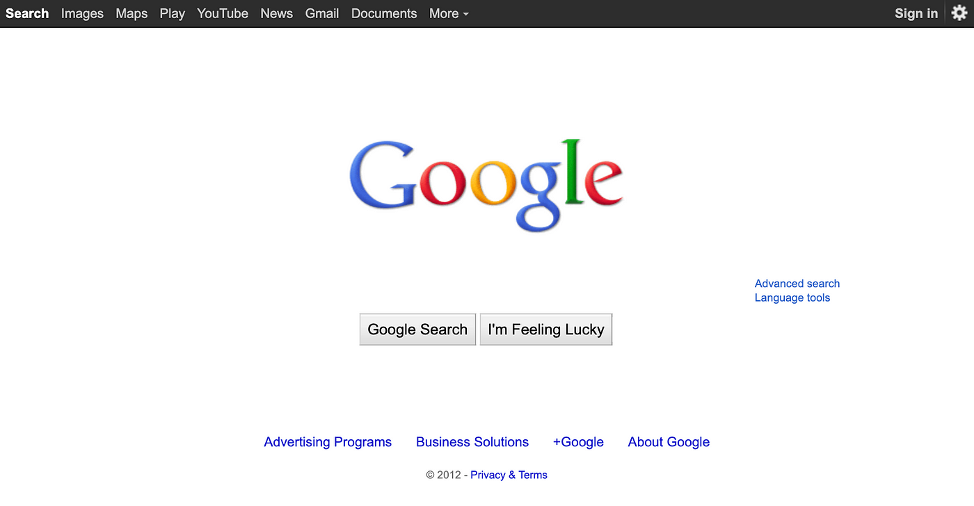
Google's homepage in the late 90s was a single search box while everyone else (Yahoo, MSN) was a wall of news, weather, and ads. They won partly on tech, but partly on this — they removed every decision except "what are you searching for?"
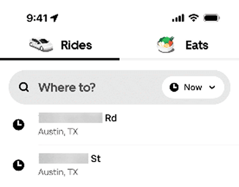
Uber

When you open Uber it doesn't ask you to browse car types or check news. One question: "Where to?" Everything else stays hidden until you've made that first choice. That's Hick's Law applied to onboarding.
See how your page compares
Our AI analyzes your landing page against the same principles used by Google and Uber.
Get Your Free UX ScoreRelated principles
If Hick's Law clicks for you, these are the next stops:
Fitts's Law
How button size and distance from the cursor change how fast visitors click your CTA.
Miller's Law
Why your brain only holds about 7 things at once — and what that means for your nav.
Resources & further reading
The Decision Lab: The Paradox of Choice
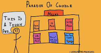
How too many options lead to anxiety and inaction.
Choice Overload: Why Simplicity Wins
A Medium piece on choice overload in modern marketing.
NN Group: Choice Overload Video
UX experts explain how too many choices kill decision-making.
Don't Make Me Think by Steve Krug
The classic book on web usability and intuitive design.
Frequently asked questions
Don't guess your UX. Scan it.
Upload your screens or paste your URL to get a senior-level review in under 3 minutes.
Start Free ScanRelated Articles
Jakob's Law: why your "original" landing page is confusing visitors
Visitors expect your page to work like every other site they use. Jakob's Law explains why being too creative with your UI quietly kills conversion.
Miller's Law: why your landing page feels overwhelming (and visitors leave)
Visitors can only hold a few things in their head at once. Miller's Law shows why crammed navs and walls of text crush conversion — and how to chunk it down.
Aesthetic-Usability Effect: why your ugly landing page feels broken (even when it works)
Visitors decide your product is good or bad in 50ms. The Aesthetic-Usability Effect explains why beautiful pages feel easier — and convert better.