Buttons That Work: A Comprehensive Guide to UI Button Design
Master the art of button design UX. Learn best practices for CTA buttons, accessibility standards, and how to drive higher conversions through better UI.
Buttons That Work: A Comprehensive Guide to UI Button Design
Your website’s buttons are the final gatekeepers of conversion. They represent the precise moment a user decides to move from "looking" to "doing." Yet, all too often, these critical elements are under-designed, over-complicated, or practically invisible.
Have you ever looked at your analytics and wondered why users aren't clicking? If your buttons aren't getting engagement, your users are likely confused about what actions they can take or, worse, what actions they should take. Buttons are more than just rectangles with text; they are functional guides that highlight important decisions and make navigation intuitive. In this guide, we’ll explore how to transform your interface by mastering button design UX.
What Is a "Button That Works" in UX?
In the world of User Interface (UI) design, a button is an interactive element intended to trigger a specific action. A "button that works" is one that effectively communicates its affordance—a design term meaning the object's properties should suggest how it is used. In simpler terms, a button must scream "I am clickable!" before a user even moves their cursor or thumb.
The psychology of buttons relies heavily on visual signifiers. We use shadows, colors, and shapes to tell the user's brain that this specific element is different from the static content around it.
"Buttons should look like buttons." — Luke Wroblewski
As Luke Wroblewski famously noted, the more we try to reinvent the button, the more we risk losing the user. When we stray too far into "flat" design or "minimalist" trends that remove these signifiers, we introduce cognitive load. Users have to stop and think: "Is this a button or just a colored box?" A successful button removes that doubt entirely.
Why High-Quality Button Design UX Matters
The impact of a single button can be the difference between a successful checkout and a bounced session. Here is why prioritizing your button UI matters:
- Clarity and Navigation: Well-designed buttons act as signposts. They tell users exactly where to go next, reducing the frustration of "pogo-sticking" (bouncing back and forth between pages trying to find a link).
- Conversion Rates: A button that is easy to find and understand naturally gets clicked more often. Small changes in button contrast or copy have been shown to increase conversions by double-digit percentages.
- Accessibility: Buttons are critical for users with motor impairments or visual disabilities. Following standard guidelines ensures that everyone—regardless of how they interact with their device—can complete tasks on your site.
- Professionalism and Trust: Consistent, polished buttons signal to the user that the site is secure and professionally maintained. A broken or poorly styled button can trigger "design debt" anxiety, making users hesitant to enter credit card info.
Is your button design working?
Get an instant analysis of your interface against 80+ UX principles.
Scan Your Site FreeHow to Implement Buttons That Drive Action
Creating effective buttons requires a mix of visual design, copywriting, and technical precision. Follow these three core implementation steps to ensure your buttons perform.
1. Highlight the Buttons for Maximum Contrast
If a button doesn't stand out, it doesn't exist. To create a strong visual hierarchy, your Call to Action (CTA) must contrast sharply with the background and surrounding elements.
- ✅ Do this: Use a bold primary color for your main action. If your site is mostly blue and white, an orange or vibrant green button will naturally draw the eye.
- ❌ Avoid this: Using "ghost buttons" (buttons with only an outline) as your primary action. Research consistently shows they are harder to recognize and receive fewer clicks than solid buttons.
2. Be Direct and Imperative with Copy
The text inside your button is the "hook." It should be short, to the point, and action-oriented. Ideally, use no more than three words. The most effective buttons use imperative verbs—words that command or request an action.
- ✅ Do this: Use phrases like "Download now," "Create account," or "Start free trial."
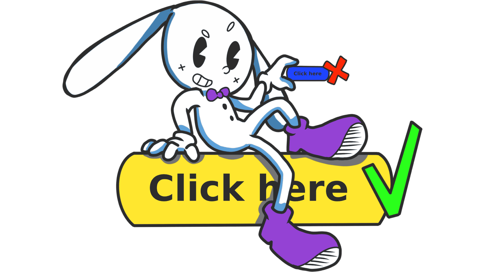
- ❌ Avoid this: Vague labels like "Submit," "Click here," or "Next." These don't tell the user what the outcome of the click will be.
3. Ensure a Comfortable Click Size (Fitts's Law)
Fitts's Law states that the time to acquire a target is a function of the distance to and size of the target. Basically: make it big enough to hit easily. This is especially vital for mobile users who use their thumbs.
- Mobile Requirements: Aim for a touch target of at least 48x48 dp. This provides enough "slop" for a human thumb to hit the button without accidental clicks on neighboring links.
- Desktop Requirements: A minimum height of 32px to 40px is standard.
- Spacing: Ensure there is sufficient "white space" around the button. Grouping buttons too closely together leads to "fat-finger syndrome," where users accidentally trigger the wrong action.
Common Button Design Mistakes to Avoid
Even seasoned designers fall into traps when trying to be overly creative. Watch out for these common errors:
1. Lack of Visual Hierarchy
- The problem: Giving every button the same weight. If your "Delete Account" button looks exactly like your "Save Changes" button, users will eventually make a catastrophic mistake.
- The fix: Use Primary, Secondary, and Tertiary button styles. Primary buttons should be solid and high-contrast; secondary buttons can be outlined; tertiary actions can be simple text links.
2. Ignoring Button States
- The problem: The button doesn't change when a user hovers over it or clicks it. This lacks "feedback," leaving the user wondering if the site is frozen.
- The fix: Design distinct states for
hover,active(pressed),focus(for keyboard navigation), anddisabled.
3. Tiny Labels
- The problem: Using a 10px font inside a large button.
- The fix: Maintain a readable font size (usually 14px-16px minimum) and ensure the text is centered vertically and horizontally within the button container.
Buttons in Action: Real-World Examples
Analyzing how industry leaders handle buttons can provide a roadmap for your own designs.
Spotify
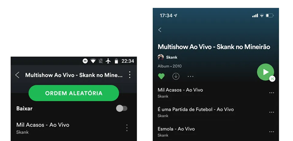
Spotify is a master of the "Primary Action." Their "Play" and "Upgrade" buttons almost always feature their signature vibrant green against a dark background. They utilize rounded "pill" shapes which are psychologically perceived as more friendly and clickable. Note their strategic positioning: buttons are placed where the thumb naturally rests on mobile or at the end of a logical content flow on desktop.
Stripe
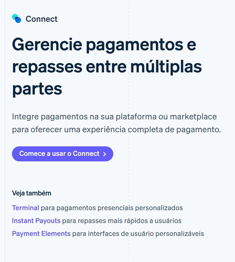
Stripe’s interface is often cited as the gold standard for developer-centric design. Their buttons are perfectly sized and respect accessibility standards (WCAG contrast ratios). What Stripe does exceptionally well is consistency. Once a user learns that a specific shade of blue means "Action," that knowledge transfers across their entire dashboard, reducing the learning curve for complex tasks.
See how your site compares
Our AI analyzes your interface against the same principles used by Spotify and Stripe.
Get Your Free UX ScoreRelated UX Principles
Understanding buttons is just one piece of the interface puzzle. To build a truly cohesive experience, you should also explore these related concepts:
Resources & Further Reading
For those who want to dive deeper into the technical specifications of button design, these resources are essential:
Material Design: Buttons
Google's official documentation on button types, states, and placement.
Apple Developer Documentation: Buttons
The Human Interface Guidelines for creating buttons within the Apple ecosystem.
Buttons in UI Design
A deep dive article by Willian Matiola on the evolution of button styles.
Frequently Asked Questions
Don't Guess Your UX. Scan It.
Upload your screens or paste your URL to get expert-level UX analysis in under 3 minutes.
Start Free ScanRelated Articles
Building the Ideal Button: A Masterclass in UX Button Design
Master the art of button design UX. Learn about primary, secondary, and ghost buttons, visual states, and how to drive higher conversion rates with better CTAs.
Strategic Pauses: UX Modal Design Best Practices for High Conversion
Master the art of UX modal design. Learn how to use strategic pauses and dialogs to guide users without causing frustration or friction.
Jakob's Law: Why Familiarity is the Ultimate UX Design Principle
Learn how Jakob's Law impacts user experience. Discover why users prefer familiar interfaces and how to leverage mental models to increase conversions.