The Psychology of Color in UX: Designing for Emotion and Action
Discover how color psychology influences user behavior. Learn to choose the right palette for your UX/UI design to increase trust and conversions.
The Psychology of Color in UX: How to Choose the Right Palette for Your Users
Imagine you are designing a health and wellness app. Your goal is to help users reduce stress and manage anxiety. Would you paint the interface in high-vibrancy neon reds and jagged orange patterns? Probably not. You would instinctively reach for soft blues, sage greens, or muted earth tones.
But why?
Color is not merely a decorative choice; it is a silent language that communicates directly with the human limbic system—the part of the brain responsible for emotions and memory. In UX design, the psychology of color is one of the most powerful tools at your disposal to influence how users perceive, interact with, and ultimately trust your product. A well-balanced color palette enhances usability by creating a consistent, predictable, and enjoyable visual experience.
In this guide, we will explore how to use color psychology as a strategic asset for your marketing and conversion goals.
What Is Color Psychology in UX?
Color psychology is the study of how different hues, tints, and shades affect human behavior and decision-making. In the context of User Experience (UX) and User Interface (UI) design, it involves selecting colors that align with the user's mental model and the product's primary function.
"Choosing a color is like choosing a voice to tell your story." — Eva Heller
When you choose a palette, you are setting the "tone of voice" for your interface. A financial app needs a voice of authority and security (often blue), while a food delivery app needs a voice of hunger and excitement (often red or orange). By understanding the psychological triggers behind these colors, you can guide users toward specific actions without saying a single word.
Why Color Psychology Matters for Your Business
The impact of color on user experience goes far beyond aesthetics. It directly influences your bottom line through several key vectors:
- Brand Perception and Trust: Users make a subconscious judgment about a product within 90 seconds of their first interaction. Up to 90% of that assessment is based on color alone. If your colors feel "off" for your industry, users may instinctively distrust your service.
- Visual Hierarchy and Navigation: Color tells users what is important. By using high-contrast colors for Call-to-Action (CTA) buttons, you reduce cognitive load and make it easier for users to complete tasks.
- Emotional Connection: Products that evoke the right emotions—be it excitement, calm, or focus—see higher rates of user retention and brand loyalty.
- Conversion Rates: A simple change in button color, based on psychological urgency and contrast, has been shown to increase click-through rates by double digits in A/B tests.
Is your color palette working?
Get an instant analysis of your interface against 80+ UX principles.
Scan Your Site FreeHow to Implement Color Psychology in Your Design
To build a palette that resonates with your audience, follow these four strategic steps.
1. Define Your Goal and User Persona
Before picking a single hex code, imagine yourself in your user's shoes. What is their primary emotional state when they open your app? An exercise app may need colors that evoke energy and motivation (like bold yellows or oranges), while a meditation site requires the calm and tranquility of teals and soft violets.
Ask yourself:
- What is the one thing I want the user to feel?
- Is this a high-energy or low-energy task?
- What are the competitors in this space doing, and do I want to align or disrupt?
2. Choose Your Primary and Secondary Colors
Colors carry universal emotional weights, though these can be nuanced:
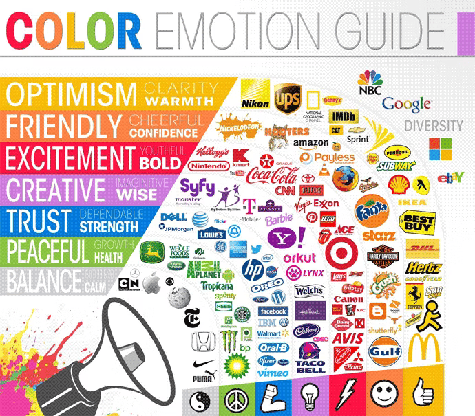
- Warm Colors (Red, Orange, Yellow): These create a sense of urgency, excitement, or warmth. Red is often used for "Clearance" or "Danger," but in food apps, it stimulates appetite.
- Cool Colors (Blue, Green, Purple): These are ideal for conveying security, growth, and tranquility. Blue is the "safest" color globally and is the standard for banking and social media.
3. Consider Your Cultural Context
Colors carry different meanings across the globe. While white symbolizes purity and weddings in Western cultures, it is often associated with mourning and funerals in parts of East Asia. Similarly, red signifies luck and prosperity in China, but can signify financial loss or danger in Western markets. Always evaluate your target demographic's cultural background to avoid unintended negative associations.
4. Test Your Palette for Accessibility and Clarity
A beautiful palette is useless if it’s unreadable. Ensure your color choices meet WCAG (Web Content Accessibility Guidelines) for contrast. This is especially important for text and functional icons. You can learn more about making your designs inclusive in our guide on Color Accessibility.
Common Color Psychology Mistakes to Avoid
1. Overwhelming the User with Too Many Colors
- The problem: Using a "rainbow" approach that lacks a clear primary color. This creates high cognitive load and confuses the visual hierarchy.
- The fix: Stick to the 60-30-10 rule: 60% dominant color (usually a neutral), 30% secondary color, and 10% accent color for CTAs.
2. Ignoring Color Blindness
- The problem: Relying solely on color to convey meaning (e.g., a green "success" message and a red "error" message without icons).
- The fix: Always use secondary cues like icons, text labels, or patterns alongside color.
3. Using "Vibrating" Color Combinations
- The problem: Placing highly saturated complementary colors (like bright blue on bright red) next to each other, which causes a "vibration" effect that hurts the eyes.
- The fix: Adjust the saturation or value of one color to create a smoother transition.
Color Psychology in Action: Real Examples
Slack

Slack uses a vibrant, multi-colored palette that breaks away from the traditional "enterprise blue." This choice reflects their brand identity: collaborative, fun, and human. By using a diverse set of colors in their logo and sidebar, they signal that their platform is a place for diverse ideas and lively communication, differentiating themselves from "boring" legacy software.
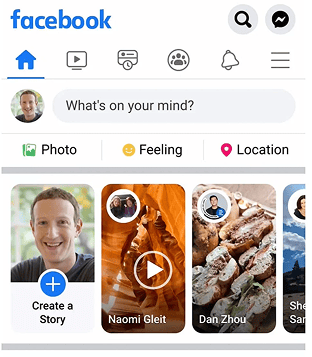
Facebook’s iconic blue isn't just a random choice. Blue is globally associated with trust, reliability, and communication. For a platform that asks you to share your personal life and data, building a sense of security is paramount. Furthermore, blue is a color that remains distinct for people with most types of color blindness, ensuring broad usability.
See how your site compares
Our AI analyzes your interface against the same principles used by Slack and Facebook.
Get Your Free UX ScoreRelated UX Principles
Understanding color is just one piece of the puzzle. To create a truly professional interface, consider these related concepts:
Color Accessibility
Ensure your color choices are inclusive for users with visual impairments.
Resources & Further Reading
Adobe Color Wheel
Use the color wheel to generate harmonious color palettes based on color theory.
Colors in Different Cultures
A comprehensive visualization of color meanings across various global cultures.
Colors.lol
An excellent tool for finding unique, ready-made color palettes that stand out.
Frequently Asked Questions
Don't Guess Your UX. Scan It.
Upload your screens or paste your URL to get expert-level UX analysis in under 3 minutes.
Start Free ScanRelated Articles
Color Accessibility UX: A Guide to Inclusive Interface Design
Master color accessibility in UX design. Learn WCAG contrast ratios, color blindness best practices, and how to create inclusive, readable interfaces for all users.
Buttons That Work: A Comprehensive Guide to UI Button Design
Master the art of button design UX. Learn best practices for CTA buttons, accessibility standards, and how to drive higher conversions through better UI.
Jakob's Law: Why Familiarity is the Ultimate UX Design Principle
Learn how Jakob's Law impacts user experience. Discover why users prefer familiar interfaces and how to leverage mental models to increase conversions.