Loss Aversion: Why your landing page needs to name what visitors lose by leaving
Most landing pages only sell the upside. Visitors hesitate. Loss Aversion is the missing half of the engine — here is how to use it without crossing into dark patterns.
Loss Aversion: Why your landing page needs to name what visitors lose by leaving
You shipped your landing page. Traffic is coming in. Nobody signs up.
Most builders look at this and think the page needs a clearer benefit. Sometimes that's right. But often the missing ingredient is the opposite — the page never tells the visitor what they'll lose by walking away. That gap is what loss aversion fixes.
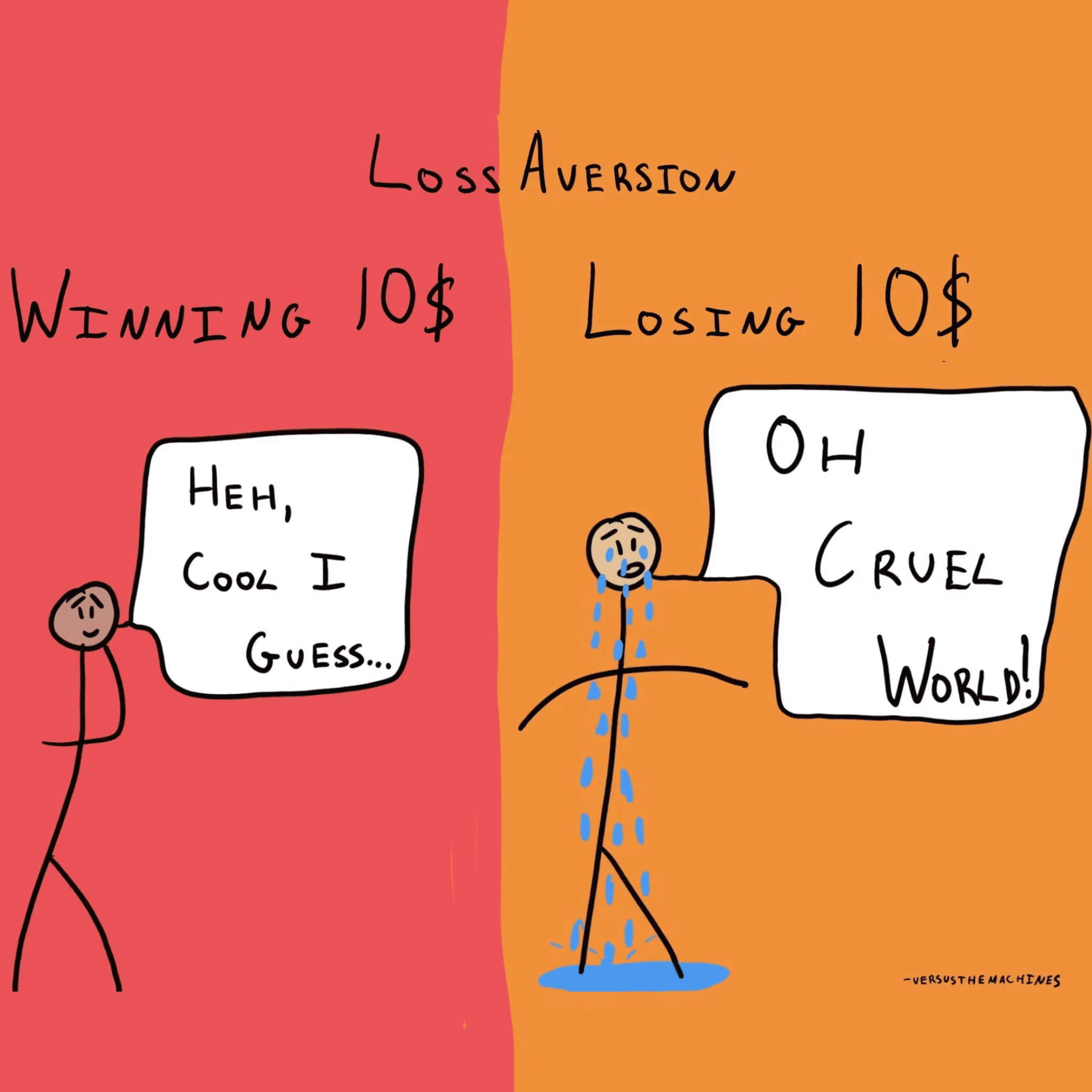
Loss aversion is one of the most reliable patterns in human behavior: people feel the pain of losing something about twice as strongly as the pleasure of gaining the same thing. If your landing page only sells the upside, you're using half the engine.
What loss aversion actually is
Two researchers — Kahneman and Tversky — found that the brain treats losses and gains very differently. A $50 bill found feels good. The same $50 dropped on the sidewalk feels noticeably worse. Same amount, different weight.
"For most people, the fear of losing is a much stronger motivator than the prospect of gaining." — Kahneman & Tversky
It made sense for our ancestors: losing a day of food was life-threatening; finding extra was a bonus. The wiring is still there. Today it shows up when someone closes your tab — they're not picking another product, they're avoiding the small "loss" of clicking sign up.
Why this matters on a landing page
Most visitors don't leave because your offer is bad. They leave because doing nothing feels safer than acting. Loss aversion is how you tilt that balance.
Conversion
Frame the feature as something they're currently missing, not just a nice add-on. "Stop losing leads who never reach your form" lands harder than "We help you get more leads."
Retention
Streaks, level badges, "your data is saved here" cues — they all work because losing the streak hurts more than building it felt good. Once a user has spent time inside your product, you can lean on that.
Churn
When people cancel, remind them what they leave behind: their saved templates, their integrations, their grandfathered price. You're not begging them to stay — you're showing them the cost of leaving.
Analyze your conversion triggers
Is your site missing the psychological hooks that drive action? Get an instant AI analysis.
Scan Your Site FreeHow to use loss aversion on your page
This is not "change the button to DON'T MISS OUT." It's about reframing what's at stake.
1. Reframe the offer
Stop selling the gain. Sell the loss of not acting.
- Gain frame: "Get 20% off your first order."
- Loss frame: "Your 20% discount expires in 2 hours."
The second one works better because it's tied to a real, time-bound loss. For more on phrasing, see Framing Effect: Frame the Information, Shape the Decision.
2. Use free trials the right way
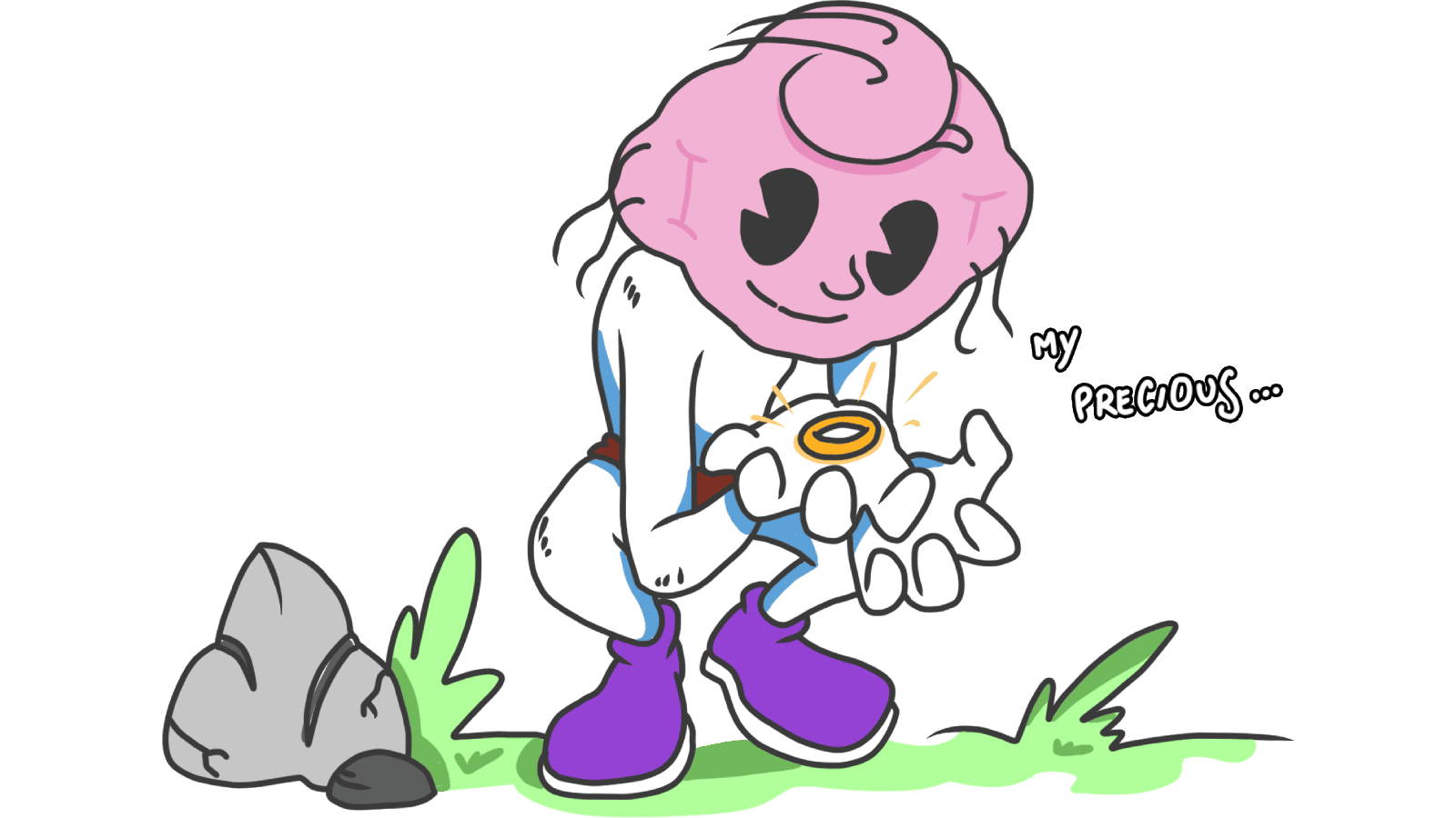
A free trial isn't just "try before you buy." After 14 days of using your tool, the user has set up workspaces, imported data, invited teammates. They aren't deciding to buy a subscription anymore — they're deciding whether to lose what they already built. That's the conversion lever. Related: Endowment Effect: My Precious.
3. Use real scarcity, never fake
When something is genuinely limited, fear of losing it kicks in. "Only 3 spots left in this cohort," "this price ends Friday."
- Countdown timers — only if the deadline is real.
- Stock counters — only if they reflect actual inventory.
If the urgency is fake, your page might convert once. After that, your reputation does the opposite of converting. See Scarcity Heuristic: Rare is Valuable.
4. Name the cost of doing nothing
For SaaS and productivity tools especially, "doing nothing" is the real competitor.
- "If you leave now, your draft will be lost."
- "Your premium features expire in 24 hours — keep your data safe."
You're not pressuring them. You're surfacing a consequence they hadn't thought through.
5. Bake loss into loyalty
Status drops, expiring credits, downgrade warnings — all flavors of loss aversion. The fear of losing "Gold tier" is usually stronger than the pull of reaching "Platinum."
Common ways builders break this
The pattern is powerful, which means it's easy to abuse.
Fake scarcity
- The mistake: Countdown timers that reset on refresh. Stock counts that never decrement.
- The fix: Only ship scarcity that's true. People are smart, and one screenshot on Twitter is enough to torch your trust.
Constant alarm bells
- The mistake: Every banner shouts "LAST CHANCE." Every email is "ACT NOW."
- The fix: If everything is urgent, nothing is. Use loss aversion sparingly so the cues that matter still land.
Dark patterns at cancellation
- The mistake: Hiding the cancel button, forcing five confirmation screens, guilting the user.
- The fix: Be honest about what they lose ("you'll lose access to your 500 saved templates"), and make leaving easy. Long-term trust beats one saved subscription.
How real products use this
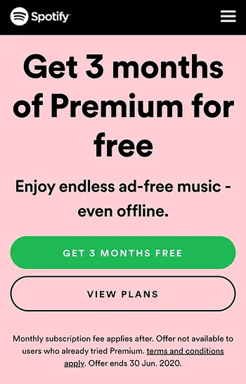
Spotify
Three months of free Premium. By the end, the user has built playlists, downloaded songs for offline, gotten used to no ads. Cancelling doesn't feel like declining a subscription — it feels like losing their library experience.
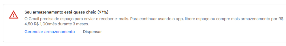
Gmail
Near the 15GB cap, Gmail doesn't pitch storage. It says: "You may not be able to send or receive emails soon." That's loss framing — losing access to a tool you depend on. The upgrade now feels like protecting yourself, not buying a feature.
See how your site compares
Our AI analyzes your interface against the same principles used by Spotify and Gmail.
Get Your Free UX ScoreRelated principles
If loss aversion is interesting, these are next door:
Framing Effect
How the way you phrase a choice changes which one visitors pick.
Endowment Effect
Why visitors value what they have set up in your product more than what is on offer outside it.
Scarcity Heuristic
Why limited spots, expiring offers, and low stock make visitors act faster.
Resources & further reading
Thinking, Fast and Slow
The definitive book by Daniel Kahneman on how our brains use two systems to think, featuring the foundational research on Loss Aversion.
Loss Aversion: The Decision Lab
An in-depth academic look at the history, science, and consequences of loss aversion in everyday life.
Fear of Loss, Engagement Hook
A practical guide on Medium about how major tech brands utilize loss aversion to keep users engaged.
Frequently asked questions
Don't Guess Your UX. Scan It.
Upload your screens or paste your URL to get expert-level UX analysis in under 3 minutes.
Start Free ScanRelated Articles
Decoy Effect: Why your pricing page needs a third option nobody picks
Two plans freeze visitors. Three plans, with one that looks slightly worse than your target, makes the choice obvious. Here is how to use the decoy effect ethically.
Default Effect: Why the option you pre-select on your landing page wins most of the time
Most visitors stick with whatever is already checked. That makes your default the most powerful design choice on the page. Here is how to set it without crossing into dark patterns.
Scarcity: how to use limits on your landing page without looking sleazy
Real scarcity drives action. Fake scarcity destroys trust. Here is how to use the scarcity principle on your landing page without crossing into dark patterns.