Fitts's Law: why visitors miss your CTA and bounce on mobile
Tiny buttons and CTAs hidden in the corner cost you signups. Fitts's Law explains why size and placement decide if visitors click — or leave.
Fitts's Law: why visitors miss your CTA and bounce on mobile
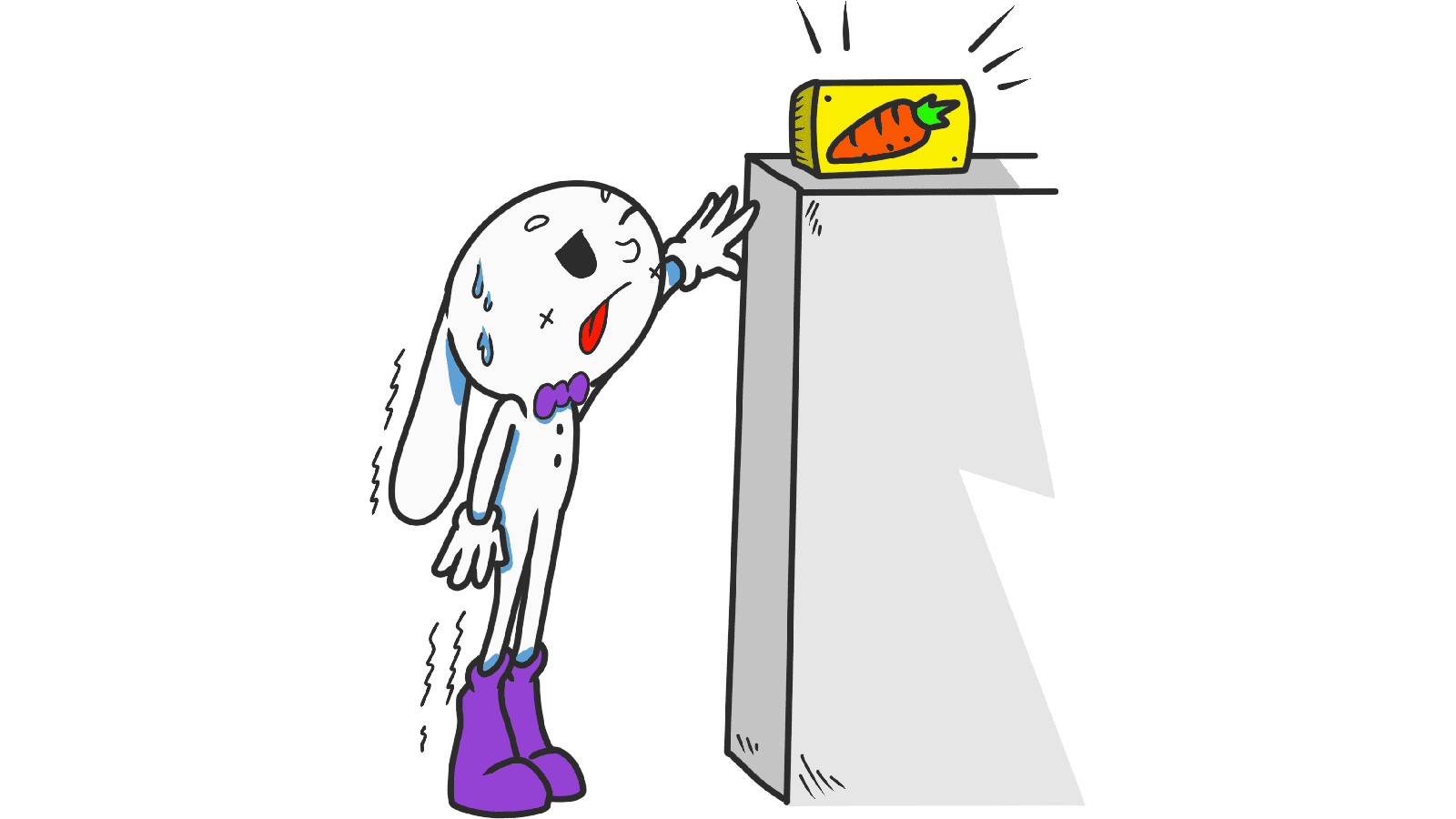
You shipped a clean landing page. Traffic looks fine on desktop, but your mobile conversion is a disaster. People scroll, hover near the CTA, and leave. The button isn't broken. It's just too small, too far, or too close to something else.
That's Fitts's Law silently eating your signups. The size of your interactive elements and where you put them on the screen literally decides whether someone clicks or gives up.
What Fitts's Law actually says
Paul Fitts, a psychologist, figured out in 1954 that the time it takes someone to hit a target depends on two things: how big the target is and how far they have to move to reach it. Smaller and farther = slower. Bigger and closer = faster.
"The time to acquire a target is a function of the target size and distance." — Paul Fitts
Forget the formula. The rule of thumb: if you want someone to click your CTA, make it big and put it where their eyes already are. Tiny buttons in awkward corners are friction you're charging your visitors to push through.
Why our brains slow down on small targets
When you click a small button, your brain has to do extra "aim and correct" work. On a 13px text link, that's a measurable pause. On a thumb-sized CTA, it's effortless. Friction adds up — every millisecond of "where is it again?" is a millisecond closer to bounce.
Why this matters on a landing page
Ignoring Fitts's Law doesn't just make your page feel cheap — it directly costs you signups.
Conversion
Your "Start free" button should be the easiest thing to hit on the entire page. If it's the same size as the legal footer link, you're telling visitors both are equally important. They are not.
Mobile
Most of your traffic is touching your page with a thumb. The thumb is fat, imprecise, and lazy. Anything smaller than ~44px is a gamble.
Accessibility
Visitors with shaky hands, on bumpy commutes, or with bigger fingers will bail on small buttons before they even read your offer.
Errors
Buttons crammed too close together produce "fat finger" mistakes. People hit "back" instead of "next" and leave because the page feels broken.
Is your interface easy to navigate?
Get an instant analysis of your landing page against 80+ conversion principles, including Fitts's Law.
Scan Your Site FreeHow to use Fitts's Law on your page
Four practical moves you can apply today.
1. Make hit targets bigger than the visual button
The clickable area can be larger than the icon or label inside it. Use padding generously — it costs nothing and prevents misclicks.
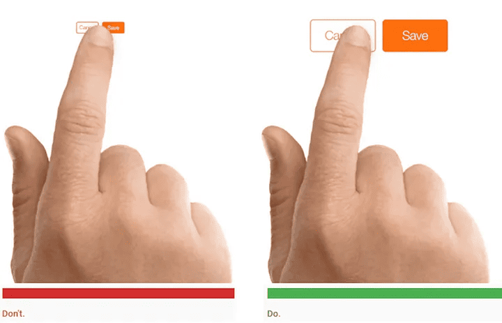
- Web: Don't ship 12px text links with no padding. Wrap them in a button with breathing room.
- Mobile: Apple says minimum 44x44 points. Material Design says 48x48 dp. Your CTA should be bigger than that.
2. Put important elements close to the user's focus
If a visitor just finished filling a form, the "Submit" button should be right under the last field. Not in the top right. Not floating somewhere else. Where their eyes already are.
3. Design for the thumb zone on mobile
Most people use their phones with one hand. The bottom third of the screen is the easy zone. The top corners are awkward.
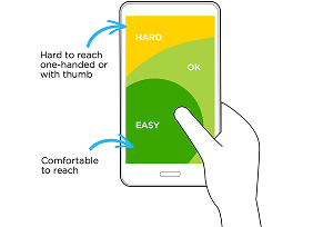
- Easy zone: Primary actions — your CTA, the "Buy" button.
- Awkward zone: Destructive or rare actions — logout, delete.
4. Test on real devices
A button that feels huge on your 27-inch monitor can be invisible on a MacBook Air or thumb-sized on an iPhone SE. Open your page on the actual hardware your visitors use.
Common ways builders break this
1. The "invisible" hitbox
- The mistake: Beautiful icon, but the clickable area is exactly the icon's outline. Visitors miss it constantly.
- The fix: Wrap icons in transparent padding so the hit area is square and generous.
2. Crowded navigation
- The mistake: Tiny links jammed into a footer or header with no spacing.
- The fix: Add real margin between interactive elements. Mistakes are invisible to you, but they happen all day on real devices.
3. CTAs in the wrong corner
- The mistake: Putting the most important action in the top-left of a mobile screen — the hardest spot for a right-handed thumb.
- The fix: Sticky bottom bars or floating buttons in the easy zone. Especially on mobile.
How real products use this
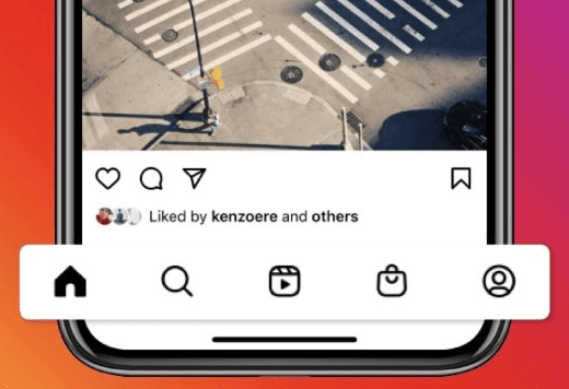
Instagram's main nav is at the bottom of the screen, perfectly thumb-reachable. Five icons, generous spacing, no fat-finger errors. That's the standard you should match.
Amazon

Amazon makes "Add to Cart" and "Buy Now" massive — high-contrast, full-width, impossible to miss. They've A/B tested this for decades. They know the size of the button moves billions of dollars.
See how your site compares
Our AI analyzes your landing page against the same principles used by Instagram and Amazon.
Get Your Free UX ScoreRelated principles
Once Fitts's Law clicks, these are the next ones to learn:
Hick's Law
How the number of choices on the page slows down or speeds up visitor decisions.
Resources & further reading
Material Design Guidelines
Find comfortable sizes for clickable areas on Google's reference site.
Fitts's Law: The Importance of Size and Distance
A deep dive into the history and application of the law by Interaction Design Foundation.
NN Group: Fitts's Law in UX
Case studies and practical applications from the leaders in evidence-based UX.
Frequently asked questions
Don't guess your UX. Scan it.
Upload your screens or paste your URL to get a senior-level review in under 3 minutes.
Start Free ScanRelated Articles
Jakob's Law: why your "original" landing page is confusing visitors
Visitors expect your page to work like every other site they use. Jakob's Law explains why being too creative with your UI quietly kills conversion.
Miller's Law: why your landing page feels overwhelming (and visitors leave)
Visitors can only hold a few things in their head at once. Miller's Law shows why crammed navs and walls of text crush conversion — and how to chunk it down.
Aesthetic-Usability Effect: why your ugly landing page feels broken (even when it works)
Visitors decide your product is good or bad in 50ms. The Aesthetic-Usability Effect explains why beautiful pages feel easier — and convert better.