Nielsen's 5 UI checks: the basics that quietly kill your landing page conversions
Visitors bounce because tiny UI things feel broken. Nielsen's five core principles are the cheapest fixes for any landing page — here's how to apply them.
Nielsen's 5 UI checks: the basics that quietly kill your landing page conversions
You shipped your landing page. People click around for a few seconds, hit a button that doesn't react, see two icons that mean the same thing, and bounce. You assume the offer is the problem. It usually isn't.
Most landing pages don't lose visitors because of the pitch. They lose them because tiny pieces of the interface feel broken, inconsistent, or unsure of themselves. The five principles below are the cheapest fixes you can make today, and they're the ones every senior designer checks first.
What these principles actually are
Jakob Nielsen wrote them in the 90s as ten rules of thumb for spotting usability problems. Forget the academic framing. They're a checklist for "is this page doing the basics right?" — the kind of stuff visitors won't compliment when you nail it, but will absolutely punish when you don't.
"User experience encompasses all aspects of the end-user's interaction with the company, its services, and its products." — Jakob Nielsen
When you skip them, your page feels off. Visitors can't say why, but they leave anyway.
Why this matters on a landing page
If a stranger can't figure out what to do in 5 seconds, they don't blame themselves. They close the tab and never come back. These five checks are about removing the silent reasons people bounce.
Conversion
A page that gives feedback at every click feels alive. A page that doesn't feels broken — and broken pages don't get signups.
Trust
Consistency reads as "this team knows what they're doing." Inconsistency reads as "this might be a scam." Stranger meets your URL with zero context, and every off-brand button chips away at trust.
Support load
Errors caught early are tickets you never have to answer. If your form rejects an email after submit instead of inline, you're creating a support email you'll have to read on Sunday.
Is your interface working?
Get an instant analysis of your landing page against 80+ conversion principles, including the classic Nielsen checks.
Scan Your Site FreeHow to apply the 5 essential checks
1. Visibility of system status (always show what's happening)
If a visitor clicks a button and nothing visibly changes, they assume it's broken. They click again. Then they leave.
Do this:
- Add a loading spinner or disabled state on every form submit.
- Use progress bars for uploads and multi-step flows.
- Show a clear success or error message after every action.
Avoid this:
- Silent buttons. If your CTA does anything, it should react instantly — even just a color change.
- Hiding the user's location in a long flow.
2. Consistency and standards (don't reinvent the basics)
Visitors spend most of their time on other sites and bring those expectations to yours. If your "save" icon is also your "download" icon, you're costing yourself trust.
Do this:
- Use familiar icons (magnifying glass for search, gear for settings).
- Keep your nav where people expect it.
- Pick one button color for the primary action and use it everywhere.
Avoid this:
- A green CTA on the homepage and a blue CTA on the pricing page.
- Custom icons that need a tooltip to be understood.
3. Aesthetic and minimalist design (cut the noise)
Every extra element on a landing page competes with your CTA. The more you stack, the less anything stands out.
Do this:
- Lead with the offer, then explain. Don't try to say everything in the hero.
- Use whitespace to separate sections.
- Hide secondary info behind expandable sections instead of stuffing it on the page.
Avoid this:
- Cramming every feature on the homepage because "people need to see everything."
- Decorative elements that don't help the user decide.
4. Match between system and the real world (talk like a human)
Your visitors don't speak your stack. Stop using internal jargon and database labels in the UI.
Do this:
- A trash icon for delete. A house for home. The obvious metaphors.
- Plain copy: "Wrong password" beats "Auth error 403."
Avoid this:
- Internal feature names ("Activate Synapse Mode") that mean nothing to a first-time visitor.
5. Error prevention (stop the mistake before it happens)
The best error message is one the user never sees because the design made the mistake impossible.
Do this:
- Disable the submit button until the form is actually valid.
- Autocomplete fields where you can — addresses, emails, etc.
- Confirmation dialogs for destructive actions ("delete this?").
Avoid this:
- A 100-character limit field that lets people type 200 characters and then errors out on submit.
Common ways builders break this
Trying to be "creative" with navigation
- The mistake: Circular menus, hidden nav, scroll-jacking. Looks cool on Dribbble. Confuses real users.
- The fix: Be creative with content and brand. Be boring with navigation.
Buttons that don't react
- The mistake: No hover state, no active state, no loading state.
- The fix: Every interactive element gets a
:hover,:active, and:disabledstate. Non-negotiable.
Showing system errors to users
- The mistake: "Error 500" or a stack trace appearing on the screen.
- The fix: Catch the error, log it, show a human message: "Something broke on our end. We're on it."
How real products use this
WhatsApp: error prevention done right

When you delete a message, WhatsApp asks you to confirm and gives you a brief "Undo" window. Two checks at once: prevent the mistake, and let the user recover when they make one anyway.
Uber: visibility of status
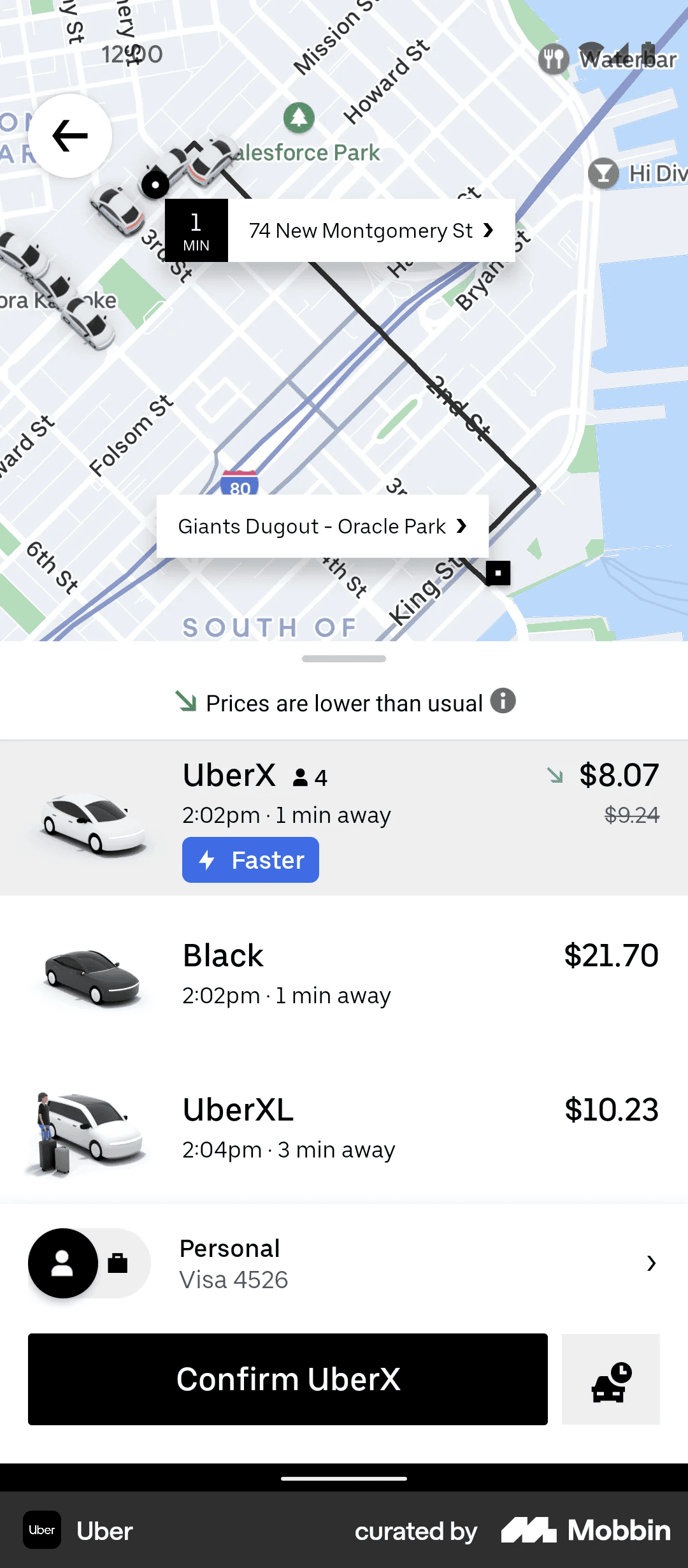
Instead of "Driver on the way," Uber shows the car moving on a map with a live ETA. Constant feedback kills the anxiety of waiting. Your landing page can borrow the same idea — show progress at every step.
See how your site compares
Our AI checks your landing page against the same principles used by WhatsApp and Uber.
Get Your Free UX ScoreRelated principles
These five are the start. The rest are next door:
Aesthetic-Usability Effect
Why good-looking pages feel easier to use, even when they have minor flaws.
Resources & further reading
NN Group
The original article on the ten usability principles by the Nielsen Norman Group.
Medium: 10 Nielsen Heuristics
A walk through all 10 with modern interface examples.
Frequently asked questions
Don't guess your UX. Scan it.
Upload your screens or paste your URL to get a senior-level review in under 3 minutes.
Start Free ScanRelated Articles
Jakob's Law: why your "original" landing page is confusing visitors
Visitors expect your page to work like every other site they use. Jakob's Law explains why being too creative with your UI quietly kills conversion.
Miller's Law: why your landing page feels overwhelming (and visitors leave)
Visitors can only hold a few things in their head at once. Miller's Law shows why crammed navs and walls of text crush conversion — and how to chunk it down.
Aesthetic-Usability Effect: why your ugly landing page feels broken (even when it works)
Visitors decide your product is good or bad in 50ms. The Aesthetic-Usability Effect explains why beautiful pages feel easier — and convert better.