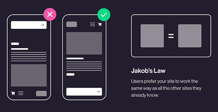
Jakob's Law: why your "original" landing page is confusing visitors
Visitors expect your page to work like every other site they use. Jakob's Law explains why being too creative with your UI quietly kills conversion.
Jakob's Law: why your "original" landing page is confusing visitors
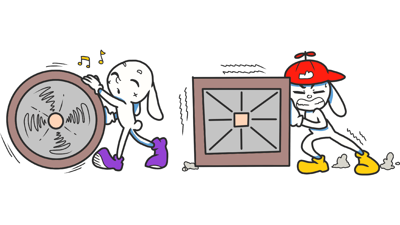
You spent two weeks designing a landing page that doesn't look like anything else. The nav is unique. The icons are custom. The hero scrolls in a wild new direction. You're proud of it. Visitors are confused.
That's Jakob's Law. The more your page violates patterns visitors already know, the more brain power they spend just figuring out how to use it — and the more likely they are to bounce before they ever read your offer.
What Jakob's Law actually says
Jakob Nielsen, one of the original usability researchers, summed it up in one line:
"Users spend most of their time on other sites. They expect yours to work the same way." — Jakob Nielsen
Visitors don't show up to your page with a blank brain. They show up with a mental model built from Google, Amazon, Instagram, and every site they've ever used. Hamburger icon = menu. Magnifying glass = search. Logo top left = home. When you break those expectations, visitors don't think "wow, original" — they think "this feels off."
Why this matters on a landing page
You have maybe 5 seconds to feel familiar enough that someone keeps scrolling. Familiarity is the cheapest trust signal you have.
Conversion
A page that "just works" lets visitors focus on your offer instead of figuring out the layout. Every second they spend hunting for your nav is a second they're not reading your headline.
Trust
Strange UI feels like a scam. The sites visitors trust most use boring, predictable patterns. Mimic them and you steal a piece of that trust by association.
Speed of understanding
If your page uses standard patterns, visitors can scan it in seconds. If everything is "different," they have to slow down and learn — and most won't bother.
When Jakob's Law gets ignored, bounce rates climb. Visitors retreat to a competitor whose page they don't have to decode.
Is your interface working against visitor expectations?
Get an instant analysis of your landing page against 80+ conversion principles, including Jakob's Law.
Scan Your Site FreeHow to use Jakob's Law on your page
The trick: be conventional with structure, original with content and brand.
1. Use familiar patterns where they exist
Don't invent a new nav. Don't invent a new "search." Don't invent a new logo placement. Steal the pattern, save your creativity for the parts that actually matter — copy, visuals, and your unique angle.
2. Keep your own pages consistent
Jakob's Law is about external consistency (your site vs. the rest of the web), but internal consistency matters just as much. If your primary button is blue on the homepage, it should be blue on every page. Switching styles between pages forces visitors to relearn.
3. Look at the giants in your space
Building a SaaS landing page? Open Linear, Vercel, Notion. Building an e-commerce store? Open Shopify stores you admire. You're not copying — you're identifying the patterns your visitors already know.
4. Innovate where it counts
You can still be creative. Just put the creativity into your headline, your hero visual, your tone of voice — not into the back button. If you do break a pattern, give visitors a clear cue (like a tooltip or a guided onboarding) to learn the new one.
5. Test with real strangers
Show your page to someone who's never seen it. If they pause, hover, or ask "where do I click?" — you've drifted too far from familiar patterns.
Common ways builders break this
1. Mystery-meat navigation
- The mistake: Custom icons or vague labels that no one understands until they click them.
- The fix: Standard icons (search, settings, trash) with text labels next to them. Always.
2. Slow, "cinematic" transitions
- The mistake: A 2-second slide animation on every menu open because it "feels premium."
- The fix: Visitors expect instant feedback. 200–300ms max.
3. Re-arranging standard layouts
- The mistake: Logo in the bottom right. Search bar in the footer. Nav on the left in a single-page site.
- The fix: Logo top-left. Nav top-right. CTA visible in the hero. Boring is the right answer.
How real products use this
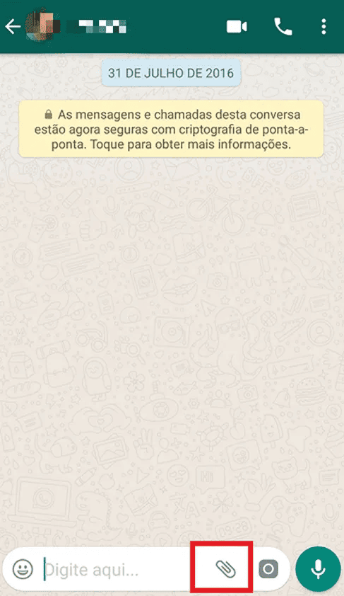
WhatsApp uses the paperclip icon for attachments — a metaphor borrowed straight from email clients in the 90s. Anyone who has ever used email knows what it does. No tutorial required.
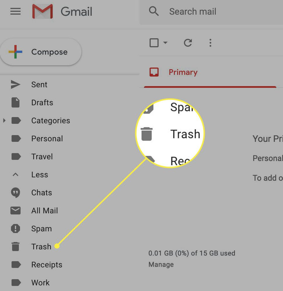
Gmail
Gmail uses the universal trash can icon to delete emails. It's the same metaphor on Mac, Windows, Android, iOS. By sticking with what visitors already know, Gmail makes itself usable on day one.
See how your site compares
Our AI analyzes your landing page against the same principles used by WhatsApp and Gmail to make your visitors feel right at home.
Get Your Free UX ScoreRelated principles
Once Jakob's Law clicks, these are the next stops:
Resources & further reading
The Power Law of Learning
An in-depth article by NN Group on how consistency drives UI efficiency.
Jakob's Law of Internet UX (Video)
Watch Jakob Nielsen explain his law of internet user experience in detail.
Frequently asked questions
Don't guess your UX. Scan it.
Upload your screens or paste your URL to get a senior-level review in under 3 minutes.
Start Free ScanRelated Articles
Miller's Law: why your landing page feels overwhelming (and visitors leave)
Visitors can only hold a few things in their head at once. Miller's Law shows why crammed navs and walls of text crush conversion — and how to chunk it down.
Aesthetic-Usability Effect: why your ugly landing page feels broken (even when it works)
Visitors decide your product is good or bad in 50ms. The Aesthetic-Usability Effect explains why beautiful pages feel easier — and convert better.
Fitts's Law: why visitors miss your CTA and bounce on mobile
Tiny buttons and CTAs hidden in the corner cost you signups. Fitts's Law explains why size and placement decide if visitors click — or leave.