Miller's Law: why your landing page feels overwhelming (and visitors leave)
Visitors can only hold a few things in their head at once. Miller's Law shows why crammed navs and walls of text crush conversion — and how to chunk it down.
Miller's Law: why your landing page feels overwhelming (and visitors leave)
You opened your landing page on someone else's laptop. Your nav has fourteen items. The pricing section lists eleven features. The hero has three CTAs. You feel that little wave of "this is a lot" — and so does every visitor who lands on it for the first time.
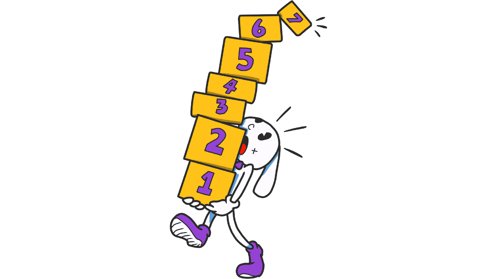
That's Miller's Law in action. The human brain can only hold about 7 things in working memory at once — and modern research says the real number is closer to 4. Stack more than that and visitors start dropping pieces, getting overwhelmed, and bouncing.
What Miller's Law actually says
In 1956, cognitive psychologist George A. Miller published a paper called "The Magical Number Seven, Plus or Minus Two." The core idea: your short-term memory can juggle around 7 (give or take 2) items at one time. Push past that and the brain starts losing track.
Newer research suggests the real working-memory limit is more like 4–5 items, especially when the items are complex. Either way, the rule is the same: less is more when you're presenting information to a stranger.
"The human mind can only deal with what it can remember." — George A. Miller
In landing-page terms: a 14-item nav, a 20-field signup form, or a hero with three CTAs and four trust badges is asking visitors to hold more than their brain can handle. So they drop everything and leave.
Why this matters on a landing page
Crowded pages don't just feel ugly — they cost you signups.
Decision paralysis
Visitors faced with too much choose nothing. Closely tied to Hick's Law.
Mistakes
If a visitor is trying to remember your pricing while clicking to a comparison page, and your UI throws ten more things at them, they make form errors and get frustrated.
Conversion
Every extra piece of info is friction. Friction kills conversion.
Trust
Cluttered, disorganized pages feel unprofessional. Tight, well-grouped pages feel like a serious product.
By designing with the "magic number 7" in mind, you create a path of least resistance — visitors get to your CTA without their brain melting.
Is your interface overwhelming visitors?
Get an instant analysis of your landing page against 80+ conversion principles, including Miller's Law.
Scan Your Site FreeHow to use Miller's Law on your page
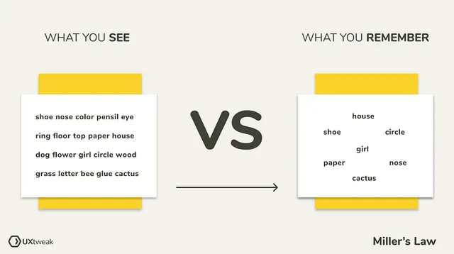
This isn't about counting to seven on every list. It's about chunking — grouping things so visitors can hold them in their head.
1. Group information (chunking)
Look at this phone number: 1234567890. Hard to read. Now: (123) 456-7890. Same digits, way easier. Apply the same trick to long forms, credit card inputs, and dense paragraphs.
2. Use clear categories for menus
If your nav has 15 items, your visitor is lost. Group them into 5–7 buckets with clear labels.
- Do this: A nav with "Product, Pricing, Resources, Customers, Contact." Five clean items.
- Avoid this: A flat nav with every page on the site.
3. Run a 5-second test
Show your hero to someone for 5 seconds. Hide it. Ask what they remember. If they can't recall the headline and the CTA, your hero is too busy.
4. Use whitespace and visual grouping
Whitespace, borders, and background tints tell the eye "these things go together." It's free, and it's the strongest tool you have for chunking.
Common ways builders break this
1. The "more is better" mistake
- The problem: Believing more options = more useful.
- The fix: Show 5–7 things. Hide the rest behind "More" or progressive disclosure.
2. Walls of text
- The problem: Long paragraphs without breaks. Brains can't chunk it.
- The fix: Bullet points. Short sentences. Frequent subheadings. Make it scannable.
3. Mega-form signups
- The problem: A 20-field signup form on one screen.
- The fix: Multi-step. Break 20 fields into 4 steps of 5. Visitors only see one chunk at a time.
How real products use this
Duolingo
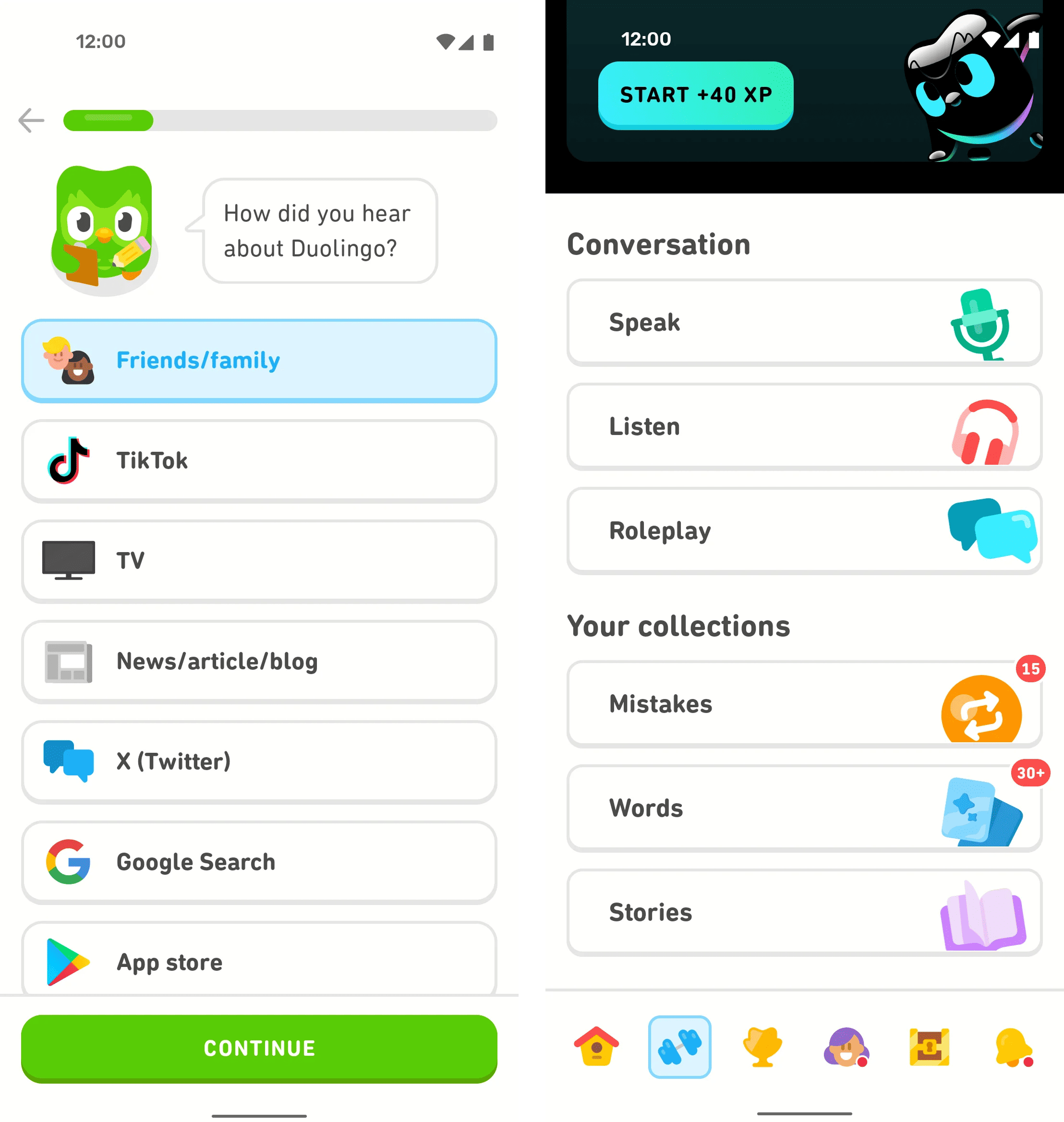
Learning a language is a memory marathon. Duolingo solves it by chunking: each lesson teaches 5–7 new words. Each screen asks one question. The whole product is built around the limits of working memory — and that's exactly why streaks happen.
See how your page compares
Our AI analyzes your landing page against the same principles used by leaders like Duolingo.
Get Your Free UX ScoreRelated principles
Once Miller's Law clicks, these are the next stops:
Hick's Law
Why every extra option on the page slows down visitor decisions.
The Von Restorff Effect
Why the one element that breaks the pattern is the one visitors remember.
Fitts's Law
How button size and distance from the cursor change how fast visitors click your CTA.
Resources & further reading
NN Group Article
How chunking helps visitors process content.
Medium Article
Miller's Law: A fundamental principle for designers.
Frequently asked questions
Don't guess your UX. Scan it.
Upload your screens or paste your URL to get a senior-level review in under 3 minutes.
Start Free ScanRelated Articles
Jakob's Law: why your "original" landing page is confusing visitors
Visitors expect your page to work like every other site they use. Jakob's Law explains why being too creative with your UI quietly kills conversion.
Aesthetic-Usability Effect: why your ugly landing page feels broken (even when it works)
Visitors decide your product is good or bad in 50ms. The Aesthetic-Usability Effect explains why beautiful pages feel easier — and convert better.
Fitts's Law: why visitors miss your CTA and bounce on mobile
Tiny buttons and CTAs hidden in the corner cost you signups. Fitts's Law explains why size and placement decide if visitors click — or leave.