Form Design: Why visitors abandon your signup form halfway through
Forms are where signups go to die. Here is how to cut friction, group fields, and ship a form that actually finishes converting your traffic.

Form Design: Why visitors abandon your signup form halfway through
A visitor clicks your CTA. The form opens. Twelve fields, half of them unclear, a country dropdown with 195 entries, a password rule that says "must contain a special character" but doesn't say which ones. They get to field five and close the tab.
That's almost every signup form on the internet. Forms are where intent goes to die. The visitor came willing to convert, and the form took just enough effort to talk them out of it.
You can't sell with a great hero and then squander it with a terrible form. Here's how to fix that.
What intuitive form design actually is
A form that feels invisible. Visitors think about what they're saying, not how to say it. Fields are grouped logically, errors show up at the right moment, mobile keyboards match the input type, and nothing is asked twice.
"A good form should not only collect information but also facilitate the user experience as much as possible, reducing barriers and uncertainties." — Jakob Nielsen
The principle: every extra field, vague label, or surprise rule is mental work. Visitors only have so much before they bail. Save that energy for the parts that matter.
Why this matters on a landing page
Forms sit at the bottom of the funnel. A small UX fix here lifts more revenue than almost anywhere else.
Direct impact on conversions
A famous Expedia experiment: removing one optional "Company Name" field added $12M/year in profit. One field. Friction is real money.
Trust
If your signup is hard, visitors assume your product will be hard. The form is a preview of what working with you feels like.
Data quality
Real-time validation and clear instructions reduce typos and broken inputs. Less garbage in your database, fewer support tickets.
Mobile
Typing on a phone is slower and more error-prone. Forms that don't optimize for mobile get abandoned at way higher rates.
Is your form structure working?
Get an instant review of your page against 80+ landing page principles.
Scan Your Site FreeHow to use this on your page
The fastest way to a better form is subtraction.
1. Cut every field you can
The single highest-leverage move: delete fields. Ask only what you absolutely need to onboard a visitor.
- Do: Use smart defaults — detect country by IP, prefill obvious fields.
- Avoid: Asking for "optional" data that helps your marketing team but does nothing for the visitor right now.
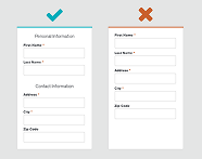
2. Group fields logically
Humans handle information better in batches. Split the form into sections — "Account info," "Shipping," "Payment" — visually distinct, with clear headers.
3. Validate in real time
Don't wait for "Submit" to tell the visitor field three was wrong. Show errors as they type, confirm correct fills with a small check.
- See Quick and Visual Communication: Using Icons Effectively for error state cues.
- Check Color Accessibility: Designing for Everyone so error colors are readable for everyone.

4. Use the right input for the option count
- More than 5 options: dropdown.
- 5 or fewer: radio buttons or segmented controls. Keeps everything visible, fewer clicks.
5. Labels above the field
Top-aligned labels are the gold standard. The eye scans down a single column. They don't disappear when the visitor focuses the field (unlike floating placeholders).
For more, see The Ideal Form: Mastering Structure.
Common ways builders break this
Placeholders as labels
- The mistake: Label only shows in the placeholder. Click the field, label disappears, visitor forgets what to type.
- The fix: Keep labels visible above the field at all times.
Hiding what's required
- The mistake: No indicator on required fields until the form fails on submit.
- The fix: Mark required with
*. Or — better — mark the few that are optional, since most should be required.
Wrong mobile keyboard
- The mistake: Standard text keyboard pops up when the visitor is typing a phone number.
- The fix: Use the right
input type—email,tel,number. Mobile then shows the right keyboard automatically.
How real products handle this
Spotify
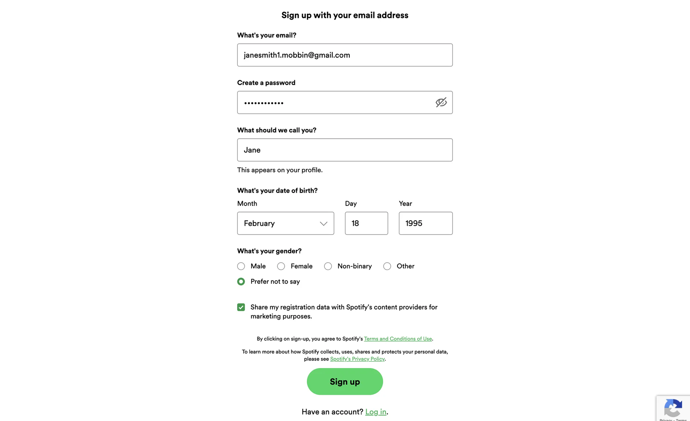
Clear placeholders, real-time validation that flags duplicate emails or weak passwords as you type, and a social auth row at the top so visitors can skip the form entirely. The "form" is barely there if you click Google.
Duolingo
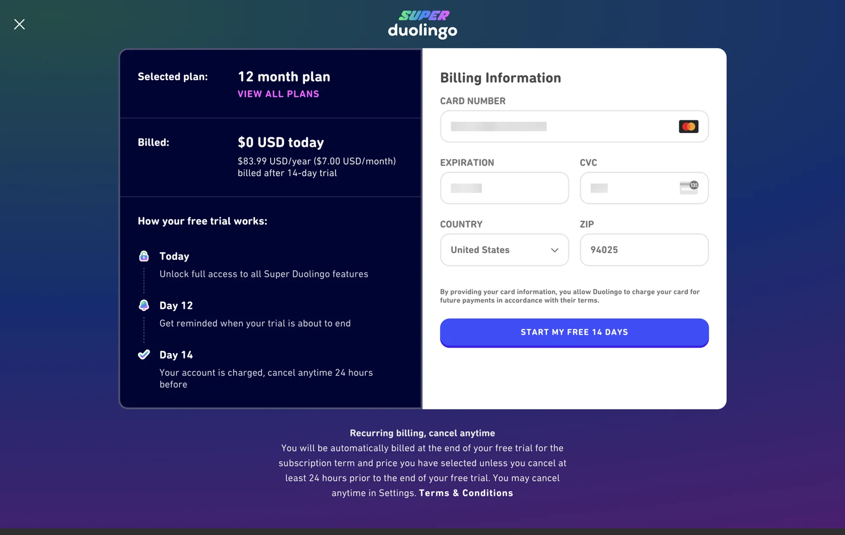
Single column, short, no surprises. Microcopy like "Secure SSL encrypted payment" reduces the gut-check anxiety of handing over a card. The form does its job and gets out of the way.
See how your site compares
Our AI reviews your page against the same patterns used by Spotify and Duolingo.
Get Your Free UX ScoreRelated principles
Forms depend on the basics. Pair this with:
Quick and Visual Communication
How icons give visitors instant feedback on form validation.
Color Accessibility
Make sure your error and success states are readable for everyone.
The Ideal Form Structure
Layout and hierarchy patterns for high-converting forms.
Resources & further reading
Form Usability
The reference guide on web form design from Nielsen Norman Group.
Web Forms Design Best Practices
Google's reference on building high-performance forms.
Frequently asked questions
Don't Guess Your UX. Scan It.
Upload your screens or paste your URL to get expert-level UX analysis in under 3 minutes.
Start Free ScanRelated Articles
Buttons That Work: Why visitors do not click your CTA and how to fix it fast
Your CTA is right there but the click rate is flat. Buttons fail on contrast, copy, and size — here is the fix that lifts conversion without a redesign.
Button Structure: Why your CTA blends in and how to build a system that gets clicked
Visitors hesitate at your CTA because the button hierarchy is broken. Here is the structure — primary, secondary, states — that makes pages convert.
Cards: How to turn a wall of features into a grid visitors actually scan
Your feature section reads like a wall of text. Cards break it into scannable units — here is how to design them so visitors stop, read, and click.