Buttons That Work: Why visitors do not click your CTA and how to fix it fast
Your CTA is right there but the click rate is flat. Buttons fail on contrast, copy, and size — here is the fix that lifts conversion without a redesign.
Buttons That Work: Why visitors do not click your CTA and how to fix it fast
You shipped your landing page. Traffic is coming in. The CTA is right there — and the click rate is flat.
The button is usually where founders bleed conversions without realizing it. It blends into the background, the copy is vague, or it's so small on mobile that thumbs miss it. Buttons aren't decoration; they're the moment a visitor decides to act. When they don't work, nothing else on the page matters.
What "a button that works" really means
A working button does one thing well: it screams "click me" before the visitor has to think about it. That's called affordance — the visual cue that tells the brain "this is pressable."
We use color, shadow, shape, and placement to send that signal. Skip those and visitors hesitate. Hesitation is the gap where conversions die.
"Buttons should look like buttons." — Luke Wroblewski
The more you push toward "minimal" or "flat" without those signals, the more friction you add. Visitors stop and ask "is this a button or just a colored box?" — and that pause is enough to lose them.
Why button quality moves your numbers
A single button can be the difference between a checkout and a bounced session.
- Wayfinding. Good buttons act as signposts. Visitors don't pogo back and forth trying to figure out the path.
- Conversion. Tiny tweaks — better contrast, better copy — routinely shift conversion by double digits.
- Accessibility. Buttons that meet contrast and size standards work for visitors with vision or motor constraints. That's more conversions, not just compliance.
- Trust. Polished, consistent buttons make the page feel safe. Broken or weirdly-styled ones make visitors nervous about typing in a credit card.
Is your button design working?
Get an instant AI review of your page against 80+ conversion principles.
Scan Your Site FreeHow to build buttons that drive action
Three things to nail. Get them right and you're already ahead of most landing pages.
1. Make it impossible to miss
If the button doesn't stand out from the page, it doesn't exist. Your CTA needs to fight for attention, not blend in.
- Do this: Pick a fill color that contrasts hard with the background. If your page is mostly blue and white, a vivid orange or green button pops.
- Don't: Use ghost buttons (outline only) for the primary action. Studies — and your own analytics if you A/B test — show solid fills win.
2. Write copy like you're giving a directive
The label is the hook. Short, specific, action-led. Three words or fewer when possible. Use imperative verbs that name the outcome.
- Do this: "Get my free report," "Start free trial," "Create my account."
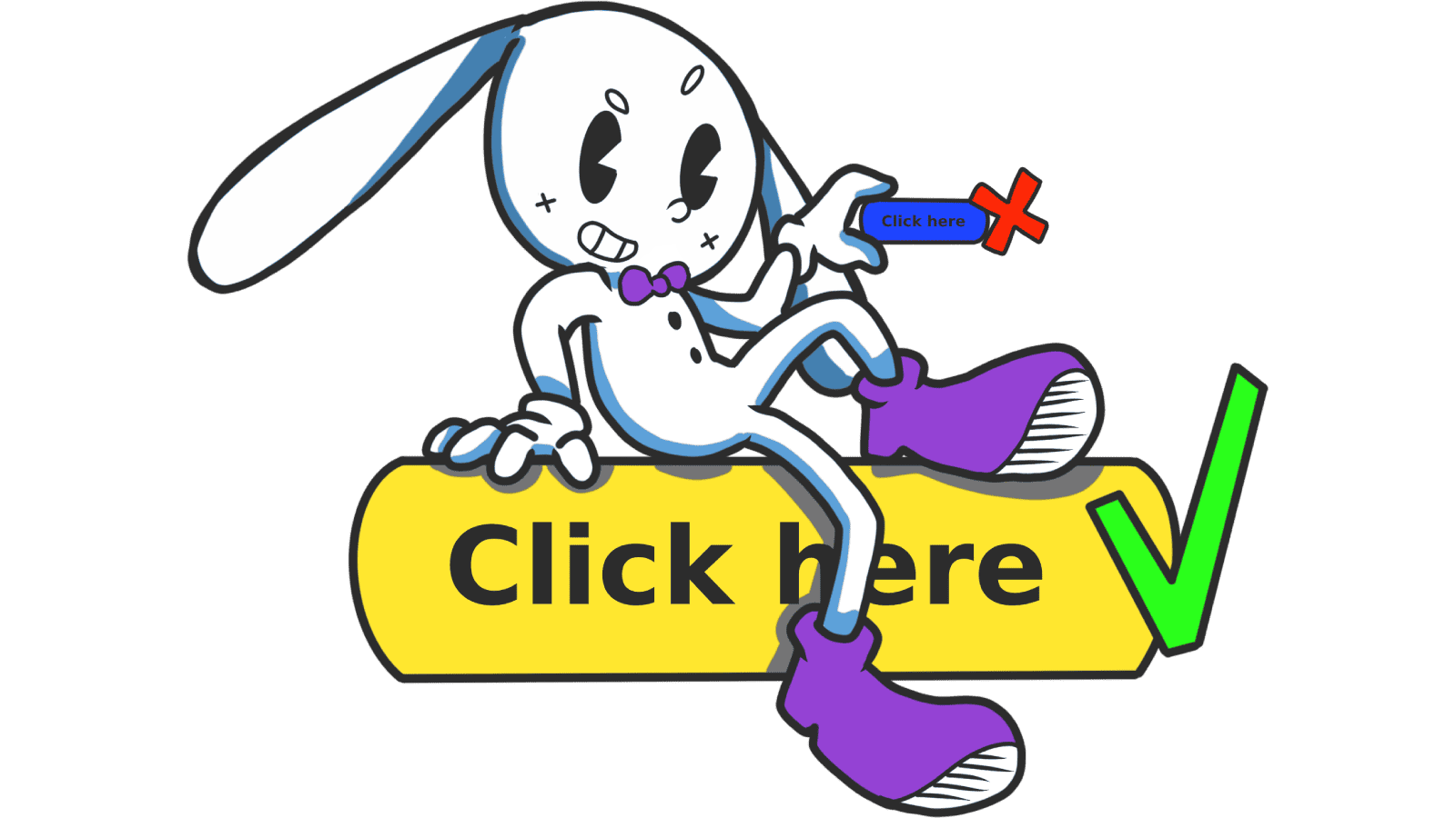
- Don't: "Submit," "Click here," "Next." None of those tell visitors what they're about to get.
3. Make it big enough to hit
Fitts's Law in plain English: the bigger and closer a target, the faster it gets hit. On phones — where most landing page traffic lives — that means thumb-friendly.
- Mobile: 48x48 dp minimum. Thumbs aren't precise.
- Desktop: 32–40px tall is the floor.
- Spacing: Don't crowd buttons. Tap-target overlap kills mobile conversion.
Common ways builders break this
No visual hierarchy
- The mistake: Every button looks the same — primary, secondary, destructive. Visitors can't tell which is the goal.
- The fix: One solid primary per screen. Outlined or text styles for everything else.
No state feedback
- The mistake: The button doesn't react on hover, click, or focus. Visitors wonder if the page is broken.
- The fix: Distinct hover, active, focus, and disabled states. Even a small color shift is enough.
Tiny labels
- The mistake: 10px text inside a big button.
- The fix: 14–16px minimum, centered. The button can be big without the text being small.
How real products do this
Spotify
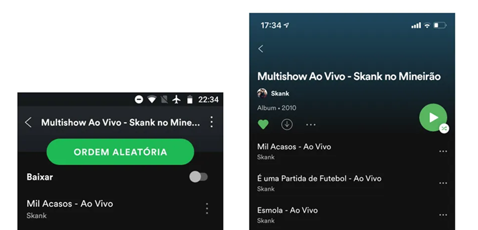
Spotify owns "the green button." Vibrant, pill-shaped, high contrast against dark backgrounds, anchored where thumbs land on mobile. You can't miss the play or upgrade button. That's the point.
Stripe
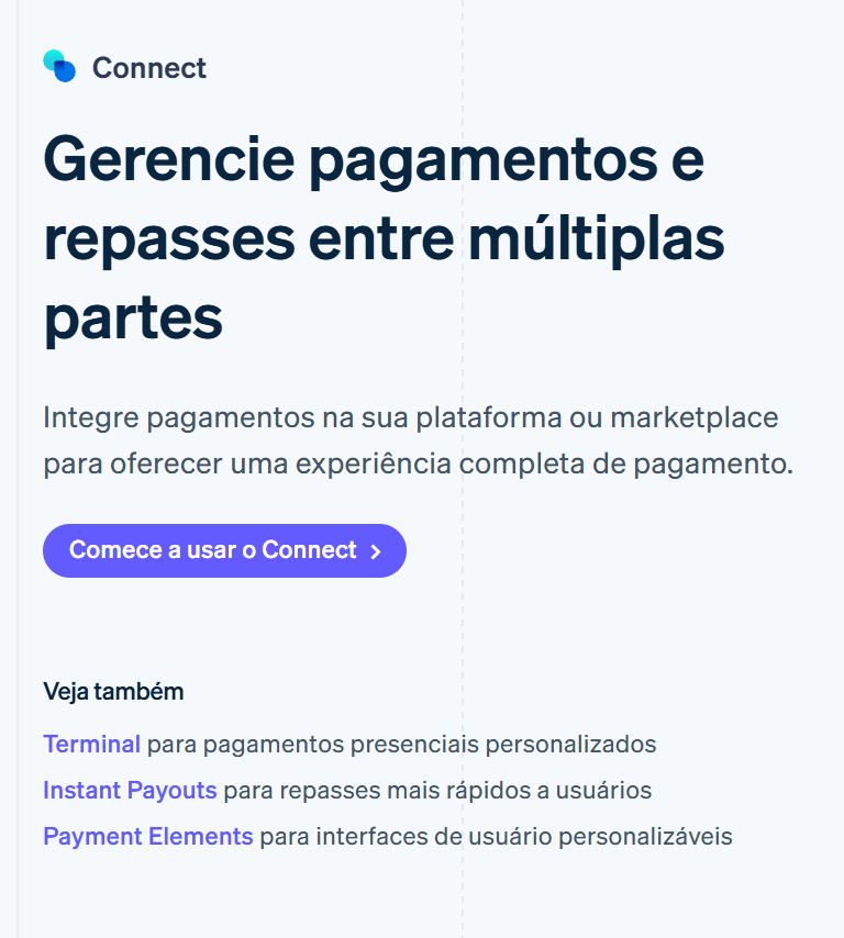
Stripe is obsessed with consistency. Their blue means "action" everywhere — dashboard, docs, marketing site. Once a visitor learns it, every new page feels familiar. That's not magic, it's discipline.
See how your site compares
Our AI checks your page against the same patterns used by Spotify and Stripe.
Get Your Free UX ScoreRelated principles
Buttons don't live alone. These shape how yours land:
Resources & further reading
Material Design: Buttons
Google's official documentation on button types, states, and placement.
Apple Developer Documentation: Buttons
The Human Interface Guidelines for creating buttons within the Apple ecosystem.
Buttons in UI Design
A deep dive article by Willian Matiola on the evolution of button styles.
Frequently asked questions
Don't Guess Your UX. Scan It.
Upload your screens or paste your URL to get a senior-level page review in under 3 minutes.
Start Free ScanRelated Articles
Button Structure: Why your CTA blends in and how to build a system that gets clicked
Visitors hesitate at your CTA because the button hierarchy is broken. Here is the structure — primary, secondary, states — that makes pages convert.
Cards: How to turn a wall of features into a grid visitors actually scan
Your feature section reads like a wall of text. Cards break it into scannable units — here is how to design them so visitors stop, read, and click.
Form Structure: Why visitors abandon your signup halfway and how to keep them
Visitors start your form, type a few characters, and leave. Form structure decides if they finish — here is the layout and feedback that converts.