Icons: Why your custom icon row confuses visitors and how to pick ones they get
Custom icons feel clever but visitors cannot decode them. Pick familiar metaphors and a single style — here is how to make icons earn their place.
Icons: Why your custom icon row confuses visitors and how to pick ones they get
You shipped your landing page. The nav has a row of cute custom icons. Visitors squint, can't tell what they mean, and scroll past your features without clicking anything.
Icons are shorthand. When they work, visitors understand a feature without reading. When they don't, they become "mystery meat navigation" — a wall of decoration that nobody decodes. This guide covers how to make yours actually communicate.
What an icon really is
Icons are visual stand-ins for actions, objects, or concepts. They lean on recognition over recall — a magnifying glass tells visitors "search" faster than the word does.
Sometimes icons replace text (mobile nav). Sometimes they support it (a save button with a disk icon). Either way, the goal is to lower the cost of understanding.
"The system should speak the users' language, with words, phrases, and concepts familiar to the user, rather than system-oriented terms." — Jakob Nielsen
An icon only works if it speaks the visitor's existing visual language. A trash can means delete. A house means home. A lightbulb does not mean search, no matter how clever you think you're being.
Why icon choice matters
Icons affect both how fast visitors move and whether they trust your product.
- Speed. A row of icons reads faster than a row of words.
- Space. A 24px icon does the work of 100px of text. Critical on mobile.
- Universal. "Home" and "Settings" icons work across languages and regions.
When icons fail, visitors hesitate. Hesitation kills conversion — they can't find the cart, they can't tell save from archive, they don't trust the page enough to type a credit card.
Is your icon design working?
Get an instant AI review of your page against 80+ conversion principles.
Scan Your Site FreeHow to use icons that actually communicate
Five rules cover most cases.
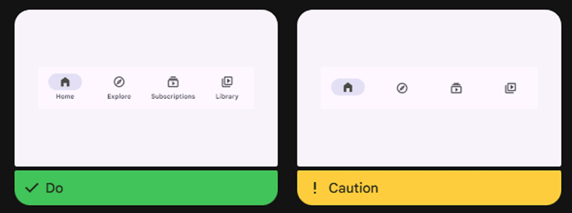
1. Don't icon everything
Icons compete for attention. Use them for navigation and primary actions, not on every label and bullet point. Visual noise makes the important stuff blend in.
2. Pick familiar metaphors
Skip clever for the sake of clever.
- Do this: Magnifier for search, envelope for email, cart for checkout.
- Don't: A custom abstract glyph for "search" because you want to be different. If visitors have to guess, you've already lost.
3. Make them legible
Icons should be sharp and readable on every screen.
- Sizing: Start from a 24px grid for legibility.
- Weight: Lines too thin disappear on low-contrast backgrounds.
- Reference: See Legibility Rules to make sure your visuals meet accessibility standards.
4. Use one visual style
Mixing icon sets is the fastest way to look amateur.
- One icon library. Either all filled or all outlined.
- Same stroke width, same corner radius, same scale.
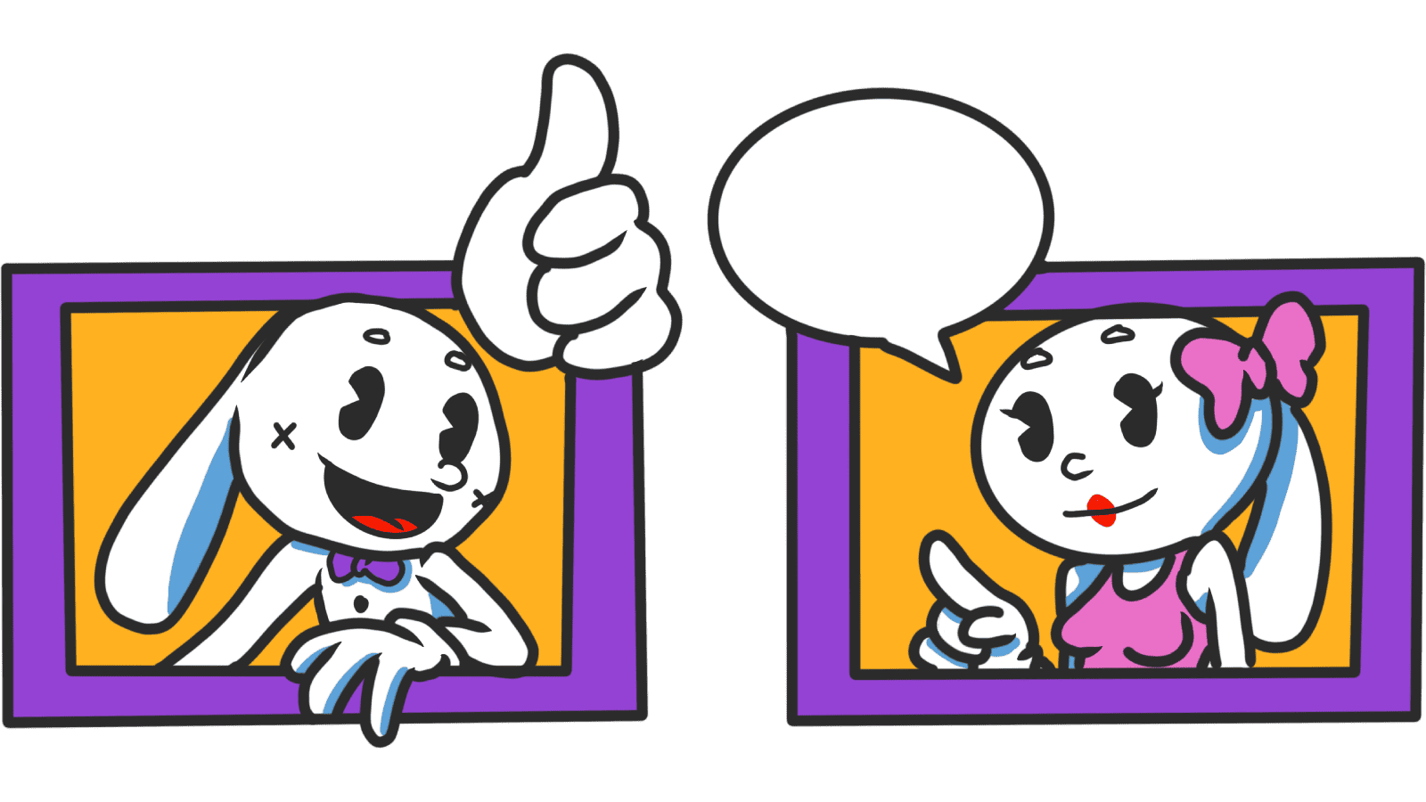
5. Add labels when in doubt
Universal icons can stand alone. Anything else needs a label or tooltip.
- Do this: Pair icons with text in nav and on buttons that aren't obvious.
- Tooltips: For desktop where icons sit alone, add a hover label.
Common ways builders break this
Mystery meat
- The mistake: Custom icons with no labels that nobody understands.
- The fix: The 2-second test. If a visitor can't guess the icon's job in 2 seconds, add a label.
Mixed styles
- The mistake: Hand-drawn icon next to a flat icon next to a 3D illustration.
- The fix: Use a single library — Lucide, Material Icons, Phosphor — and stick to it.
Tap targets too small
- The mistake: A 24px icon is also the tap target. Thumbs miss it.
- The fix: The icon can be 24px, but the tappable area should be 44x44px.
How real products do this
Google Drive
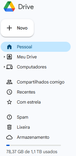
Google Drive uses real-world metaphors — folder, pencil, trash — that visitors have understood since the desktop era. No onboarding needed.
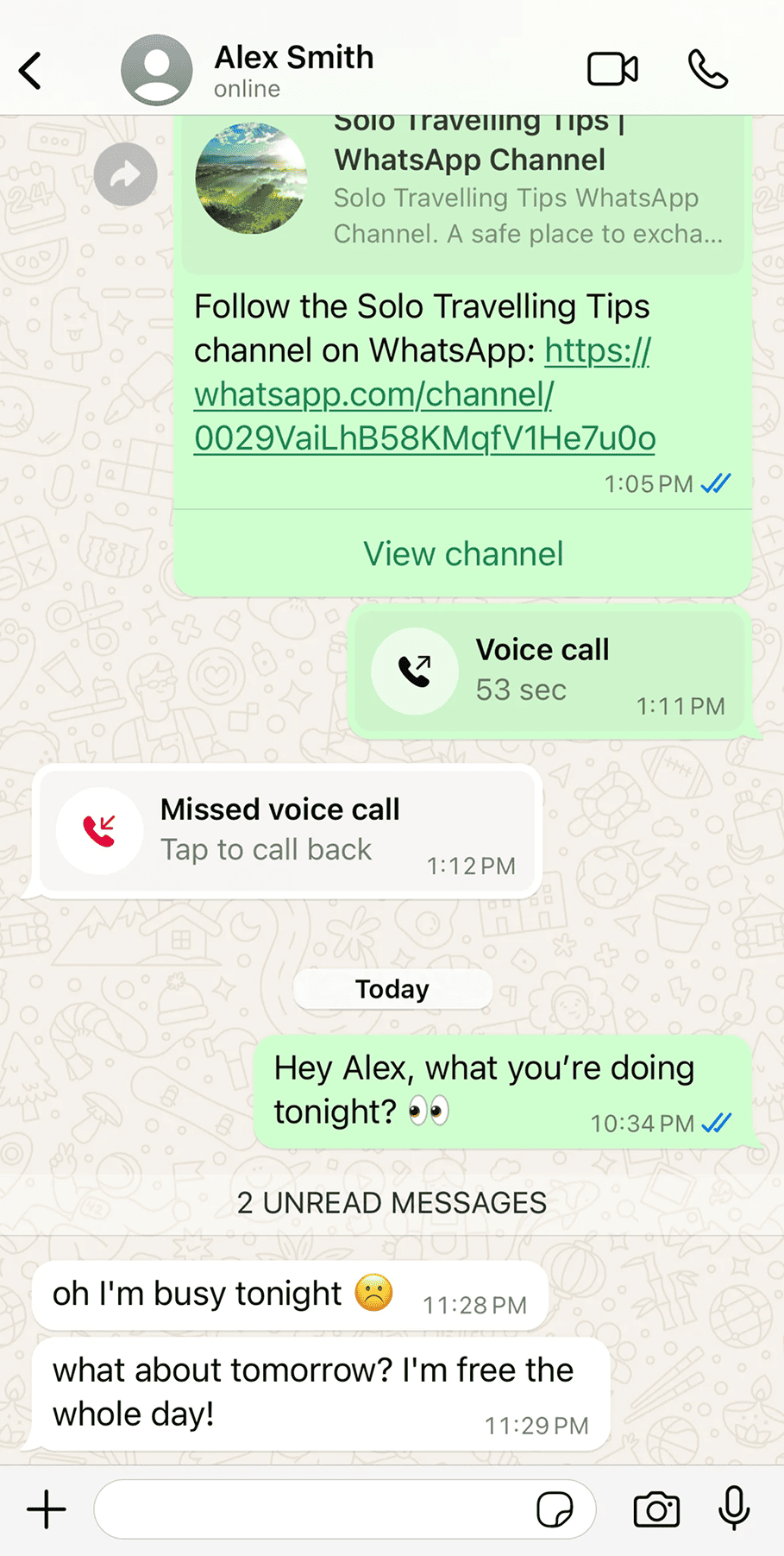
WhatsApp uses iconography for speed. Camera, phone, mic, paperclip — all instantly readable. The blue checkmarks for read receipts use color shifts to communicate status without needing a word.
See how your site compares
Our AI checks your page against the same patterns used by Google Drive and WhatsApp.
Get Your Free UX ScoreRelated principles
Icons connect with the rest of the UI. These shape how yours feel:
Legibility Rules
How to size and weight icons so they stay sharp on every screen.
Resources & further reading
Material Design Icons
Google's comprehensive icon set designed for readability and clarity.
Flaticon
The world's largest database of free customizable icons.
Lucide Icons
Beautiful & consistent icons. The primary set used in many modern design systems.
Frequently asked questions
Don't Guess Your UX. Scan It.
Upload your screens or paste your URL to get a senior-level page review in under 3 minutes.
Start Free ScanRelated Articles
Buttons That Work: Why visitors do not click your CTA and how to fix it fast
Your CTA is right there but the click rate is flat. Buttons fail on contrast, copy, and size — here is the fix that lifts conversion without a redesign.
Button Structure: Why your CTA blends in and how to build a system that gets clicked
Visitors hesitate at your CTA because the button hierarchy is broken. Here is the structure — primary, secondary, states — that makes pages convert.
Cards: How to turn a wall of features into a grid visitors actually scan
Your feature section reads like a wall of text. Cards break it into scannable units — here is how to design them so visitors stop, read, and click.