Cards: How to turn a wall of features into a grid visitors actually scan
Your feature section reads like a wall of text. Cards break it into scannable units — here is how to design them so visitors stop, read, and click.
Cards: How to turn a wall of features into a grid visitors actually scan
You shipped your landing page with a feature section. Eight features, each a paragraph. It looks like a wall. Visitors scroll past, never pick one, never click anything.
Cards fix that. They package each idea into a tappable, scannable unit — image, title, short description, action. Think Pinterest, Spotify, or any pricing grid. The pattern shows up everywhere because it works on every screen size and reduces the mental cost of "what do I focus on?"
What a card actually is
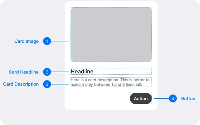
A card is a self-contained block — a small container that holds one idea and an entry point to more. Think of an index card: image, headline, description, button. That's it.
The strength is modularity. Cards stack, filter, and rearrange without breaking the layout. They turn a long page into a grid of small decisions.
"Design components aren't just visual blocks; they're pieces of a system that ensures consistency, efficiency, and scalability." — Brad Frost
Done well, cards make your page feel organized as it grows. Done poorly, they become decorated paragraphs that nobody reads.
Why cards matter on a landing page
It's not aesthetics. It's about how visitors actually process pages.
Scanning beats reading
Visitors don't read; they scan. Cards create clear edges, so the eye jumps from one idea to the next without hunting for context.
Mobile-friendly by default
A grid of four cards on desktop becomes a stack of four on mobile without redesign work. Cards are responsive almost for free.
Action lives where the eye lands
Every card can have its own CTA — "Read more," "Add to cart," "Try it." That removes the noise of competing actions on a long page.
Hierarchy in a small space
Inside one card, you can use size and weight to highlight what matters first — the title, the price, the badge — without designing a whole new section.
Is your card layout working?
Get an instant AI review of your page against 80+ conversion principles.
Scan Your Site FreeHow to build cards that work
Four rules cover most of what you need.
1. One idea per card, prioritized
Title, content, and action lined up so the eye flows naturally. Lead with the most important element — usually the title or the image — and let the rest support it. If the card is visual, the image carries the weight; if it's text-heavy, the title does.
2. Make the action obvious
Don't make visitors guess where to click. Add a clear CTA — "Save," "Share," "View" — usually at the bottom or under the description.
Do this: Solid, high-contrast button for the primary action. Don't: Make the entire card a link with no button cue. On mobile, that leads to accidental taps.
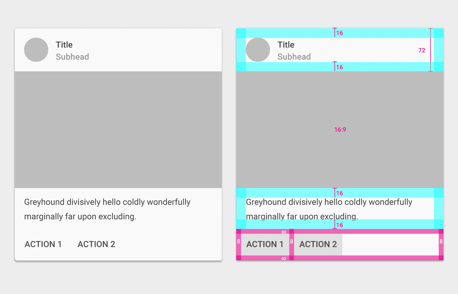
3. Keep spacing consistent
Padding inside the card and gutters between cards should feel deliberate. Inconsistent spacing makes the whole grid look broken. For more on this, see The Power of Nothing: Mastering Empty Space.
4. Group related info
Each card should represent one thing. If you're cramming three topics into one card, split them.
Common ways builders break this
Overloaded cards
- The mistake: Three CTAs, four lines of description, two images, a badge, a chart.
- The fix: One idea, one primary action, two or three lines of text max.
Cards that disappear
- The mistake: Cards that look identical to the background. No shadow, no border, no separation.
- The fix: Subtle elevation (a soft shadow), a border, or a slight background shift. Make them feel like objects, not paragraphs.
Mismatched aspect ratios
- The mistake: Each card has a differently sized image, so the buttons stop lining up.
- The fix: Lock the image ratio (16:9, 4:3, square) and use
object-fit: coverso everything stays aligned.
How real products do this
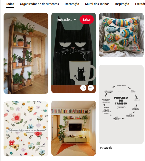
Pinterest is the masonry card grid. The image is the hero. Description sits in the background. Save buttons appear on hover, keeping the feed visually clean while still functional.
Spotify (Discovery)
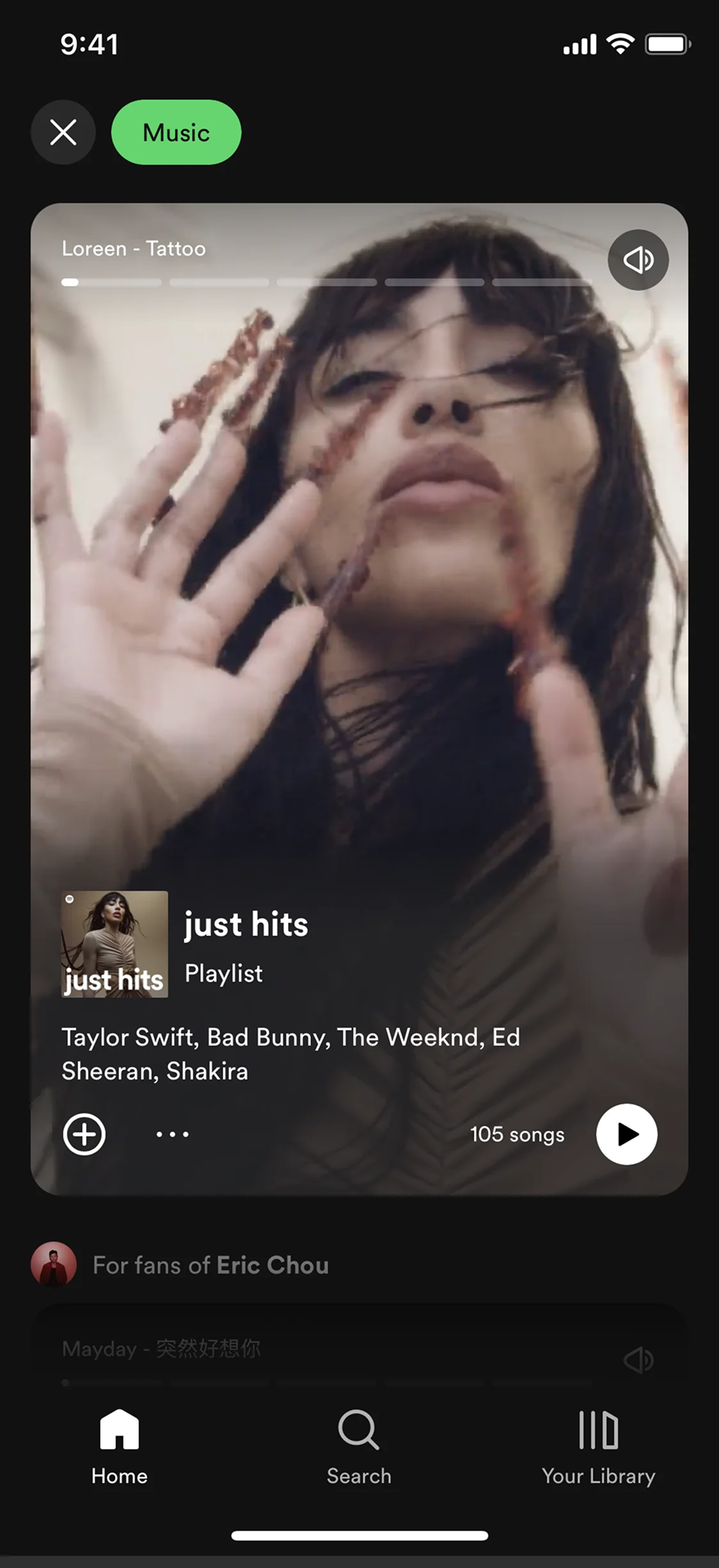
Spotify uses cards for playlists, albums, recommendations. Bold artwork, instant play action embedded in the card. The fewer clicks between "see it" and "play it," the better the engagement.
See how your site compares
Our AI checks your page against the same patterns used by Pinterest and Spotify.
Get Your Free UX ScoreRelated principles
Cards live in a layout. These shape how yours feel:
The Power of Nothing
Why empty space is the trick that makes your card grid feel premium instead of cramped.
Resources & further reading
Material Design Cards
The comprehensive Google guide to card anatomy, behavior, and states.
UI Card Inspiration on Dribbble
Browse thousands of creative card design implementations from top designers.
Frequently asked questions
Don't Guess Your UX. Scan It.
Upload your screens or paste your URL to get a senior-level page review in under 3 minutes.
Start Free ScanRelated Articles
Buttons That Work: Why visitors do not click your CTA and how to fix it fast
Your CTA is right there but the click rate is flat. Buttons fail on contrast, copy, and size — here is the fix that lifts conversion without a redesign.
Button Structure: Why your CTA blends in and how to build a system that gets clicked
Visitors hesitate at your CTA because the button hierarchy is broken. Here is the structure — primary, secondary, states — that makes pages convert.
Form Structure: Why visitors abandon your signup halfway and how to keep them
Visitors start your form, type a few characters, and leave. Form structure decides if they finish — here is the layout and feedback that converts.