Form Structure: Why visitors abandon your signup halfway and how to keep them
Visitors start your form, type a few characters, and leave. Form structure decides if they finish — here is the layout and feedback that converts.

Form Structure: Why visitors abandon your signup halfway and how to keep them
You shipped your landing page. The signup form is right there. Visitors get to it, type a few characters, and leave halfway through.
Forms are where conversion intentions go to die. Bad form structure adds friction at exactly the wrong moment — the one where the visitor has already said "yes, I'm interested." This guide covers how to build forms that feel like a natural progression instead of a chore.
What a structured form really is
A structured form isn't just a stack of inputs. It's a deliberate flow that uses hierarchy, grouping, and feedback to make every field feel obvious.
Every field has a cost. Every cost discourages a visitor. Good structure lowers that cost without dropping fields.
"Good forms are invisible—they work effortlessly." — Luke Wroblewski
Invisible forms remove friction at every step: the right field types, immediate feedback, logical grouping, no surprises.
Why form structure matters
Forms decide whether a visitor becomes a user — or bounces.
- Conversion. Every second saved on a checkout or signup form correlates directly with completion.
- Trust. A clean, organized form feels safe. A misaligned, confusing one makes visitors hesitate before typing in a credit card.
- Accessibility. Proper labels, error states, and structure mean more people complete the form — including visitors using screen readers or keyboard nav.
- Data quality. Clear fields lead to clean data. Vague fields lead to junk submissions.
Is your form structure working?
Get an instant AI review of your page against 80+ conversion principles.
Scan Your Site FreeHow to build a form that converts
Four areas to nail.
1. Get the anatomy right
Every form has the same parts: labels, inputs, placeholders, help text, errors, action buttons. Each one needs a distinct visual style.
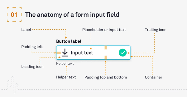
Your submit button should never look like an input field. The label should never look like the placeholder.
2. Pick a field style and stick to it
Two common styles: filled (solid background) and outlined (border only). Both work. Mixing them in the same form looks broken.
- Filled fields: Strong visual cue. Good for dense layouts.
- Outlined fields: Lighter feel. Good for minimalist pages.
Do this: Pick one and use it everywhere. Don't: Mix the two without intent.
3. Add real assistance
Visitors should never have to guess what's expected.
- Help text: One line under the field — "Password must be 8 characters."
- Error messages: Specific. "Please include an '@' in the email address" beats "Invalid input."
- Icons: Magnifier for search, error icon for validation. Helps colorblind visitors who can't rely on red-text-only.
For more, see Quick and Visual Communication: Icons and Color Accessibility.
4. Group with proximity
Related fields go together. Different sections get visual space between them.
- Label sits close to its input.
- City + state + zip cluster together.
- Personal info group is visually separated from billing info group.
For more on spacing, see Margins and Spacing.
Common ways builders break this
Two-column forms
- The mistake: Putting fields side by side to "save space."
- The fix: Single column. Visitors read top-to-bottom; side-by-side fields cause skips and confusion. Exception: First/Last name, City/State.
Placeholder as label
- The mistake: Using only the placeholder text as the field label.
- The fix: Persistent labels — above the field or floating. The moment a visitor starts typing, placeholders vanish, and they forget what was asked.
Vague errors
- The mistake: "Invalid input."
- The fix: Tell the visitor exactly what's wrong and how to fix it. "Password must include a number."
How real products do this
PayPal
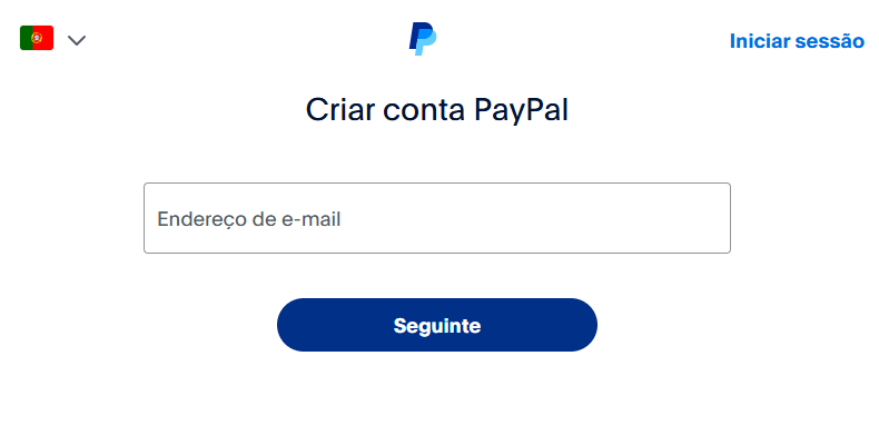
PayPal breaks long signup flows into small steps. Each screen has a clear hierarchy and just a few fields. Visitors don't see a wall — they see a series of small, completable tasks.
Google Forms
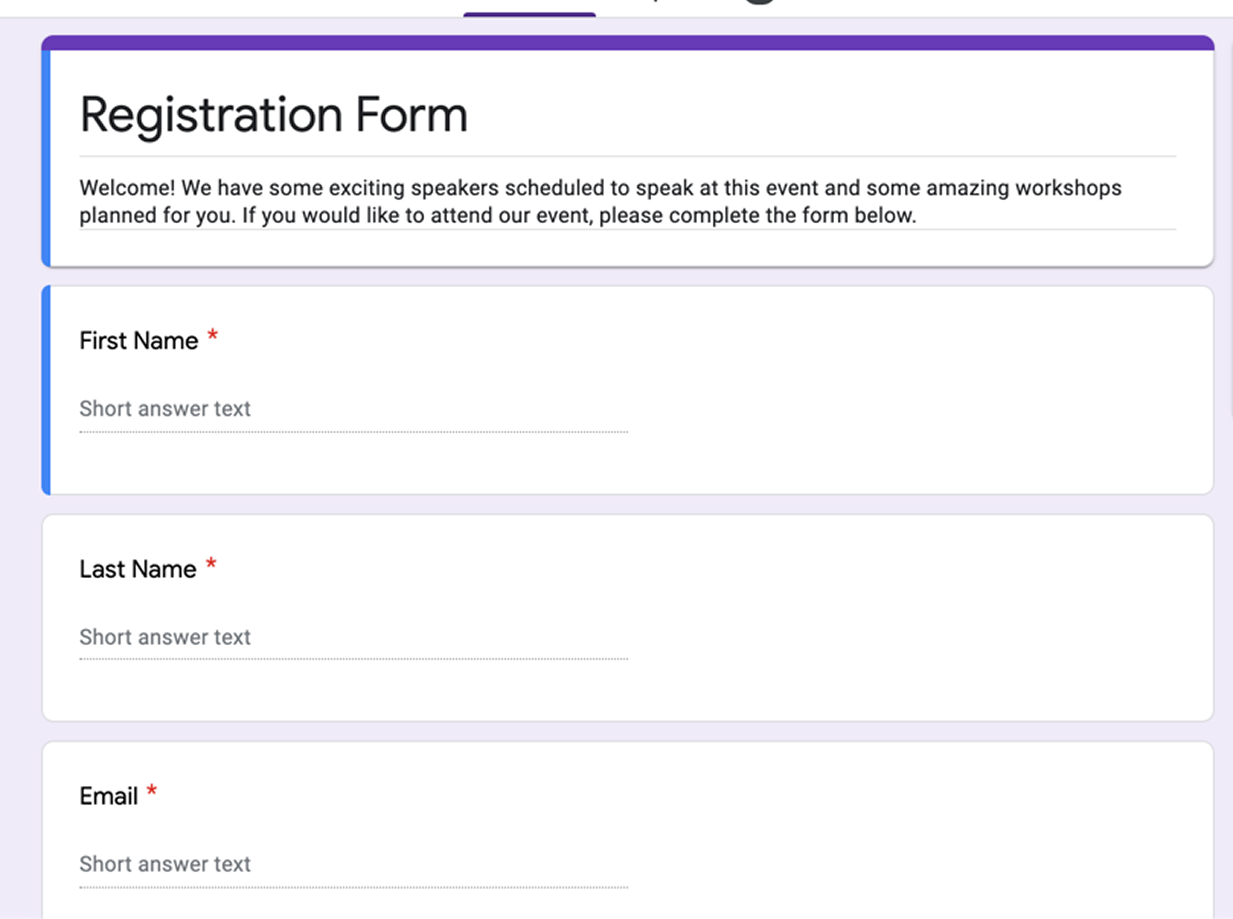
Google Forms validates as visitors move from field to field. Mistakes get caught early, before reaching submit. Clean, mobile-friendly, customizable — even boring forms can feel good when they work.
See how your site compares
Our AI checks your page against the same patterns used by PayPal and Google.
Get Your Free UX ScoreRelated principles
Forms touch a lot of other patterns. These shape how yours feels:
Quick and Visual Communication: Icons
How small symbols inside fields cut friction and help visitors finish faster.
Color Accessibility
Why your error message is invisible to half your visitors and how to fix it.
Resources & further reading
Material Design Text Fields
Google's official specifications for text field states and anatomy.
Fluent Design System (Microsoft)
Microsoft's guidelines for building functional and accessible form components.
Human Interface Guidelines (Apple)
Apple's layout and input rules for iOS and macOS applications.
Frequently asked questions
Don't Guess Your UX. Scan It.
Upload your screens or paste your URL to get a senior-level page review in under 3 minutes.
Start Free ScanRelated Articles
Buttons That Work: Why visitors do not click your CTA and how to fix it fast
Your CTA is right there but the click rate is flat. Buttons fail on contrast, copy, and size — here is the fix that lifts conversion without a redesign.
Button Structure: Why your CTA blends in and how to build a system that gets clicked
Visitors hesitate at your CTA because the button hierarchy is broken. Here is the structure — primary, secondary, states — that makes pages convert.
Cards: How to turn a wall of features into a grid visitors actually scan
Your feature section reads like a wall of text. Cards break it into scannable units — here is how to design them so visitors stop, read, and click.