Color Accessibility: Why your landing page colors might be locking visitors out
Your palette looks great on your monitor. But low contrast and color-only signals quietly lose visitors. Here is the check that fixes it.
Color Accessibility: Why your landing page colors might be locking visitors out
You picked a palette in Figma. It looked clean on your 5K display in a dark room. Then you shipped, opened the page on your phone in the sun, and squinted to read your own headline.
Most builders treat color as decoration. It isn't. Color is how visitors find your CTA, parse your form errors, and decide whether your page feels professional or sloppy. When the contrast is off or you signal everything with hue alone, a real chunk of your traffic just bounces — and they don't tell you why.
This is the principle that fixes it.
What color accessibility actually is
Color accessibility means anyone can read your text and act on your CTAs — including people with low vision, the 8% of men who are red-green colorblind, the visitor reading on a sunny patio, and your future self at 2am with eye strain.
"If a design doesn't work for everyone, it doesn't work well for anyone." — Jared Spool
The core idea is simple: contrast and clarity. The text has to clearly stand out from its background, and meaning can never live in color alone.
Why this matters on a landing page
You don't need to care about accessibility because of a checklist. You need to care because every visitor who can't read your headline is a lost signup.
Reach
Roughly 300 million people worldwide have some form of color vision deficiency. Add anyone on a glare-y screen, on a budget phone, or over 50, and you're talking about a meaningful slice of your traffic.
Trust
Faint gray text on white reads as "this looks unfinished." Even visitors with perfect vision feel something is off. The page loses authority before they reach your offer.
Conversion
If a visitor can't tell which button is the primary action, they don't pick a button. They leave.
Analyze your conversion triggers
Find out if your colors are quietly costing you signups. Get an instant review of your landing page.
Scan Your Site FreeHow to use this on your page
You don't have to ditch your brand. You just have to apply it with a tiny bit more discipline.
1. Hit the WCAG contrast bar
The Web Content Accessibility Guidelines give you concrete numbers. Use them as your floor.
- Body text: 4.5:1 minimum.
- Large text (18pt+ or 14pt bold): 3:1 minimum.
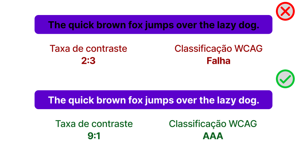
Run your hero headline, body copy, and CTA labels through a contrast checker. If the number is below 4.5:1, bump the weight, the size, or the color. Don't ship the design until those numbers pass.
2. Test your page outside Figma
Your palette has to survive the real world.
- Direct sunlight: Open it on your phone outside. Can you still read it?
- Light and dark mode: Does your "success green" still feel like success when the background flips?
- Night Shift / blue light filters: Many visitors browse with a warm filter on. Confirm your accent colors still read.
3. Never let color carry meaning alone
If a visitor is colorblind, a red border around a form field looks identical to a gray one. Color is a hint, not a signal.
- Do this: Pair color with an icon, a label, or text. "Email is invalid" plus a red border plus a warning icon.
- Avoid this: A green dot and a red dot with no text labels.
For more on visual signals, see Icons: Enhancing Navigation with Meaning.
4. Check your page through colorblind eyes
Use the colorblind preview in Figma or Chrome DevTools. Then look at your CTA, your error states, and your charts. If a deuteranopic visitor can't tell your "Sign up" button from your "Learn more" button, your page is broken for them.
Common combinations to watch:
- Green and red
- Blue and purple
- Light green and yellow
5. Don't fade out the secondary copy too far
The mistake almost every solo builder makes: secondary text becomes #CCCCCC on white. Looks elegant in mockups, unreadable in real life. Build hierarchy with weight and size, not by making text disappear.
If you're tweaking text in general, also check Legibility Rules: Designing for Readability.
Common ways builders break this
Gray-on-gray secondary text
- The mistake: Subheads and captions hover around 2:1 contrast because it "looks minimalist."
- The fix: Hold a 4.5:1 floor. Get hierarchy from font weight and size instead.
Color-only error states
- The mistake: A field turns red with no message and no icon.
- The fix: Add explicit text ("Email is required") and an icon. Color is the third layer, not the first.
Link colors that blend
- The mistake: Inline links that are only distinguishable by a slightly different blue.
- The fix: Underline links inside body text. It's the universal signal that doesn't depend on color.
How real products handle this
Google Analytics
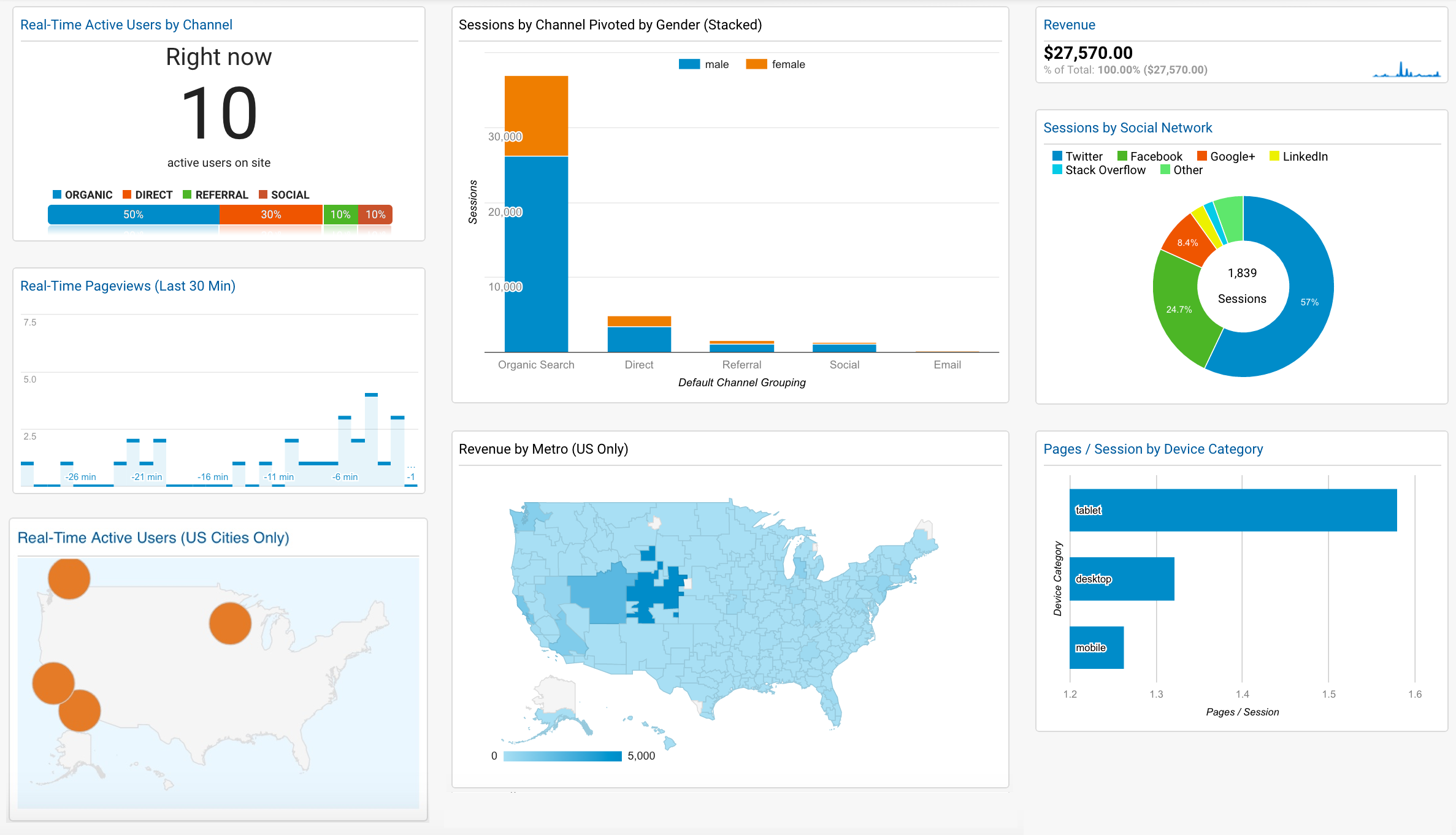
Their charts never rely on color alone. Hover states, numerical labels, and distinct legend shapes mean even a fully colorblind visitor can read the data.
Duolingo
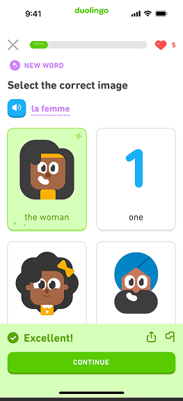
Right answers don't just turn green — there's a check icon and a sound. Wrong answers don't just turn red — there's a cross icon and a different sound. Three signals for every state. Nobody guesses.
Gmail
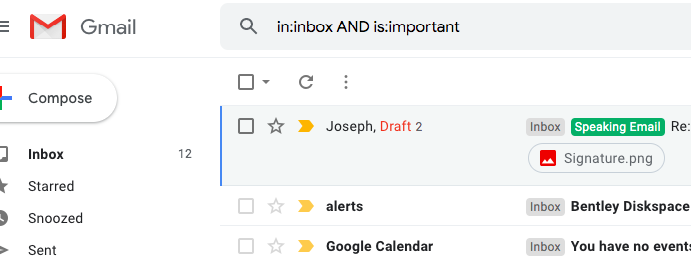
The yellow "Important" tag sits on a clean white background with a dark border. The contrast is high, and it's paired with text. Easy to spot, easy to read.
See how your site compares
Our AI checks your colors against the same standards used by Google and Duolingo.
Get Your Free UX ScoreRelated principles
Color is one piece. These go right next to it:
Icons: Enhancing Navigation
Use icons alongside color to make signals readable for everyone.
Legibility Rules
How font choice, line height, and spacing make body text actually readable.
Resources & further reading
Who can use?
A handy tool for checking color contrast and previewing your palette through different vision types.
WCAG 2.1 Guidelines
The official spec for web content accessibility — the numbers everything else references.
Kolor
A small game that sharpens your eye for hue and saturation.
Frequently asked questions
Don't Guess Your UX. Scan It.
Upload your screens or paste your URL to get expert-level UX analysis in under 3 minutes.
Start Free ScanRelated Articles
Color Psychology: Why your landing page palette is sending the wrong message
Visitors decide if your page feels trustworthy in seconds — color does most of the talking. Here is how to pick a palette that converts instead of confusing.
Buttons That Work: Why visitors do not click your CTA and how to fix it fast
Your CTA is right there but the click rate is flat. Buttons fail on contrast, copy, and size — here is the fix that lifts conversion without a redesign.
Jakob's Law: why your "original" landing page is confusing visitors
Visitors expect your page to work like every other site they use. Jakob's Law explains why being too creative with your UI quietly kills conversion.