Button Structure: Why your CTA blends in and how to build a system that gets clicked
Visitors hesitate at your CTA because the button hierarchy is broken. Here is the structure — primary, secondary, states — that makes pages convert.
Button Structure: Why your CTA blends in and how to build a system that gets clicked
You shipped your landing page. The hero looks great. Visitors scroll, hesitate at the CTA, then leave. The button is right there — and somehow they didn't click.
Buttons are the last step between intent and action. If yours blends in, looks like a banner, or competes with three other "main" actions on the same screen, you're losing conversions before visitors even understand the offer. This guide breaks down how to build buttons that get clicked.
What a button actually does
A button is a visual contract. It promises: "click me and this specific thing happens." Everything in good button design points to that contract — the color, the size, the copy, the way it reacts when you hover.
"Every button should have a clear purpose. If users have to think about what it does, it has already failed." — Steve Krug
Two patterns matter most. Fitts's Law says easier-to-hit targets get hit more — bigger buttons, in expected places, win. Affordance says buttons should look pressable. Flat boxes that don't read as interactive get ignored, even when they're styled in your brand color.
Why button structure matters for conversion
Spending time on a small rectangle pays off because that rectangle is where the money is.
- Less guessing. When buttons follow predictable rules, visitors don't stop to figure out what's clickable.
- Visual hierarchy. Primary, secondary, and tertiary styles tell visitors which action you actually want them to take.
- Accessibility. Big touch targets and high contrast mean more visitors — including ones with motor or vision constraints — can complete the action.
- Trust. Inconsistent buttons look amateur. Inconsistent looking pages don't get credit cards typed into them.
Is your button structure working?
Get an instant AI review of your page against 80+ conversion principles.
Scan Your Site FreeHow to build a button system that works
You don't need 12 button styles. You need a clean hierarchy and predictable states.
1. Set the hierarchy
Not every action deserves the same weight. Pick a clear top of the food chain.
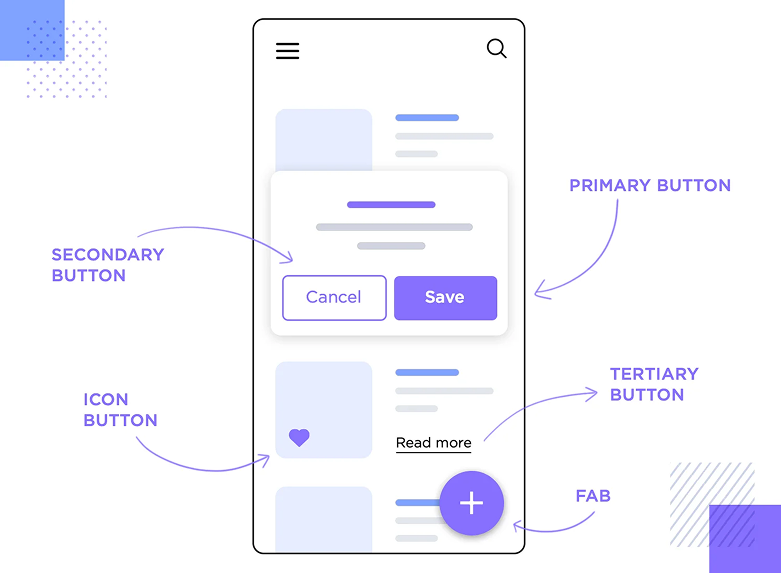
Primary buttons
Your main action — "Start free trial," "Get the report," "Sign up." One per screen, ideally. High contrast, solid fill, obvious.
Secondary buttons
Alternative actions that aren't the goal — "Learn more," "Cancel," "See pricing." Lower contrast, often outline style.
Icon buttons
Small, repetitive actions where the symbol is universal — plus, trash, search. Everything else needs a label.
Floating action buttons
Mobile pattern. The most common task on the screen, anchored where the thumb naturally rests.
Outline and text buttons
The lowest tier. Use them for tertiary actions or inline navigation, never for the main CTA on a landing page.
2. Design the states
A button is a tiny conversation. States are the body language.
Default
Looks pressable. A subtle shadow or fill is enough — the button should feel like an object, not a block of text.
Hover
Reacts on cursor enter. Color shift, slight elevation, or both. Confirms "yes, this is interactive."
Pressed
Quick visual feedback when clicked — a scale-down, color darken, or both. Makes the click feel real.
Loading / activated
When something's processing, show it. A spinner inside the button beats a frozen page every time.
Disabled
When the action isn't available yet, dim the button — don't hide it. Visitors need to see what's possible once they fill the form.
For more on what makes a button actually convert, see Buttons That Work.
Common ways builders break this
Ghost-button-as-primary
- The mistake: Using an outline-only button as the main CTA because it "looks clean."
- The fix: Solid fill for your primary. Save outlines for secondary actions.
Tiny tap targets
- The mistake: A 28px button on mobile. Thumbs miss it.
- The fix: 44x44px minimum (Apple) or 48x48px (Google). Spacing matters too — don't crowd buttons next to each other.
Vague labels
- The mistake: "Submit," "Click here," "Next." Visitors don't know what's about to happen.
- The fix: Use action verbs and outcomes. "Get my free report" beats "Submit" every time.
How real products do this
Duolingo
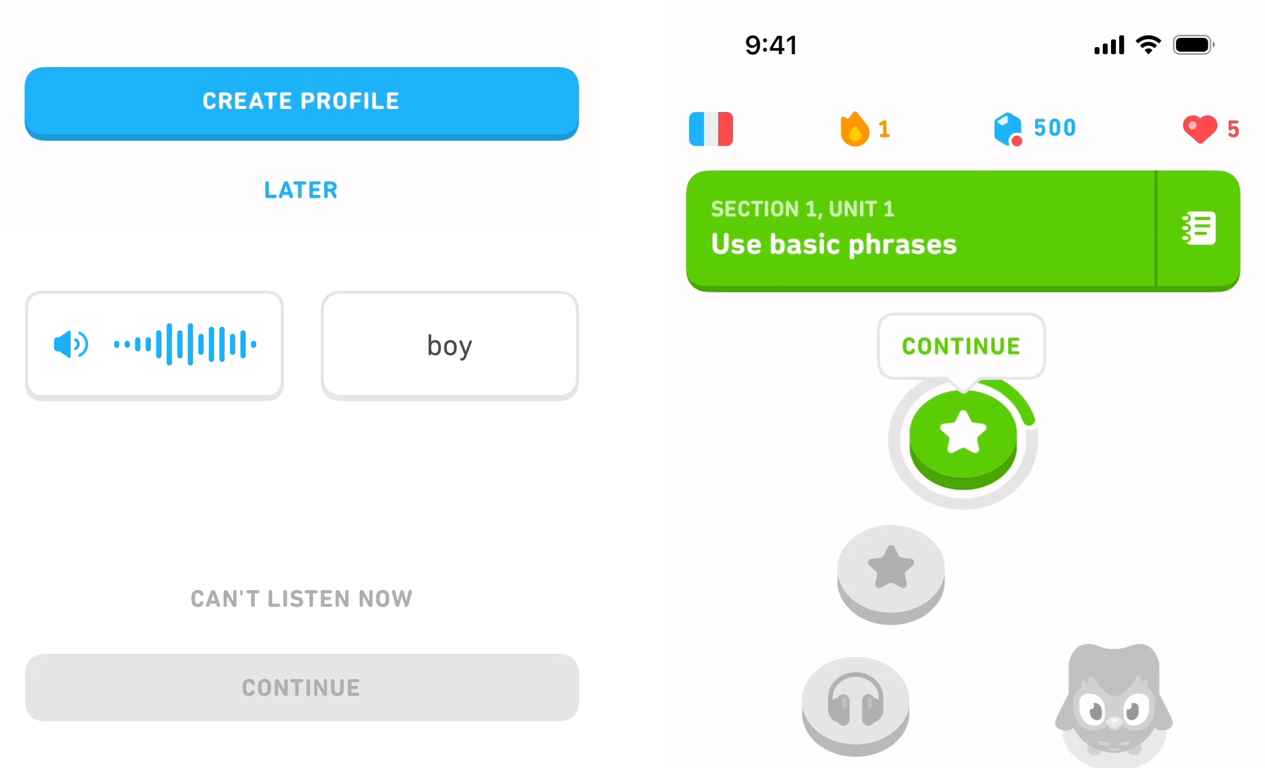
Duolingo's buttons have visible "depth" — a thick bottom border that disappears on press. The result feels physical. Their primary actions are loud green; their secondary actions are gray. You always know what to tap.
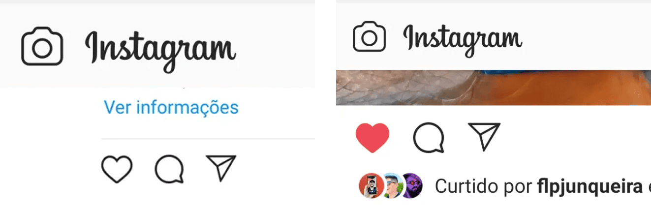
Instagram leans on icons and tiny state animations. Tap the heart and it pops, fills red, and confirms the like — no toast, no message. The state change is the feedback.
See how your site compares
Our AI checks your page against the same patterns used by Duolingo and Instagram.
Get Your Free UX ScoreRelated principles
Buttons live inside a system. These topics shape how yours land:
Buttons That Work
The copy and placement tweaks that turn a flat CTA into one visitors actually click.
Color Psychology
Why your button color is doing more conversion work than your headline.
Resources & further reading
Material Design: Buttons
Google's comprehensive guide on button types, placement, and behavior.
Apple Human Interface Guidelines: Buttons
Best practices for designing buttons within the iOS and macOS ecosystems.
Frequently asked questions
Don't Guess Your UX. Scan It.
Upload your screens or paste your URL to get a senior-level page review in under 3 minutes.
Start Free ScanRelated Articles
Buttons That Work: Why visitors do not click your CTA and how to fix it fast
Your CTA is right there but the click rate is flat. Buttons fail on contrast, copy, and size — here is the fix that lifts conversion without a redesign.
Cards: How to turn a wall of features into a grid visitors actually scan
Your feature section reads like a wall of text. Cards break it into scannable units — here is how to design them so visitors stop, read, and click.
Form Structure: Why visitors abandon your signup halfway and how to keep them
Visitors start your form, type a few characters, and leave. Form structure decides if they finish — here is the layout and feedback that converts.