Halo Effect: Why your landing page looks "cheap" in the first 3 seconds
Visitors decide if your landing page is trustworthy in 3 seconds. Polish the first impression and the rest of the page benefits — here is what to focus on.

Halo Effect: Why your landing page looks "cheap" in the first 3 seconds
A visitor lands. The hero loads. They squint. Three seconds in, they've already decided whether your product looks legit, sketchy, or "fine, I guess." Most of them don't read past that judgment.
That's the halo effect — one strong impression colors how visitors feel about everything else on the page. A polished hero makes them assume the product is also polished. A dated header makes them assume the whole tool is half-built. Same product, different verdict.
What this principle actually says
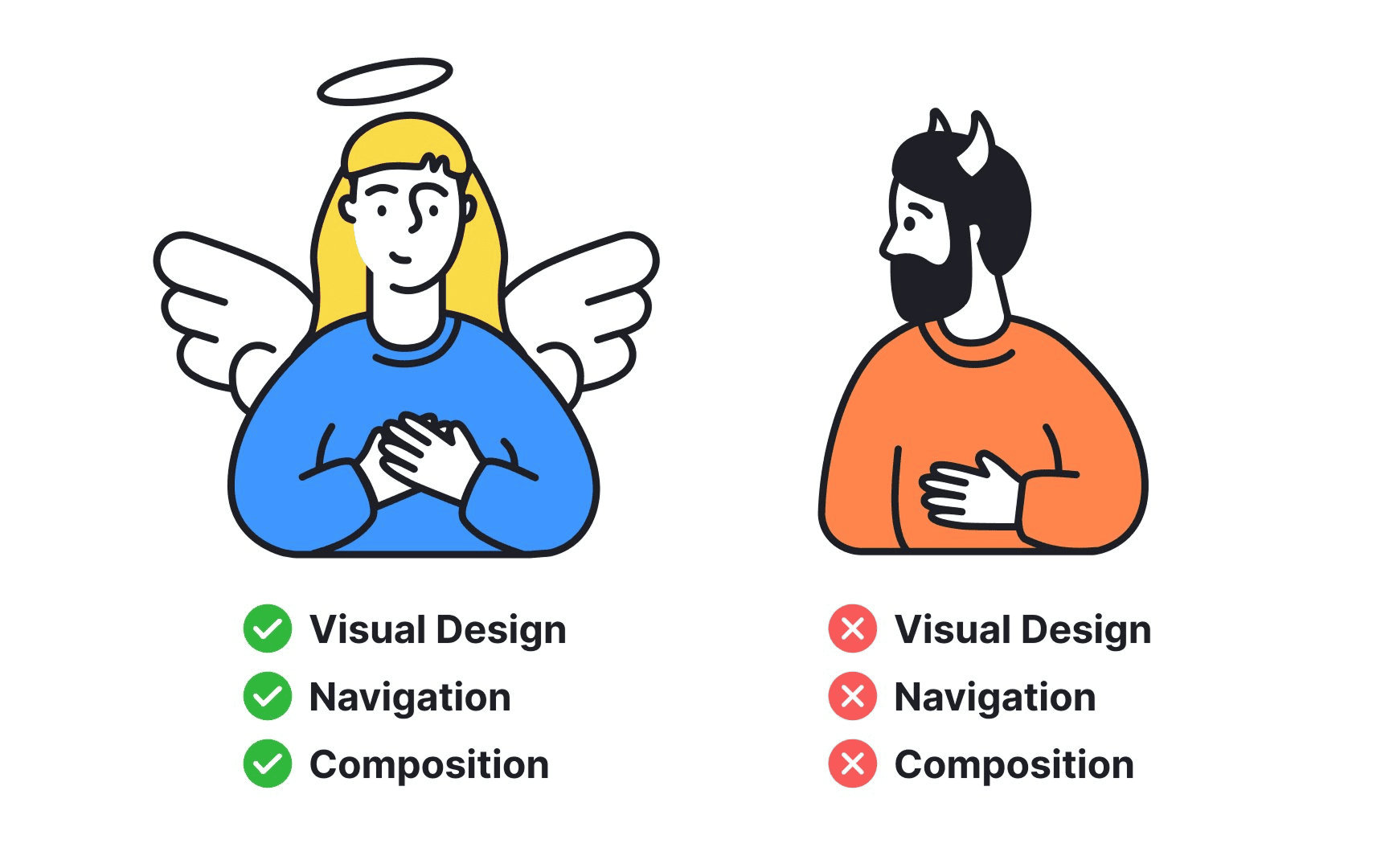
The halo effect is when one trait we notice (looks good, sounds smart, has a famous customer) bleeds into how we judge everything else. If the page looks premium, visitors assume the product is reliable, secure, and well-built.
"We tend to judge a book by its cover, and that initial read colors the whole experience." — Adapted from Edward Thorndike
You don't get to argue with this. You either work with it or get punished by it.
Why this matters for conversion
This is the principle behind why "looks matter." It's not vanity. It's the trust shortcut visitors use before they're willing to read a word of your copy.
- Visitors forgive a polished page. Small bugs, odd flows, slow loads — they let it slide if the page looks good. The opposite is also true.
- Premium look = premium price. A well-designed page can charge more without hesitation.
- Trust comes free. A clean, modern landing page signals "this team is serious." Phishing alert mode never activates.
- Lower mental load. A pretty page puts visitors in a positive mood, and positive moods convert better.
See which patterns your page is missing
Find out where your interface is leaking conversions and trust.
Scan Your Site FreeHow to set the halo on your page
1. Nail the first 3 seconds
The hero does most of the work.
- Strong typography. Pick one good typeface and stick to a clear hierarchy.
- One real product screenshot, not a stock illustration. Your tool, doing its actual thing.
- No clutter. One headline, one sub, one CTA. Save the rest for further down.
- Avoid: generic stock photos, hero illustrations that could belong to any SaaS, three CTAs fighting for attention.
2. Lead with your best work
Don't bury your strongest feature three sections down. Whatever your product does best, show it first.
- The "wow" moment. If your tool generates a report, show the report — not a marketing illustration of one.
- Set the tone. A strong demo above the fold buys you patience for everything below.
3. Borrow trust from people they recognize
Halo transfers. If a name or logo your visitor trusts is on your page, your page inherits some of that trust.
- Logos that fit your audience. A founder cares more about Lovable, Y Combinator, or Product Hunt than Fortune 500.
- Real testimonial photos and names. Generic "John D., CEO" is worse than no testimonial.
- Related: Social Proof, Authority Bias.
4. Don't let the inside break the spell
A beautiful landing page that leads to an ugly product app makes visitors feel tricked. The halo turns into the opposite — every flaw inside the app gets weighted heavier than it should.
- Match the polish. Onboarding screens, dashboard, even error states should feel like the same brand.
- Speed matters. A slow load undoes a beautiful design before it even renders.
Common mistakes
1. Beautiful page, broken product
- The mistake: Spending all the design budget on the homepage and shipping a 2015-looking app.
- The fix: Polish the first 3 product screens at least as much as the landing page.
2. Inconsistent feel
- The mistake: Hero is sleek, pricing page looks like a different company built it.
- The fix: Use the same fonts, spacing, and color across every page a visitor will see.
3. Trend-chasing for the wrong audience
- The mistake: Copying a Dribbble trend that doesn't fit who you sell to.
- The fix: Polish for your buyer's expectations, not for design Twitter.
How real products do this
Apple
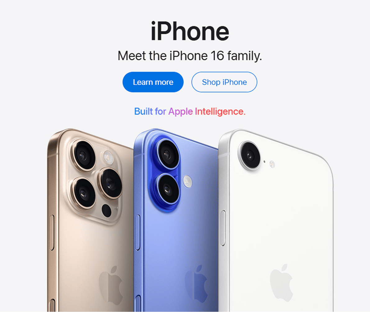
Apple's industrial design, packaging, and retail spaces create such a strong halo that even when they remove features or ship buggy software, users assume the whole brand is still the gold standard. The halo is doing real work for them every day.
Stripe
Stripe shipped the cleanest developer docs in the industry before they shipped market dominance. Engineers assumed the underlying API had to be as clean as the docs page. That assumption did half the selling.
See how your page compares
Our AI checks your interface against the same patterns Apple and Stripe use.
Get Your Free UX ScoreRelated principles
Social Proof
How recognizable names and faces transfer trust to your page.
Authority Bias
Why visitors trust pages that feel endorsed by an expert in their space.
Aesthetic-Usability Effect
Why a beautiful page also feels easier to use, even if it is not.
Resources & further reading
The Halo Effect in Psychology: Definition and Examples
Thorndike's original concept with modern examples.
Why do positive impressions influence our opinions?
How the bias plays out in marketing and product decisions.
Frequently asked questions
Don't Guess Your UX. Scan It.
Upload your screens or paste your URL to get expert-level analysis in under 3 minutes.
Start Free ScanRelated Articles
Confirmation Bias: Why your landing page needs to mirror what visitors already believe
Visitors do not arrive with an open mind. They scan for proof of what they already think. Here is how to align your page so it feels right in the first 5 seconds.
Anchoring Bias: Why the first number on your landing page changes how visitors judge every other number
Visitors do not evaluate your price in a vacuum. Whatever number they see first becomes the yardstick. Here is how to set anchors that make your offer feel like a steal.
Attention Bias: Why visitors look right past your best feature on your landing page
Visitors do not scan your page evenly. They hunt for the one thing they care about and ignore everything else. Here is how to put it where their eyes already are.