Social Proof: why your landing page looks sketchy without it (and how to fix it)
Strangers don't trust your claims — they trust other strangers. Social Proof shows you exactly which trust signals turn skeptical visitors into signups.

Social Proof: why your landing page looks sketchy without it (and how to fix it)
You shipped your landing page. The copy is good. The design is fine. But conversion is flat. Visitors land, scroll, and leave — and you can feel the question they're silently asking: "Has anyone actually used this thing?"
Without an answer, the default assumption is "no." That's the problem social proof solves. Your visitors don't trust you yet — they're strangers. But they'll trust other strangers. Reviews, logos, user counts, testimonials — these are the trust signals that turn "looks interesting" into "okay, I'll sign up."
What social proof actually is
Social proof is the principle that says we look at what other people are doing to figure out what we should do. Empty restaurant vs. busy restaurant — most people pick the busy one without thinking. The same instinct lights up when a visitor lands on your page.
"We view a behavior as more correct in a given situation to the degree that we see others performing it." — Robert Cialdini
In landing-page terms: visitors will doubt your claims about your product. They will not doubt the claims of someone who already paid for it. Other people's voices are the cheapest credibility you have.
Why this matters on a landing page
Strangers don't trust strangers. That's the entire conversion problem. Social proof is your shortcut.
Conversion
Adding reviews, user counts, or logos near your CTA reliably bumps conversion. It's one of the highest-ROI changes on any landing page.
Reduces doubt
When a visitor sees "Used by 10,000 founders," they stop questioning whether your product works.
Borrowed authority
A logo from a company they recognize transfers some of that trust to you, no questions asked.
Speeds decisions
Social proof short-circuits over-analysis. Visitors stop reading every feature and trust the crowd.
Analyze your conversion triggers
See which trust signals your landing page is missing with an instant review.
Scan Your Site FreeHow to use social proof on your page
Don't just stuff a testimonial section halfway down. Place different types of social proof at the moments visitors actually doubt you.
1. Show reviews and ratings
Aggregate ratings give a fast read. Individual reviews answer specific objections.
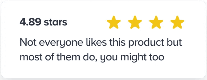
- Aggregate: Star rating right next to the product or pricing.
- Detailed: Real, specific reviews — not "great product, 5 stars."
- Verification: "Verified buyer" badges so visitors don't suspect fakes.
2. Show user numbers
Numbers signal momentum. They tell visitors they're not the first one to risk a click.
- Total count: "Join 500+ founders shipping faster pages."
- Real-time: "12 people scanned their landing page today."
- Growth: "The fastest-growing review tool for indie builders."
3. Borrow trust from recognized brands
If well-known companies use you, show their logos. If publications covered you, show those too. See Authority Bias for more on why this works.
- Logo wall: Customers visitors recognize — even one or two strong logos beat a wall of unknowns.
- Press: "As seen in TechCrunch, Wired, etc." Even local press counts.
- Expert quotes: A quote from a respected name in your niche outweighs ten anonymous reviews.
4. User-generated content
The most authentic kind of social proof — real people, real situations.
- Customer photos in reviews.
- Tweets and screenshots of users praising the product.
- Short video testimonials, even unscripted phone clips.
Common ways builders break this
1. The "ghost town" mistake
- The problem: A "0 comments" counter or a Twitter feed last updated six months ago.
- The fix: Hide social proof until it's actually impressive. An empty number is worse than no number.
2. Testimonials that look fake
- The problem: Stock photos. Only 5-star reviews. Generic praise that could apply to any product.
- The fix: Real names, real photos, real specifics. Let a 4-star review through. The flaws make the praise more believable.
3. Negative framing
- The problem: "Most people haven't started saving for retirement yet" — this accidentally normalizes the bad behavior.
- The fix: Frame the positive. "Join the 30% of proactive savers who already started."
How real products use this
Walmart
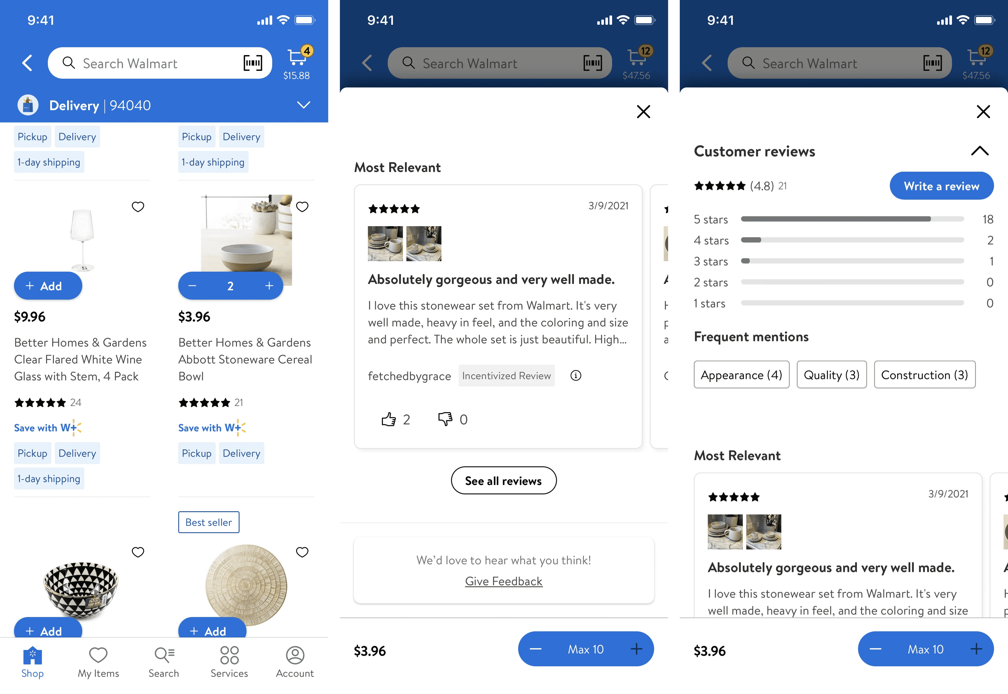
Walmart puts the star rating and review count right under the product title — the moment visitors first ask "is this good?" They also surface a "% of buyers who recommend this" stat. One number, instant verdict.
Slack
Slack's homepage has long featured a logo wall with IBM, Airbnb, Target. By association, Slack reads as "what serious teams use." That single section probably moves more enterprise signups than any feature page.
See how your site compares
Our AI analyzes your landing page against the same principles used by Walmart and Slack.
Get Your Free UX ScoreRelated principles
If social proof clicks, these are next:
Bandwagon Effect
Why visitors follow the crowd — even when they cannot tell you why they joined.
Authority Bias
Why a quote from someone visitors already trust is worth ten anonymous testimonials.
Resources & further reading
Influence: The Psychology of Persuasion
The chapter on Social Proof is the classic reference on the subject by Robert Cialdini.
Social Proof in User Experience
Nielsen Norman Group article on how to apply social proof effectively and ethically in interfaces.
Frequently asked questions
Don't guess your UX. Scan it.
Upload your screens or paste your URL to get a senior-level review in under 3 minutes.
Start Free ScanRelated Articles
Authority Bias: Why your landing page looks sketchy to strangers (and what to fix first)
New visitors do not trust you yet. They scan for proof you are not a scam. Authority Bias is how you signal you are real before they read a single word.
Bandwagon Effect: Why your landing page needs to show that other people already use you
Visitors do not want to be the first one. Show them they are not, and you remove half the hesitation. Here is how to use the bandwagon effect without faking it.
Anchoring Bias: Why the first number on your landing page changes how visitors judge every other number
Visitors do not evaluate your price in a vacuum. Whatever number they see first becomes the yardstick. Here is how to set anchors that make your offer feel like a steal.