Attention Bias: Why visitors look right past your best feature on your landing page
Visitors do not scan your page evenly. They hunt for the one thing they care about and ignore everything else. Here is how to put it where their eyes already are.
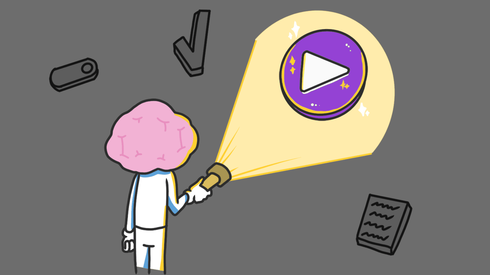
Attention Bias: Why visitors look right past your best feature on your landing page
You shipped your landing page. The feature you spent two weeks building is on screen. Visitors read the headline, scroll past the feature you're most proud of, and bounce.
It's not that they hated it. They didn't even see it. People don't read landing pages the way you wrote them. They arrive with one question in their head and scan only for the answer. Everything else is wallpaper.
That's attention bias, and it explains why most "we have so many features" pages convert worse than the ones that say one thing clearly.
What attention bias actually is
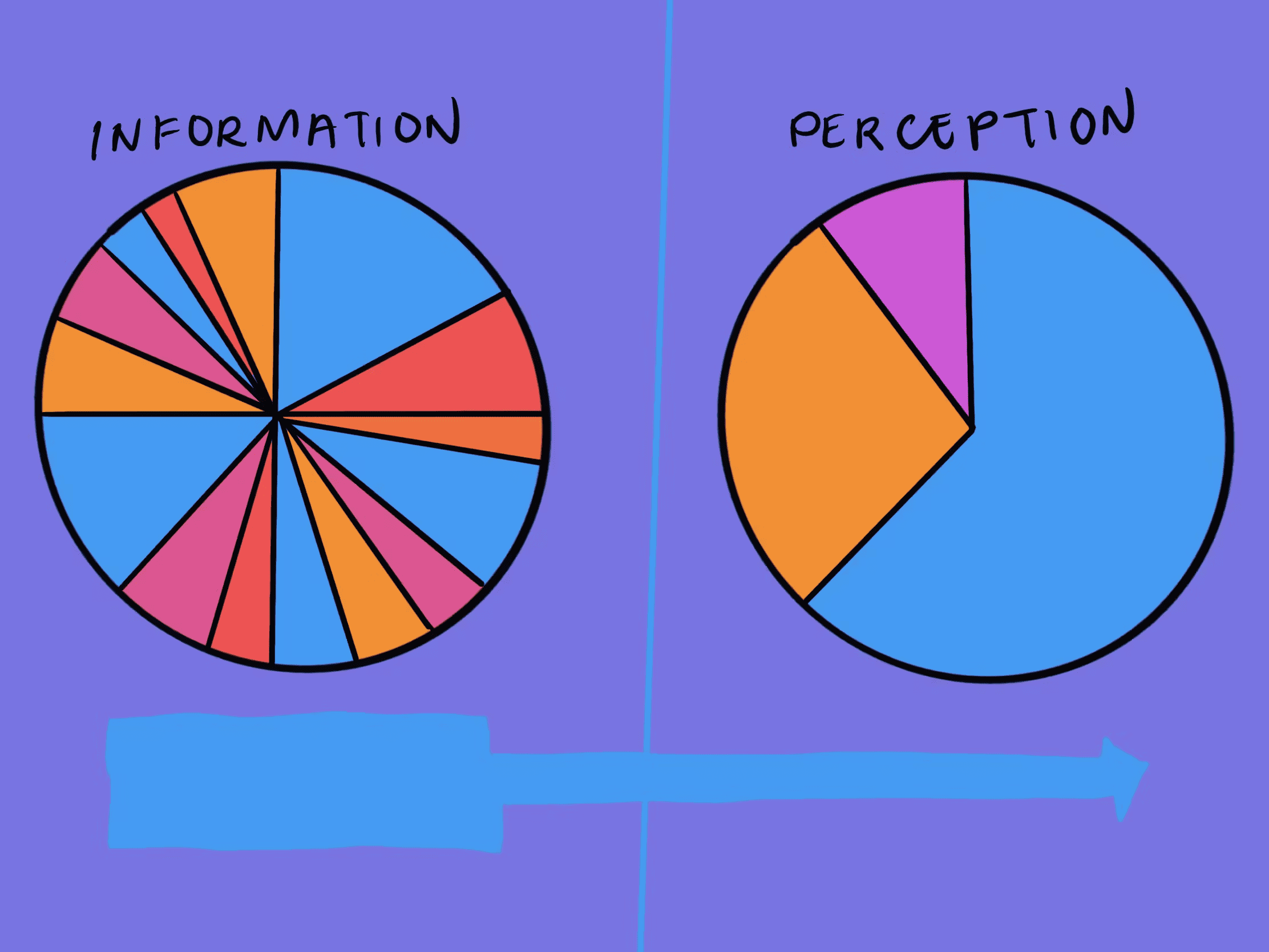
Attention bias is the brain's habit of filtering the world through whatever is on its mind right now. Hungry? Every billboard becomes food. Worried about getting hacked? You scan a SaaS page only for "encrypted," "SOC 2," and the lock icon — the rest is invisible.
"Attention is a limited resource. Where we direct it defines our reality." — Mihaly Csikszentmihalyi
Your brain has to do this. It's drowning in input. So it prioritizes what matches your current goal or worry and skips the rest. On a landing page, this means visitors don't weigh every element evenly. They hunt for proof of the one thing they came for. If your visual hierarchy doesn't match what they're hunting for, your best work is invisible.
Why this matters on a landing page
When your page ignores what's already on the visitor's mind, you create friction. They have to dig for the answer. Most won't bother.
Conversion
If a visitor is in "ready to buy" mode and your "Sign Up" button is the same size as your "Read Our Blog" link, they leave. Pages that convert well always make the next step the loudest thing on screen for the goal the visitor walked in with.
Trust
If a visitor is worried about getting locked into a contract, putting "Cancel anytime" near the CTA does more than ten testimonials. You're answering their actual question instead of the one you wish they were asking.
Bounce rate
A cluttered page makes the brain work harder to filter signal from noise. The lazier path is closing the tab. Strip away anything that isn't helping the visitor get their answer.
See which persuasion techniques your site is missing
Our AI analyzes your interface against 80+ psychological triggers including Attention Bias.
Analyze Your Conversion TriggersHow to use attention bias on your page
You have to figure out what's already loaded in the visitor's head when they hit your page, then point everything at that.
1. Pick the one thing this page is for
Every page has one job. Pricing page? Help them pick a plan. Homepage? Get them to the demo or the signup. Product page? Get them to the form.
- Do this: Decide the single action this page exists to drive. Make that action the loudest, biggest, highest-contrast element on screen.
- Avoid: Treating your "Sign Up" button and your "Read our Privacy Policy" link with the same visual weight.
2. Match the emotion the visitor brought
If your tool is for security, the visitor probably arrived nervous. Use visuals and copy that meet that nervousness — solid colors, lock icons, plain language about what you do with their data.
- Strategic phrasing: The way you wrap the message changes what gets noticed. See Framing: How to Shape the Decision.
- Visual fit: A meditation app shouldn't look like a fintech dashboard. The vibe is part of the answer.
3. Strip the noise
Attention bias works in your favor only when there's nothing else competing. A clean page with one CTA out-converts a clever page with five.
- Avoid choice overload: Too many options paralyze visitors. See reducing options to increase action.
- Use whitespace on purpose: Empty space pushes the eye toward what matters. It's not "wasted" — it's a tool.
 Source: The Decision Lab
4. Put feedback where the click happened
When something works or breaks, visitors look at where they just clicked — not the top of the page. Error and success messages need to land in the visitor's current focus, not 500 pixels away.
Common ways builders break this
Designing for yourself, not the visitor
- The mistake: Putting the feature you're most proud of front and center, even if it's not why anyone signs up.
- The fix: Watch one real session recording. Whatever the visitor scans for is what your hero should answer. Build for what they care about, not what you care about.
Cranking urgency to mask weak copy
- The mistake: Red banners, countdown timers, "Only 1 left!" on a page where nothing is actually scarce.
- The fix: Use urgency only when it's real. Fake urgency catches the eye once and then trains visitors to ignore everything you say.
Hiding feedback
- The mistake: A "Thanks for signing up" toast 800px above the button the visitor just clicked.
- The fix: Confirmation lives next to the action. If they click submit, the response shows up next to submit. Not at the top of a long scroll.
How real products use this
Waze
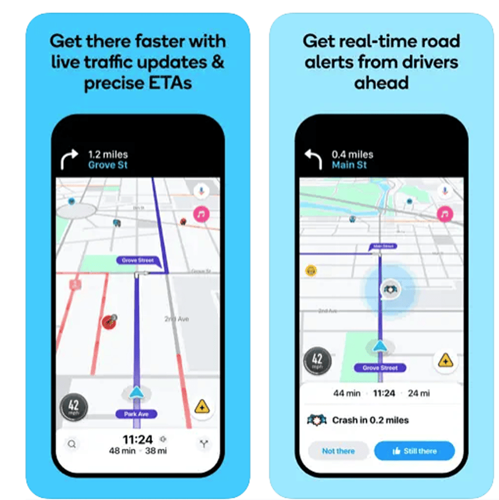
When you're driving, your attention is on "where do I turn next?" Waze knows this. The next turn, traffic ahead, and police alerts get all the visual weight. Side streets, business names, and everything else get dimmed. They don't show you more — they show you less, but louder.
Amazon
On a product page, the visitor cares about two things: "When does it arrive?" and "Is this a good deal?" That's why Amazon hammers the Prime delivery date and the orange Add to Cart button. The 50 other elements on the page exist, but they're tuned down so the two things you actually care about pop.
See how your site compares
Our AI analyzes your interface against the same principles used by Waze and Amazon.
Get Your Free UX ScoreRelated principles
Attention rarely works alone. These pair with it:
Framing Effect
How the wrapping around a number or claim shifts whether visitors notice it.
Choice Overload
Why too many options on a page push visitors to pick none.
Von Restorff Effect
Why one thing that breaks the pattern is the one thing visitors remember.
Resources & Further Reading
Flow: The Psychology of Optimal Experience
A deep dive by Mihaly Csikszentmihalyi into how humans focus and find 'flow' in tasks.
The Power and Impact of Attention Bias
A Medium guide on applying these psychological filters to digital product design.
Frequently Asked Questions
Don't Guess Your UX. Scan It.
Upload your screens or paste your URL to get expert-level UX analysis in under 3 minutes.
Start Free ScanRelated Articles
Anchoring Bias: Why the first number on your landing page changes how visitors judge every other number
Visitors do not evaluate your price in a vacuum. Whatever number they see first becomes the yardstick. Here is how to set anchors that make your offer feel like a steal.
Choice Overload: Why too many options on your landing page kill conversion
You think more choices give visitors freedom. They give them a reason to leave. Here is how to cut down options and lift conversion without losing flexibility.
Contrast Effect: Why your pricing page needs an option visitors will not pick
Visitors do not judge your price in isolation. They compare. Without a contrast on your pricing page, the "right" plan never feels obviously right.