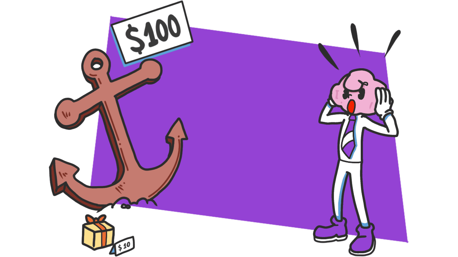
Anchoring Bias: Why the first number on your landing page changes how visitors judge every other number
Visitors do not evaluate your price in a vacuum. Whatever number they see first becomes the yardstick. Here is how to set anchors that make your offer feel like a steal.
Anchoring Bias: Why the first number on your landing page changes how visitors judge every other number
You launched your pricing page. You priced your plan at $49. Visitors look at it and bounce. You drop it to $29. Same thing.
The price isn't the problem. The problem is that you never gave visitors anything to compare it to. Without an anchor, they invent one — usually a free competitor or "what I paid last time" — and your number lands wrong.
Anchoring is one of the most reliable patterns in how people judge value. Whatever number a visitor sees first becomes the yardstick for everything that follows. If you don't set the yardstick, the market sets it for you.
What anchoring actually is
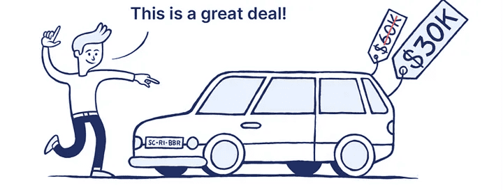
Anchoring is the brain's habit of latching onto the first piece of information it sees, then judging everything else against it. Show a $2,500 handbag first, and an $800 wallet on the next shelf feels like a deal. Show the $800 wallet alone, and it feels expensive.
"The human mind doesn't start from scratch when making decisions; it latches onto any initial information available." — Daniel Kahneman
The number doesn't even have to be related. Studies have shown that random numbers shown before a price still bend how people estimate that price. This is wired in. You can't argue your way past it — but you can use it.
Why this matters on a landing page
Most builders set a price, throw it on the page, and hope it lands. The visitor's brain doesn't work that way. It always asks "compared to what?" Either you answer that question, or the visitor answers it for you.
Conversion
The order in which you show prices, plans, and value points changes which one feels reasonable. A $99 plan looks expensive next to a $19 plan. It looks cheap next to a $499 enterprise tier. Same number, different reaction.
Trust
Honest anchors — a real "was" price, a real comparison to a competitor, a real time savings — make the offer feel grounded. Made-up anchors get spotted instantly and torch your credibility for the rest of the visit.
Effort perception
Anchoring isn't only about money. "Sign up in 3 steps" sets a low effort anchor. A 20-field form with no preamble sets a high one. The number you put on a task before someone starts it shapes whether they finish it.
Analyze your conversion triggers
See which persuasion techniques your site is missing with an instant AI analysis.
Find Growth OpportunitiesHow to use anchoring on your page
This isn't about adding fake "was" prices. It's about being intentional with the first number, claim, or step a visitor sees.
1. Set the anchor before the price
Show value before cost. If your tool replaces a $200/month service or saves 10 hours a week, show that first. Then your $29/month feels like a rounding error instead of an expense.
- Do this: "Replaces three tools that cost $300/month — yours for $29."
- Avoid: Leading with the price tag and hoping the features explain themselves.
For more on phrasing, see Framing Effect: Frame the Information, Shape the Decision.
2. Use a high tier to make the middle look obvious
Three-tier pricing works because the top tier sets the anchor. If your "Pro" plan is $199, your "Standard" at $49 looks like the sane choice — even for someone who never considered Pro.
- Do this: Place the most expensive plan on the left or top of the comparison.
- Avoid: Leading with the cheapest plan if your goal is to sell the middle. The cheap price becomes the anchor and everything else looks bloated.
For a related move, see The Decoy Effect.
3. Anchor the effort, not just the price
Visitors are also estimating "how long is this going to take me?" Set that anchor early.
- Do this: "Sign up in 3 simple steps." "Setup takes 2 minutes."
- Avoid: Dumping a 15-field form on screen with no heads-up. The visual itself becomes the anchor — and it screams "this is going to take forever."
4. Watch out for negative anchors
The first thing a visitor sees sticks. If that's a cookie banner, an error toast, or a "starting at" price that's nowhere near reality, you've anchored them on something that hurts you.
- Do this: Lead with the headline benefit and a clean hero. Save fine print for later.
- Avoid: Putting "from $9" on top when most users will pay $49. They'll feel ambushed when the real number shows up.
Common ways builders break this
The invisible anchor
- The mistake: Showing a price in isolation. The visitor finds their own anchor — usually a competitor — and you lose.
- The fix: Always provide context. ROI, alternative cost, time saved, comparison plan. Don't make the visitor guess what "good" looks like.
The fake "was" price
- The mistake: Inventing an "original" price that nobody ever paid just to make the discount look bigger.
- The fix: Visitors are sharp. A permanent "50% off" sale registers as marketing noise. Use real anchors — competitor pricing, your own previous price, the cost of doing it manually.
Anchoring on the wrong thing
- The mistake: Telling visitors a setup is "easy" when it actually takes 30 minutes.
- The fix: Accuracy matters. If you anchor on "30 seconds" and reality is 5 minutes, every second past 30 feels like a betrayal. Set anchors you can actually hit.
How real products use this
Duolingo
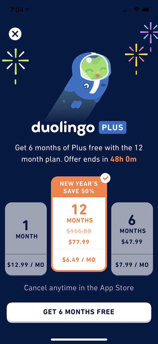
On their Super Duolingo upsell, they show the full annual price first as the anchor. Then they break it down to a monthly cost. The smaller number lands soft because the bigger one set the scale. The "savings" badge doubles down — your eyes go straight to what you're "gaining," not what you're spending.
See how your site compares
Our AI analyzes your interface against the same principles used by Duolingo to maximize value perception.
Get Your Free UX ScoreRelated principles
If anchoring clicked, these are next door:
Loss Aversion
Why the cost of leaving feels heavier than the upside of staying.
The Decoy Effect
How a third option you do not expect anyone to pick makes your target plan look obvious.
Framing Effect
How the way you phrase a number shifts whether it feels cheap or expensive.
Resources & Further Reading
Thinking, Fast and Slow
Daniel Kahneman's seminal book that explains anchoring and other biases in detail.
The Anchoring Effect - NN/g
An in-depth article on how people focus on initial information to estimate value.
What is Anchoring Bias?
A clear academic definition with various research-backed examples.
Frequently Asked Questions
Don't Guess Your UX. Scan It.
Upload your screens or paste your URL to get expert-level UX analysis in under 3 minutes.
Start Free ScanRelated Articles
Attention Bias: Why visitors look right past your best feature on your landing page
Visitors do not scan your page evenly. They hunt for the one thing they care about and ignore everything else. Here is how to put it where their eyes already are.
Choice Overload: Why too many options on your landing page kill conversion
You think more choices give visitors freedom. They give them a reason to leave. Here is how to cut down options and lift conversion without losing flexibility.
Contrast Effect: Why your pricing page needs an option visitors will not pick
Visitors do not judge your price in isolation. They compare. Without a contrast on your pricing page, the "right" plan never feels obviously right.