Confirmation Bias: Why your landing page needs to mirror what visitors already believe
Visitors do not arrive with an open mind. They scan for proof of what they already think. Here is how to align your page so it feels right in the first 5 seconds.
Confirmation Bias: Why your landing page needs to mirror what visitors already believe
You launched. Your copy is sharp. Your features are real. Visitors land, glance around, and bounce. You can't figure out what's wrong.
Here's the issue: visitors aren't arriving with an open mind. They have a preset list of what your kind of product should look like, sound like, and feel like. If your page doesn't match that list in the first three seconds, they leave — even if you're better than what they expected.
That's confirmation bias, and it's why "good" pages still flop when they're a few degrees off the visitor's mental picture.
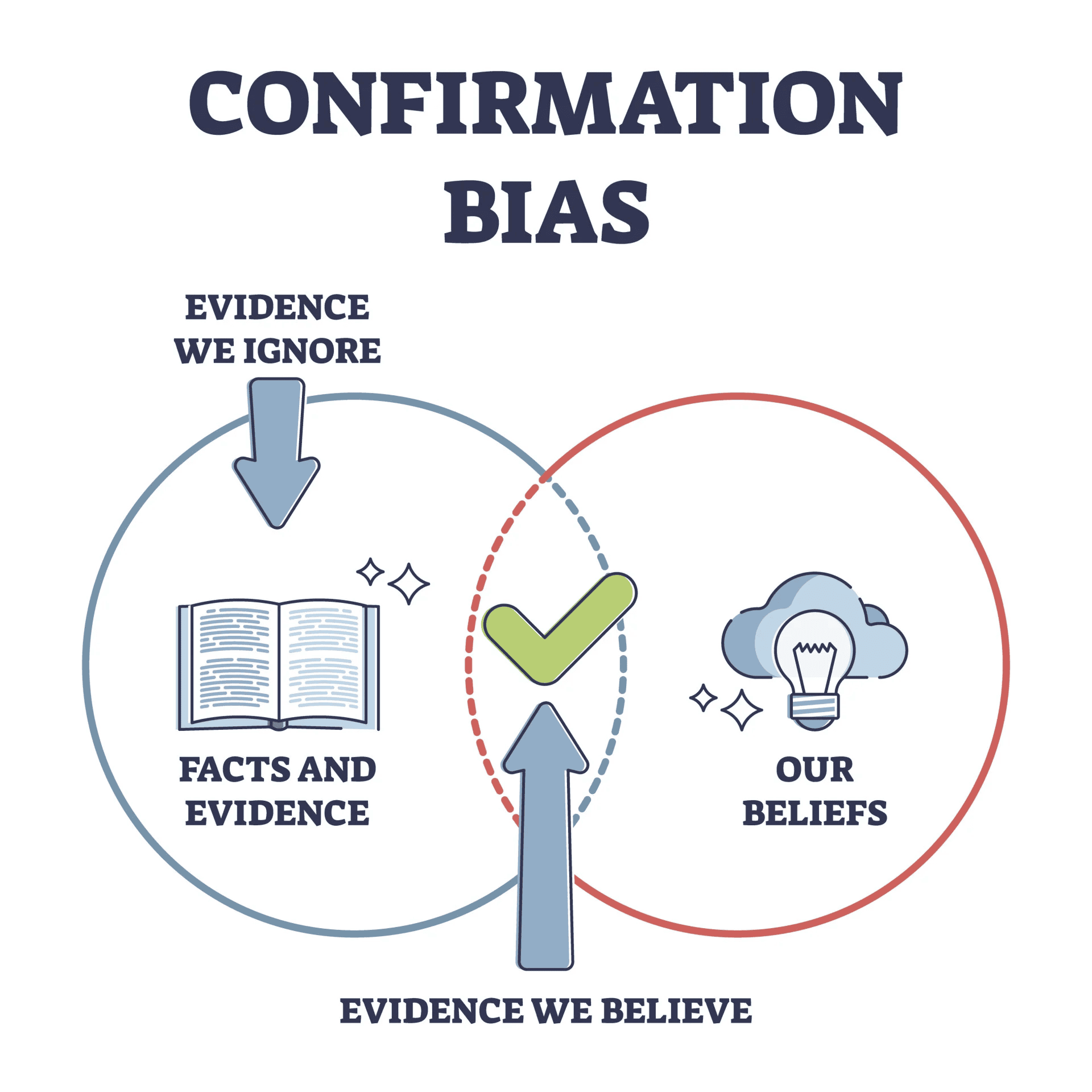
What confirmation bias actually is
People are wired to look for things that match what they already think — and to ignore or reject things that don't. It's a cognitive shortcut. Building new mental models from scratch is expensive. Slotting new info into existing ones is cheap.
"The human understanding when it has once adopted an opinion ... draws all things else to support and agree with it." — Francis Bacon
Visitors arrive with assumptions about how your kind of product works, what good design looks like, and what your category should cost. They scan your page for confirmation of those assumptions. Things that match get processed. Things that don't get tuned out.
Why this matters on a landing page
Landing pages live or die on the first 5 seconds. That's not enough time for visitors to adjust their mental model. Either you fit it, or you don't.
Lower friction
When your page matches what visitors expected, they don't have to think. The flow feels "intuitive" — which really just means "matches what I already believed."
Brand stickiness
When your messaging confirms something the visitor likes about themselves — "I'm an indie hacker," "I'm not a designer," "I value privacy" — they feel seen. Feeling seen is most of the battle for loyalty.
Easier to introduce something new
If your product breaks the usual pattern, you need to frame it as an extension of something familiar instead of a contradiction. "Like X, but for Y" works because it gives visitors a familiar mental hook.
Analyze your conversion triggers
See which persuasion techniques your site is missing and how cognitive biases are affecting your UX.
Scan Your Site FreeHow to align with visitor beliefs on your page
This isn't about lying. It's about matching the part of your visitor's worldview that's already true.
1. Know what visitors actually believe
You can't align with assumptions you haven't named. Look at:
- Mental models: What do they expect when they click "Get Started"?
- Tools they already use: What does Lovable, Framer, or Webflow look like? They expect your page to feel familiar.
- What they value: Speed? Privacy? Aesthetic? Each comes with its own visual language.
2. Match their language
If your visitors say "landing page review," don't lead with "UX audit." If they search for "why my site doesn't convert," don't make them parse "conversion rate optimization deep dive."
- Do this: Use the words visitors already use. Pull them from support tickets, search queries, Twitter replies.
- Avoid: Internal jargon. "Clever" marketing speak. Anything you'd be embarrassed to say in a casual conversation.
3. Lead with proof of what they expected
If a visitor came in believing your tool is "the fast one," put speed front and center. Not as a feature deep in a list — as the hero.
- Believer in security? SOC 2 logo near the CTA.
- Trust real testimonials? Match — see Social Proof.
4. Use familiar patterns
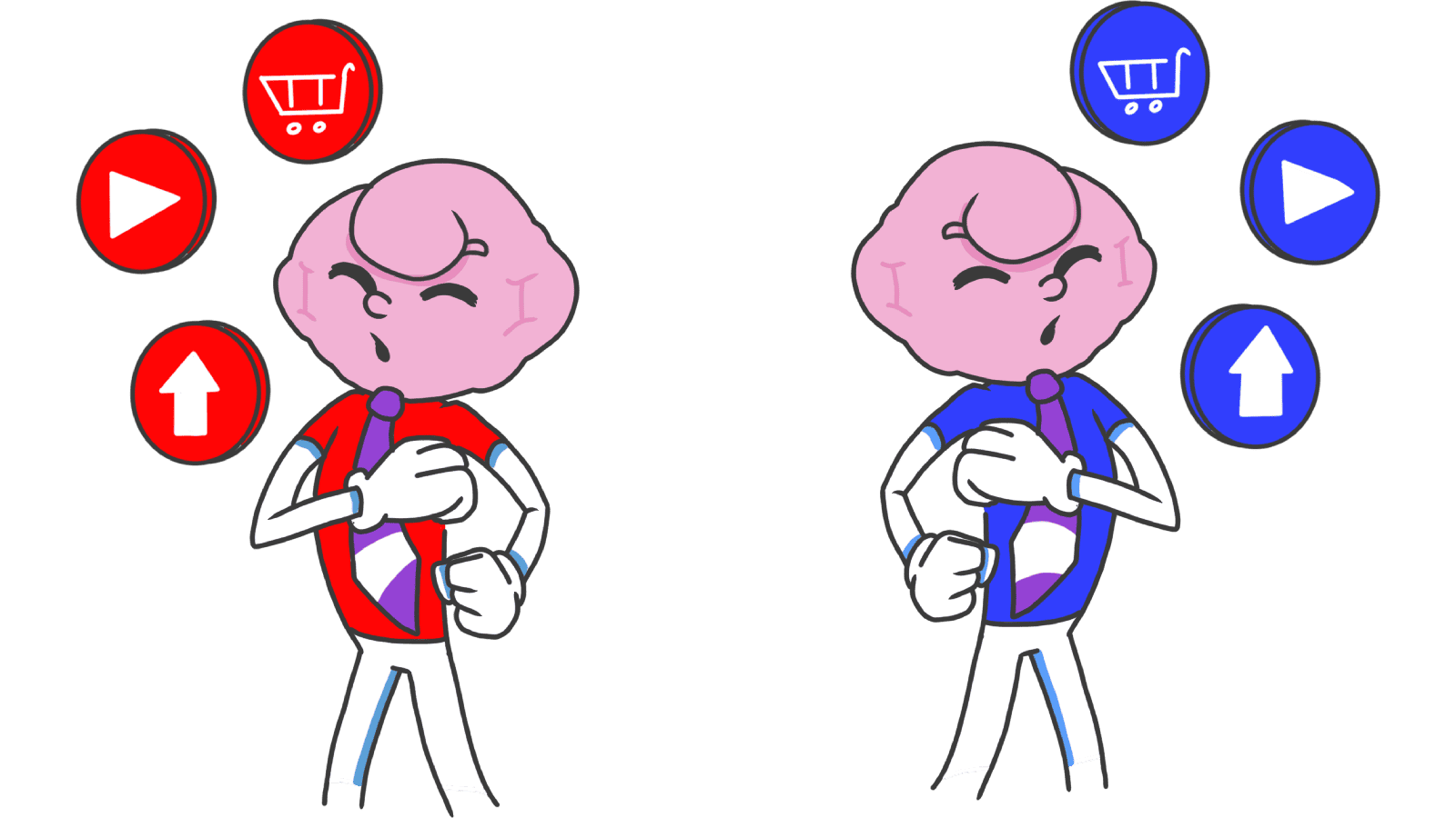
Confirmation bias also covers layout. Visitors expect navigation top, cart top-right, footer with links. Break it and you're asking them to rebuild their mental model — most won't.
- Stay consistent: Standard icons, standard placements, standard interactions.
- Innovate where it matters: Save your "different" moves for the actual product, not the navigation.
5. Introduce new things gently
If you must challenge a belief — a redesign, a new pricing model, a category shift — bridge it.
- Explain why: "We moved this here because it makes X faster" lands better than a quiet redesign.
- Acknowledge the old way: A short note, an in-app callout, a "what's new" tour. Don't pretend the old way never existed.
Common ways builders break this
Reinforcing the wrong belief
- The mistake: A user once thought your tool was slow. Every minor lag now confirms it.
- The fix: Proactively kill that perception. Snappy interactions, instant feedback, micro-animations that say "we did the thing fast." Rewrite the narrative on purpose.
Filter bubbles in your product
- The mistake: Only showing users what they already like. Useful in the short term, narrowing in the long term.
- The fix: Add a "Discover" or "Suggested" surface that gently pushes outside the comfort zone — without overwhelming.
Designer confirmation bias
- The mistake: You ran a usability test, three of five people struggled, and you said "they didn't get it."
- The fix: Practice the opposite — actively look for reasons your design fails, not for reasons it works. The flaws that hurt your conversion are usually the ones you're best at explaining away.
How real products use this
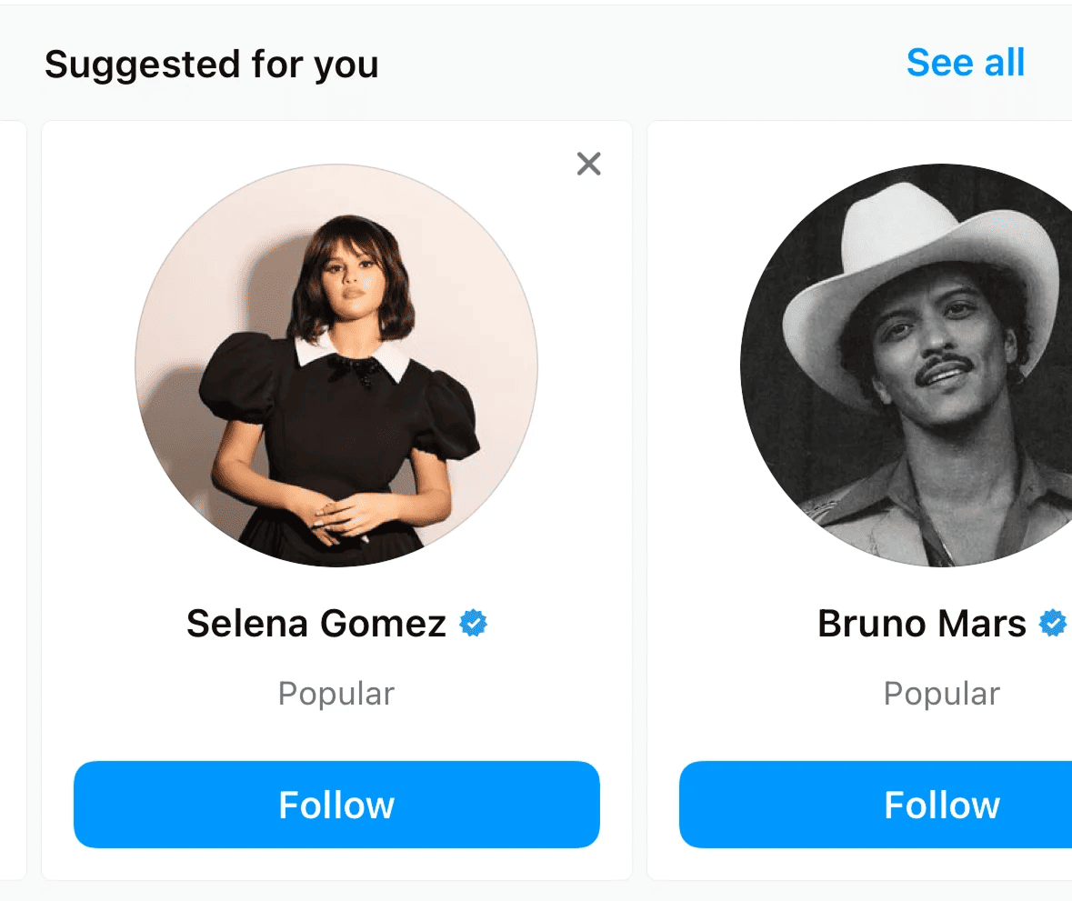
Instagram tracks what you tap, what you watch, what you linger on, then floods your Explore page with more of it. The feed is one giant confirmation machine. The more it confirms, the longer you stay.
Netflix
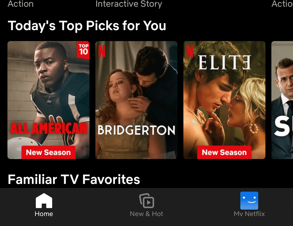
Watch three crime documentaries and the hero banner becomes another crime thriller. Netflix isn't recommending. It's confirming your identity as "a true-crime person." That confirmation makes hitting Play feel obvious.
See how your site compares
Our AI analyzes your interface against the same psychological principles used by Instagram and Netflix.
Get Your Free UX ScoreRelated principles
These compound with confirmation bias:
Social Proof
How showing what other people are doing gives visitors permission to do the same.
Resources & Further Reading
Simply Psychology: Confirmation Bias
Article with a detailed explanation of the bias and examples.
The Decision Lab: Confirmation Bias
Article analyzing the impact of confirmation bias in various areas.
Frequently Asked Questions
Don't Guess Your UX. Scan It.
Upload your screens or paste your URL to get expert-level UX analysis in under 3 minutes.
Start Free ScanRelated Articles
Halo Effect: Why your landing page looks "cheap" in the first 3 seconds
Visitors decide if your landing page is trustworthy in 3 seconds. Polish the first impression and the rest of the page benefits — here is what to focus on.
Anchoring Bias: Why the first number on your landing page changes how visitors judge every other number
Visitors do not evaluate your price in a vacuum. Whatever number they see first becomes the yardstick. Here is how to set anchors that make your offer feel like a steal.
Attention Bias: Why visitors look right past your best feature on your landing page
Visitors do not scan your page evenly. They hunt for the one thing they care about and ignore everything else. Here is how to put it where their eyes already are.