Aesthetic-Usability Effect: why your ugly landing page feels broken (even when it works)
Visitors decide your product is good or bad in 50ms. The Aesthetic-Usability Effect explains why beautiful pages feel easier — and convert better.
Aesthetic-Usability Effect: why your ugly landing page feels broken (even when it works)
You shipped a landing page. Functionally, everything works. But signups are flat. Visitors keep saying "it didn't feel right." You can't quite pin down why.
Here's the answer most builders don't want to hear: visitors decide if your product is good or bad in about 50 milliseconds. Before they read your headline. Before they understand your offer. The look of the page sets the tone for everything that follows.
That's the Aesthetic-Usability Effect: visitors think pretty things are easier to use. Even when they're not.
What this effect actually is
When an interface looks polished, visitors feel good about it — and that good feeling makes them more patient with minor friction, more trusting of your brand, and more likely to convert.
"Good design is aesthetic. Only well-executed objects can be beautiful." — Dieter Rams
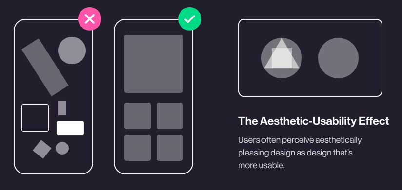
The effect was first researched in 1995 at the Hitachi Design Center. They found a stronger correlation between how attractive an interface looked and how usable people thought it was, than between how attractive it was and how usable it actually was. In plain English: pretty masks problems.
For a builder, that's gold. Your landing page doesn't have to be flawless. It just has to look like it cares.
Why this matters on a landing page
You don't sell to visitors who already know you. You sell to strangers who land on your URL and have to decide in seconds if you're worth their time.
First impressions
Aesthetics are the hook. Two products that do the same thing — the prettier one wins the click. Every time.
Trust
A polished page signals "this team knows what they're doing." A messy page signals "is this a scam?" The signal is unfair, but it's how visitors filter.
Tolerance
When something small breaks on a beautiful site, visitors blame themselves. When it breaks on an ugly one, they blame you and leave.
Competitive edge
When two tools have feature parity, the better-looking one converts. That's often the only differentiator left.
Is your interface working?
Get an instant analysis of your landing page against 80+ conversion principles.
Scan Your Site FreeHow to use this on your page
This isn't about glitter. It's about looking intentional.
1. Get the fundamentals right
Before any "design flair," nail the basics:
- Typography: A clear hierarchy. One heading font, one body font, real spacing.
- Color: Two or three colors used consistently. Real contrast for readability.
- Spacing: Whitespace is a design element. Use it to separate, not to fill.
2. Don't sacrifice clarity for prettiness
A beautiful page that hides the CTA is a failed page.
- Do this: Make your primary CTA the most obvious thing on screen — even if it "breaks" your minimalist look.
- Avoid this: Hiding the menu behind a hamburger on desktop because it looks cleaner. Visitors get lost.
3. Test perception with real strangers
Show your hero to someone for 5 seconds. Hide it. Ask: "What does this product do?" If they can't tell you, looking pretty is masking a clarity problem.
4. Balance polish and signal
Every element on screen should earn its place. Decorative shapes that don't help the visitor decide are noise. Cut them.
- Use a design system. Consistent buttons, icons, inputs across the site. Even one component that looks "different" snaps the spell.
Common ways builders break this
1. Designing for Dribbble, not for visitors
- The mistake: Ultra-thin fonts. Low-contrast colors. "Aesthetic" choices that hurt readability.
- The fix: Stick to accessibility basics (WCAG contrast). Beautiful and readable aren't opposites.
2. Animating everything
- The mistake: Five different motion effects on the homepage because "it feels premium."
- The fix: Animation should give feedback, not decorate. Snappy and purposeful.
3. Skipping the wireframe
- The mistake: Jumping straight to high-fidelity visuals before the layout makes sense.
- The fix: Wireframe first. Decide the flow. Then make it pretty.
How real products use this
Spotify
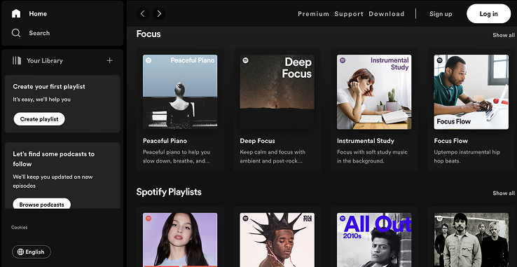
Spotify uses massive, bold album art as the visual centerpiece. The interface looks lush — and because it does, visitors forgive small navigation quirks they'd flame on a less attractive app.
Duolingo
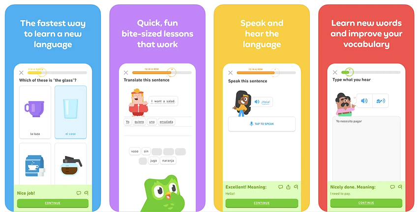
Duolingo doesn't look like a textbook. It looks like a game. Bright colors, friendly characters, satisfying animations. The visual delight makes a hard task (learning a language) feel doable. That's the effect at full power.
See how your site compares
Our AI analyzes your landing page against the same principles used by Spotify and Duolingo.
Get Your Free UX ScoreRelated principles
These pair well with the Aesthetic-Usability Effect:
Hick’s Law
Why too many options on the page slow down or paralyze visitor decisions.
Jakob's Law
Why visitors expect your page to feel familiar — and bounce when it does not.
Resources & further reading
Nielsen Norman Group
In-depth article on the importance of aesthetics in the perception of usability.
Human Interface Guidelines
Apple's design standards, highlighting how to balance aesthetics and usability.
Material Design
Google's guidelines for creating beautiful and functional interfaces.
Frequently asked questions
Don't guess your UX. Scan it.
Upload your screens or paste your URL to get a senior-level review in under 3 minutes.
Start Free ScanRelated Articles
Jakob's Law: why your "original" landing page is confusing visitors
Visitors expect your page to work like every other site they use. Jakob's Law explains why being too creative with your UI quietly kills conversion.
Miller's Law: why your landing page feels overwhelming (and visitors leave)
Visitors can only hold a few things in their head at once. Miller's Law shows why crammed navs and walls of text crush conversion — and how to chunk it down.
Fitts's Law: why visitors miss your CTA and bounce on mobile
Tiny buttons and CTAs hidden in the corner cost you signups. Fitts's Law explains why size and placement decide if visitors click — or leave.