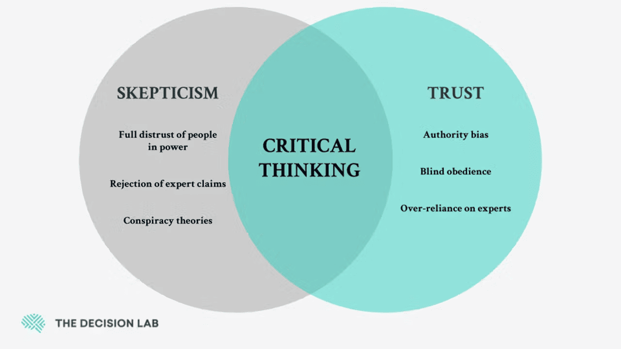
Authority Bias: Why your landing page looks sketchy to strangers (and what to fix first)
New visitors do not trust you yet. They scan for proof you are not a scam. Authority Bias is how you signal you are real before they read a single word.
Authority Bias: Why your landing page looks sketchy to strangers (and what to fix first)
You shipped your landing page. You wrote it yourself. The copy is fine. Traffic shows up. Nobody trusts it enough to sign up.
Here's the thing nobody tells you when you launch: a stranger has zero reason to believe you're real. Not because your product is bad — because they've never heard of you. They're scanning your page for any reason to bail. Authority Bias is how you give them a reason to stay.
What authority bias actually is
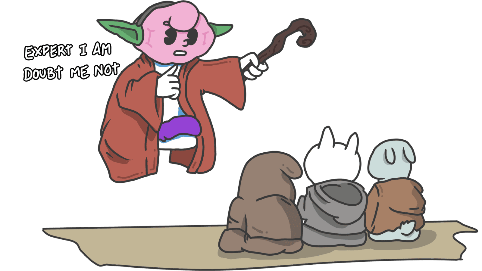
People are wired to give more weight to anyone who looks like they know what they're doing. A guy in jeans tells you to cross the street, you ignore him. A firefighter in full gear says the same thing, you sprint. Same words, very different reaction.
"Obedience to authority is so deeply ingrained in us that we may act contrary to our own values simply because an authority figure has told us to." — Stanley Milgram
Your brain leans on this because evaluating every claim from scratch is exhausting. If someone looks credible, you outsource the judgment. On a landing page, this means visitors don't read your copy and grade it on a rubric. They look at how the page feels and decide in two seconds whether you're worth their attention.
Why this matters on a landing page
Trust is what gets you the click. Visitors arrive skeptical, especially if they're about to hand over an email or a credit card. Authority Bias closes that gap.
Conversion
When someone with credibility — a recognizable logo, a known investor, a real expert — has stood next to your product, the visitor stops asking "is this real?" and starts asking "is this for me?" You've moved past the trust hurdle.
Lower bounce
A page that looks professional gets read. A page that looks sloppy gets closed. Authority isn't only about logos and quotes — your design itself either signals "this is a real company" or "this is a side project."
Easier to introduce something new
If your product is unfamiliar — new category, new approach, weird positioning — visitors need a tether to something they already trust. That's what authority signals do. They give the unfamiliar idea a familiar friend.
When authority is missing, you're a stranger in a t-shirt giving advice. With it, you're the firefighter — and visitors stop questioning the basics.
See which persuasion techniques your site is missing
Analyze your interface against 80+ UX and psychological triggers to see if you are building real authority.
Analyze Your Conversion TriggersHow to build authority on your page
Adding a "Featured In" strip with random logos won't save a sketchy page. Authority is woven through the whole experience.
1. Use experts who fit the problem
Generic testimonials don't move people. A relevant expert does. If you sell a fitness app, a quote from a strength coach lands harder than "Sarah from Dallas."
- Do this: Real name, real title, real photo, in the same space your product operates.
- Avoid: Stock photos, vague names, no credentials.
2. Show the badges that matter
If you've earned something credible — SOC 2, Y Combinator, a real industry award, coverage in a publication people recognize — put it where visitors will see it. Especially near the signup or pricing.
- Place it strategically: Trust signals work best close to the moment of friction (sign up button, checkout).
- Less is more: Three relevant logos beat fifteen random ones. Quality beats quantity.
3. Sound like you know what you're doing
Authority isn't only logos. It's tone.
- Professional design: Broken layouts, mismatched fonts, and ten different shades of blue scream "side project." A clean, considered design says "real company."
- Confident copy: Cut "we think" and "maybe." "Save 10 hours a week" beats "Our tool might help you save time."
4. Cite real sources
If you make a claim — "increases signups by 40%" — back it up. Link to a real study or your own data. Vague claims get ignored. Cited claims get believed.
5. Borrow authority from symbols
You don't always need a person. Symbols carry weight too.
- Visual cues: A founder on a podcast you've heard of. A clean dashboard screenshot that looks like it belongs in a real company.
- The right words: Industry-specific language signals you're an insider — but don't drown the page in jargon.
- The right setting: A demo recorded in a real product, not a Figma mockup.
Common ways builders break this
Borrowed authority that doesn't fit
- The mistake: A famous athlete recommends your cybersecurity tool. It catches the eye but adds no real credibility.
- The fix: Match the expert to the problem. A security researcher promoting a VPN beats a celebrity every time.
Logo soup
- The mistake: Twenty trust badges in the footer, half of them outdated, none recognizable.
- The fix: Pick three or four that mean something. Cut the rest.
Sloppy execution
- The mistake: Typo in your headline. 404 on your "Learn More" button. A mid-page section that's clearly half-finished.
- The fix: Authority is fragile. One typo undoes ten testimonials. Polish the surface before you polish the funnel.
How real products use this
Headspace

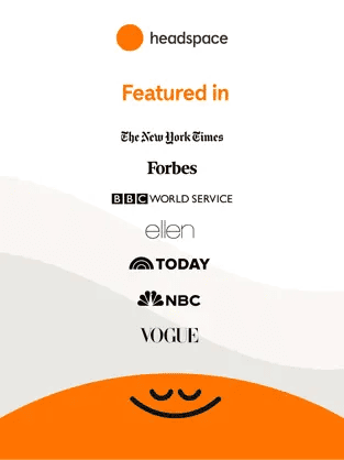
Meditation can sound flaky. Headspace stacks authority to fix that.
- Founder credibility: Andy Puddicombe was a Buddhist monk for years. That's not marketing — that's a real bio.
- Real research: They cite peer-reviewed studies done with universities, not vague "science says" claims.
- Apple's stamp: "App of the Day" and "Editor's Choice" use Apple's authority to validate theirs.
The result: a category that used to feel woo-woo now feels like science.
See how your site compares
Our AI analyzes your interface against the same principles used by Headspace to build credibility and trust.
Get Your Free UX ScoreRelated principles
Authority works hardest when it's stacked with these:
Social Proof
Show that real people use your product so the next visitor feels safe joining them.
The Halo Effect
How one strong signal makes everything else about your product feel better.
Resources & Further Reading
For those looking to dive deeper into the psychology of persuasion and the Milgram studies, check out these essential resources:
Influence: The Psychology of Persuasion
Robert Cialdini's seminal work on the six pillars of influence, including a deep dive into Authority.
The Milgram Experiment
A documentary/study overview of the classic (and controversial) study on obedience to authority.
Why Do We Always Trust the Doctor?
An in-depth explanation of Authority Bias by The Decision Lab.
Frequently Asked Questions
Don't Guess Your UX. Scan It.
Upload your screens or paste your URL to get expert-level UX analysis in under 3 minutes.
Start Free ScanRelated Articles
Bandwagon Effect: Why your landing page needs to show that other people already use you
Visitors do not want to be the first one. Show them they are not, and you remove half the hesitation. Here is how to use the bandwagon effect without faking it.
Social Proof: why your landing page looks sketchy without it (and how to fix it)
Strangers don't trust your claims — they trust other strangers. Social Proof shows you exactly which trust signals turn skeptical visitors into signups.
Anchoring Bias: Why the first number on your landing page changes how visitors judge every other number
Visitors do not evaluate your price in a vacuum. Whatever number they see first becomes the yardstick. Here is how to set anchors that make your offer feel like a steal.