Choice Overload: Why too many options on your landing page kill conversion
You think more choices give visitors freedom. They give them a reason to leave. Here is how to cut down options and lift conversion without losing flexibility.
Choice Overload: Why too many options on your landing page kill conversion
You shipped your landing page with five plans, three CTA buttons, and a "Compare All Features" toggle. Visitors land. They look at it. They open another tab to "think about it." They never come back.
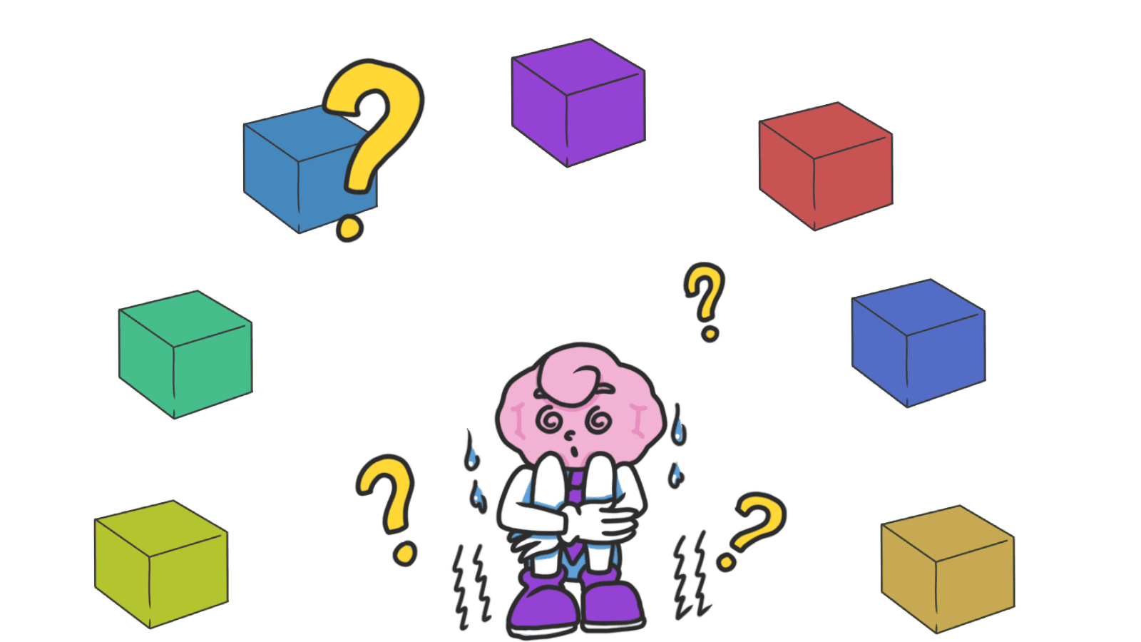
You added all those options thinking it would help. It didn't. When you give visitors too much to weigh, the brain's response isn't "great, I'll evaluate carefully." It's "I'll figure this out later." And later is never.
What choice overload actually is
Choice overload is what happens when you give people more options than their brain wants to process. Past a certain point, every extra option doesn't add freedom — it adds friction.
"Autonomy and freedom of choice are critical to our well-being, and choice is critical to freedom and autonomy." — Barry Schwartz
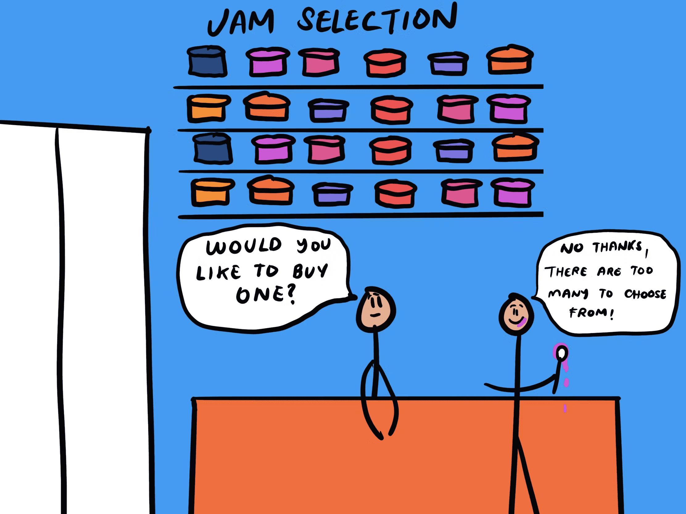
Schwartz called this the Paradox of Choice. The classic test: a grocery store set up a jam tasting with 24 jams. Lots of people stopped, but only 3% bought. Cut the display to 6 jams and 30% bought. Same product, fewer options, ten times the sales.
In your landing page, this hits anywhere visitors have to decide: pricing, navigation, signup paths, feature lists.
Why this matters on a landing page
Every choice burns a tiny amount of mental energy. By the time a visitor reaches your CTA, you want them to have energy left to click.
Conversion
Fewer, clearer choices convert better. Five plans don't beat three. Three CTAs don't beat one. Pages that say "here's the path, take it" out-convert pages that say "here are seven paths, pick whichever."
Less abandonment
Decision fatigue is real. Visitors who burn through 15 small decisions on the way to the signup form often abandon at the form — not because the form is bad, but because they're tired.
Confidence
When the choice was easy, visitors feel good about it. When it took effort, they second-guess. Easy decisions stick. Hard ones get refunded.
Analyze your conversion triggers
Is Choice Overload killing your sales? Get an instant analysis of your interface against 80+ psychological triggers.
Scan Your Site FreeHow to fix choice overload on your page
You're playing curator now. Your job is to narrow the options without removing the sense of control.
1. Cap visible options
Working memory is small. In a busy, distracted environment like a landing page, it's even smaller.
- Do this: 3 to 5 main options on pricing, plans, or primary navigation.
- Avoid: Mega-menus with 40 links. "Compare 8 plans" tables that need scrolling sideways.
2. Group everything else under filters
If you really have a big inventory, don't dump it all on the page. Categorize and filter.
- Group by intent: What is the visitor trying to do? Match categories to that, not to your internal team structure.
- Filter aggressively: Let visitors narrow to what they want before they see the full list.
3. Recommend one option
A "Most Popular" or "Recommended" badge gives anxious visitors a default. Most will take it. Some will look around and pick something else. Both groups convert.
- Halo: One highlighted option lifts the whole comparison. See Halo Effect.
- Social proof: "90% of users pick this" works because it tells visitors they're not alone.
4. Set smart defaults
The easiest decision is one the visitor doesn't have to make. Pre-pick the most common or beneficial path.
- Path of least resistance: This is the Default Effect. It carries a lot of weight when used honestly.
5. Hide the rest behind progressive disclosure
Don't show every feature, every plan, every detail upfront. Show what 90% of visitors need. Let the rest dig.
- "See more" links: Hide secondary stuff.
- "Advanced" toggles: Most users won't open them. The ones who do are the ones who want them.
Common ways builders break this
The kitchen-sink homepage
- The mistake: Every feature, every link, every CTA on the homepage. "Just in case."
- The fix: What does 80% of your traffic actually want? Show that. Cut the rest below the fold or onto a separate page.
Flat visual hierarchy
- The mistake: Every button looks the same. Every link is the same color and weight. The eye has nowhere to land.
- The fix: One clear primary action per screen. Everything else is visually secondary.
Cute category names
- The mistake: "The Investment" instead of "Pricing." "Our Voyage" instead of "About."
- The fix: Use the words visitors expect. They aren't on your page to admire your branding — they're trying to do a thing. Make it findable.
How real products use this
Netflix
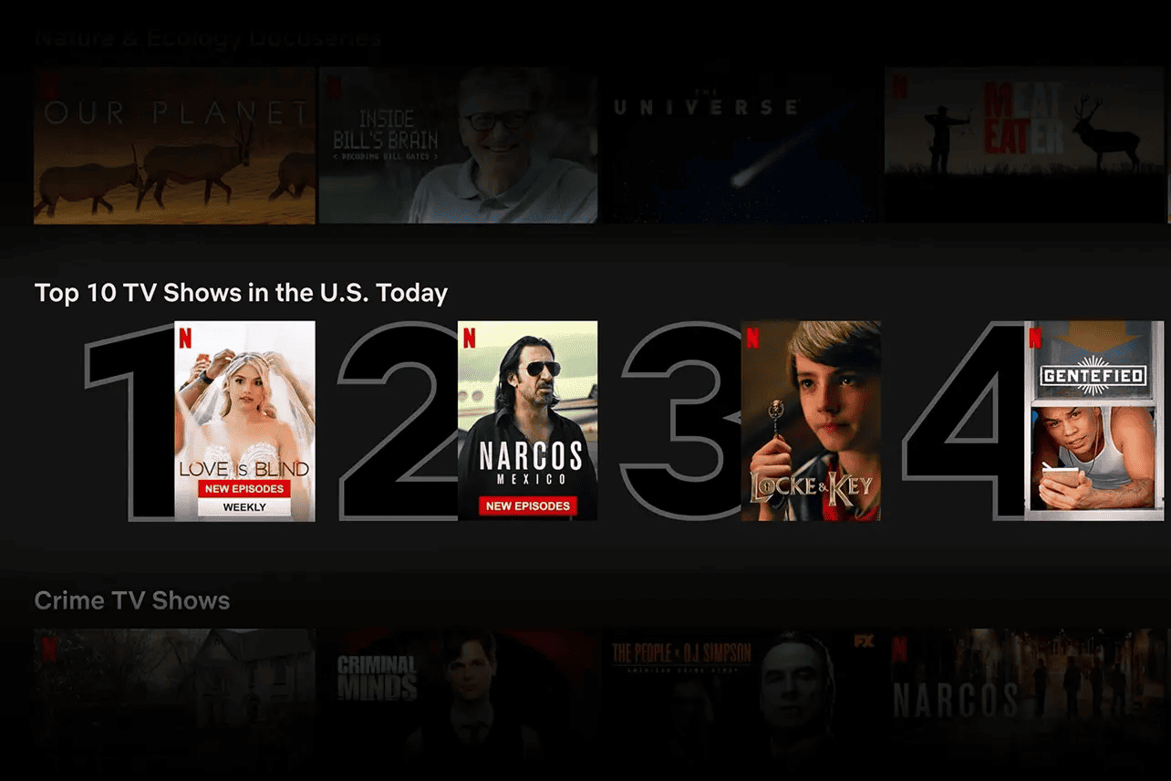
Netflix has 5,000+ titles. They never show them as a flat list. Instead:
- Hyper-specific rows: "Gritty crime dramas." "Feel-good comedies."
- Top 10 list: A daily, narrow shortlist that cuts thousands of choices to ten.
- Match percentage: "97% match" tells you which one to pick without making you compare.
The catalog stays massive. The choice stays small.
See how your site compares
Our AI analyzes your interface against the same principles used by companies like Netflix to drive engagement.
Get Your Free UX ScoreRelated principles
These pair with choice overload directly:
The Default Effect
How a smart pre-selected option lifts conversion without taking away choice.
The Halo Effect
Why highlighting one strong option makes the whole comparison easier.
Hick's Law
The simple math: more choices means slower decisions. Fewer means faster.
Resources & Further Reading
Barry Schwartz - The paradox of choice
TED Talk: Classic lecture that popularized the concept of choice overload.
The Paradox of Choice - Why More Is Less
Barry Schwartz's book that delves deeper into the topic.
Minimize Cognitive Load to Maximize Usability
NN Group article on how to reduce user mental load, including simplifying choices.
Frequently Asked Questions
Don't Guess Your UX. Scan It.
Upload your screens or paste your URL to get expert-level UX analysis in under 3 minutes.
Start Free ScanRelated Articles
Anchoring Bias: Why the first number on your landing page changes how visitors judge every other number
Visitors do not evaluate your price in a vacuum. Whatever number they see first becomes the yardstick. Here is how to set anchors that make your offer feel like a steal.
Attention Bias: Why visitors look right past your best feature on your landing page
Visitors do not scan your page evenly. They hunt for the one thing they care about and ignore everything else. Here is how to put it where their eyes already are.
Contrast Effect: Why your pricing page needs an option visitors will not pick
Visitors do not judge your price in isolation. They compare. Without a contrast on your pricing page, the "right" plan never feels obviously right.