Contrast Effect: Why your pricing page needs an option visitors will not pick
Visitors do not judge your price in isolation. They compare. Without a contrast on your pricing page, the "right" plan never feels obviously right.
Contrast Effect: Why your pricing page needs an option visitors will not pick
You priced your product at $19/month. It feels fair. You ship the page with a single plan. Nobody buys.
Then a friend tells you to add two more plans — a stripped-down free tier and a $49 pro tier. You don't even change the $19 plan. Conversion jumps. What happened?
Your visitors aren't judging $19 in a vacuum. They never were. They're comparing, and you weren't giving them anything to compare against. That's the Contrast Effect, and it's running on every pricing page, every feature list, every before/after.
What the contrast effect actually is
The brain doesn't evaluate things on their own. It evaluates relatively. Lift a 10lb weight, then a 5lb one — the second feels lighter than 5lb. See a $500 product, then a $150 one — the $150 feels like a deal, even when $150 is objectively expensive.
"Judgments are often influenced not by absolute values, but by comparisons with other available options." — Richard H. Thaler
We don't ask "Is this good?" — we ask "Is this better than that?" If you don't give visitors something to compare against, they'll go find one (usually your competitor).
Why this matters on a landing page
You spend hours picking the right number for your price. None of it lands without context.
Perceived value
Place your "main" plan next to a stripped-down free tier and a richer enterprise tier. The middle one becomes the obvious choice — even if you never changed its price.
Less choice paralysis
When the comparison is built into the page, the "right" answer feels obvious in seconds. No comparison, no decision.
Higher conversion
Guided comparison steers visitors toward the plan you actually want them to pick. No comparison, and they bounce to weigh you against three competitors in another tab.
Visual hierarchy
The same logic applies outside pricing. A bright CTA against a calm page wins the eye. A page where everything shouts wins nothing.
See which conversion patterns your page is missing
Our AI reviews your page against 80+ patterns including the Contrast Effect.
Analyze Your Conversion TriggersHow to use this on your page
This is mostly about presentation, not product changes.
1. Put options side by side
The classic application: the pricing table. Place your "Pro" plan between a "Free" tier (looks too limited) and an "Enterprise" tier (looks too expensive). Now Pro is the Goldilocks choice.
- Tip: Make specific benefits compare directly. "Unlimited storage" right next to "10GB" makes "Unlimited" feel infinite.
- Related: First Impressions Matter on anchoring and The Decoy That Directs on adding a third option that nobody picks.
2. Use visual contrast on purpose
This applies beyond pricing.
- Color: A bright "Sign up" button against a calm background pulls the eye.
- Scale: Big headline, small body — the brain instantly knows what's primary.
- Spacing: A single element with generous whitespace around it feels premium. Cram things together and they feel cheap.
3. Order matters
In onboarding, a tiny first task (2 seconds) makes the next 20-second task feel doable. A heavy first task makes the easy version feel like relief. The same applies on a landing page — leading with a complex feature makes the rest feel simpler by comparison.
4. Pick the comparison set yourself
If you don't give visitors a comparison, they'll pick one — usually your competitor. Better to control the frame: "Old way vs. our way," "Designer cost vs. UX Scan cost," "Industry average vs. our results."
Common ways builders break this
Comparing too many things at once
- The mistake: A pricing page with five tiers and 30 feature rows.
- The fix: Compare 2 or 3 things. Beyond that, visitors freeze.
"Everything is the hero"
- The mistake: Every button is bright. Every headline is huge. Every section says "MOST IMPORTANT."
- The fix: Pick one primary action per page. Let everything else be quieter so it can pop.
Junk options
- The mistake: Inventing a fake bad option just to make another look good. Visitors smell this.
- The fix: Make your comparisons honest — "this plan vs. that plan" with real differences. The goal is to help them pick the best fit, not corner them.
How real products use this
Uber
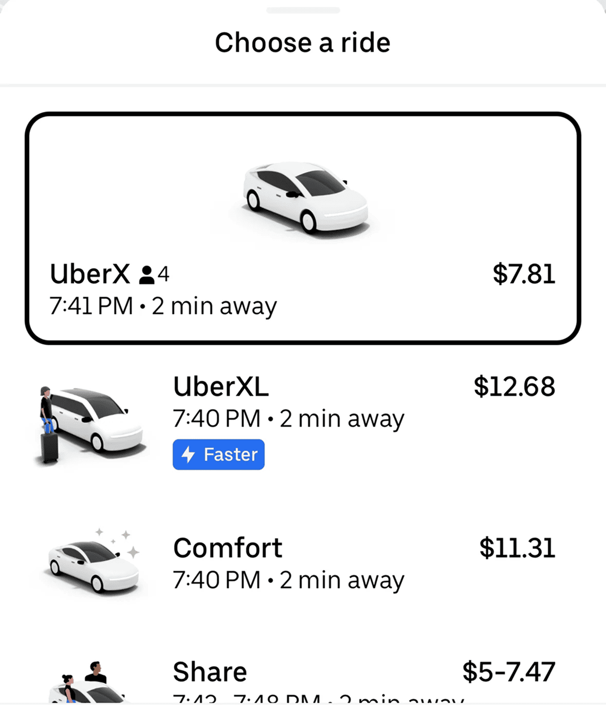
Uber never shows a single price. You see UberX, Comfort, and Black side-by-side, with car icons, ETAs, and prices in a clean column. Comfort sits in the middle as the "smart" choice — slightly nicer than X, way cheaper than Black. The frame steers you straight to it.
Amazon
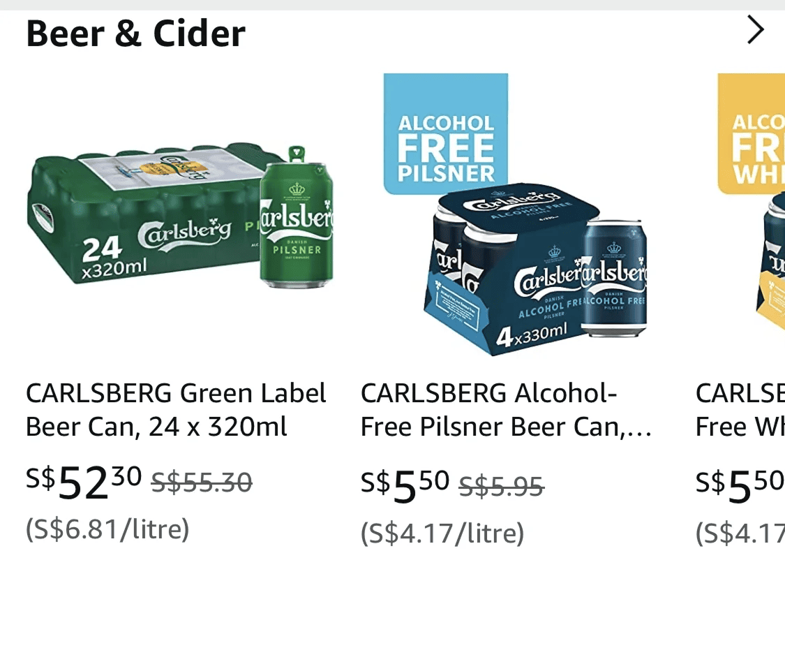
Strikethrough pricing is contrast effect at scale. $79.99 next to a crossed-out $120 doesn't read as a price — it reads as a $40 win. Whether the product was ever sold at $120 is another question.
See how your site compares
Our AI reviews your page against the same patterns used by Uber and Amazon.
Get Your Free UX ScoreRelated principles
Contrast plays well with these:
First Impressions Matter (Anchoring)
How the first number visitors see frames every number after it.
The Decoy That Directs (Decoy Effect)
How adding a third option visitors will not pick makes one of the others obvious.
Resources & further reading
How the Contrast Effect Shapes Your Decisions
A clear walkthrough of relative perception and how it shows up in decisions.
The Psychology of Contrast: Designing with Contrast
A deep guide on the visual and psychological side of contrast in design.
Frequently asked questions
Don't Guess Your UX. Scan It.
Upload your screens or paste your URL to get expert-level UX analysis in under 3 minutes.
Start Free ScanRelated Articles
Anchoring Bias: Why the first number on your landing page changes how visitors judge every other number
Visitors do not evaluate your price in a vacuum. Whatever number they see first becomes the yardstick. Here is how to set anchors that make your offer feel like a steal.
Attention Bias: Why visitors look right past your best feature on your landing page
Visitors do not scan your page evenly. They hunt for the one thing they care about and ignore everything else. Here is how to put it where their eyes already are.
Choice Overload: Why too many options on your landing page kill conversion
You think more choices give visitors freedom. They give them a reason to leave. Here is how to cut down options and lift conversion without losing flexibility.