Default Effect: Why the option you pre-select on your landing page wins most of the time
Most visitors stick with whatever is already checked. That makes your default the most powerful design choice on the page. Here is how to set it without crossing into dark patterns.
Default Effect: Why the option you pre-select on your landing page wins most of the time
You shipped your pricing page with three plans. You expect visitors to compare them carefully and pick whichever fits. Instead, almost everyone clicks whichever one you pre-selected.
That's not a bug. That's the most powerful pattern in choice design. Visitors stick with whatever's already chosen for them — not because they're lazy, but because the brain treats the default as a recommendation. If you're not picking your defaults on purpose, you're losing conversion to whatever your dev set as the placeholder.
What the default effect actually is
The Default Effect is the tendency for people to stick with whatever option is pre-selected. Changing it costs two things: a click, and the mental work of evaluating an alternative. Most visitors won't pay either cost.
"If you want to encourage someone to do something, make it easy. [...] One of the most effective ways to make it easy is to set a smart default." — Richard Thaler & Cass Sunstein
A few reasons this is so strong:
- Mental ease: Sticking takes zero thought.
- Loss aversion: "What if changing it makes it worse?" is enough to freeze visitors.
- Implied recommendation: The default reads as "the company picked this — must be the right one."
Why this matters on a landing page
Defaults are the most underrated lever in your funnel. They influence pricing, signup, plan choice, and every checkbox visitors face.
Less decision fatigue
Every choice burns mental energy. Pre-pick the most common option and visitors keep their energy for the steps that matter.
Higher conversion
A pre-selected "Annual" plan converts more annual subscribers than asking visitors to choose. A pre-selected "Recommended" plan converts more upgrades. The math is brutal and consistent.
Smoother checkout
Pre-filled shipping methods, pre-selected payment types, pre-checked "save my info" — every removed step is one less place visitors abandon.
Signal of expertise
A smart default tells visitors "we know what most people need here." That builds trust without saying a word.
Is your interface working with or against human psychology?
Get an instant analysis of your interface against 80+ UX principles, including the Default Effect.
Scan Your Site FreeHow to set defaults on your page
The job is to pick defaults that benefit visitors and your business at the same time. When those align, defaults are gold. When they don't, you drift into dark pattern territory.
1. Map every choice in your funnel
Walk through your landing page and product. Note every place visitors have to pick something.
- Onboarding (notifications, profile visibility).
- Plan choice (monthly vs annual).
- Checkout (shipping, payment, add-ons).
- Privacy (data sharing, marketing emails).
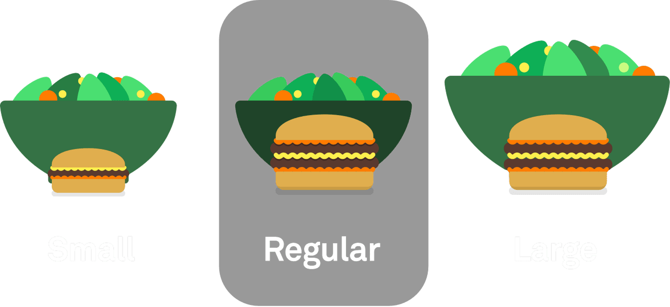
2. Pick a default that helps most users
The default should match what 70-80% of users would have picked anyway, ideally one that also helps your conversion or retention.
- Plan choice: Pre-select "Recommended" or "Most Popular." Most visitors want the safe pick.
- Shipping: Pre-select "Standard" if 90% pick that.
- Privacy/marketing emails: Default to off. Yes, it costs you signups. It costs you less than the GDPR fine and the trust hit.
3. Make the default visible
Don't hide the default. Highlighted border, checkmark, or a clear "Recommended" badge. Visitors should know it's pre-selected and feel free to change it.
4. For high-stakes choices, force a click
Some decisions shouldn't have a default. Deleting an account. Authorizing a large payment. Anything legally binding. Make visitors actively pick — that's the only way the choice is real.
5. Test and watch refunds
A default that lifts conversion but spikes refunds is bleeding you. Watch satisfaction scores and cancellations after default changes. If people feel tricked, the default is wrong.
Common ways builders break this
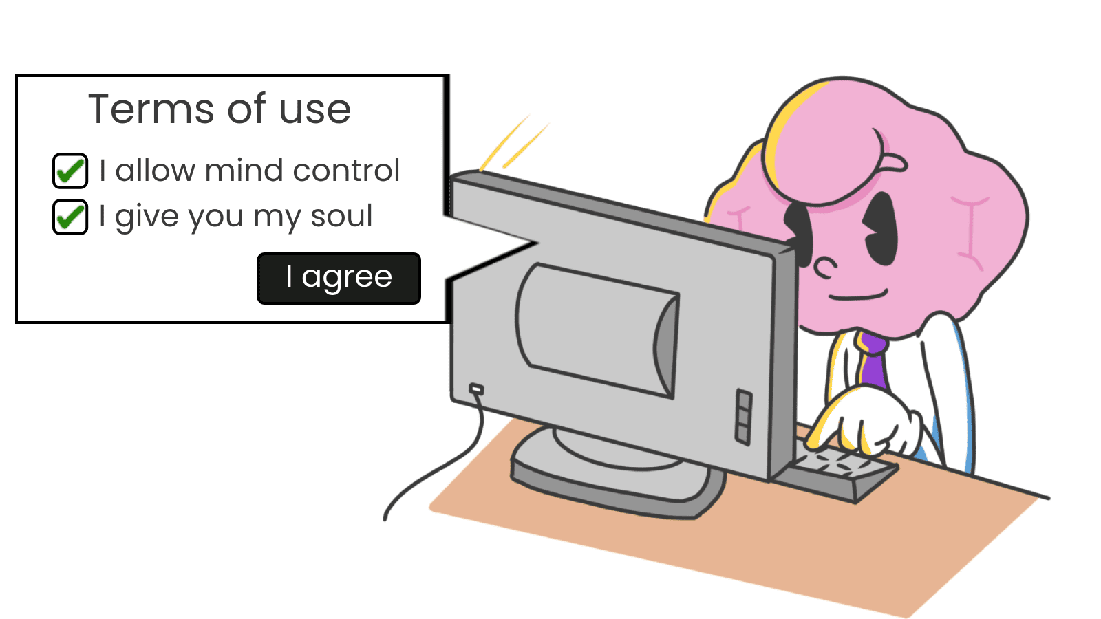
The "sneaky add-on"
- The mistake: Pre-checking paid extras at checkout — insurance, premium support, a $5 "donation."
- The fix: Only pre-select things that help the user. Anything they'd be annoyed to discover later belongs unchecked.
Privacy off by default
- The mistake: Pre-checking "share my data with marketing partners."
- The fix: Default to private. It's the law in many places, and it's also the move that earns long-term trust.
Ignoring context
- The mistake: Defaulting currency to USD for a UK visitor. Defaulting language to English for a Brazilian visitor on a localized URL.
- The fix: Smart defaults based on visitor data. IP, language settings, prior behavior. Each is one less friction point.
How real products use this
Organ donation
The classic case. Countries that ask citizens to opt in to be organ donors get rates around 15-20%. Countries with opt-out get rates above 90%. Same population, same biology, totally different outcome — just a flipped default.
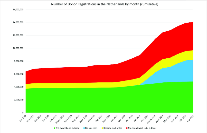
The Netherlands switched to opt-out in 2020. Donor registrations spiked. The lesson for landing pages: the default isn't a small choice. It's the choice.
Slack
When you join a new Slack workspace, notifications default to "Direct Messages, Mentions & Keywords" — not "All Messages." That single default protects new users from getting buried in their first hour. Most people never change it. They also never feel overwhelmed enough to leave.
See how your site compares
Our AI analyzes your interface against the same principles used by industry leaders like Slack.
Get Your Free UX ScoreRelated principles
Defaults work alongside these:
Status Quo Bias
Why visitors stick with whatever is already happening, even when change would help them.
Hick's Law
The rule that more options means slower decisions — defaults skip the choice entirely.
Resources & Further Reading
The Power of Defaults
Nielsen Norman Group article on how defaults impact user experience and decisions.
Nudge: Improving Decisions About Health, Wealth, and Happiness
The authors dedicate a large part of the book to discussing the power and ethics of defaults.
The Power of Defaults (Medium)
A deep dive into how defaults shape our digital world.
Frequently Asked Questions
Don't Guess Your UX. Scan It.
Upload your screens or paste your URL to get expert-level UX analysis in under 3 minutes.
Start Free ScanRelated Articles
Decoy Effect: Why your pricing page needs a third option nobody picks
Two plans freeze visitors. Three plans, with one that looks slightly worse than your target, makes the choice obvious. Here is how to use the decoy effect ethically.
Loss Aversion: Why your landing page needs to name what visitors lose by leaving
Most landing pages only sell the upside. Visitors hesitate. Loss Aversion is the missing half of the engine — here is how to use it without crossing into dark patterns.
Scarcity: how to use limits on your landing page without looking sleazy
Real scarcity drives action. Fake scarcity destroys trust. Here is how to use the scarcity principle on your landing page without crossing into dark patterns.