Decoy Effect: Why your pricing page needs a third option nobody picks
Two plans freeze visitors. Three plans, with one that looks slightly worse than your target, makes the choice obvious. Here is how to use the decoy effect ethically.
Decoy Effect: Why your pricing page needs a third option nobody picks
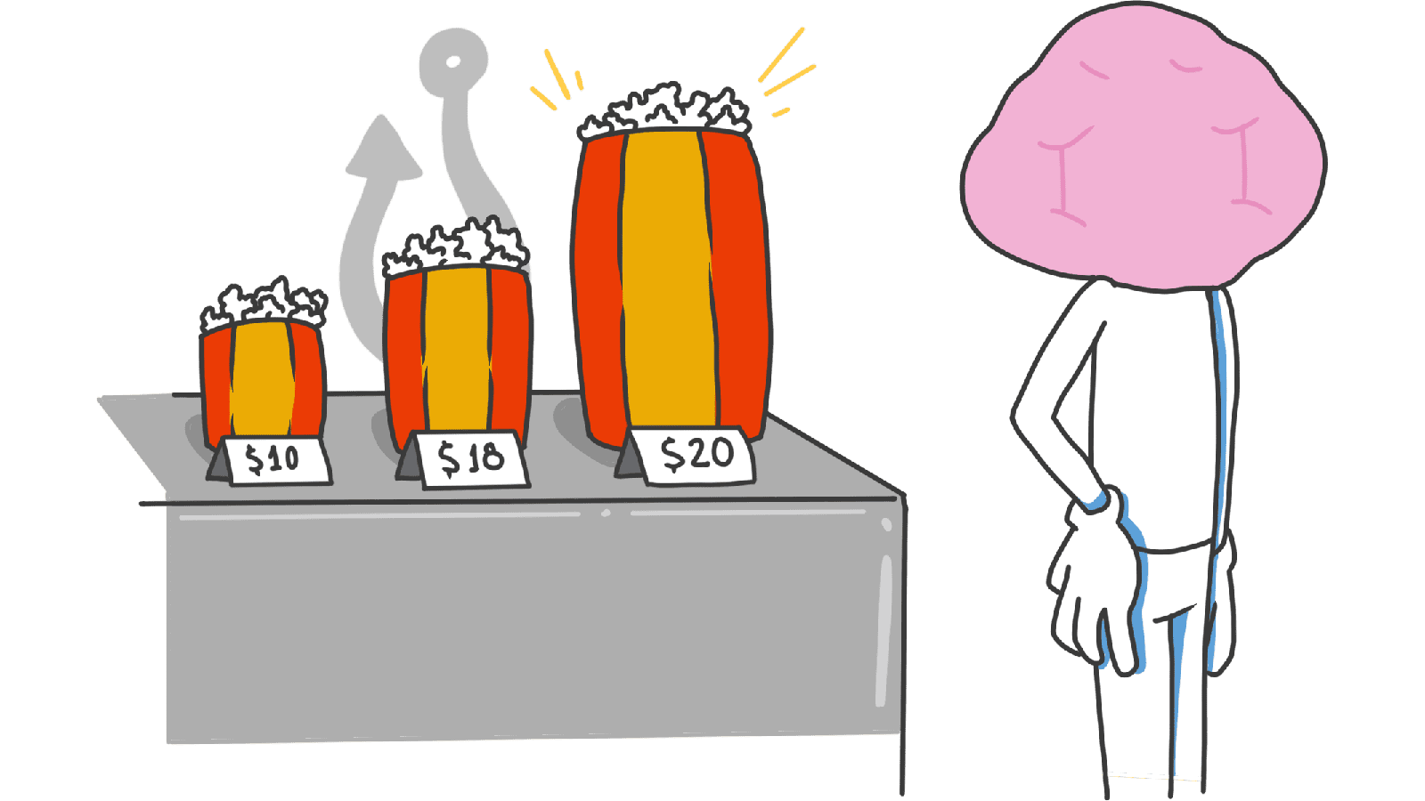
You launched with two plans: Basic at $9 and Pro at $29. Visitors land on the pricing page, stare at it for ten seconds, and bounce. You drop Pro to $19. Same result.
The price isn't broken. The comparison is. With two equally reasonable options, visitors freeze. They want to be sure they're picking right, can't quickly tell which one wins, and end up picking neither.
The fix is a third plan — one that looks slightly worse than your target plan. Suddenly the choice is obvious. That's the Decoy Effect.
What the decoy effect actually is
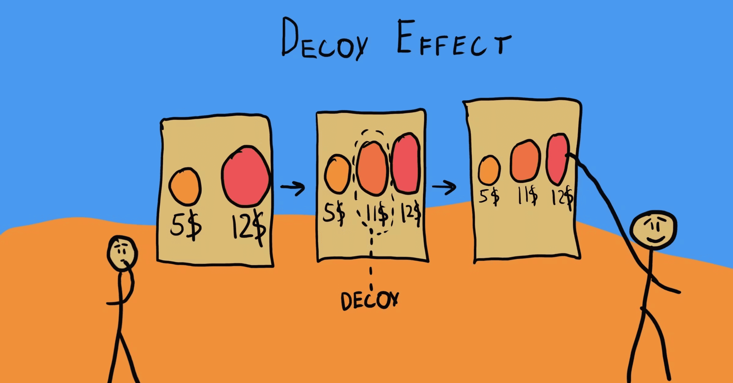
The Decoy Effect is what happens when you add a third option that's clearly worse than one of the original two. It doesn't pull traffic toward itself. It pulls traffic toward the option it's "almost as good as."
Classic Economist subscription example:
- A: Online ($50)
- B: Print only ($60)
- C: Online + Print ($60)
B is the decoy. Nobody picks it. But its job is to make C look like a no-brainer at the same price. Without B, more people would pick A. With B in the mix, most people pick C.
"People don't know what they want until they see it in context." — Dan Ariely
People don't have an internal price meter. They look around and judge by comparison. The decoy gives them something to compare against — and you control the answer.
Why this matters on a landing page
Used right, the decoy makes a hard decision feel easy. That's worth a lot when you're losing visitors at the pricing page.
Conversion
A clear winner converts faster than a fair fight. When one plan obviously beats another, visitors stop deliberating and click. Less deliberation, more conversion.
Higher average revenue
The decoy nudges visitors toward your higher-margin plan because the higher plan now looks like the deal. You're not raising prices — you're making the right plan obvious.
Less buyer's remorse
When the choice felt easy, visitors feel smart about picking. When it took effort, they second-guess. Easy decisions stick. Hard ones get refunded.
Analyze your conversion triggers
Is your pricing page helping users decide, or driving them away? Get an instant analysis of your interface's psychological triggers.
Scan Your Site FreeHow to design a decoy
This isn't about adding a random third price. It needs structure to work.
1. Pick the two real plans
The two visitors usually struggle between. Probably your Basic and your Pro. Visitors are torn — Basic is cheaper, but Pro has the feature they want.
2. Decide which one you want them to pick
Usually the higher-margin or higher-retention one. Most of the time that's Pro or Annual.
3. Build the decoy
The decoy should be clearly worse than your target, but not necessarily worse than the cheap plan in every way.
The formula:
If Basic is $10 and Pro is $30, your decoy could be a "Pro Lite" at $28. Same price tier as Pro, but missing the features Pro has. Now jumping from $28 to $30 for the full Pro feels obvious. The decoy quietly makes Pro the winner.
 Source: The Decision Lab
4. Show the three plans together
The comparison is the whole point. Put them side by side. Use a "Most Popular" badge on the target. Let the price/feature matrix do the rest.
Common ways builders break this
Decoy too obvious
- The mistake: A decoy so bad that visitors feel insulted — like the trick is too visible.
- The fix: The decoy should look like a real plan that some specific kind of user might actually choose. If it looks like a joke, you lose trust.
Too many tiers
- The mistake: Adding the decoy to a five-tier pricing page.
- The fix: The decoy effect works with three. With more, the comparison gets lost in the noise and you're back to choice overload.
Pushing toward a bad plan
- The mistake: Using a decoy to herd visitors toward a plan that doesn't actually serve them.
- The fix: The target plan has to genuinely be the best option for most people. Decoys amplify a real winner. They don't manufacture one.
How real products use this
Duolingo
Duolingo's monthly plan often acts as the decoy. The monthly price looks expensive next to the discounted annual. The math becomes obvious: pay monthly and bleed, or pay annually and "save." Most pick annually. The monthly plan was never really competing for the click.
Spotify
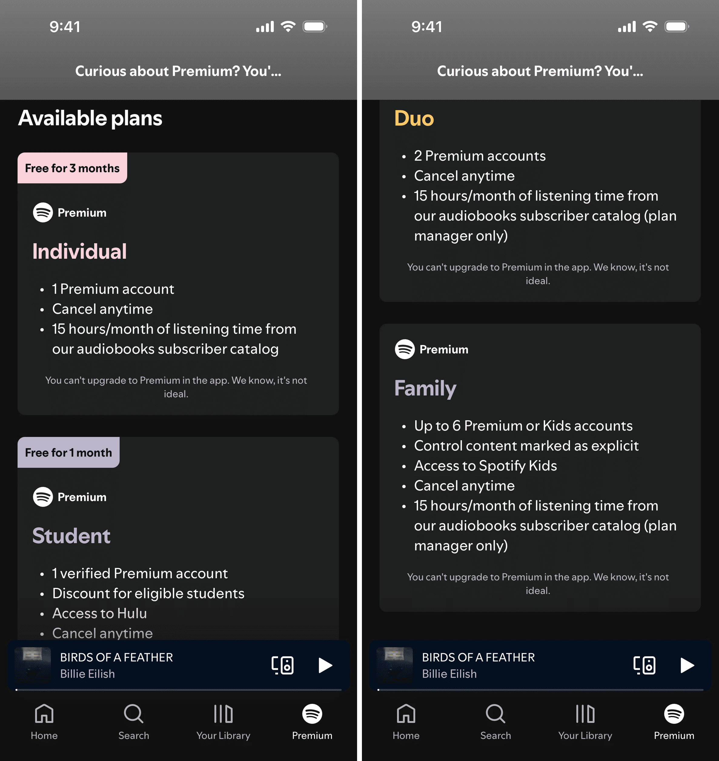
Spotify's Duo plan sits between Individual and Family. Duo is two accounts. Family is six accounts for a few dollars more. Duo isn't a bad plan — but next to Family, the math is impossible to ignore. Most couples upgrade to Family even when they only need two accounts.
See how your site compares
Our AI analyzes your interface against the same principles used by Duolingo and Spotify to maximize conversion.
Get Your Free UX ScoreRelated principles
The decoy works with these:
Choice Overload
Why too many plans freeze visitors and how to narrow them down.
The Framing Effect
How the way you wrap a price changes whether it feels expensive.
Resources & Further Reading
Predictably Irrational by Dan Ariely
The foundational book detailing The Economist experiment and the science of irrational decision making.
The Decision Lab: Decoy Effect
A deep dive into the history and experimental data behind the asymmetric dominance effect.
Frequently Asked Questions
Don't Guess Your UX. Scan It.
Upload your screens or paste your URL to get expert-level UX analysis in under 3 minutes.
Start Free ScanRelated Articles
Default Effect: Why the option you pre-select on your landing page wins most of the time
Most visitors stick with whatever is already checked. That makes your default the most powerful design choice on the page. Here is how to set it without crossing into dark patterns.
Loss Aversion: Why your landing page needs to name what visitors lose by leaving
Most landing pages only sell the upside. Visitors hesitate. Loss Aversion is the missing half of the engine — here is how to use it without crossing into dark patterns.
Scarcity: how to use limits on your landing page without looking sleazy
Real scarcity drives action. Fake scarcity destroys trust. Here is how to use the scarcity principle on your landing page without crossing into dark patterns.