Framing Effect: how the words on your landing page change who clicks
Same offer, two phrasings — wildly different conversion. The Framing Effect explains why your copy moves more action than your design.
Framing Effect: how the words on your landing page change who clicks
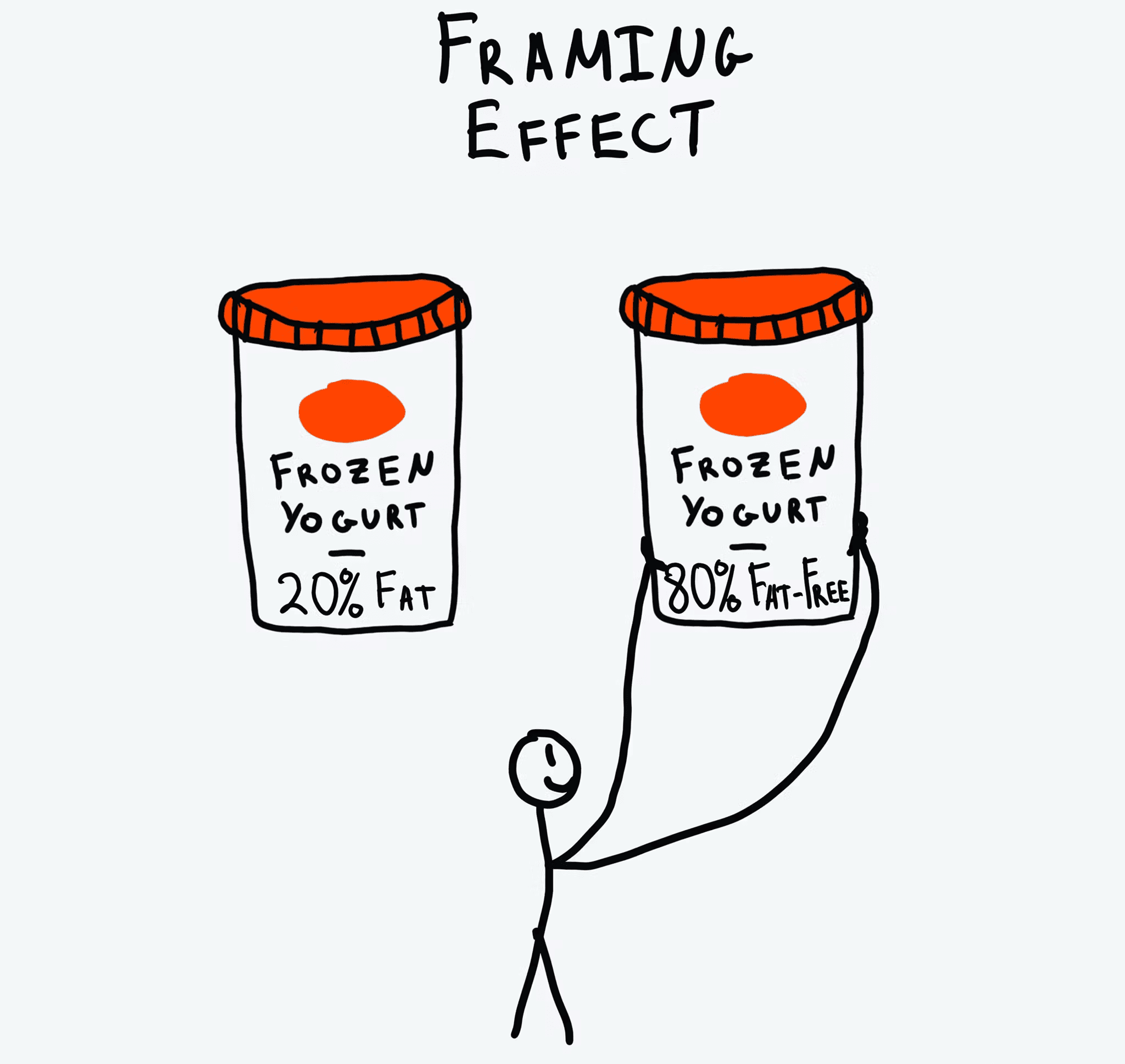
Imagine two ground-beef labels at a grocery store. One says "90% lean." The other says "10% fat." Same beef. Same price. Most people grab the first one without thinking.
That's the Framing Effect. The way you word a choice changes how visitors feel about it — even when the underlying facts are identical. On a landing page, your copy is doing this constantly. Either it's helping visitors say yes, or it's quietly tipping them toward "back."
What the Framing Effect actually is
It's the principle that says people decide based on how options are presented — gain vs. loss, positive vs. negative — not just the raw facts. We're emotional readers, not rational calculators. Same data, different wrapper, different decision.
"The way a problem is framed can dramatically affect the choice that is made." — Amos Tversky & Daniel Kahneman
Daniel Kahneman and Amos Tversky proved this in dozens of experiments. The takeaway for you: small copy changes can swing your conversion rate hard. Headline tweaks aren't fluff — they're leverage.
Why this matters on a landing page
Your copy is the conversation. The frame you choose decides the tone of that conversation.
Conversion
"$5/month" feels small. "$60/year" feels real. Same price, different commitment vibe. Reframing your offer can change conversion without changing anything else.
Trust
"Protects 99% of your data" lands warmer than "Fails to protect 1% of your data." Identical facts, opposite feelings.
Decision speed
Highlighting "Most popular" or "Best value" gives visitors a frame to anchor their choice. Without it, they over-analyze and bounce.
Analyze your conversion triggers
See which persuasion techniques your landing page is missing with an instant AI review.
Scan Your Site FreeHow to use framing on your page
You're choosing between two angles: focus on the gain or focus on the loss. Both work — different moments call for different ones.
1. Positive framing: focus on the gain
Lead with what visitors get. Best for onboarding, top-of-funnel hero copy, and feature pitches.
- Do this: "Join 50,000 founders shipping faster landing pages."
- Avoid this: "Stop being one of the people who launches and gets crickets."
2. Negative framing: focus on avoiding loss
Lead with what visitors lose if they don't act. Best for limited-time offers, security-related actions, or churn-prevention moments. This is rooted in Loss Aversion.
- Do this: "Don't lose your draft — your trial expires in 24 hours."
- Avoid this: "Your offer is available for 24 more hours." (Neutral. Doesn't create the loss frame.)
3. Lean into positive numbers
When you show data or social proof, frame it on the winning side of the ratio. Brains process "success" faster than "non-failure."
- Example: "8 out of 10 founders recommend us" beats "Only 2 out of 10 don't recommend us."
- Implementation: Surface high satisfaction scores, not low complaint rates.
4. Frame the comparison
Show your offer next to a clearly worse alternative. The "Pro" plan looks great when the "Basic" plan is missing the obvious must-have feature. That's The Decoy Effect — framing's cousin.
Common framing mistakes to avoid
1. Doom-mongering everywhere
- The mistake: Every notification screams "you're missing out." Visitors get fatigued and tune out.
- The fix: Keep negative framing for high-stakes moments. Positive framing for the day-to-day.
2. Framing as deception
- The mistake: Calling a "recurring subscription" a "one-time setup."
- The fix: Framing is about presentation, not lying. The facts have to hold up.
3. Wrong frame for the moment
- The mistake: Selling insurance with gain framing. People shopping for insurance are already in loss mode.
- The fix: Match the frame to the visitor's mindset. Loss-prevention copy for high-risk categories. Gain copy for productivity and lifestyle.
How real products use this
Netflix: the "Most Popular" frame
Netflix highlights one tier — usually the middle one — with a "Most Popular" label, brighter colors, or a slight outline.
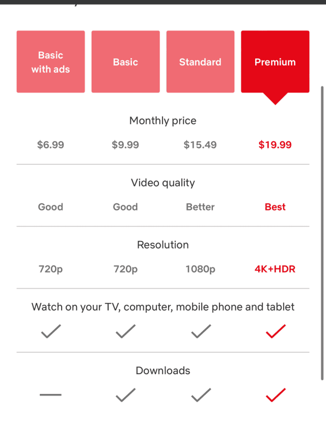
Why it works: The label does the work. Visitors stop comparing every spec. They think "if most people pick this, it's probably right for me." That frame collapses the decision into a single click.
See how your site compares
Our AI analyzes your landing page against the same principles used by Netflix and other conversion leaders.
Get Your Free UX ScoreRelated principles
The Framing Effect rarely works alone. Pair it with:
Loss Aversion
Why naming what visitors lose by leaving moves more action than promising what they gain.
The Decoy Effect
How adding an obviously worse third option makes your target plan look like the smart pick.
Anchoring Bias
Why the first number visitors see colors how they read every price after it.
Resources & further reading
The Framing Effect and Its Impact on UX
A deep dive into how presentation shapes digital decision-making via Medium.
The Decision Lab: The Framing Effect
A comprehensive scientific breakdown of the principle with real-world implications.
Thinking, Fast and Slow by Daniel Kahneman
The definitive book on cognitive biases and the architecture of choice.
Frequently asked questions
Don't guess your UX. Scan it.
Upload your screens or paste your URL to get a senior-level review in under 3 minutes.
Start Free ScanRelated Articles
Anchoring Bias: Why the first number on your landing page changes how visitors judge every other number
Visitors do not evaluate your price in a vacuum. Whatever number they see first becomes the yardstick. Here is how to set anchors that make your offer feel like a steal.
Attention Bias: Why visitors look right past your best feature on your landing page
Visitors do not scan your page evenly. They hunt for the one thing they care about and ignore everything else. Here is how to put it where their eyes already are.
Choice Overload: Why too many options on your landing page kill conversion
You think more choices give visitors freedom. They give them a reason to leave. Here is how to cut down options and lift conversion without losing flexibility.