Isolation Effect: Why your CTA gets lost when everything on the page tries to stand out
If every section is bold, none of them are. The Isolation Effect is how you make one thing on your landing page impossible to miss.
Isolation Effect: Why your CTA gets lost when everything on the page tries to stand out
You opened your landing page and tried to find your primary CTA in two seconds. You couldn't.
It's there — but it's wearing the same gradient as your hero badge, the same color as your feature icons, and the same scale as your "Read more" link. The eye has nowhere to land. So visitors scroll, get tired, and leave.
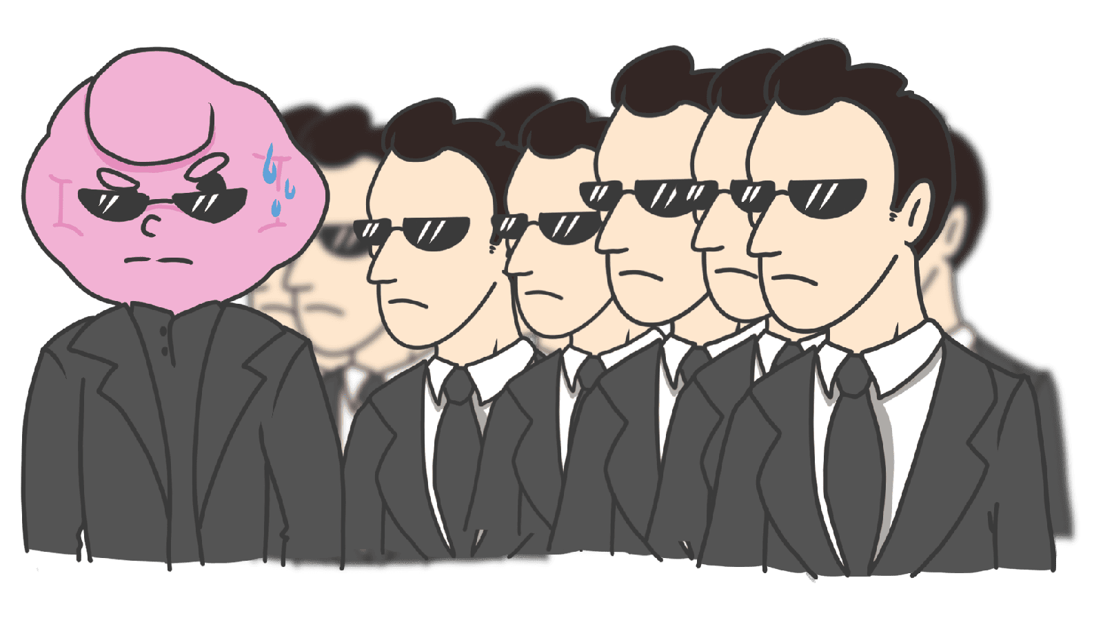
The fix isn't a brighter button. It's the Isolation Effect — also known as the Von Restorff Effect — which is the reason you remember the one person in a yellow jacket in a sea of gray suits. Make one thing different on purpose, and the brain locks onto it.
What the isolation effect actually is
In 1933, a psychiatrist named Hedwig von Restorff documented something simple: when most items in a set look the same, the one that's different is the one we remember. A list of black words with one red word — the red one sticks.
"Contrast attracts attention. Visual distinctiveness improves memorization." — Roberto Lisandro
Brains are pattern machines. When the pattern breaks, attention spikes. That's why CTAs are usually a different color, why "Recommended" tiers are a different size, and why notification badges are red dots.
Why this matters on a landing page
Visitors aren't reading your page top to bottom. They're scanning. The Isolation Effect is what tells the eye where to land.
Hierarchy
Make the primary action visually different from everything else. Your visitor's eye finds it without thinking.
Higher conversion
On a pricing page, marking one tier with a "Most Popular" tag and a different background is enough to swing a lot of decisions. The brain follows the highlighted path.
Recall
If your value prop is in the same style as everything else, visitors won't remember it. Pull it out — make it bigger, isolated by whitespace, in a different weight — and it becomes the thing they describe to a friend.
Analyze your conversion triggers
See which patterns your page is missing with an instant landing page review.
Scan Your Site FreeHow to use this on your page
The trick is establishing a "norm" first, then breaking it on purpose. If everything is loud, nothing is.
1. Make your primary CTA visibly different
The most common application. If your page is mostly blues and grays, your primary button is a bright orange or a brand accent.
- Color: Pick a complementary or accent color for the main CTA only.
- Size: Slightly bigger than secondary buttons.
- Shape: Solid fill while everything else is outlined.
- Whitespace: Surround it with empty space. Isolation by silence.
2. Highlight key information in body copy
Visitors skim. Help them.
- Use bold or italics on the 2-3 phrases that carry the message.
- Make inline links a clearly different color so they read as interactive islands.
3. Break the rhythm in lists and tables
Long lists are exhausting. Highlight one row.
- In a pricing table, give the recommended plan a different background and a small badge.
- On an e-commerce grid, use a "Sale" or "New" tag on a few cards — not all of them.
4. Use icon style to mark the special one
If your nav has five outlined icons, make the cart icon a solid fill. The eye flags it instantly. Same trick for "new" badges or unread states.
5. Don't highlight everything
The whole effect dies the moment you have three "primary" buttons and four "Most Popular" badges on the same screen. If everything is highlighted, nothing is.
Common ways builders break this
The Las Vegas effect
- The mistake: Every section is loud — bright colors, animations, large fonts, gradients. The page screams.
- The fix: 60-30-10. 60% dominant color (usually neutral), 30% secondary, 10% accent. Pick one thing per page that gets the accent.
Color-only isolation
- The mistake: The "different" element is only different by color, which fails for color-blind visitors.
- The fix: Pair color with shape, size, or weight. Always.
Highlighting the wrong thing
- The mistake: The "Cancel" button is more vibrant than the "Submit" button. Or the secondary feature gets the splash treatment.
- The fix: Map the visitor's primary goal first. The visual hero matches the goal.
How real products use this
Amazon
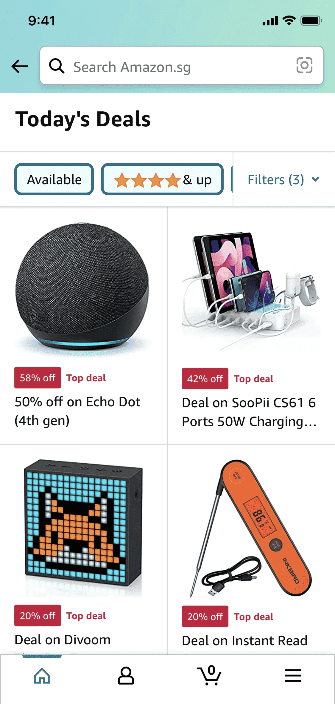
Amazon's pages are a sea of products in standard black and white. Then a few items wear a red "Deal of the Day" or "Limited Time Deal" tag. In a uniform layout, those red badges are the only thing the eye lands on first.
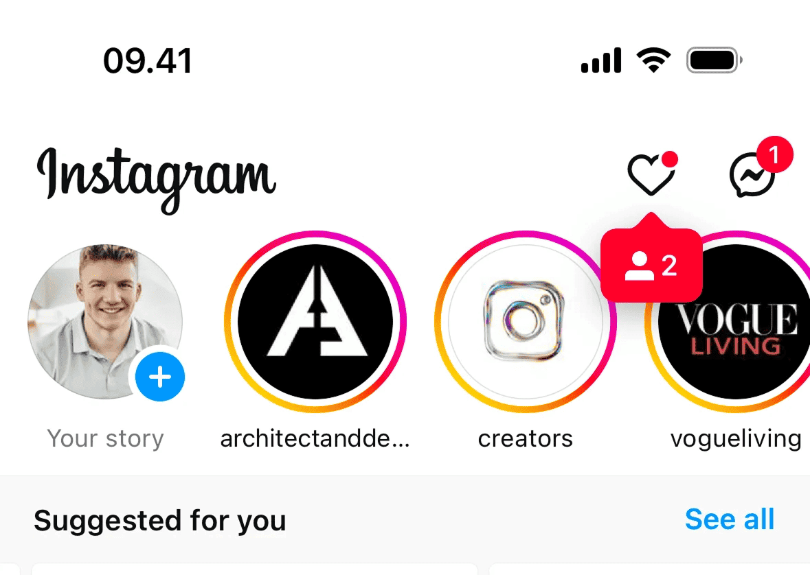
A row of avatars with gray rings is uniform. The moment one wears a multi-color gradient ring, your eye snaps to it. That's why you tap stories you didn't plan to watch.
See how your site compares
Our AI reviews your page against the same patterns used by Amazon and Instagram.
Get Your Free UX ScoreRelated principles
The Isolation Effect plays with these:
Attention Bias
Why visitors notice some things and miss others completely.
Fitts's Law
How button size and distance change how easily visitors click.
Hick's Law
The more options you show, the slower visitors decide.
Resources & further reading
The Von Restorff Effect
A clear breakdown of why the brain prioritizes the unique item in a set.
Psychology in Design
How memory-related effects like isolation shape user behavior.
Frequently asked questions
Don't Guess Your UX. Scan It.
Upload your screens or paste your URL to get expert-level UX analysis in under 3 minutes.
Start Free ScanRelated Articles
Recency Bias: Why the last thing on your landing page is what visitors remember
Visitors forget the middle of your page. They remember the start and the end. Here is how to design the last moment so it actually drives the click.
Zeigarnik Effect: Why unfinished signups pull visitors back to your page
Visitors who start a flow but do not finish stay haunted by it. Here is how to use unfinished tasks on your landing page to drive more conversions.
Anchoring Bias: Why the first number on your landing page changes how visitors judge every other number
Visitors do not evaluate your price in a vacuum. Whatever number they see first becomes the yardstick. Here is how to set anchors that make your offer feel like a steal.