Zeigarnik Effect: Why unfinished signups pull visitors back to your page
Visitors who start a flow but do not finish stay haunted by it. Here is how to use unfinished tasks on your landing page to drive more conversions.
Zeigarnik Effect: Why unfinished signups pull visitors back to your page
A visitor lands on your signup page, fills in their name and email, hesitates at the password field, and closes the tab. Most builders treat that as a lost user. They're not — yet.
That visitor is now carrying an open loop in their head. They started something and didn't finish it. Their brain will keep poking at it. If your page does the small things right, they'll come back to close the loop.
That's the Zeigarnik effect — the brain's stubborn need to finish what it started. It's one of the most powerful retention tools you can build into a landing page or signup flow, and most builders waste it.
What the Zeigarnik effect is
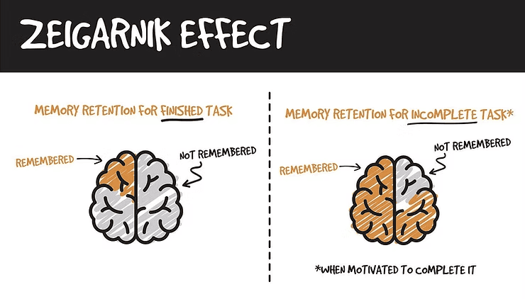
People remember unfinished tasks much more clearly than finished ones. Once a task is done, the brain dumps it. Once a task is open, the brain keeps a tab on it — literally.
A psychologist named Bluma Zeigarnik noticed this watching waiters: they remembered every detail of in-progress orders and completely forgot the details once the bill was paid. The "open loop" closed; the data got deleted.
"Unfinished tasks create a level of tension that keeps that task at the front of our minds until it is completed." — Jim Kwik
Translated to landing pages: every step of your signup, onboarding, or checkout is an open loop. Visitors who get partway in carry that loop with them. The loop is your second-best chance to convert them.
Why this matters for your conversion rate
1. Visitors come back on their own
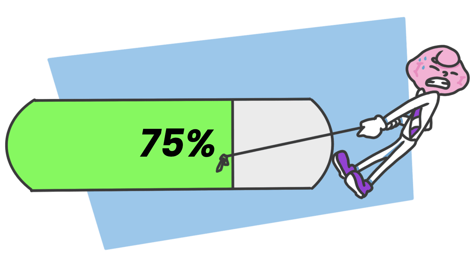
If a visitor knows they're 70% through your onboarding, the pull to finish is stronger than any push notification. The unfinished progress bar is doing the work.
2. Long flows feel survivable
Multi-step forms feel less daunting when each completed step gives a tiny dopamine hit. The brain treats each stage as a mini-finish, but the larger loop stays open and pulls them forward.
3. Cart abandon recovery is built on this
"You left something in your cart" works because the cart is an open loop. The visitor's brain was already reminding them; the email just closes the gap.
4. Where it backfires
Open too many loops and visitors burn out. Forty unfinished checklists is anxiety, not motivation. The loops have to feel close-able.
Are your conversion triggers working?
See where your page opens loops with visitors — and where it just lets them walk away.
Analyze Your Site FreeHow to use the Zeigarnik effect on your page
The pattern: open a loop, show progress, give a clear way to close it.
1. Show progress, always
The progress bar is the most powerful application. The moment a visitor sees "Step 2 of 4," the loop opens — and the pull to reach 4/4 starts working.
- Do this: Show "Step X of Y" on multi-step flows. Show "% complete" on profile setup.
- Avoid: Hiding the total number of steps. Without an end in sight, "infinite work" feels worse than "I'm 80% there."
2. Chunk long flows into stages
Big tasks scare visitors off. Break them into stages, each one a mini-completion that releases its own little dopamine hit while the big loop stays open.
- Tip: Use a "save and continue" pattern. Tells the brain the state is alive even if the tab closes.
3. Make resuming dead simple
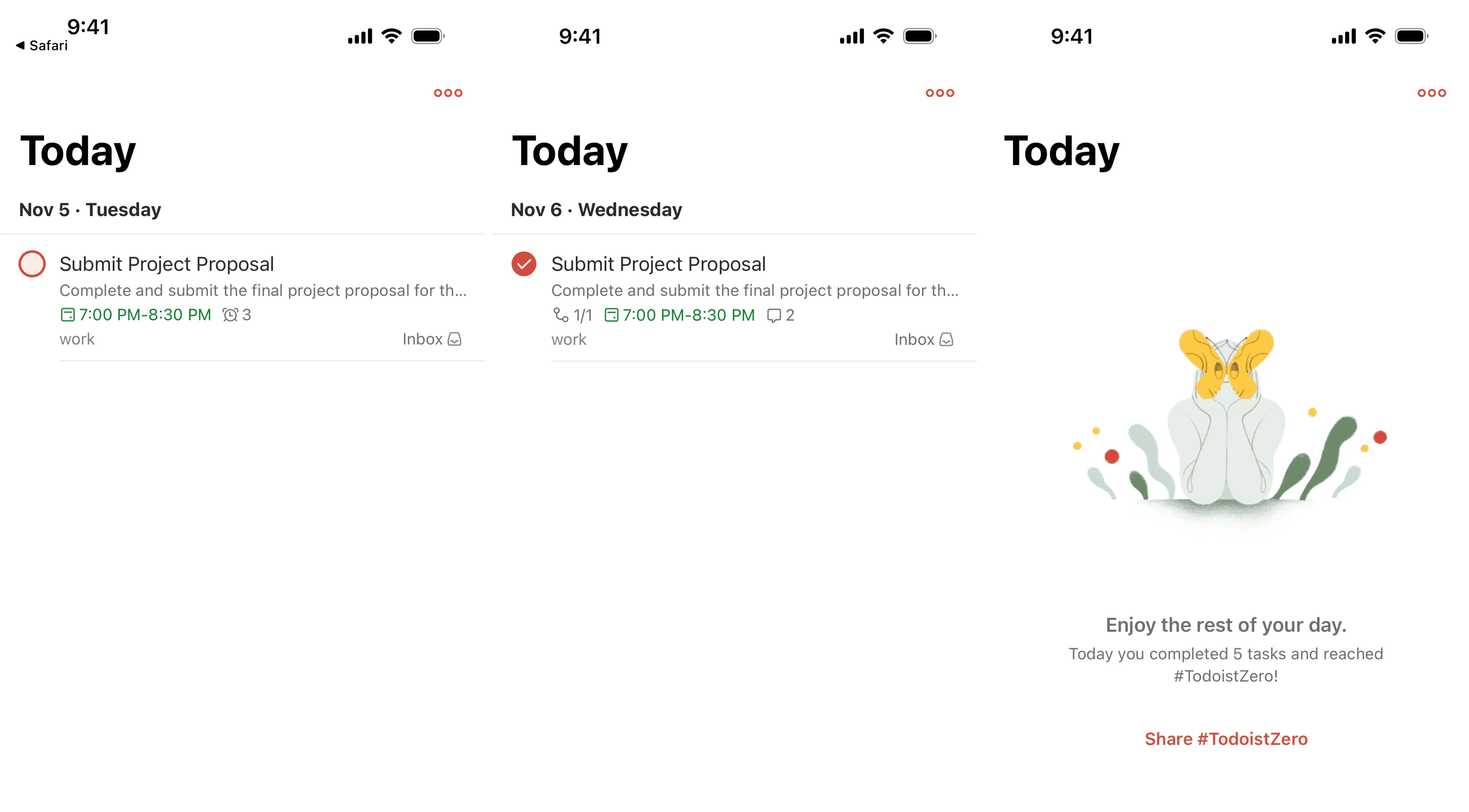
The whole pattern dies if visitors come back and have to start from zero. Save state. Email them a link to resume exactly where they were.
- Example: Netflix's "Continue Watching" is the visual loop made obvious — that thin red bar under the thumbnail is the open task.
4. End sections with a hook
For content (blogs, video, lessons), close one loop with a teaser of the next. The brain marks the next thing as "started" the second you reference it.
- Pattern: "Next, we'll cover X" at the end of every section.
- Effect: A new loop opens before the old one fully closes.
5. Use reminders sparingly
Cart abandon emails, "you left something" notifications, "complete your profile" nudges — these reactivate fading loops. Use them once or twice. After that, the tension flips into annoyance and visitors close the loop by deleting your emails.
Common ways builders break this
1. Loop overload
- The mistake: Twenty unfinished checklists, six setup wizards, a dozen "you should also" prompts.
- The fix: One main loop at a time. Pick the next step that matters. The rest can wait.
2. No reason to care
- The mistake: A progress bar on a flow the visitor doesn't actually want to finish.
- The fix: Tie completion to a real reward. "Complete your profile to get 5x more matches." Without intrinsic want, the loop is just noise.
3. The infinite trap
- The mistake: Streaks, badges, and challenges with no real end. Tension that never resolves becomes stress.
- The fix: Let people finish. Real closure is what makes the next loop trustworthy.
How real products handle it
Todoist
Todoist runs entirely on this. Open checkboxes feel itchy. Crossing them off feels great. The Karma points add a second loop on top of the first. The whole product is just well-managed cognitive tension.
LinkedIn Profile Strength
LinkedIn's "Profile Strength" meter is famous for a reason. That incomplete circle in your sidebar feels wrong. People fill in years of education, skills, and experience just to reach "All-Star" — work they would never have done if asked all at once.
See how your site compares
Our AI checks your page against the same patterns used by Todoist and LinkedIn.
Get Your Free UX ScoreRelated principles
The Zeigarnik effect works even better stacked with these:
Resources & further reading
How to Use the Zeigarnik Effect in UX
A deep-dive video from NN Group explaining the bias with practical examples.
Why You Might Be Overwhelmed
Psychology Today explores the darker side of unfinished tasks and mental health.
Frequently asked questions
Don't Guess Your UX. Scan It.
Upload your screens or paste your URL to get expert-level UX analysis in under 3 minutes.
Start Free ScanRelated Articles
Isolation Effect: Why your CTA gets lost when everything on the page tries to stand out
If every section is bold, none of them are. The Isolation Effect is how you make one thing on your landing page impossible to miss.
Recency Bias: Why the last thing on your landing page is what visitors remember
Visitors forget the middle of your page. They remember the start and the end. Here is how to design the last moment so it actually drives the click.
Anchoring Bias: Why the first number on your landing page changes how visitors judge every other number
Visitors do not evaluate your price in a vacuum. Whatever number they see first becomes the yardstick. Here is how to set anchors that make your offer feel like a steal.