Recency Bias: Why the last thing on your landing page is what visitors remember
Visitors forget the middle of your page. They remember the start and the end. Here is how to design the last moment so it actually drives the click.
Recency Bias: Why the last thing on your landing page is what visitors remember
Think about the last landing page you actually scrolled to the bottom of. What do you remember about it? Probably the headline at the top — and the last thing you saw before you left.
That's recency bias. The brain hangs onto the most recent thing it saw and quietly forgets the middle. For builders, this means your final section, your last CTA, and your closing line carry way more weight than the testimonials buried halfway down.
Most landing pages still treat the bottom as an afterthought — a tired footer, a duplicate of the same CTA, no real closing argument. That's a free conversion lever sitting on the floor.
What recency bias is
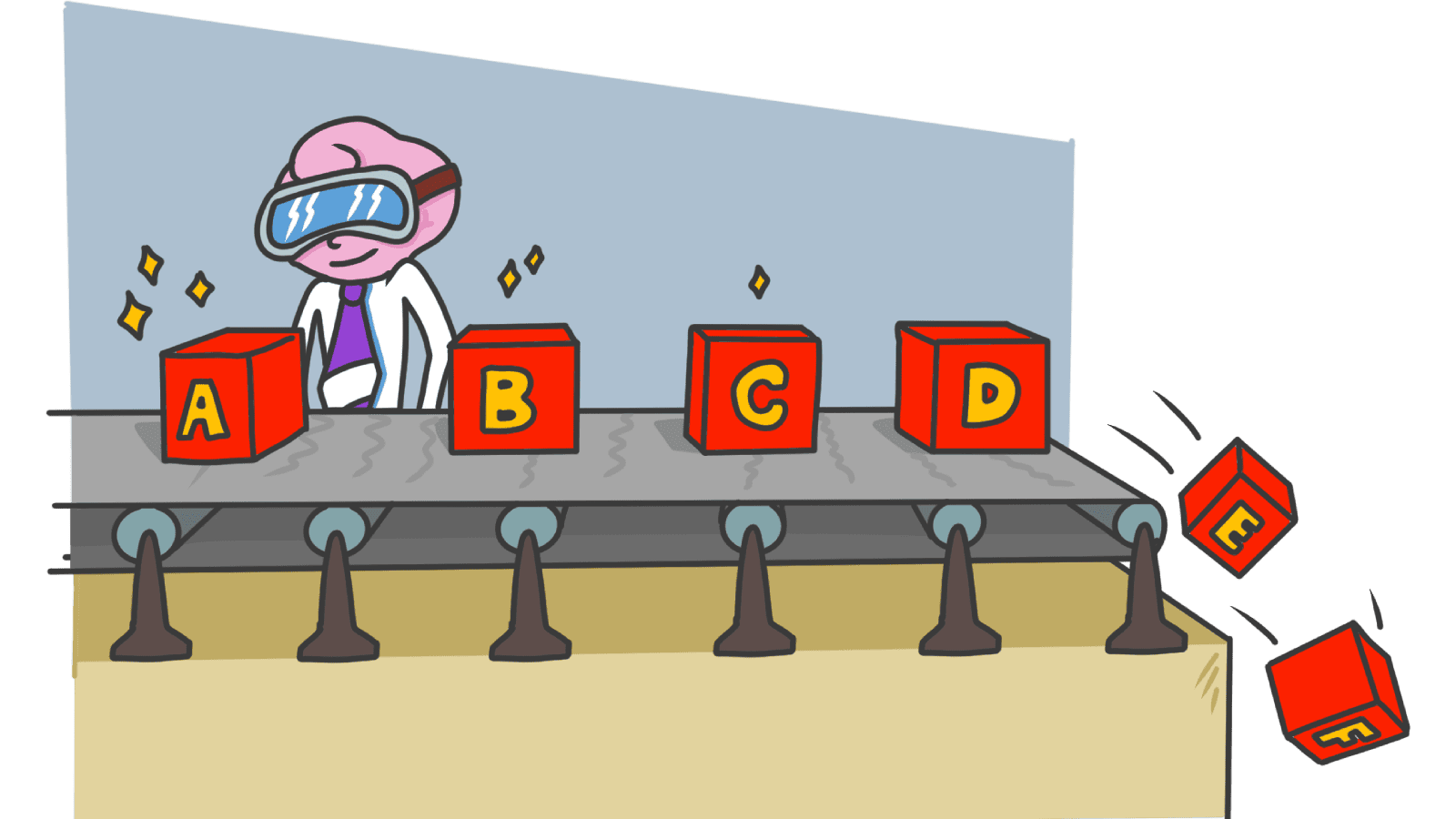
When people scan a sequence of information, the last items stay fresh in short-term memory longest. The middle gets overwritten. The end stays loud.
"What we hear last often sounds loudest in our memory." — Principle of memory psychology
This is part of the broader Serial Position Effect: the start (Primacy) sticks long-term, the end (Recency) wins short-term recall. On a landing page, where the visitor decides in seconds, recency does most of the work.
The last thing they see — the closing CTA, the FAQ, the "Thanks for reading" — is what they're holding when they decide whether to click or close.
Why this matters for your conversion rate
1. Snap decisions
Visitors don't weigh every claim on your page. They make a fast call based on the last strong impression. If your last section is weak, the whole page lands soft.
2. Brand memory
Even if they don't convert today, what they remember tomorrow is shaped by the last thing they saw. A boring footer trains them to remember your page as boring.
3. The cliffhanger problem
If your page just stops — no clear next step, no closing pitch — visitors leave with no momentum. With one well-designed final section, the same traffic converts noticeably better.
Analyze your conversion triggers
Our AI checks where the strongest moments on your page actually land — and where you are wasting them.
Scan Your Site FreeHow to use recency on your landing page
The job isn't to add filler at the bottom. It's to put your sharpest pitch where the brain remembers best.
1. Save your strongest CTA for the end
The first CTA should hook the early-decided visitors. The final CTA should close the ones still on the fence. That last button, with one clear value line above it, is the highest-leverage button on the page.
2. End every long section with a summary
After a wall of features or a long pricing comparison, finish with a one-line takeaway. That summary is what stays.
- Do this: "Order summary" before the pay button. "Key takeaways" after the article.
- Avoid: Ending a long pricing table with no recommendation. The visitor remembers confusion.
3. Repeat the core message at the bottom
If there's one line you want visitors to walk away with, say it twice — at the top and again at the end. The repetition cements it.
- Hero line: "Is your landing page ready to convert?"
- Closing line: "Your next launch deserves a second opinion."
Same idea, two memory hooks.
4. Order your menus and lists with recency in mind
In nav menus, footer links, and feature lists, the last item gets disproportionate attention.
- Do this: Put your highest-intent links — pricing, signup, "start free" — last in the nav, where visitors scan to.
- Avoid: Putting your differentiator in the middle of a 10-item list. It vanishes.
5. Design the last screen of every flow
The post-signup screen, the "thanks for subscribing" page, the success modal — these set the visitor's lasting memory of your product. A bland default screen wastes the highest-recall moment in the funnel.
For more on how the end of a journey shapes memory, see The Peak-End Rule.
Common ways builders break this
1. Burying the important stuff in the middle
- The mistake: Hiding pricing or "what's included" between feature blocks because it feels less exciting.
- The fix: Use the top for big benefits and the bottom for the actions. The middle is where memory goes to die.
2. The cliffhanger ending
- The mistake: The page just stops. No second CTA, no closing pitch, no final line.
- The fix: Always close with a clear next step. Even one line — "still curious? Run a free scan." — beats nothing.
3. Hiding negatives at the end
- The mistake: Surfacing fees or limitations at the very last step "so they don't kill the click."
- The fix: Visitors remember the surprise more than the offer. Put trade-offs upfront; close with the good stuff.
How real products handle it
Spotify
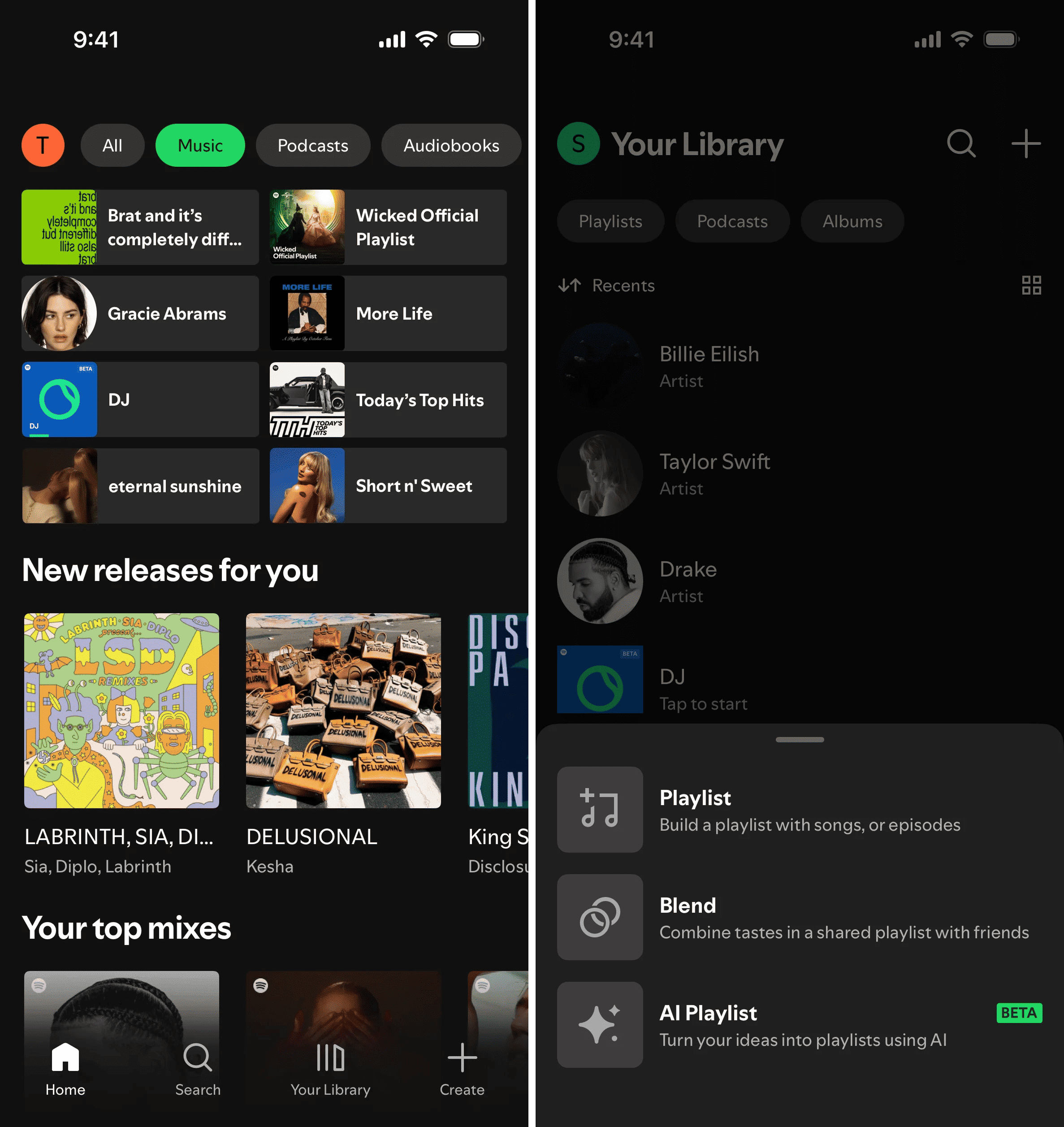
Spotify puts "Recently Played" front and center. Instead of forcing visitors to remember what they liked, they show them what they just listened to — and the brain instantly recognizes it. It's recency turned into a feature: low cognitive load, high engagement, sticky habit loop.
See how your site compares
Get a third-party check on whether your last section is closing the deal — or wasting the click.
Get Your Free UX ScoreRelated principles
Recency rarely works alone. These pair with it:
The Peak-End Rule
How the strongest moment and the final moment together decide what visitors remember.
Resources & further reading
Why do we remember items at the end of a list better?
An in-depth article from The Decision Lab explaining where this bias occurs, its psychological roots, and its effects on decision making.
The Recency Effect in UI Design
Interaction Design Foundation's guide on defining and applying the recency effect to create more intuitive user interfaces.
Frequently asked questions
Don't Guess Your UX. Scan It.
Upload your screens or paste your URL to get expert-level UX analysis in under 3 minutes.
Start Free ScanRelated Articles
Isolation Effect: Why your CTA gets lost when everything on the page tries to stand out
If every section is bold, none of them are. The Isolation Effect is how you make one thing on your landing page impossible to miss.
Zeigarnik Effect: Why unfinished signups pull visitors back to your page
Visitors who start a flow but do not finish stay haunted by it. Here is how to use unfinished tasks on your landing page to drive more conversions.
Anchoring Bias: Why the first number on your landing page changes how visitors judge every other number
Visitors do not evaluate your price in a vacuum. Whatever number they see first becomes the yardstick. Here is how to set anchors that make your offer feel like a steal.