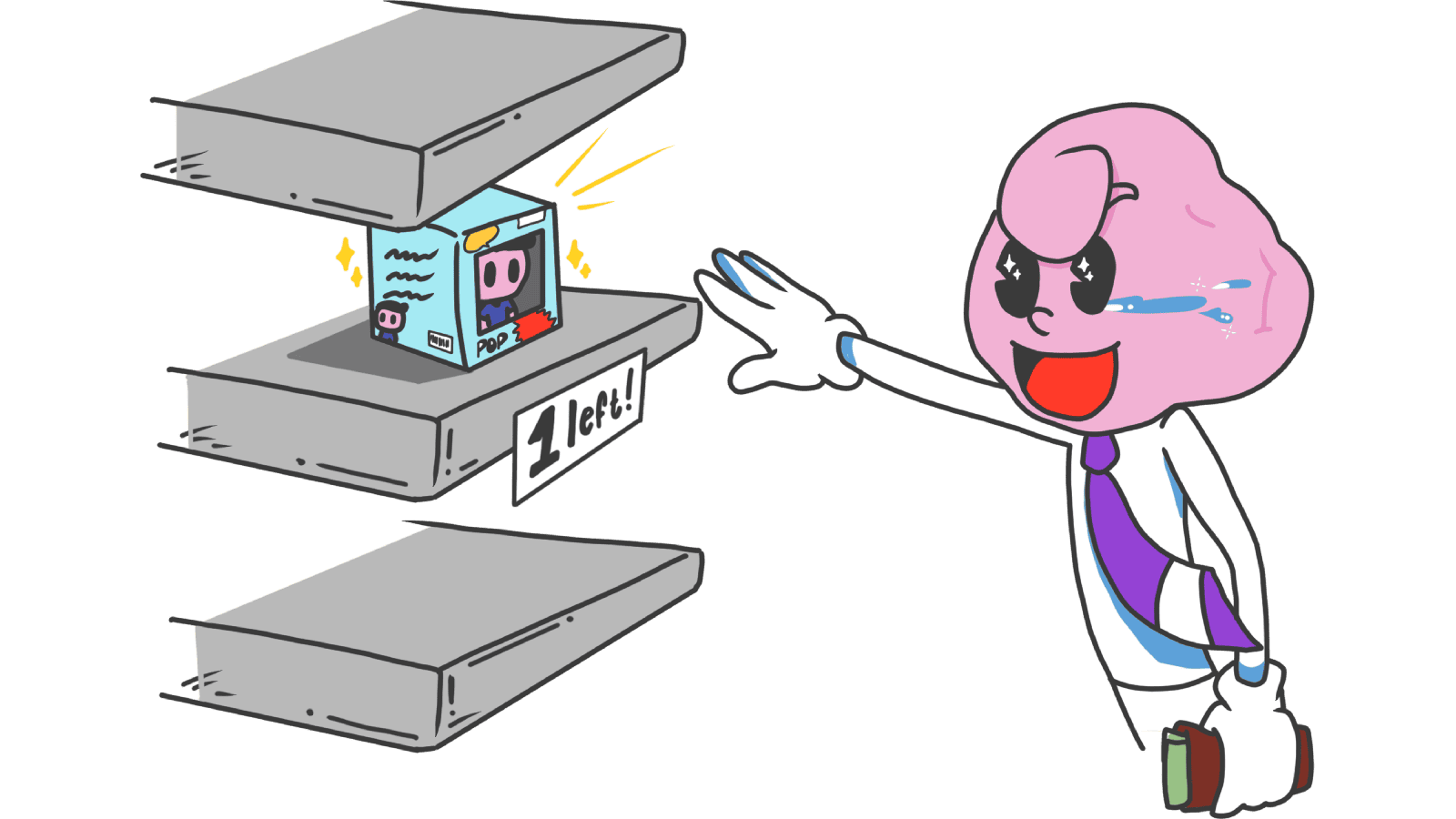
Scarcity: how to use limits on your landing page without looking sleazy
Real scarcity drives action. Fake scarcity destroys trust. Here is how to use the scarcity principle on your landing page without crossing into dark patterns.
Scarcity: how to use limits on your landing page without looking sleazy
You shipped a landing page. Visitors come, read, and leave with "I'll think about it." A week later they don't even remember your URL. The problem isn't the offer. The problem is that nothing on the page tells them to decide now.
Scarcity is the principle that fixes that. Real limits — limited spots, expiring offers, low stock — push visitors from "maybe later" to "okay, fine." But fake scarcity destroys trust faster than no scarcity at all. Here's how to use it without looking like a fly-by-night ecommerce site.
What scarcity actually is
The scarcity principle says we value things more when they're rare or hard to get. It's wired into us — for our ancestors, scarce resources were usually the most valuable. Today, that instinct kicks in when we see "only 3 spots left" or "offer ends Friday."
"The way to love anything is to realize that it might be lost." — G.K. Chesterton
On a landing page, scarcity does one thing: it removes "later" as an option. Visitors who would have bookmarked and forgotten now have to decide.
Why this matters on a landing page
Used right, scarcity is one of the strongest conversion tools you have.
Conversion
A real deadline forces visitors to switch from passive ("looks cool") to active ("am I in or out?").
Perceived value
If your beta has 50 spots and 47 are taken, visitors assume there's a reason. Scarcity becomes a quality signal.
Decision speed
Visitors stop over-analyzing minor details when there's a real risk of missing out. The decision shrinks to "yes or no."
But — and this matters — fake scarcity is a one-shot trick. The first time a visitor refreshes the page and your timer resets, your reputation is dead. They screenshot it. They post it. You don't recover.
Analyze your conversion triggers
See which persuasion techniques your landing page is missing with an instant review.
Scan Your Site FreeHow to use scarcity without crossing the line
Four flavors of scarcity, all built on real constraints.
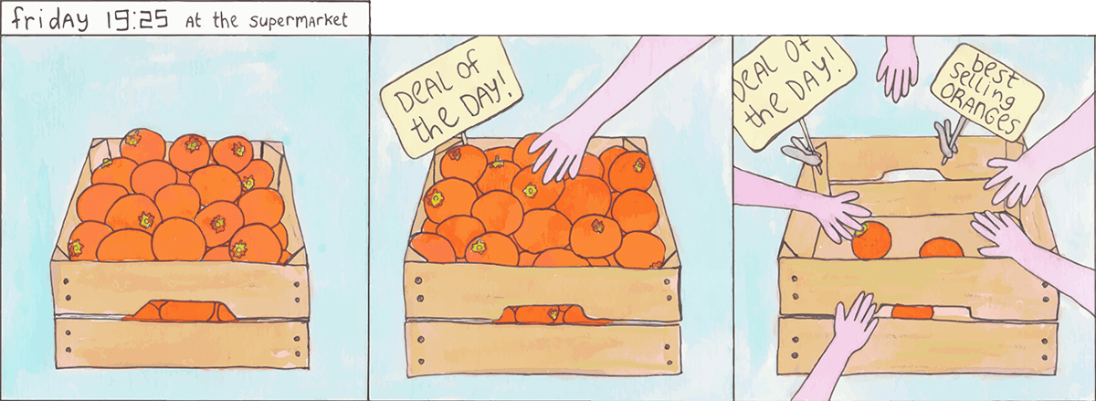
1. Quantity scarcity
Tell visitors when supply is genuinely low.
- Do this: "Only 3 cohort spots left." Be specific — specific numbers feel real.
- Avoid this: Slapping "Low stock" on items where you have hundreds in the warehouse.
2. Time scarcity
Use real deadlines — early-bird windows, launch promos, end-of-month pricing changes.
- Do this: A countdown timer for an offer that actually ends Friday at midnight.
- Avoid this: Evergreen timers that reset on every refresh. This is the dark pattern visitors will roast you for.
3. Access scarcity (exclusivity)
Restrict who can join. Closed beta, founding-member tier, invite-only — done well, this builds desire.
- Do this: "Founding member pricing for the first 100 customers, locked for life."
- Avoid this: Making access so hard that the friction outweighs the FOMO.
4. Combine with social proof
Scarcity hits hardest when paired with Social Proof. When something is scarce because others are buying, the effect compounds.
- Example: "15 people signed up in the last hour — only 2 spots left."
Common ways builders break this
1. Fake urgency
- The mistake: A countdown that doesn't correspond to anything real.
- The fix: Use timers only for genuine events — sale endings, shipping cutoffs, cohort start dates.
2. Pressure on the wrong stuff
- The mistake: Aggressive scarcity copy on something visitors need (insurance, healthcare, basic finance).
- The fix: Save scarcity for "wants," not "needs." The vibe is "fun limit," not "panic now."
3. Inconsistency
- The mistake: Saying "Sold out" on the homepage but allowing checkout on the product page.
- The fix: Sync your messaging. Mismatched signals tank trust instantly.
How real products use this
Booking.com
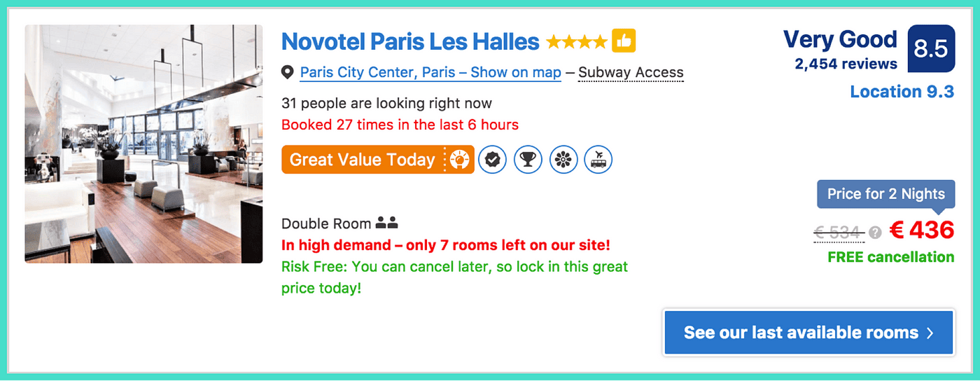
Booking.com is the most famous (and most criticized) example of scarcity in action:
- Quantity: "Only 1 room like this left on our site!"
- Social proof + scarcity: "In high demand — only 3 rooms left."
- Activity: "15 people are looking at this hotel right now."
Effective? Absolutely. But Booking has been called out for laying it on too thick. The lesson: scarcity should help visitors decide, not panic them into clicking. There's a line, and the cost of crossing it is your brand.
See how your site compares
Our AI analyzes your landing page against the same principles used by Booking.com and other conversion leaders.
Get Your Free UX ScoreRelated principles
Scarcity rarely works alone. Pair it with:
Social Proof
Why visitors trust your offer more when they see other people already chose it.
Loss Aversion
Why naming what visitors lose by leaving moves more action than promising what they gain.
Anchoring Effect
Why the first number visitors see colors how they read every price after it.
Resources & further reading
Influence: The Psychology of Persuasion
Robert Cialdini dedicates a chapter to scarcity as a tool of influence.
Scarcity in UX: The psychological pattern that became a norm
A deep dive into how scarcity has become a standard, often misused, pattern in digital design.
Frequently asked questions
Don't guess your UX. Scan it.
Upload your screens or paste your URL to get a senior-level review in under 3 minutes.
Start Free ScanRelated Articles
Decoy Effect: Why your pricing page needs a third option nobody picks
Two plans freeze visitors. Three plans, with one that looks slightly worse than your target, makes the choice obvious. Here is how to use the decoy effect ethically.
Default Effect: Why the option you pre-select on your landing page wins most of the time
Most visitors stick with whatever is already checked. That makes your default the most powerful design choice on the page. Here is how to set it without crossing into dark patterns.
Loss Aversion: Why your landing page needs to name what visitors lose by leaving
Most landing pages only sell the upside. Visitors hesitate. Loss Aversion is the missing half of the engine — here is how to use it without crossing into dark patterns.