Peak-End Rule: why how your landing page ends decides if visitors come back
Visitors don't remember every scroll. They remember the high point and the ending. Peak-End Rule shows how to design moments that stick.
Peak-End Rule: why how your landing page ends decides if visitors come back
You're chasing perfection on every section of your landing page. Every paragraph polished. Every animation tuned. And visitors still don't remember much about it. That's not a content problem — it's a memory problem.
Visitors don't remember the average of every moment on your page. They remember the high point and the ending. That's the Peak-End Rule, and once you understand it, you can stop spreading effort thin and start designing moments that actually stick.
What the Peak-End Rule actually is
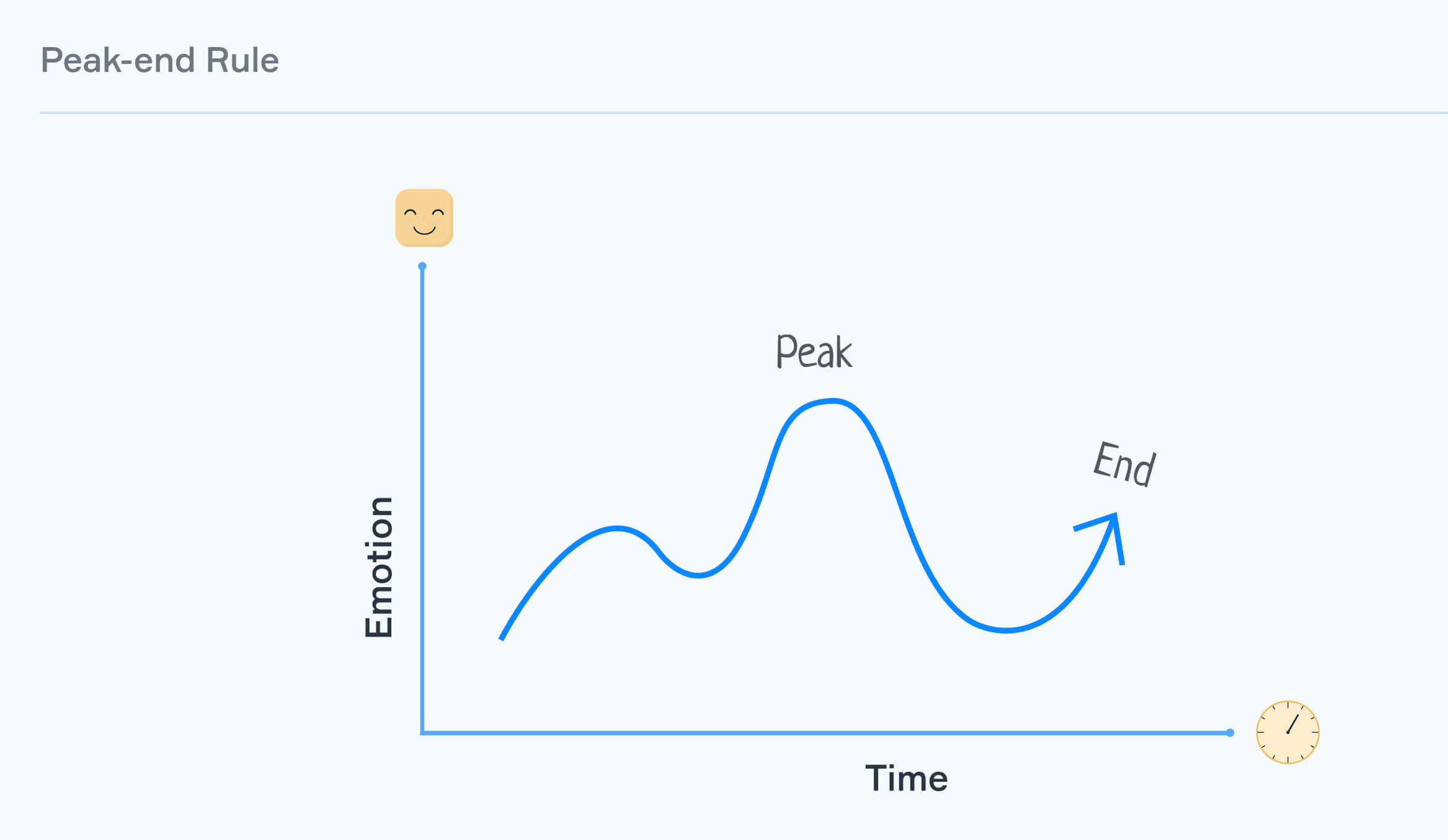
It's the cognitive bias that says people judge an experience based on its most intense moment (the peak) and how it ended — not the sum of every moment in between. Whether the experience was great or painful, those two snapshots dominate the memory.
"We don't remember experiences as they were lived, but rather as they end and in their most intense moments." — Daniel Kahneman
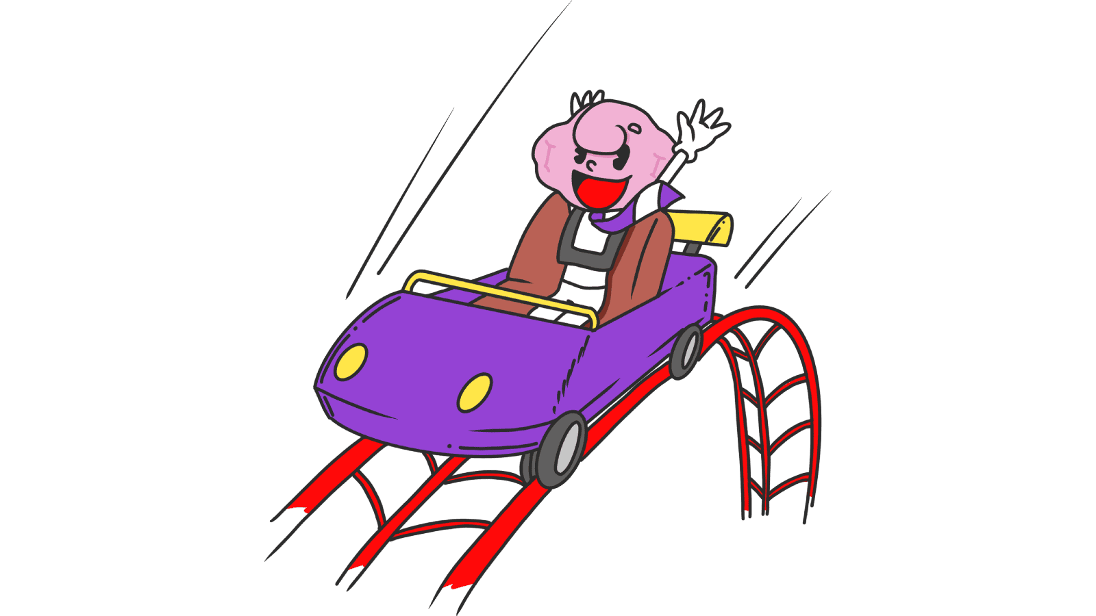
Daniel Kahneman, who coined the idea, even showed that people prefer a longer painful experience to a shorter one — as long as the longer one ends a little better. That's wild, but it's how memory works. Translated to landing pages: visitors might forgive a slow section if the success moment at the end feels rewarding.
Why this matters on a landing page
Your landing page isn't just one page anymore — it's a journey: scroll, click, sign up, see the welcome screen, get the email. Memory of that whole flow is decided by two snapshots.
Conversion
A peak during your value-prop section creates emotional momentum that pushes visitors through the signup gate.
Retention
The "Welcome, you're in" moment after signup is the ending of your acquisition flow. If it's a generic redirect, visitors forget you. If it celebrates them, they come back tomorrow.
Reviews and word of mouth
Visitors leave reviews based on what they remember. End on a high and the rating bumps. End flat and they forget you exist.
Analyze your conversion triggers
Get an instant analysis of your landing page against 80+ conversion principles.
Scan Your Site FreeHow to use the Peak-End Rule on your page
You don't need to make every second perfect. You need to nail two specific moments.
1. Find your potential peaks
Map the visitor journey. Where are the high-emotion moments — both good (signup success, first action completed) and bad (form rejection, error states)?
- Examples of good peaks: completing signup, seeing the first useful piece of content, hitting a milestone.
2. Make the positive peaks bigger
When something good happens, don't bury it in a generic "Saved." message.
- Microinteractions: A subtle confetti animation, a satisfying check, a quick haptic.
- Celebratory copy: "You're in. Let's go." beats "Account created."
- Unexpected wins: A bonus credit or a quick "you've already done X today" right after the action.
3. Smooth out the negative peaks
Every product has frustrating moments — slow loads, validation errors, dead ends. You can't always remove them. You can soften them.
- Helpful copy at points of friction: Tooltips where visitors usually get stuck.
- Progress bars so long forms feel finite.
- Empathetic error messages with a clear way out, not just "Something went wrong."
4. Nail the ending
The last screen carries massive weight. If your "Thank you" page is a redirect to a blank dashboard, you've wasted the most memorable moment.
- The farewell: Logouts, confirmations, completion screens — make them feel intentional and warm.
- Post-action value: "Your scan is ready — here's what to do next" beats a silent redirect.
5. Time your feedback request right
Never ask for a review during a frustrating moment. Wait for the high point — right after a success — and that's when you ask. Memory is at its most generous.
Common ways builders break this
1. The abrupt ending
- The mistake: Visitor finishes signup. Page redirects to an empty dashboard. No acknowledgement.
- The fix: A clear "you did it" screen with a single, obvious next step.
2. Polishing the middle, ignoring the peak
- The mistake: Every section is fine. Nothing stands out. Memory has nothing to grab onto.
- The fix: Pick one moment and make it shine. Don't spread your design love evenly.
3. Fake celebration on a broken product
- The mistake: Confetti animation after signup, then the product doesn't work.
- The fix: Peaks have to reflect real value. Otherwise visitors just feel patronized.
How real products use this
Duolingo
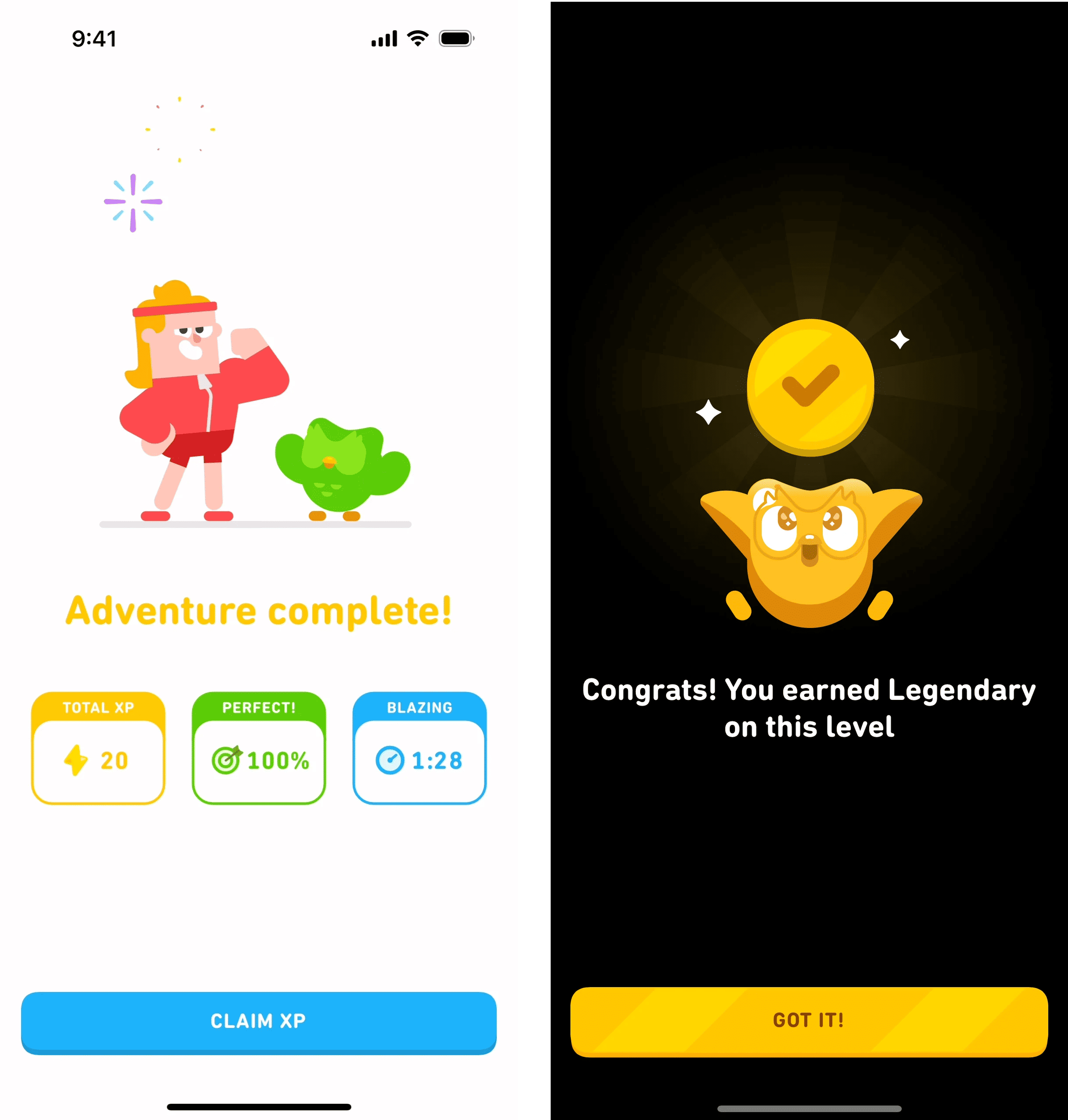
Duolingo turns the end of every lesson into the peak. XP earned, streak extended, animated celebration. By the time you close the app, your last memory is "I won." That's why people open it again tomorrow.
Disney parks

Disney days involve heat, lines, expensive snacks. Plenty of negative moments. They counter it with peaks (the rides) and they nail the end (fireworks). Visitors leave remembering the show, not the 90-minute wait.
See how your site compares
Our AI analyzes your landing page against the same principles used by Duolingo and Disney.
Get Your Free UX ScoreRelated principles
If the Peak-End Rule clicks, these are next:
Loss Aversion
Why naming what visitors lose by leaving moves more action than promising what they gain.
Social Proof
How showing other people winning with your product creates a peak for new visitors.
Resources & further reading
Thinking, Fast and Slow
Daniel Kahneman's seminal book explaining the research on the Peak-End Rule.
The Peak-End Rule: How Impressions Become Memories
NN/g article focused on the practical application of the rule in UX design.
Frequently asked questions
Don't guess your UX. Scan it.
Upload your screens or paste your URL to get a senior-level review in under 3 minutes.
Start Free ScanRelated Articles
Anchoring Bias: Why the first number on your landing page changes how visitors judge every other number
Visitors do not evaluate your price in a vacuum. Whatever number they see first becomes the yardstick. Here is how to set anchors that make your offer feel like a steal.
Attention Bias: Why visitors look right past your best feature on your landing page
Visitors do not scan your page evenly. They hunt for the one thing they care about and ignore everything else. Here is how to put it where their eyes already are.
Choice Overload: Why too many options on your landing page kill conversion
You think more choices give visitors freedom. They give them a reason to leave. Here is how to cut down options and lift conversion without losing flexibility.