The Von Restorff Effect: Using the Isolation Effect to Boost UX
Master the Isolation Effect (Von Restorff Effect) to improve memorability and conversion. Learn how visual contrast drives user action in digital design.
The Power of Different: How the Isolation Effect Guides User Behavior
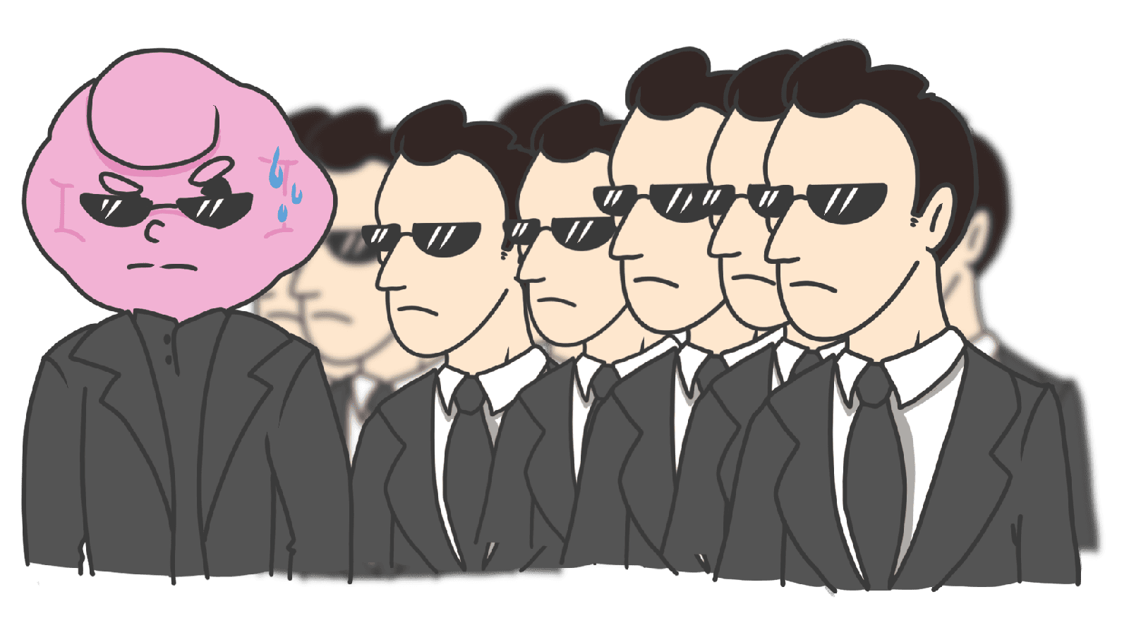
Imagine you are walking through a crowded train station where every single person is wearing a charcoal gray suit. Suddenly, you spot one individual wearing a bright yellow raincoat. An hour later, if someone asks you to describe the people you saw at the station, who is the only person you will remember with clarity?
This isn't just a quirk of observation; it is a fundamental psychological principle known as the Von Restorff Effect, or more commonly, the Isolation Effect. In the world of User Experience (UX) and User Interface (UI) design, this principle is one of the most powerful tools in a designer's arsenal. By making specific elements stand out from their surroundings, we can direct user attention, improve information retention, and significantly boost conversion rates.
In this guide, we will explore the science behind the Isolation Effect and provide actionable strategies to implement it effectively in your digital products without overwhelming your users.
What Is the Isolation Effect?
The Isolation Effect, named after psychiatrist Hedwig von Restorff who first documented it in 1933, posits that when multiple homogeneous objects are presented, the object that differs from the rest is most likely to be remembered.
Essentially, our brains are wired to notice "the different one in the crowd." In a list of words printed in black, if a single word is highlighted in red, your brain flags that item as significant. This happens because the brain constantly looks for patterns to save energy; when a pattern is broken, it triggers a heightened state of awareness and encoding in our long-term memory.
"Contrast attracts attention. Visual distinctiveness improves memorization." — Roberto Lisandro
In UX design, the Isolation Effect is the psychological foundation for why Call-to-Action (CTA) buttons are often bright colors, why "Recommended" pricing tiers are enlarged, and why notification badges are almost always a contrasting red. We are leveraging the brain’s natural tendency to prioritize the unique over the uniform.
Why the Isolation Effect Matters for Your Business
In a digital landscape where the average human attention span is shrinking, the ability to guide a user’s eye is synonymous with the ability to drive revenue. If a user cannot immediately identify the most important action on a page, they are likely to experience "choice paralysis" and bounce.
1. Improved Information Hierarchy
The Isolation Effect allows designers to create a clear "path of least resistance." By isolating the primary action, you reduce the cognitive load required for a user to decide what to do next.
2. Higher Conversion Rates
When used correctly on pricing tables or checkout pages, the Isolation Effect can steer users toward high-value options. By making a specific plan "different" (using a label like "Most Popular" or a different background color), you tap into the user's subconscious bias to follow the highlighted path.
3. Better Brand Recall
Information that stands out is information that sticks. If your key value proposition or a unique selling point (USP) is visually isolated from a block of text, users are more likely to remember it long after they have closed their browser tab.
Analyze your conversion triggers
See which persuasion techniques your site is missing with an instant psychological UX audit.
Scan Your Site FreeHow to Implement the Isolation Effect
To harness the Von Restorff Effect, you must first establish a "norm" and then strategically break it. Here is how to apply this across various UI elements:
1. Use Strategic Visual Contrast
The most common application of the Isolation Effect is through visual contrast. If your entire interface uses a palette of blues and grays, a bright orange button will immediately become the focal point.
- Color: Use a complementary color for your primary CTA.
- Size: Make the "Recommended" plan slightly larger than the others.
- Shape: If your icons are generally thin-lined, use a solid-fill icon for the most important action.
- Whitespace: Surround a critical piece of information with ample negative space to isolate it from the "noise."
2. Highlight Key Information in Text
Users rarely read every word on a screen; they scan. You can facilitate this scanning behavior by isolating keywords.
- Use bolding, italics, or a background highlight (like a digital highlighter) for crucial data points.
- Ensure links are a distinct color from the body text to make them "islands" of interactivity.
3. Break the Monotony in Lists and Tables
Data-heavy interfaces can be exhausting. To keep users engaged:
- In a pricing table, highlight one specific row or column.
- Use a "Sale" tag or a "New" badge on specific product cards in an e-commerce grid.
4. Create Distinctive Icons
If your navigation bar consists of five icons that all look like thin outlines, making the "Profile" or "Cart" icon a solid shape or a different color will make it the "isolated" element. This is particularly effective for alerts or notifications that require immediate attention.
5. Don’t Overdo the Highlighting
The Paradox of Choice applies here: if you try to highlight everything, you effectively highlight nothing. The Isolation Effect relies entirely on the presence of a "homogeneous set." If you have three "primary" buttons and four "Sale" badges on one screen, the user will become overwhelmed, and the cognitive benefit of the bias is lost.
Common Isolation Effect Mistakes to Avoid
1. Over-Highlighting (The "Las Vegas" Effect)
- The problem: When too many elements compete for attention using bright colors, animations, and large fonts, the user experiences "sensory overload."
- The fix: Follow the 60-30-10 rule for color. 60% dominant color, 30% secondary, and only 10% for your accent (isolated) color.
2. Ignoring Accessibility
- The problem: Creating contrast through color alone can alienate users with color blindness.
- The fix: Always pair color changes with a change in shape, size, or weight. Use tools to ensure your "isolated" element meets WCAG contrast ratios.
3. Misaligned Isolation
- The problem: Highlighting an element that isn't actually the most important, such as a "Cancel" button that is more vibrant than the "Submit" button.
- The fix: Map your user goals before designing. Ensure the visual "hero" of the page matches the user's primary objective.
The Isolation Effect in Action: Real Examples
Amazon

Amazon is a master of the Isolation Effect. On a page filled with thousands of products, they use vibrant red labels for "Deal of the Day" or "Limited Time Deal." By isolating these items from the standard black-and-white pricing, they create a sense of urgency and direct the user’s eye immediately to the items most likely to convert.
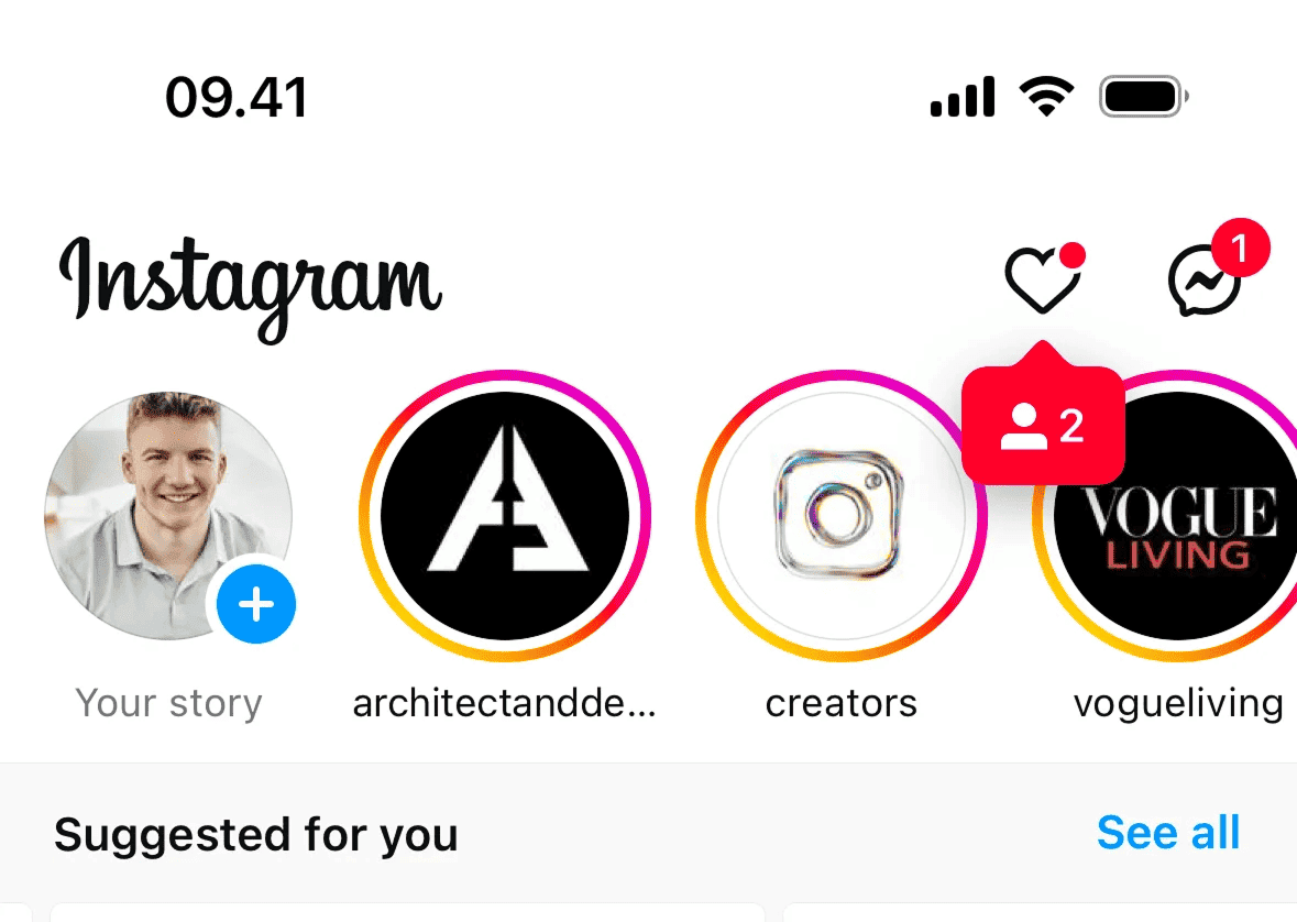
Instagram uses the Isolation Effect to drive engagement through Stories. While the feed is a vertical scroll of static or auto-playing posts, the top bar features circular avatars. When a user has a new story, a multi-colored gradient ring appears around their avatar. This visual isolation from the white background and the standard grey borders of "viewed" stories creates an irresistible urge to click.
See how your site compares
Our AI analyzes your interface against the same principles used by Amazon and Instagram.
Get Your Free UX ScoreRelated UX Principles
The Isolation Effect doesn't work in a vacuum. It is often paired with other psychological triggers to create a seamless experience:
Attention Bias
Our tendency to pay attention to emotionally charged stimuli while ignoring others.
Fitts's Law
The time to acquire a target is a function of the distance to and size of the target.
Hick's Law
The more choices you present to a user, the longer it takes them to reach a decision.
Resources & Further Reading
The Von Restorff Effect
A deep dive by The Behaviours Agency into why the brain prioritizes unique items.
Psychology in Design
An article exploring how memory-related biases like isolation affect user behavior.
Frequently Asked Questions
Don't Guess Your UX. Scan It.
Upload your screens or paste your URL to get expert-level UX analysis in under 3 minutes.
Start Free ScanRelated Articles
Recency Bias in UX: Why the Last Interaction Matters Most
Master the Recency Bias to improve user retention and conversions. Learn how the Serial Position Effect influences memory and design better UX/UI flows.
The Zeigarnik Effect: Use Unfinished Tasks to Boost UX Engagement
Discover how the Zeigarnik Effect drives user retention. Learn to use the psychology of unfinished tasks to improve completion rates and UX design.
Anchoring Bias in UX: How First Impressions Shape Value Perception
Master the anchoring bias in UX design. Learn how to use initial information to guide user perception of price, value, and task complexity for higher conversions.