Status Quo Bias: Why "10x better" still loses to "what they already use"
Visitors stick with their broken current tool because switching feels risky. Here is how to design a landing page that lowers the cost of saying yes.
Status Quo Bias: Why "10x better" still loses to "what they already use"
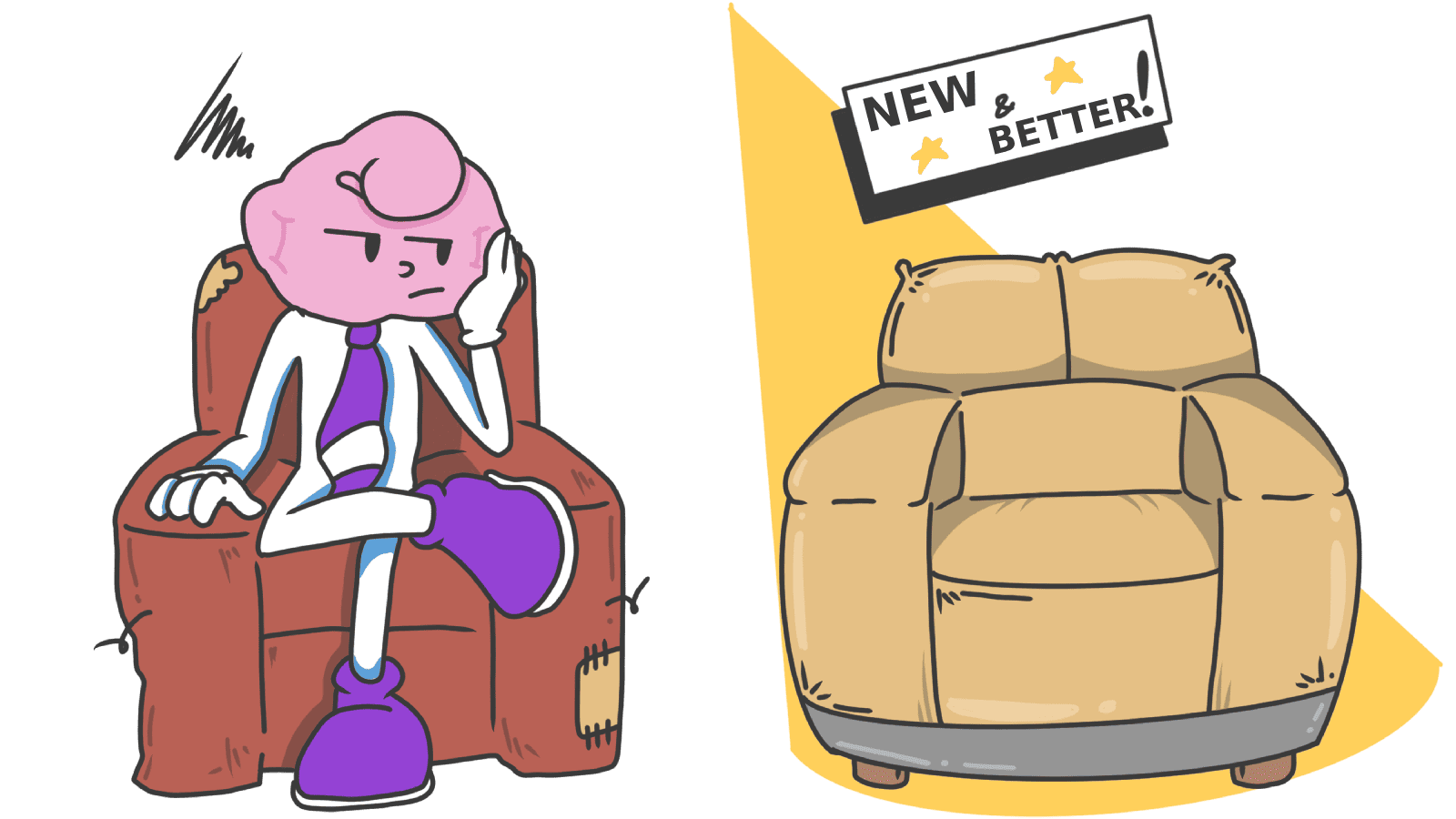
You shipped a better tool. Faster, cleaner, cheaper. You ran the numbers and they're undeniable. Yet visitors land on your page, nod along, and go back to using the slow, ugly thing they already had.
Welcome to status quo bias. The biggest competitor for most builders isn't another startup — it's the visitor's current habit. Even when your product is obviously better, switching costs feel real and immediate; the upside feels theoretical and far away.
Your landing page either lowers that switching cost or it doesn't. Most pages don't.
What status quo bias is
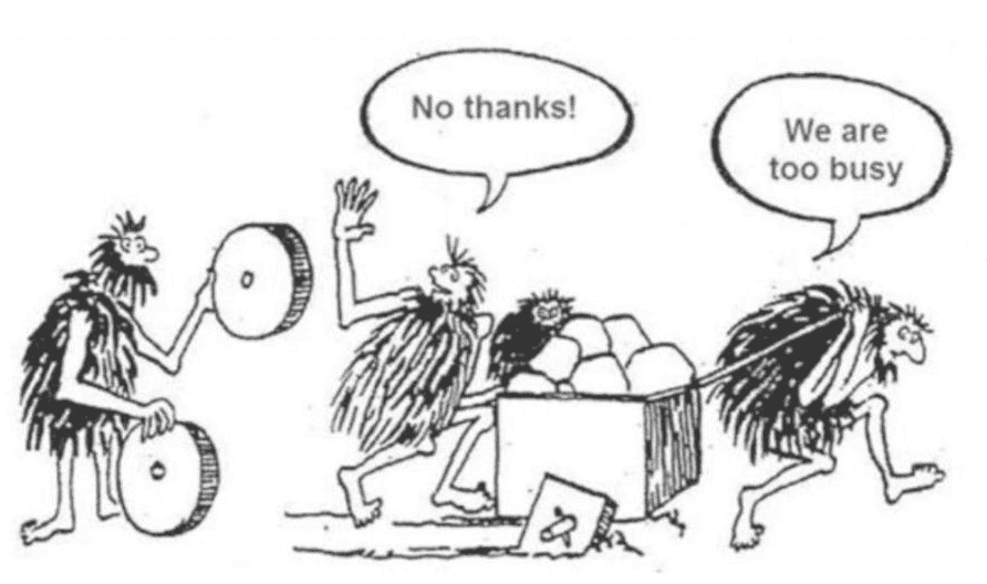
People prefer staying put, even when staying put is worse. Change requires three things the brain hates spending: effort, evaluation, and perceived risk.
"People have a general tendency to stick with their current situation or to do what they've always done." — Daniel Kahneman, Jack Knetsch & Richard Thaler
Two patterns feed it:
- Loss Aversion. Visitors weigh the loss of their current setup (familiarity, sunk time) heavier than the gain of yours.
- Sunk cost. "I already learned the old tool" feels like throwing money away if they switch.
Both are running silently behind every "I'll think about it" you get.
Why this matters for your conversion rate
1. Adoption
If switching feels expensive — even just mentally — visitors stay broken. "10x better" usually doesn't crack inertia. "10x better and 10x easier to switch" does.
2. Feature discovery
Even your existing users won't try new features that knock them off their usual path. They have a worn groove through your app; everything outside it feels like extra work.
3. Retention
The flip side: once a habit lives in your product, status quo bias works for you. That's the whole game of stickiness.
Is Status Quo Bias stopping your visitors from converting?
Get an instant analysis of your landing page against 80+ conversion principles.
Scan Your Site FreeHow to lower the cost of switching
The trick isn't to convince visitors that you're better. It's to make the move feel cheap.
1. Cut the switching cost — visibly
The single biggest unlock is removing the friction of moving over. Show visitors you've thought about their migration before they have to.
- Do this: "Import your boards from Trello in one click." "We'll migrate your data for you."
- Avoid: Making visitors recreate everything by hand.
2. Name the cost of staying
Visitors often don't realize their current setup is bleeding them. Frame the status quo not as "comfortable" but as "expensive."
- "Stop losing 5 hours a week to manual data entry."
- "Every week without this fix is more wasted ad spend."
3. Use loss framing on the headline
Instead of listing what they gain, name what they keep losing by waiting. This taps into Loss Aversion, which is the engine behind status quo bias.
- Gain frame: "Get a faster checkout."
- Loss frame: "Stop losing buyers at the last step."
4. Make trying feel risk-free
Inertia needs a small push. Free trials, "no credit card required," money-back guarantees — these all reframe trying as not-really-changing.
- On the CTA: "Try free for 14 days. Cancel in one click."
- Near pricing: "30-day refund, no questions."
5. Don't ask for the full switch on day one
Big migrations spook people. Let them try the smallest possible version first. They'll move the rest once they trust it.
- Avoid: "Migrate your whole workflow."
- Better: "Run one scan. See if you like it."
6. Make the helpful default the new status quo
Once you're inside the product, defaults are the most reliable nudge there is. Pre-select the helpful settings and visitors will stick with them by sheer inertia. See The Default Effect.
Common ways builders break this
1. The "big bang" launch
- The mistake: Redesigning the whole product overnight and forcing existing users into the new version.
- The fix: Roll out gradually. Let early users opt in. Listen, fix, then push to the rest.
2. Assuming "better" is enough
- The mistake: Building a feature comparison table and expecting people to switch on logic.
- The fix: Add proof of safe switching — testimonials from people who actually moved over, migration tools, "we'll handle it" support.
3. Long onboarding before any value
- The mistake: A 12-step tutorial before the visitor sees their first result.
- The fix: Get them to a "wow" as fast as possible. Time-to-first-value is the metric that breaks inertia.
How real products handle it
Apple (Safari)
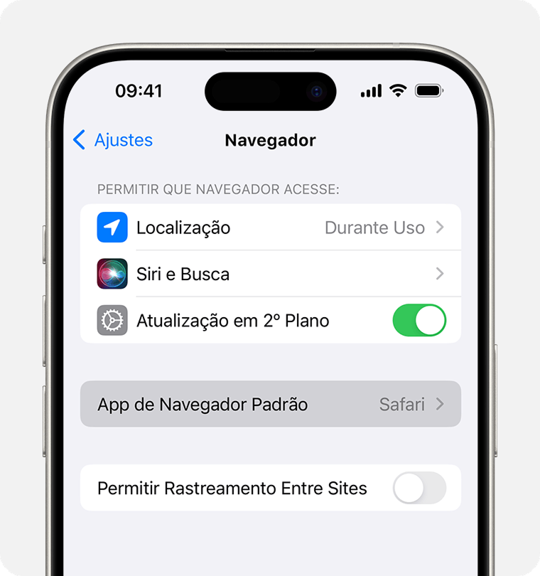
Safari is the default browser on every Apple device. Most users never change it — not because Safari is the best, but because changing it requires effort. The status quo wins by default. Lesson for builders: if you can become the default anywhere, status quo bias starts working for you.
Spotify vs. Physical Media
Spotify cracked the "but I own my music" version of status quo bias by killing the perceived risk. Free tier removed the cost of trying. "Daily Mixes" made the app feel personal within minutes. By the time you'd built playlists, switching back to owning files felt like the harder option.
See how your site compares
Get a third-party check on whether your page is making switching feel easy — or risky.
Get Your Free UX ScoreRelated principles
Status quo bias rarely works alone. Pair with:
Loss Aversion
Why naming what visitors lose by sticking with their current tool moves more action than naming what they gain.
The Default Effect
How pre-selected options quietly steer almost every choice visitors make on your page.
Resources & further reading
Status Quo Bias in Decision Making (Samuelson & Zeckhauser)
One of the seminal academic articles that documented the Status Quo Bias.
Status Quo Bias - The Decision Lab
A deep dive into why we prefer things to stay the same.
Nudge: Improving Decisions About Health, Wealth, and Happiness
The foundational book on behavioral economics and how to influence choices through design.
Frequently asked questions
Don't Guess Your UX. Scan It.
Upload your screens or paste your URL to get expert-level UX analysis in under 3 minutes.
Start Free ScanRelated Articles
Decoy Effect: Why your pricing page needs a third option nobody picks
Two plans freeze visitors. Three plans, with one that looks slightly worse than your target, makes the choice obvious. Here is how to use the decoy effect ethically.
Default Effect: Why the option you pre-select on your landing page wins most of the time
Most visitors stick with whatever is already checked. That makes your default the most powerful design choice on the page. Here is how to set it without crossing into dark patterns.
Loss Aversion: Why your landing page needs to name what visitors lose by leaving
Most landing pages only sell the upside. Visitors hesitate. Loss Aversion is the missing half of the engine — here is how to use it without crossing into dark patterns.