Color Psychology: Why your landing page palette is sending the wrong message
Visitors decide if your page feels trustworthy in seconds — color does most of the talking. Here is how to pick a palette that converts instead of confusing.
Color Psychology: Why your landing page palette is sending the wrong message
You spent two days on a palette in Figma. Then you shipped, and a friend said it "feels off" without being able to explain why.
That feeling is not random. Color is the first thing a visitor processes — before they read your headline, before they look at your CTA, before they decide whether your product is real. If the palette doesn't match the promise, the page loses authority in the first second. And no amount of clever copy gets that back.
This is what's actually going on, and what to do about it.
What color psychology actually is
Color psychology is the (well-documented) pattern that different colors trigger different feelings — calm, urgency, trust, warmth — fast, before any reading happens.
"Choosing a color is like choosing a voice to tell your story." — Eva Heller
When you pick a palette, you're picking a tone of voice. A finance app needs to feel solid (usually blue). A food app needs to feel hungry (usually warm and red). A meditation app needs to feel quiet (usually soft greens or muted earths). When the tone doesn't match the offer, visitors feel the dissonance even if they can't articulate it.
Why this matters on a landing page
Color is doing more work than your copy in the first 5 seconds. Get it right and the page feels legitimate. Get it wrong and visitors leave before reading.
First impressions
People form a gut take on a page in well under a second. Most of that take is color and layout — not words. If your palette feels off-brand for the category (think: hot pink finance app), trust drops before you've said anything.
Visual hierarchy
A high-contrast CTA tells the eye where to go without thinking. A page with five "primary" colors makes everything compete and nothing wins.
Conversion
A simple color and contrast change on the primary button can move click-through in a real way. Not magic — just the eye finally being able to find the next step.
Is your color palette working?
Get an instant review of your page against 80+ landing page principles.
Scan Your Site FreeHow to use this on your page
You don't need a brand book. You need four decisions made on purpose.
1. Decide what visitors should feel
Before you open the color picker, finish this sentence: "When someone lands on this page, I want them to feel ___ within 5 seconds."
Calm? Excited? Confident? Curious? Pick one. That word drives the palette.
Ask yourself:
- Is this a high-energy or low-energy task?
- What do my competitors look like — and do I want to fit in or stand out?
2. Pick a primary and a secondary, then stop
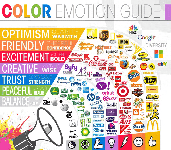
Most colors carry rough emotional weight:
- Warm (red, orange, yellow): energy, urgency, hunger, action.
- Cool (blue, green, purple): trust, growth, calm, professionalism.
Pick one primary brand color, one secondary, and a small set of neutrals. That's it. The 60-30-10 split (60% neutral, 30% secondary, 10% accent) is a safe default that almost never looks bad.
3. Sanity check across cultures and contexts
If your audience isn't local, color meanings shift. White reads as "weddings" in the West and "mourning" in parts of East Asia. Red is "luck" in China and "danger" in Western markets. Worth a quick check if you're shipping globally.
4. Pressure-test the palette for readability
A pretty palette that nobody can read is a broken palette. Check contrast ratios — body text should hit 4.5:1 against the background. See Color Accessibility for the numbers.
Common ways builders break this
Rainbow landing page
- The mistake: Five accent colors competing for attention. Every section uses a different highlight. The page screams.
- The fix: 60-30-10. One dominant neutral, one secondary, one accent for CTAs.
Color-only meaning
- The mistake: Green box for success, red box for error, no icon, no label. Color-blind visitors can't tell.
- The fix: Pair color with an icon and text. Always.
Vibrating combos
- The mistake: Highly saturated complements next to each other (bright blue on bright red), causing the "vibration" effect that hurts the eyes.
- The fix: Drop saturation on one of them, or add a neutral between them.
How real products use color
Slack

Slack ditched "boring enterprise blue" for a multi-color palette. The message: this is a place for diverse, lively communication, not stiff corporate software. The palette tells you the brand before you read a word.
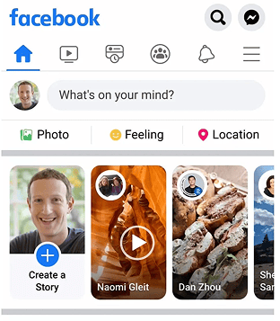
Facebook's blue isn't an accident. Blue reads as trust, reliability, and communication globally. Useful when you're asking people to share their personal data. It's also one of the few colors that stays distinct across most types of color blindness.
See how your site compares
Our AI reviews your interface against the same patterns used by Slack and Facebook.
Get Your Free UX ScoreRelated principles
Color is one piece. These are the next ones:
Color Accessibility
Make sure your color choices are readable for visitors with low vision or color blindness.
Resources & further reading
Adobe Color Wheel
Generate harmonious palettes using the color wheel and basic color theory.
Colors in Different Cultures
A visual reference for how color meanings shift across the world.
Colors.lol
A fast way to find unusual, ready-made palettes when you want to stand out.
Frequently asked questions
Don't Guess Your UX. Scan It.
Upload your screens or paste your URL to get expert-level UX analysis in under 3 minutes.
Start Free ScanRelated Articles
Color Accessibility: Why your landing page colors might be locking visitors out
Your palette looks great on your monitor. But low contrast and color-only signals quietly lose visitors. Here is the check that fixes it.
Buttons That Work: Why visitors do not click your CTA and how to fix it fast
Your CTA is right there but the click rate is flat. Buttons fail on contrast, copy, and size — here is the fix that lifts conversion without a redesign.
Jakob's Law: why your "original" landing page is confusing visitors
Visitors expect your page to work like every other site they use. Jakob's Law explains why being too creative with your UI quietly kills conversion.