Readability Rules: Why nobody reads past your hero on mobile
If visitors bounce before scrolling, your text is probably too small or too tight. Here are the four readability settings every landing page needs.
Readability Rules: Why nobody reads past your hero on mobile
You ship the page. The copy is sharp. Analytics says visitors land, scroll a few hundred pixels, and leave.
Open it on your phone. Hold it at the distance you actually use it. Try to read the body text without zooming. If you're squinting, your visitors are too — and they're not going to fight your typography to find your value prop.
Readability is the silent killer of solo-built landing pages. Tiny text, low contrast, tight line spacing. Each one is invisible in your design tool and obvious on a real phone. Fix the four below and you'll keep more visitors past the fold than any copy change.
Legibility vs readability — quick distinction
- Legibility — can the visitor tell one letter from another?
- Readability — can the visitor read a paragraph without it feeling like work?
Both matter. The best typography is the kind visitors don't notice they're reading.
"Readability should be invisible. If the user notices the effort to read, something is wrong." — Oliver Reichenstein
Hard-to-read text forces the brain to spend energy decoding letters instead of absorbing your message. Visitors don't say "your line height is tight." They just leave.
Why this matters on a landing page
Time on page
Comfortable text gets read. Uncomfortable text gets skipped. Your value prop only lands if visitors actually read it.
Conversion
If your CTA button text is hard to read, visitors don't click it. If your pricing fine print is illegible, visitors get suspicious.
Trust
Tiny gray text on white reads as "fine print." Visitors associate fine print with hidden terms. Big, generous, comfortable text reads as confident.
Accessibility
Most readability rules overlap with WCAG. Following them keeps your page usable for visitors with low vision and for anyone reading in glare or with brightness turned down.
Is your typography working?
Get an instant analysis of your landing page against 80+ conversion principles.
Scan Your Site FreeThe four readability settings every landing page needs
1. Body text at 16px minimum
12px and 14px were the standard in 2010. They are not the standard now. On mobile, anything below 16px triggers auto-zoom on form fields and forces visitors to bring the phone closer to their face.
Do: 16px minimum for body. 18px is better for marketing pages. Don't: Use 12px for "elegance." It looks elegant in Figma and broken on a phone.
2. High contrast — aim for 7:1 on body
Contrast is the difference in luminance between text and background. Light gray on white might look "subtle" in your editor. Outside in sunlight, it disappears.
Do: Run your colors through a contrast checker. Aim for at least 7:1 on body text. See Color Accessibility. Don't: Use light gray on white or medium gray on dark. Your designer brain might love it. Real visitors won't read it.
3. Line height around 1.5x
Line height (the vertical space between lines) decides whether your paragraph feels like a paragraph or a wall.
Do: Set body line-height to 1.5x the font size (so 24px line height for 16px text). Tighten to 1.2x for large headings. Don't: Use the default 1.0–1.1. The lines pile on top of each other and visitors give up.
4. Use a real font weight, not a hairline
Thin (100) and Hairline (200) weights look gorgeous in design tools and disappear on real screens — especially when brightness is low.
Do: Use Regular (400) or Medium (500) for body. See Word Weight for the full picture. Don't: Use weights below 300 for anything you actually want visitors to read.
Common ways builders break this
Long lines of text
- The mistake: Body text that runs the full width of a 1440px monitor — 120 characters per line. The eye gets lost between the end of one line and the start of the next.
- The fix: Cap line length at 45 to 75 characters. Use a max-width on your text containers.
Headers that look like body text
- The mistake: Sections that all look the same size and weight. Visitors can't scan.
- The fix: Make hierarchy obvious. Distinct size jumps between H1, H2, and body. See Size Matters.
Centering paragraphs
- The mistake: Centering long blocks because they "look balanced." The eye has to hunt for the start of every line.
- The fix: Left-align anything more than three lines. See Text Alignment.
How real products do this
Medium

Medium is the gold standard for digital reading. Generous 1.5–1.6x line height, generous font size, generous space around the text. The space isn't empty — it's keeping the reader inside the paragraph.
The New York Times
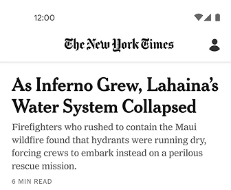
The Times packs much more onto the page than Medium does, and it still reads cleanly. The trick is strict hierarchy — distinct serifs for stories, sans-serifs for navigation and metadata. Visitors always know where they are.
See how your site compares
Our AI checks your readability settings and 80+ other landing page details in under 3 minutes.
Get Your Free ScanRelated principles
Readability is one piece. These pair with it:
Color Accessibility
Pick colors that work for visitors with low vision and on screens with glare.
Resources & further reading
Material Design: Typography
Google's reference for type sizes, weights, and spacing systems.
Apple Typography Guidelines
The readability rules Apple uses across iOS and macOS.
Frequently asked questions
Don't Guess Your Page. Scan It.
Paste your URL or upload a screenshot. Get a full landing page review with conversion risks, copy feedback, and what to fix first. It's just 3 minutes.
Start Free ScanRelated Articles
The Power of Fonts: Why your landing page feels off and your typeface is the reason
Same words, different font, different conversion. Here is how to pick a typeface that matches your product and stops killing your hero section.
Buttons That Work: Why visitors do not click your CTA and how to fix it fast
Your CTA is right there but the click rate is flat. Buttons fail on contrast, copy, and size — here is the fix that lifts conversion without a redesign.
Jakob's Law: why your "original" landing page is confusing visitors
Visitors expect your page to work like every other site they use. Jakob's Law explains why being too creative with your UI quietly kills conversion.