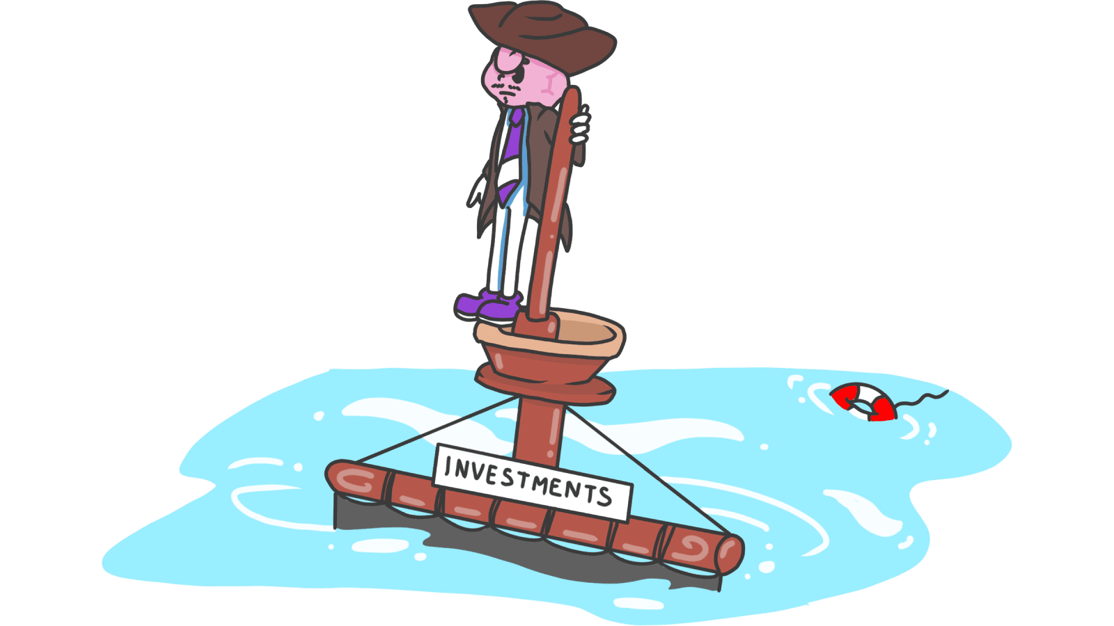
Sunk Cost Fallacy: Why visitors stay with broken tools — and how to free them
Visitors stay with bad products because they already invested time. Here is how to design a landing page that turns sunk cost into a reason to switch.
Sunk Cost Fallacy: Why visitors stay with broken tools — and how to free them
You're talking to a potential user. They know their current setup is bad. The reports look ugly, the flow is slow, half the team has quietly stopped using it. And yet — "we've spent three years setting it up. We can't really switch now."
That's the sunk cost fallacy. People keep paying into something just to justify what they already spent. For builders, this shows up everywhere: visitors who agree your product is better, then go back to the broken thing they know.
The fallacy can also work for you — once visitors invest a few minutes in your product, leaving feels like a waste. The job is to design around both sides.
What the sunk cost fallacy is
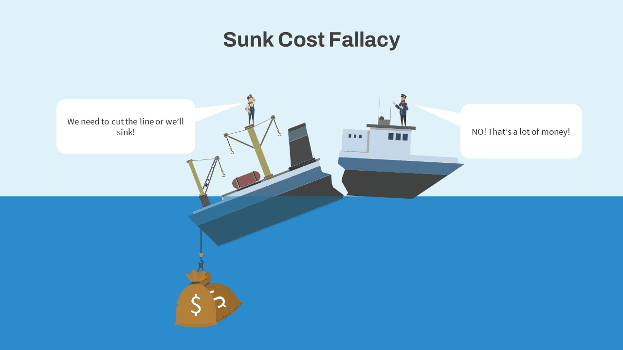
People keep going on a path because they've already invested in it — money, time, learning, emotion — even when stopping would be smarter. The investment is gone either way. But the brain treats abandoning it as "wasting" it.
"The sunk cost fallacy keeps people for too long in poor jobs, unhappy marriages, and unpromising research projects." — Daniel Kahneman
On a landing page this looks like:
- "I've already filled out three pages of this form, might as well finish."
- "I've used Tool X for two years. I can't switch now, I know all its quirks."
- "We already paid for this annual plan, no point evaluating alternatives."
It's irrational and extremely common.
Why this matters for your product
Sunk cost is a double-edged tool. Used right, it boosts retention. Used wrong, it traps users and destroys trust.
Where it hurts
When a visitor feels stuck on your page because they "already invested" — already filled in info, already learned the flow — they finish out of obligation, not enthusiasm. They won't come back.
Where it helps
If your product helps the visitor build something — a saved scan history, a configured workspace, a list of past reports — every minute they invest makes leaving harder. That's healthy stickiness, not entrapment.
Where it costs you
Internally, sunk cost is also why builders keep features that aren't working. "We spent a quarter on it" isn't a reason to keep something visitors don't use.
Analyze your conversion triggers
Find out which moments on your page are pulling visitors in — and which are just wasting their time.
Scan Your Site FreeHow to use sunk cost on your landing page (without being shady)
1. Find where sunk cost lives in your funnel
Map every place a visitor spends real time before getting to value: signup, onboarding, configuration, first scan. Each of those is a sunk cost the brain will weigh heavily.
The question to ask yourself: are visitors finishing because they want to, or because they don't want to "waste" the time they already put in?
 Source: Slide Bazaar
2. Pitch on future value, not past pain
When you're trying to flip someone from a competitor, don't focus on what they wasted using the old tool. Focus on what they save starting tomorrow.
- Avoid: "You've been wasting hours on the old tool."
- Better: "Your next launch deserves a second opinion."
3. Help them carry their progress over
If a visitor's main reason for staying with their current tool is "I have all my data there," show up with a migration plan. Imports, exports, switching credits.
- Imports: "Bring your existing reports over in one click."
- Switching offer: "Coming from Tool X? We'll cover your last month."
4. Use progress to build the right kind of stickiness
Once visitors are inside your product, surface their investment in a way that feels like recognition, not handcuffs. Related: Effort Justification.
- Year-in-review summaries: "Here's what you've built this year."
- Progress bars: "You're 80% through onboarding."
The visitor sees value in finishing because they want the result, not because the page is guilt-tripping them.
5. Always make restart cheap
If a visitor took a wrong turn — set up wrong, picked the wrong plan, started the wrong flow — let them reset without losing everything. The freedom to undo investment makes them more willing to invest in the first place.
Common ways builders break this
1. The roach motel
- The mistake: Buried cancel buttons. Mandatory phone calls to downgrade. "Are you sure?" five times.
- The fix: Make leaving easy. If your product is good, they'll stay. If they only stay because they can't find the exit, they'll spend their last week telling everyone they hate you.
2. Keeping dead features
- The mistake: Cluttering the UI with old features because "we already built them."
- The fix: Use data. If 2% of users touch a feature, hide it or kill it. Sunk cost shouldn't decide your roadmap.
3. Guilt-trip copy at cancellation
- The mistake: "Are you sure you want to throw away all the time you've invested?"
- The fix: Acknowledge what they built, but respect their choice. "You're keeping access until [date]. Your data export is here." Trust now; they may come back later.
How real products handle it
Amazon
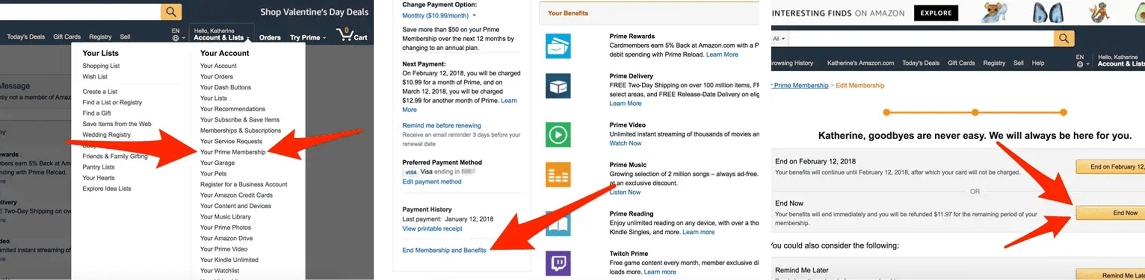
Amazon's Prime cancel flow is the textbook (and slightly aggressive) sunk cost play. It shows you exactly what you used: shipping savings, hours of video, months remaining. Framing the cancel as a loss of past investment makes people second-guess. Effective for retention, but flirts with dark pattern territory if the exit gets too hidden.
See how your site compares
Get a third-party check on whether your page builds healthy stickiness — or just traps visitors.
Get Your Free UX ScoreRelated principles
Sunk cost works hand-in-hand with these:
Loss Aversion
Why naming what visitors lose by leaving moves more action than naming what they gain.
The Endowment Effect
Why the workspace and configuration visitors set up in your product feel like theirs.
Resources & further reading
The Sunk Cost Fallacy: Why We Continue With an Investment Even If It's Rational to Quit
A deep dive by The Decision Lab into the evolutionary and psychological roots of this bias.
Predictably Irrational by Dan Ariely
A foundational text on how irrationality—including sunk costs—influences our daily decisions.
Frequently asked questions
Don't Guess Your UX. Scan It.
Upload your screens or paste your URL to get expert-level UX analysis in under 3 minutes.
Start Free ScanRelated Articles
Endowment Effect: how to make visitors feel like your product is already theirs
Visitors value what they own. The Endowment Effect explains why free trials, personalization, and "your" copy turn casual signups into loyal users.
Anchoring Bias: Why the first number on your landing page changes how visitors judge every other number
Visitors do not evaluate your price in a vacuum. Whatever number they see first becomes the yardstick. Here is how to set anchors that make your offer feel like a steal.
Attention Bias: Why visitors look right past your best feature on your landing page
Visitors do not scan your page evenly. They hunt for the one thing they care about and ignore everything else. Here is how to put it where their eyes already are.