The Power of Fonts: Why your landing page feels off and your typeface is the reason
Same words, different font, different conversion. Here is how to pick a typeface that matches your product and stops killing your hero section.
The Power of Fonts: Why your landing page feels off and your typeface is the reason
You ship the page. The copy is sharp. The colors look good. But the whole thing feels somehow generic, or somehow wrong, and you can't say why.
Try this: change the font. Same words, same layout, different typeface. Suddenly the page reads like a real product instead of a template.
Type is the voice of your page. Visitors hear it before they read a word. Pick a font that doesn't match your product and you're undercutting every other decision you made.
What "the power of fonts" actually means
Every font carries a feeling. A jagged horror typeface and a soft script can spell the exact same word and tell you completely different things.
"Typography is a voice. It can be formal or casual, friendly or authoritative." — Ellen Lupton
The "power" is psychological. A heavy bold reads as confident. A thin light feels delicate. A geometric sans feels engineered. A high-contrast serif feels considered. Pick the one whose feeling matches what you sell.
Why this matters on a landing page
First-impression trust
Visitors decide if your page looks legit in well under a second. Type is one of the first signals. A clean, well-set typeface signals "this is a real company." A generic system font on a hero headline signals "this was thrown together."
Hierarchy
The size and weight of your type tells visitors where to look. A 48px bold headline does the work of an arrow. A wall of 14px gray text does the opposite.
Conversion
If your CTA button text is hard to read, you lose money. The most expensive font choice is one that makes "Get started" look like fine print.
Brand fit
Your font should agree with your product. A friendly humanist sans on a kids' learning app — yes. The same font on a fintech compliance dashboard — visitors will pause and not know why.
Is your typography working?
Get an instant analysis of your landing page against 80+ conversion principles.
Scan Your Site FreeHow to pick the right font
1. Decide what your product should sound like
Before opening Google Fonts, write down three words. Trustworthy. Modern. Playful. Premium. Technical. Calm.
Now match those words to a font category. Geometric sans for tech. Humanist sans for friendly SaaS. Serif for premium or editorial. Slab serif for bold and confident.
2. Pick between serif and sans
The most common decision:
- Serif — feet on the letters. Reads as traditional, authoritative, considered. Works for media, finance, premium goods.
- Sans-serif — no feet. Reads as modern, clean, fast. The default for SaaS and most digital products.
Going deeper: Serif or Sans?.
3. Optimize for screen, not for Figma
A font that looks elegant at 80px in your design tool can look fragile at 16px on a real laptop. Test at the sizes you'll actually ship.
- Look at body text on a phone, in daylight, with brightness turned down.
- Check the x-height (the height of the lowercase letters). Generous x-heights read better on screens.
- Avoid hairline weights for anything you actually want people to read.
For the technical settings, see Readability Rules.
4. Match the tone
A "fun" rounded font on a banking app creates the same friction as a serious font on a kids' app — visitors feel the mismatch even when they can't name it. Pick a font whose vibe agrees with the product.
Common ways builders break this
Using too many fonts
- The mistake: Four or five different typefaces on one page. The design fragments.
- The fix: Two fonts max. One for headings, one for body. Use weights for variety, not new fonts.
Ignoring contrast
- The mistake: Light gray on white because it "looks clean." Visitors squint, then leave.
- The fix: Run your colors through a contrast checker. Aim for 7:1 on body text.
Forgetting line height
- The mistake: Body text with default line height. The lines pile on top of each other.
- The fix: Set body line-height to roughly 1.5x. Tighter for headings.
How real products do this
Disney
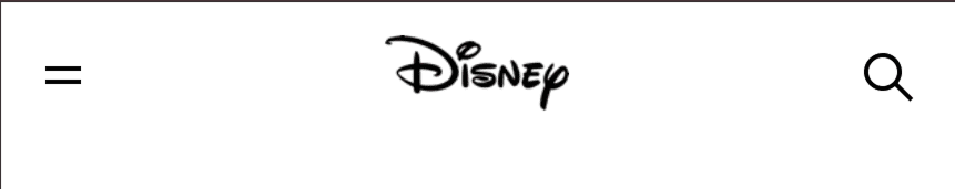
Disney's custom cursive is instantly recognizable and instantly says "magic, family, story." That font would be wrong for almost every other product. For Disney it's the entire brand.
Google uses Roboto everywhere. It's geometric enough to feel engineered, open enough to feel friendly. It scales from a smartwatch face to a 4K display without breaking. That's the boring superpower of a great body font — you stop noticing it.
See how your site compares
Our AI checks your fonts and 80+ other landing page details in under 3 minutes.
Get Your Free ScanRelated principles
Type is one piece. These pair with it:
Readability Rules
Line length, spacing, and contrast settings that make your copy comfortable to read.
Resources & further reading
Google Fonts
The default library for free, web-optimized fonts.
Font Pair
A quick way to find typeface combinations that already work well together.
Frequently asked questions
Don't Guess Your Page. Scan It.
Paste your URL or upload a screenshot. Get a full landing page review with conversion risks, copy feedback, and what to fix first. It's just 3 minutes.
Start Free ScanRelated Articles
Readability Rules: Why nobody reads past your hero on mobile
If visitors bounce before scrolling, your text is probably too small or too tight. Here are the four readability settings every landing page needs.
Buttons That Work: Why visitors do not click your CTA and how to fix it fast
Your CTA is right there but the click rate is flat. Buttons fail on contrast, copy, and size — here is the fix that lifts conversion without a redesign.
Jakob's Law: why your "original" landing page is confusing visitors
Visitors expect your page to work like every other site they use. Jakob's Law explains why being too creative with your UI quietly kills conversion.