Images: Why your hero stock photo is making your product feel cheap
Generic stock photos make visitors leave before reading your headline. Pick images that build trust — here is how to choose ones that lift conversion.
Images: Why your hero stock photo is making your product feel cheap
You shipped your landing page. The hero has a generic stock photo of people pointing at a laptop. Visitors land, glance once, and decide your product is forgettable before they read the headline.
Images set the emotional tone of your page in milliseconds. Visitors process them before words. Bad images don't just look ugly — they make your product feel cheap, generic, or untrustworthy. Good images do the heavy lifting your copy can't. This guide breaks down how to choose them.
What good image design really is
It's the deliberate choice of every visual on your page — hero, thumbnails, illustrations, infographics — to support what the visitor is supposed to feel and understand.
If an image isn't doing a job, it shouldn't be on the page.
"Illustrations and images in interfaces need to be intentional: every pixel must have a purpose." — Brad Frost
Visitors find meaning in patterns. Strong visuals reduce mental work — visitors get the message without reading. Weak ones add noise.
Why images matter on a landing page
The right images do three things at once.
Trust and emotion
Faces, real environments, and authentic photography signal trust. A fintech with friendly illustrations lowers anxiety. A premium tool with crisp screenshots signals quality.
Scannability
Visitors don't read; they scan. Images become anchors that stop the eye. A clear screenshot, a labeled diagram, a feature illustration — all work as visual signposts.
Conversion
Generic stock photos cause "banner blindness" — visitors assume they're ads and skip them. Authentic imagery (real product, real team, real screenshots) builds proof that converts.
Are your images working?
Get an instant AI review of your page against 80+ conversion principles.
Scan Your Site FreeHow to use images on your page
You need a tiered approach — different image types for different jobs.
1. Pick the right image type
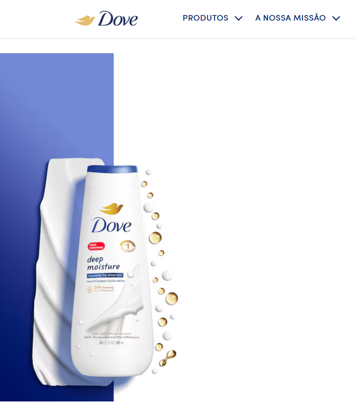
a. Hero images
The face of your page. High-impact, high-quality. The hero either reinforces the value prop or wastes prime real estate.
b. Thumbnails
Visual previews — in cards, lists, or galleries. Aspect ratio consistency matters more than the image itself.
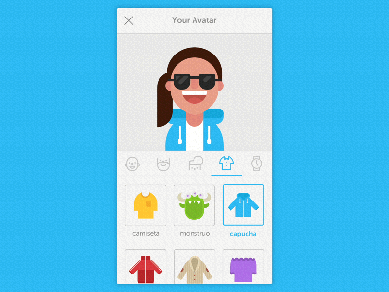
c. Avatars
Represent users or brands. Logos for companies, real photos or clean graphics for users.
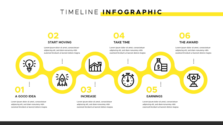
d. Graphics and infographics
Numbers and shapes that explain data faster than a paragraph can.
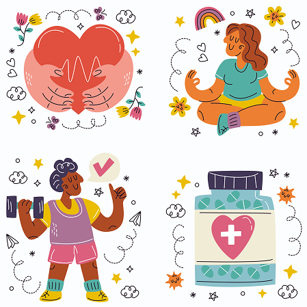
e. Illustrations
For abstract concepts photography can't capture. Stylized, branded, custom — they signal personality.
2. Best practices
Set a clear focal point
The eye should know where to land first. On responsive layouts, make sure the focal point doesn't get cropped on mobile.
- Do this:
object-fit: coverand intentionally framed subjects. - Don't: Let the important part of the photo get sliced off on a 375px viewport.
Optimize file size
High quality doesn't mean huge files. Slow images kill UX and SEO.
- Do this: WebP or AVIF. Use
srcsetto serve smaller files to smaller screens. - Don't: Drop a 5MB PNG for a thumbnail.
Get accessibility right
Always provide alt text. Screen readers depend on it.
- Do this: Describe the intent — "founder using laptop in coffee shop" beats "image."
- Don't: Stuff keywords or leave alt blank on important images.
Common ways builders break this
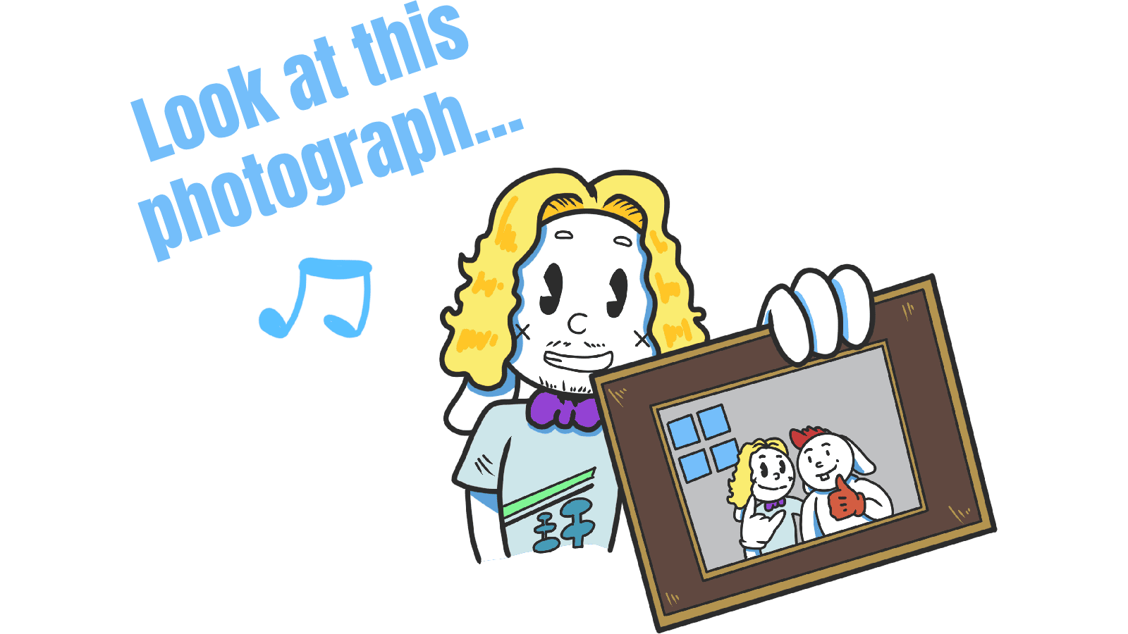
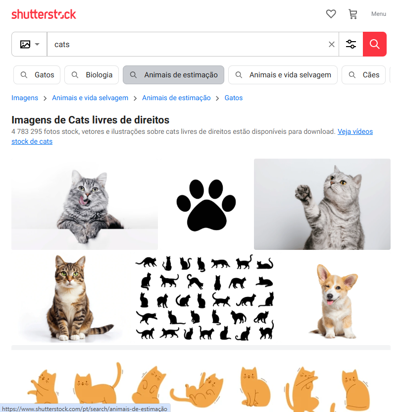
Cheesy stock photos
- The mistake: Generic boardroom high-fives, "diverse team smiling at laptop."
- The fix: Real product screenshots, real team photos, or curated authentic stock from Unsplash.
Unreadable text overlays
- The mistake: White text over a busy hero image. Visitors can't read the headline.
- The fix: Dark gradient overlay, blur, or pick images with intentional negative space for text.
Mixed visual styles
- The mistake: 3D illustrations, flat icons, and grainy stock photos all in the same page.
- The fix: Pick one style and use it everywhere — minimalist, line art, claymorphism, whatever fits the brand.
How real products do this
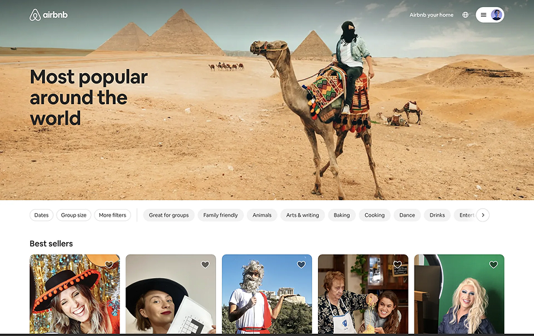
Airbnb
Airbnb uses hero images to sell aspiration. The visitor pictures themselves in the rental before they read the headline. The photos do the marketing.
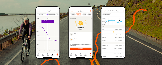
Strava
Strava turns data into images — maps of routes, graphs of performance, athlete avatars. The visuals make achievements feel personal and shareable.
See how your site compares
Our AI checks your page against the same patterns used by Airbnb and Strava.
Get Your Free UX ScoreRelated principles
Images live inside a system. These shape how yours feel:
Iconography
When a small icon does the job better than a heavy image.
Resources & further reading
Storyset
A massive bank of customizable illustrations.
Undraw
Beautiful, open-source illustrations for every project.
Unsplash
The internet's source for freely usable high-quality images.
Pexels
Free stock photos and videos shared by talented creators.
Frequently asked questions
Don't Guess Your UX. Scan It.
Upload your screens or paste your URL to get a senior-level page review in under 3 minutes.
Start Free ScanRelated Articles
Buttons That Work: Why visitors do not click your CTA and how to fix it fast
Your CTA is right there but the click rate is flat. Buttons fail on contrast, copy, and size — here is the fix that lifts conversion without a redesign.
Button Structure: Why your CTA blends in and how to build a system that gets clicked
Visitors hesitate at your CTA because the button hierarchy is broken. Here is the structure — primary, secondary, states — that makes pages convert.
Cards: How to turn a wall of features into a grid visitors actually scan
Your feature section reads like a wall of text. Cards break it into scannable units — here is how to design them so visitors stop, read, and click.