Header and Footer: How to anchor your site so visitors never feel lost
Visitors land deep on a blog post and bounce because there is no nav. Headers and footers anchor your site — here is how to build them so visitors stay.
Header and Footer: How to anchor your site so visitors never feel lost
You shipped your landing page. Someone lands deep on a blog post from Twitter. They want to check pricing, but the header has no nav, just a logo. They bounce.
Headers and footers are the structural anchors of your site. They tell visitors who you are, what's available, and where to go next. When they're missing or weak, visitors get lost — and lost visitors don't convert.
What headers and footers actually do
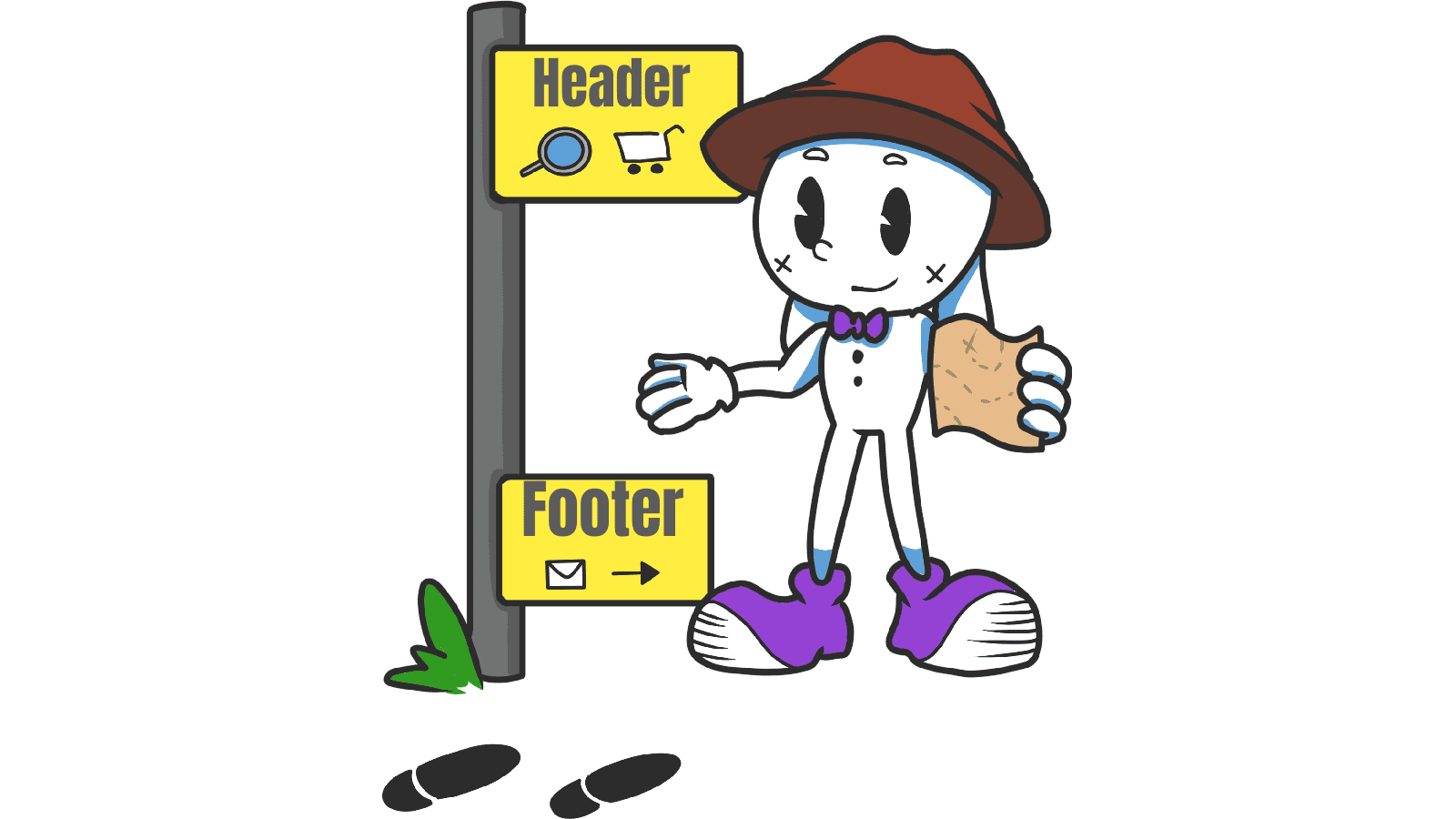
Headers anchor the top of every page. They show your brand, the main paths, and usually the primary CTA. They're the first thing visitors see and the way they orient.
Footers anchor the bottom. They catch visitors who scrolled all the way through your content and offer a "what's next" — secondary nav, legal links, social, a final CTA.
"Headers and footers are like road signs — they help users navigate with confidence, knowing where they are and where they can go." — Steve Krug
Both are signal-rich zones. Visitors learn to look there for orientation. Skip them and your page feels rootless.
Why these anchors matter
They're the most-seen elements on your entire site.
Orientation
Most visitors don't enter through your homepage. They land on blog posts, pricing pages, or specific feature pages from search and social. A consistent header tells them whose site they're on and what else is here.
Less mental effort
Predictable layouts let visitors rely on muscle memory. They shouldn't have to learn your specific site — they should be able to navigate by pattern.
Conversion
A "Get started" button in the header means the path to action is one tap away from anywhere. A newsletter signup or final CTA in the footer catches visitors who finished reading and want a next step.
Compliance and trust
Privacy, terms, accessibility — visitors look in the footer. Skip them and you both hurt trust and risk legal headaches.
Is your navigation working?
Get an instant AI review of your page against 80+ conversion principles.
Scan Your Site FreeHow to build effective headers and footers
Balance is everything. Empty hurts. Overloaded also hurts.
1. When you need a header
Almost always. Specifically:
- Multiple sections or product categories.
- High-frequency tools — search, cart, profile.
- Brand recognition matters at the landing moment.
2. Header best practices
Keep it tight. 5–7 main links. If you have more, group them or move them to the footer.
- Logo: Top-left or center, always linked to home.
- Sticky vs static: For long pages, sticky cuts navigation time. Make it slim once visitors scroll.
- CTA emphasis: Style your primary action so it stands out from nav links — that's where you want visitors to act.
3. When you need a footer
Always, even on a single-page landing site. Specifically:
- Secondary nav (about, careers, press).
- Trust signals (logos, certifications, social proof).
- Legal stuff (privacy, terms, accessibility).
- A final CTA for visitors who scrolled all the way down.
4. Footer best practices
Group with clear column headers — Company, Product, Support.
- Type size: Smaller than body, but still readable. Hit WCAG contrast.
- Final CTA: Don't let the page just end. A signup, a "back to top," or a clear next step.
- Padding: Enough breathing room that the footer doesn't feel like a junk drawer.
Common ways builders break this
Kitchen-sink header
- The mistake: Every page jammed into the top nav — 14 links, no hierarchy.
- The fix: Top tier in the header, secondary in the footer or a mega menu.
Mobile breakage
- The mistake: A header that eats 40% of the screen on mobile, or a footer that becomes an endless scroll of links.
- The fix: Hamburger for the header, accordions for footer columns.
Low contrast
- The mistake: Light gray on white. Looks "elegant," reads as unreadable.
- The fix: 4.5:1 contrast minimum for nav text.
Infinite scroll, no footer
- The mistake: Visitors literally can't reach the footer.
- The fix: Use a sticky sidebar or a "Load more" button so footer access stays possible.
How real products do this
YouTube

YouTube's fixed header keeps search always reachable. Visitors can scroll through 800 comments and still find a new video without scrolling back to the top. Search is centered because search is the action.
Stripe
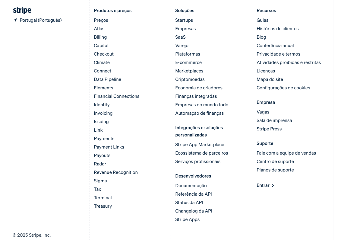
Stripe's footer is a sitemap in disguise. Dozens of links, organized in a clean grid with subtle typography. Developers and decision-makers can find docs, legal, or pricing instantly without losing the page.
See how your site compares
Our AI checks your page against the same patterns used by YouTube and Stripe.
Get Your Free UX ScoreRelated principles
Headers and footers connect to everything else. These shape how yours feel:
Resources & further reading
Material Design: Header
Google's official reference for flexible header design and behavior.
Frequently asked questions
Don't Guess Your UX. Scan It.
Upload your screens or paste your URL to get a senior-level page review in under 3 minutes.
Start Free ScanRelated Articles
Buttons That Work: Why visitors do not click your CTA and how to fix it fast
Your CTA is right there but the click rate is flat. Buttons fail on contrast, copy, and size — here is the fix that lifts conversion without a redesign.
Button Structure: Why your CTA blends in and how to build a system that gets clicked
Visitors hesitate at your CTA because the button hierarchy is broken. Here is the structure — primary, secondary, states — that makes pages convert.
Cards: How to turn a wall of features into a grid visitors actually scan
Your feature section reads like a wall of text. Cards break it into scannable units — here is how to design them so visitors stop, read, and click.