Gestalt principles: why your landing page feels messy (even when it isn't)
Visitors can't tell why your page feels off — but Gestalt principles can. Group, connect, and align your elements so the eye reads them in seconds.

Gestalt principles: why your landing page feels messy (even when it isn't)
You shipped a landing page. The copy is good. The colors are fine. But something feels off. A friend tells you "it just looks busy" and they can't say why. You can't either.
That's a Gestalt problem. Your brain instinctively groups things on a page — by proximity, similarity, and visual connection. When those groupings get muddled, every section looks "off" even if every individual element is fine.
Get the grouping right and the whole page suddenly feels effortless to scan.
What Gestalt principles actually are
Gestalt is German for "form" or "shape." A group of psychologists in early 1900s Germany figured out that the brain doesn't read a page element by element — it reads patterns. Headers + nav links + a logo aren't three things to a visitor. They're "the header."
"A good interface doesn't need to be explained, it simply makes sense." — Don Norman
There are seven Gestalt principles in total. The three that decide if your landing page feels organized or chaotic are: Proximity, Similarity, and Uniform Connectedness. Master those and your page reads like it had a designer.
Why this matters on a landing page
Visitors don't read your page. They scan it. Gestalt is what makes scanning easy.
Cognitive load
When elements group correctly, visitors don't have to "figure out" your layout. They just see the structure.
Scannability
A clear visual hierarchy lets visitors jump straight to the section they care about — usually the CTA or pricing.
Trust
Pages that feel organized read as professional. Pages where things float randomly read as "amateur" — and amateurs don't get your credit card.
Is your interface working with or against the brain?
Get an instant analysis of your landing page against 80+ conversion principles, including Gestalt grouping.
Scan Your Site FreeHow to use Gestalt on your page
Stop looking at single elements. Start looking at the space between them.
1. Group related things — Proximity
Things close together are read as a group. Things far apart are read as separate.
How to apply:
- Forms: Label sits right next to its input. Different sections (shipping vs. billing) get extra space between them.
- Nav: Group related links tightly, push unrelated stuff (logout, profile) farther away.
- Whitespace is a tool, not a leftover. It's the cheapest way to communicate grouping.
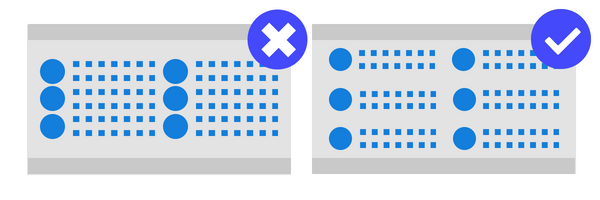
- ✅ Do this: 8px between a heading and its body. 32px before a new section.
- ❌ Avoid this: A button equally spaced between two unrelated blocks — visitors don't know which it belongs to.
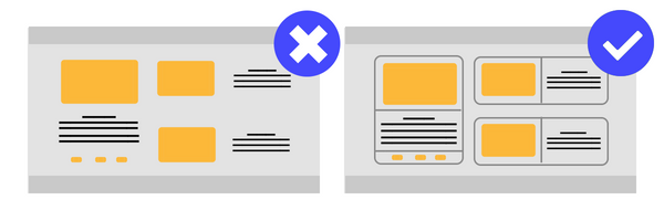
2. Make patterns consistent — Similarity
Things that look alike are read as related. Color, shape, size, all of it.
How to apply:
- CTAs: Every primary CTA on the site looks the same. Same color, same shape, same size.
- Links: All clickable text uses the same color. If one is blue, all are blue.
- Alerts: Red = error. Green = success. Yellow = warning. Stick to the rules.
- ✅ Do this: Pick one icon style (outline or filled) and use it everywhere.
- ❌ Avoid this: Different "submit" button colors on different pages. You're forcing visitors to relearn.
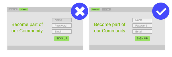
3. Connect related elements — Uniform Connectedness
Things visually connected — a shared border, a card, a background tint — are read as more related than things just placed near each other.
How to apply:
- Cards: Use them to group an image, a title, and a price into one unit.
- Containers: Subtle backgrounds to group settings, widgets, or pricing tiers.
- Steppers: Lines connecting steps in a checkout — visitors instantly read it as a single flow.
✅ Do this: A light grey background "well" containing a group of related settings. ❌ Avoid this: Boxes inside boxes inside boxes. Too many borders and the page becomes visual noise.
Common ways builders break this
1. Accidental proximity
- The mistake: "Delete" sitting right next to "Save" with no spacing.
- The fix: Big spacing between opposite actions — and ideally, different colors too.
2. Broken similarity
- The mistake: Using your CTA color for a non-clickable heading.
- The fix: Reserve specific colors for specific functions. If "primary blue" means "click me," nothing else gets to be blue.
3. Over-boxing
- The mistake: A border around every single element.
- The fix: Use whitespace first. Add borders only when grouping by space alone isn't clear enough.
How real products use this
99 Taxi — Proximity

99 Taxi groups "Driver," "Passenger," and "Help" tightly together as a single nav block. The "I want to be a driver" CTA sits visually apart with extra whitespace around it. The brain reads the difference instantly: those are nav links, this one is special.
Mercado Libre — Similarity
Every product card on Mercado Libre uses the exact same size, background, and structure. Visitors can scan a hundred products without their brain re-loading. Then they break the pattern on the selected item — making it bigger — and the eye snaps to it.
See how your site compares
Our AI analyzes your landing page against the same Gestalt principles used by 99 Taxi and Mercado Libre.
Get Your Free UX ScoreRelated principles
If Gestalt clicks, these are next:
Hick's Law
Why too many options on the page slow down or paralyze visitor decisions.
Resources & further reading
Andy Rutledge Article
Principles of Gestalt Perception.
The Law of Similarity
Interaction Design Foundation - Gestalt Principles (Part 1).
Proximity and Connectedness
Interaction Design Foundation - Gestalt Principles (Part 2).
Frequently asked questions
Don't guess your UX. Scan it.
Upload your screens or paste your URL to get a senior-level review in under 3 minutes.
Start Free ScanRelated Articles
Jakob's Law: why your "original" landing page is confusing visitors
Visitors expect your page to work like every other site they use. Jakob's Law explains why being too creative with your UI quietly kills conversion.
Miller's Law: why your landing page feels overwhelming (and visitors leave)
Visitors can only hold a few things in their head at once. Miller's Law shows why crammed navs and walls of text crush conversion — and how to chunk it down.
Aesthetic-Usability Effect: why your ugly landing page feels broken (even when it works)
Visitors decide your product is good or bad in 50ms. The Aesthetic-Usability Effect explains why beautiful pages feel easier — and convert better.