Aesthetic-Usability Effect: Why Beautiful Design Wins
Discover the Aesthetic-Usability Effect. Learn why attractive interfaces are perceived as more usable and how to balance beauty with functionality.

Aesthetic-Usability Effect: Why Beautiful Design Wins (and Where It Fails)
Have you ever visited a website and felt an immediate sense of trust just because it looked professional? Or perhaps you’ve used an app that was slightly confusing, yet you found yourself forgiving its minor flaws because the interface was simply stunning? This isn't a coincidence; it is a documented psychological phenomenon known as the Aesthetic-Usability Effect.
In the world of User Experience (UX), first impressions are formed in as little as 50 milliseconds. Within that blink of an eye, users have already decided whether your product is trustworthy, high-quality, and—crucially—easy to use. While we are taught not to "judge a book by its cover," in digital product design, the cover often dictates the entire reading experience.
In this guide, we’ll explore the balance between form and function, the psychology behind why humans favor beauty, and how you can leverage the Aesthetic-Usability Effect to create more successful products without sacrificing the core utility your users need.
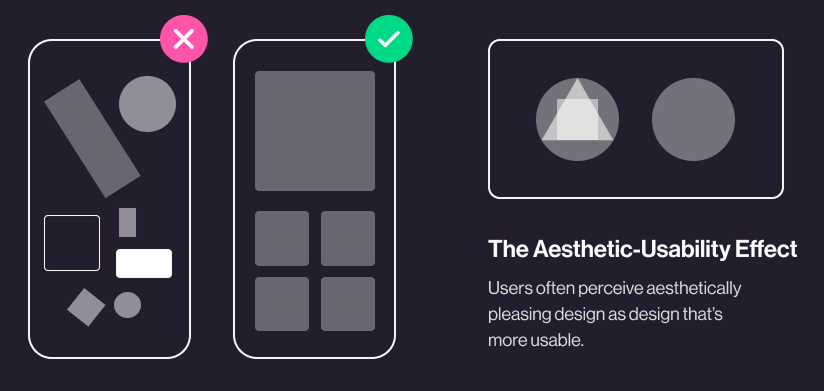
What Is the Aesthetic-Usability Effect?
The Aesthetic-Usability Effect refers to users' tendency to perceive attractive products as more usable. When an interface is visually appealing, users experience a positive emotional response. This response triggers a "halo effect," where the positive feelings generated by the aesthetics spill over into the user's evaluation of how well the product actually works.
Essentially, beauty masks minor usability friction. If a user finds a design beautiful, they are more likely to be patient with minor errors, confusing navigation, or slow loading times.
"Good design is aesthetic. Only well-executed objects can be beautiful." — Dieter Rams
The concept was first researched in 1995 by researchers Masaaki Kurosu and Kaori Kashimura at the Hitachi Design Center. They found a stronger correlation between the participants' ratings of aesthetic appeal and perceived usability than between aesthetic appeal and actual usability. This discovery revolutionized how we think about UI design: it’s not just "eye candy"—it's a fundamental part of the user's cognitive process.
Why the Aesthetic-Usability Effect Matters
Understanding this law is vital for designers, founders, and product managers because it directly impacts user adoption and long-term retention.
1. The Power of First Impressions
Aesthetics serve as the "hook." In a crowded marketplace, a visually superior product will almost always win the initial click. It creates a sense of perceived value before the user has even interacted with a single button.
2. Increased User Tolerance
No product is perfect. When a user encounters a bug or a confusing workflow in a "ugly" app, they often feel frustrated and judge the product as incompetent. However, when that same issue occurs in a beautiful, polished app, users are more likely to think, "Oh, I must have made a mistake," or simply overlook the glitch. This "grace period" is essential for retaining users during their learning curve.
3. Brand Trust and Credibility
A polished interface signals that the company cares about details. If a site looks dated or messy, users subconsciously worry about the security of their data or the reliability of the service. High-quality aesthetics act as a proxy for professional credibility.
4. Competitive Advantage
If two apps offer the exact same functionality, the more attractive one will win. In a "feature-parity" world, design is often the only remaining differentiator that can drive conversion and organic word-of-mouth growth.
Is your interface working?
Get an instant analysis of your interface against 80+ UX principles.
Scan Your Site FreeHow to Implement the Aesthetic-Usability Effect
Applying this law isn't about adding "glitter" to a bad product. It’s about creating a harmonious synergy between what the user sees and what the user does. Here are four steps to master this balance:
### 1. Invest in Professional Aesthetics
To trigger the effect, your interface must look intentional. This involves a deep focus on the fundamentals:
- Typography: Use a clear typographic hierarchy to guide the eye.
- Color Theory: Use colors that evoke the right emotions and ensure high contrast for readability.
- Grid and Spacing: Consistent white space (or negative space) prevents the "clutter" that kills perceived usability.
### 2. Don’t Sacrifice Functionality
This is the most dangerous pitfall. A beautiful interface that is impossible to navigate is a "pretty failure."
- ✅ Do this: Ensure that your primary Call to Action (CTA) is the most prominent element, even if it "breaks" a perfectly minimal layout.
- ❌ Avoid this: Hiding essential menu items behind a "hamburger" icon just to make the homepage look cleaner if it results in users getting lost.
### 3. Test with Real Users
Because aesthetics are subjective, what looks "intuitive" to a designer might be "confusing" to a user.
- Perception Testing: Show users a screenshot for 5 seconds and ask what they think the product does.
- Usability Testing: Watch them try to complete a task. If they struggle but say "I love the look of it," you are seeing the Aesthetic-Usability Effect in action—but you still need to fix the underlying usability issue.
### 4. Balance Simplicity and Sophistication
Avoid "visual noise." Every element on the screen should have a purpose. If a decorative element distracts from the user's primary goal, it's not good design; it's a distraction.
- Consistency: Use a design system to ensure that buttons, icons, and input fields look and behave the same way across the entire application.
Common Aesthetic-Usability Mistakes to Avoid
1. The "Dribbble" Syndrome
- The problem: Designing for "likes" rather than users. This results in ultra-thin fonts, low-contrast colors, and hidden navigation that looks great in a portfolio but fails in the real world.
- The fix: Always prioritize accessibility (WCAG standards) over "minimalist" trends that hinder readability.
2. Over-Animating the Interface
- The problem: Using excessive motion graphics that slow down the user’s journey or cause motion sickness.
- The fix: Use animation purposefully to provide feedback (e.g., a button press) rather than just for decoration.
3. Ignoring Information Architecture
- The problem: Focusing so much on the "look" of the page that the logical flow of information is lost.
- The fix: Map out your user flow in wireframes before applying high-fidelity UI styles.
Aesthetic-Usability Effect in Action: Real Examples
Spotify
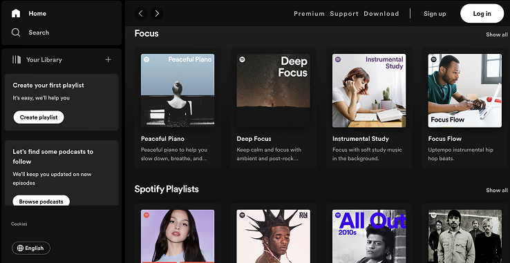
Spotify is a masterclass in the Aesthetic-Usability Effect. Their music player uses high-quality album art as a backdrop, creating a deeply immersive and "beautiful" experience. Because the UI is so visually pleasing, users often overlook minor frustrations like occasional navigation changes.
Why it works: Spotify uses personalization to enhance aesthetics. The "Made For You" playlists aren't just functional; the custom-generated covers make the user feel like the app was designed specifically for them, increasing both perceived and actual value.
Duolingo
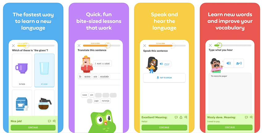
Learning a language is hard, but Duolingo makes it feel easy through visual delight. The use of bright colors, friendly characters (Duo the owl), and satisfying animations for correct answers creates a positive emotional state.
Why it works: The "beauty" of Duolingo is its friendliness. By making the interface look like a game rather than a textbook, they reduce the cognitive "threat" of learning. Users are more willing to stick with the difficult task of practicing a language because the environment feels safe and fun.
See how your site compares
Our AI analyzes your interface against the same principles used by Spotify and Duolingo.
Get Your Free UX ScoreRelated UX Principles
Understanding how the Aesthetic-Usability Effect interacts with other laws will make you a better designer.
Hick’s Law
Understand how the number of choices affects user decision time.
Jakob's Law
Users spend most of their time on other sites; design for familiarity.
Resources & Further Reading
For those who want to dive deeper into the psychology of design, we recommend these essential resources:
Nielsen Norman Group
In-depth article on the importance of aesthetics in the perception of usability.
Human Interface Guidelines
Apple's design standards, highlighting how to balance aesthetics and usability.
Material Design
Google's guidelines for creating beautiful and functional interfaces.
Frequently Asked Questions
Don't Guess Your UX. Scan It.
Upload your screens or paste your URL to get expert-level UX analysis in under 3 minutes.
Start Free ScanRelated Articles
Jakob's Law: Why Familiarity is the Ultimate UX Design Principle
Learn how Jakob's Law impacts user experience. Discover why users prefer familiar interfaces and how to leverage mental models to increase conversions.
Miller's Law in UX: How to Optimize Cognitive Load for Better Design
Master Miller's Law to reduce cognitive load. Learn how chunking and the 7±2 rule improve UX, increase retention, and boost your site's usability.
Fitts’s Law: Designing for Speed and Accuracy in UX
Learn how to apply Fitts’s Law to improve UI usability. Discover how size and distance impact user speed, conversion rates, and mobile ergonomics.