Whitespace: Why your landing page would convert better with less stuff on it
Most landing pages cram too much above the fold. Strategic whitespace makes the CTA pop and the page feel premium. Here is how to use it.

Whitespace: Why your landing page would convert better with less stuff on it
You ship the page. Hero, sub-hero, three feature highlights, a screenshot, two CTAs, social proof, and a banner — all above the fold. You spent weeks on it. Visitors land, freeze, and bounce.
The instinct when nobody is converting is to add more. More copy. More features. More badges. It almost always makes things worse. Cluttered pages overwhelm visitors and hide the action you want them to take.
The fix is the opposite: remove things. Or — same effect, different framing — give the things you keep more room to breathe. That's whitespace, and it's the cheapest premium upgrade your page can get.
What whitespace actually is
Whitespace is the space between things. It doesn't have to be white — it can be any color, image, or texture. The job is to act as a buffer between elements, not to be a specific color.
Two types worth knowing:
- Macro whitespace — the big gaps between major sections, around the hero, around the entire content block.
- Micro whitespace — the small gaps between letters, lines of text, items in a menu.
"Design is about both the whitespace and what you put in it." — Paul Rand
Whitespace isn't empty. It's working. It's telling the eye where one idea ends and another begins.
Why this matters on a landing page
Less overwhelm
Visitors have limited attention. A cluttered hero forces them to process too much at once. They skim, miss the value prop, and leave.
CTA emphasis
Surround your "Start free trial" with empty space and it becomes the focal point. Cram it between two graphics and it disappears.
Comfort while reading
Tight line spacing turns paragraphs into walls. Generous line spacing makes them feel readable in three seconds.
Premium feel
Apple, Linear, Stripe — every page that "looks expensive" uses lots of empty space. Discount and spammy pages cram every pixel. Visitors associate space with quality without thinking about it.
Is your layout feeling crowded?
Get an instant analysis of your landing page against 80+ conversion principles, including spacing.
Scan Your Site FreeHow to use whitespace strategically
1. Audit the clutter
Open your live page on mobile. Where does it feel crowded? Navigation links touching each other? Footer that's a wall of text? Hero with five competing messages?
Mark every spot that feels tight. Those are your fixes.
2. Decide what each space is for
Don't add gaps just because. Each space should do one of three jobs:
- Highlight something — add macro whitespace around your CTA or your headline.
- Improve readability — add micro whitespace inside text blocks.
- Separate topics — use space instead of dividers and hard borders.
3. Tune your typography
Whitespace and typography are linked. Increase line height (1.5x for body). Increase paragraph spacing. Suddenly the same words feel digestible.
For specific values, see Readability Rules.
4. Use generous margins and padding
Margins around containers, padding inside them. Both create the room your elements need to feel like real, tappable, readable things.
See Margins and Spacing for a deeper dive.
5. Stick to a spacing system
The 8-point system (8, 16, 24, 32, 48, 64, 96, 128) keeps everything consistent. Random values create that "shaky" feeling, even if every gap is technically fine on its own.
6. Squint at the page
Step back. Squint until details blur. Does one side feel heavier than the other? Does your eye flow naturally from headline to image to CTA? If anything feels stuck, give it more space.
Common ways builders break this
Inconsistent gaps
- The mistake: 20px between some elements, 35px between others, no real reason.
- The fix: Pick a scale (4, 8, 16, 32, 64) and apply it everywhere.
Empty space without grouping
- The mistake: Adding gaps between everything until the page reads as broken or unfinished — no clear groups, just floating fragments.
- The fix: Things that belong together should still be close. Things that don't should be further apart. Space communicates relationships, not just "more is better."
Desktop spacing on mobile
- The mistake: 200px section gaps that produce endless scroll on a phone.
- The fix: Use responsive spacing. Reduce macro gaps on mobile. Keep micro spacing tight enough to keep buttons tappable.
How real products do this
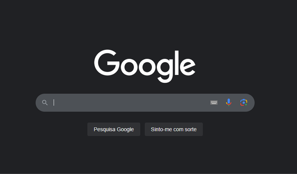
Google's homepage is a logo and a search bar. The whitespace forces you to do exactly one thing. No nav clutter, no news cards, no "you might also want to see." It's the most extreme example of "less stuff equals more action."
Apple
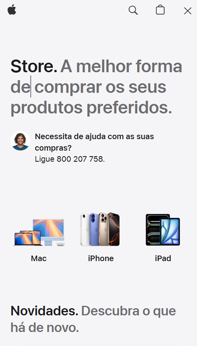
Apple's product pages put one product on a huge canvas of empty space. The space says "this is important" before you read a word. Specs and details only appear when you scroll for them. Visitors read it as luxury — without anyone calling it luxury.
See how your site compares
Our AI checks your spacing and 80+ other landing page details in under 3 minutes.
Get Your Free ScanRelated principles
Whitespace is one piece of layout. These pair with it:
Readability Rules
Set the line height and font size that make your copy comfortable to read.
Resources & further reading
Typescale
Set a visual rhythm for text and spacing using mathematical ratios.
Gestalt Principles
How the eye perceives groups, gaps, and empty space.
Frequently asked questions
Don't Guess Your Page. Scan It.
Paste your URL or upload a screenshot. Get a full landing page review with conversion risks, copy feedback, and what to fix first. It's just 3 minutes.
Start Free ScanRelated Articles
Grid Systems: Why your landing page falls apart on different screen sizes
A landing page with no grid is a landing page that breaks on every device. Here is how to use a grid to keep your layout sharp and responsive.
Responsive Design: Why your landing page falls apart on someone else’s phone
Your page looks great on your laptop and breaks on a real phone. Here is how to ship a layout that holds up on any device visitors actually use.
Buttons That Work: Why visitors do not click your CTA and how to fix it fast
Your CTA is right there but the click rate is flat. Buttons fail on contrast, copy, and size — here is the fix that lifts conversion without a redesign.