Responsive Design: Why your landing page falls apart on someone else’s phone
Your page looks great on your laptop and breaks on a real phone. Here is how to ship a layout that holds up on any device visitors actually use.

Responsive Design: Why your landing page falls apart on someone else’s phone
You shipped your page. It looks great on your 14" MacBook. Then you opened it on your phone and the CTA button got cut off. Then a friend opened it on a small Android phone and the hero text overlapped the navigation.
Now multiply: iPhones, foldables, ultrawide monitors, iPads in landscape, mid-range Androids. Your visitors aren't on your hardware. If your page only works on the screen you built it on, you're losing the rest of them.
This is what responsive design fixes — and where most builders trip.
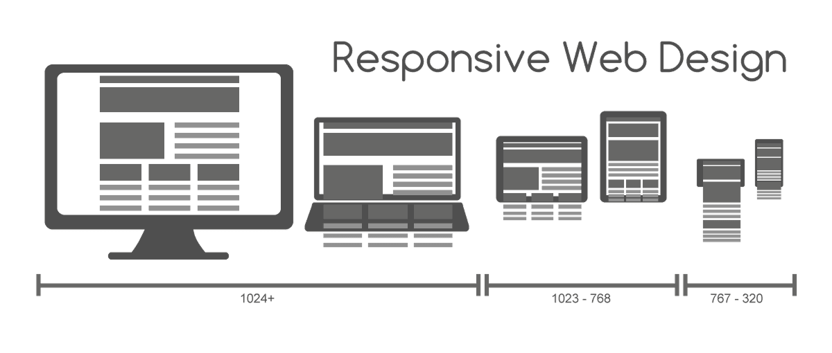
What responsive design actually is
Responsive design means your layout adapts to the screen, not the other way around. One codebase, fluid grids, and breakpoints that reshape the page as the viewport changes.
Think of it like water — it takes the shape of whatever you pour it into. Same content, different containers.
"Responsive design isn't just about screen sizes, it's about designing for flexibility." — Ethan Marcotte
The point isn't to perfect three specific screens. It's to set rules that let the content live comfortably anywhere.
Why this matters on a landing page
Most of your traffic is on mobile. If your page breaks there, your launch is dead before it starts.
Conversion
A visitor on the bus on their phone hits a hero where the CTA is below the fold or off-screen. They bounce. You never know.
SEO
Google indexes your mobile site, not the desktop one. If mobile is missing content or hard to navigate, your rankings drop.
Future-proofing
Foldables, weird aspect ratios, smart watches — there's always another device. Building flexible rules instead of pixel-perfect layouts means you don't redesign every time a new phone ships.
Accessibility
Some visitors zoom in 200-400%. A truly responsive page reflows; a rigid one breaks horizontally and becomes unusable.
Is your layout working on all devices?
Get an instant review of your page across mobile, tablet, and desktop.
Scan Your Site FreeHow to use this on your page
It's less about "designing three layouts" and more about thinking in systems.
1. Start from mobile
Mobile-first means designing for the smallest screen first. Why? It forces you to cut anything that doesn't matter. With limited real estate, every element has to earn its place.
In Figma:
- Build for at least three breakpoints:
- Mobile: 320px - 480px
- Tablet: 768px - 1024px
- Desktop: 1024px+
- Use them as checkpoints, not separate designs.
2. Avoid fixed pixel widths
The fastest way to break a layout: width: 1200px. Use percentages, vw, vh, rem instead.
In Figma, lean on Auto Layout with "Fill Container." Your elements stretch and shrink with the parent frame. That mimics how flexbox and CSS grid actually work.
For the underlying structure, see The Foundation of Design: Grids.
3. Set frame constraints
Constraints tell Figma how layers behave when the parent resizes:
- Scale: grows proportionally.
- Left and right: stretches with both edges.
- Center: stays pinned to the middle.
These get you a button that pins to the bottom of a phone screen, or a hero image that holds visual weight on a 27" monitor. For positioning, see Alignment Matters.
4. Test on a real phone
Don't trust the desktop preview. Touch targets feel completely different under a thumb than under a mouse cursor.
- Do: Open your prototype on your actual phone.
- Avoid: Resizing the browser window and calling it done.
Common ways builders break this
Shrink-to-fit
- The mistake: Scaling the desktop layout down until it fits on a phone. Tiny text, unclickable buttons.
- The fix: Reflow. A 3-column desktop layout becomes a single stacked column on mobile.
Touch targets too small
- The mistake: Mobile links and buttons placed too close together. Visitors tap the wrong thing.
- The fix: Minimum 44x44px (Apple) or 48x48dp (Google). With breathing room around them.
Hidden navigation
- The mistake: Hiding nav behind a hamburger on desktop just to look "minimalist."
- The fix: On larger screens, keep primary nav visible. The hamburger is a mobile compromise, not a clean design choice.
Oversized images
- The mistake: Loading a 5MB hero on a 3G phone. Page never paints.
- The fix: Use
srcsetso smaller devices get smaller files.
How real products handle this
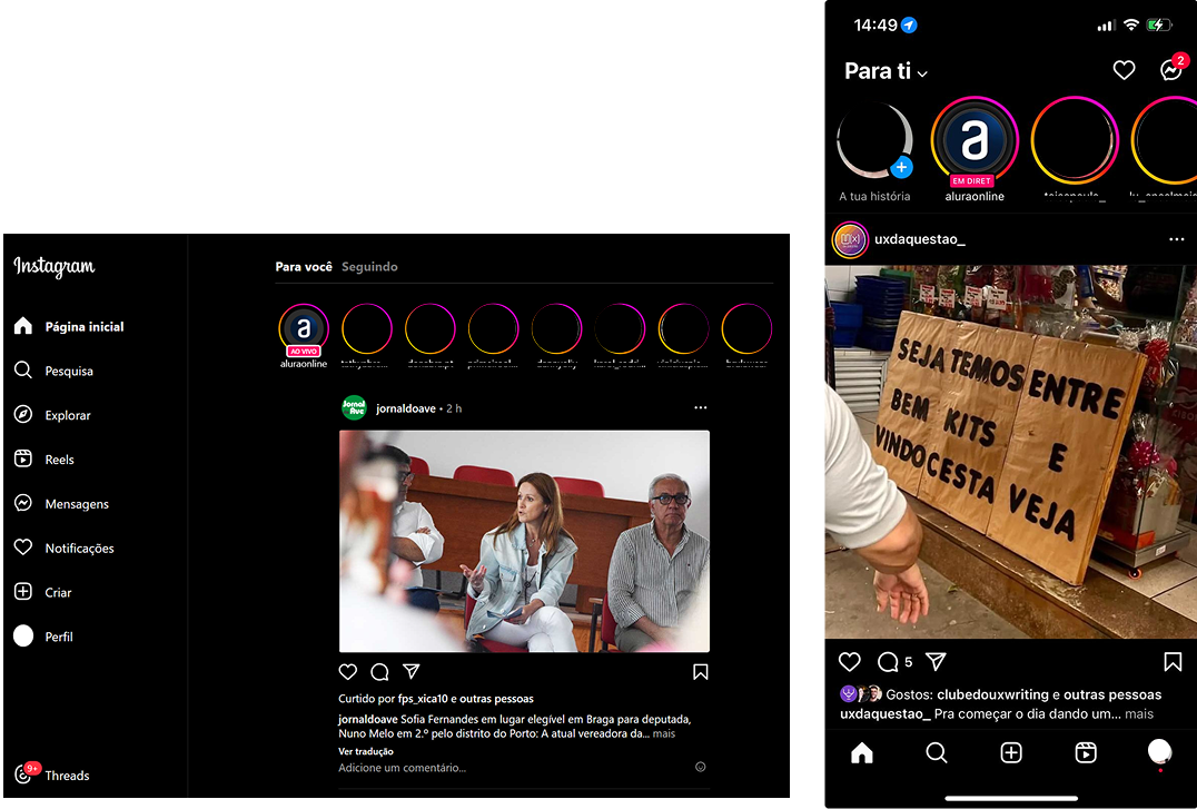
On mobile, a single-column feed maximizing photo size. On desktop, the same feed centered with nav on the left and suggestions on the right. Same content, different containers — exactly what responsive means.
Spotify
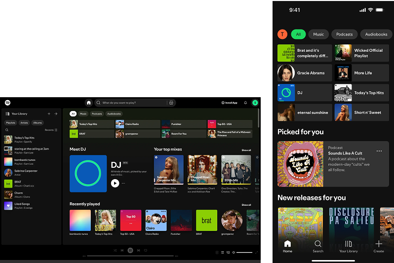
Mobile prioritizes thumb-zone controls. Desktop and tablet pull in album art, queue, and metadata as space allows. The brand feel stays the same across phone, tablet, desktop, and even car displays.
See how your site compares
Our AI reviews your page across screen sizes against the same patterns used by Instagram and Spotify.
Get Your Free UX ScoreRelated principles
Responsiveness is one piece of layout. These pair with it:
The Foundation of Design: Grids
How to set up the underlying structure your layout depends on.
Resources & further reading
Am I responsive?
Drop in your URL and see how your page renders across four device sizes at once.
Responsify
A Figma plugin to test designs across a range of device sizes in one click.
Frequently asked questions
Don't Guess Your UX. Scan It.
Upload your screens or paste your URL to get expert-level UX analysis in under 3 minutes.
Start Free ScanRelated Articles
Whitespace: Why your landing page would convert better with less stuff on it
Most landing pages cram too much above the fold. Strategic whitespace makes the CTA pop and the page feel premium. Here is how to use it.
Grid Systems: Why your landing page falls apart on different screen sizes
A landing page with no grid is a landing page that breaks on every device. Here is how to use a grid to keep your layout sharp and responsive.
Buttons That Work: Why visitors do not click your CTA and how to fix it fast
Your CTA is right there but the click rate is flat. Buttons fail on contrast, copy, and size — here is the fix that lifts conversion without a redesign.