Grid Systems: Why your landing page falls apart on different screen sizes
A landing page with no grid is a landing page that breaks on every device. Here is how to use a grid to keep your layout sharp and responsive.

Grid Systems: Why your landing page falls apart on different screen sizes
You ship the page. It looks great on your 16-inch laptop. You open it on your phone — buttons run off the edge. You open it on a 4K monitor — content floats in the middle of an ocean. You open it on a tablet — somehow worse.
This is a grid problem. A landing page without a grid is a layout that works on exactly one screen size, your editor. Every other device is a roll of the dice.
A grid is the invisible scaffolding that keeps elements in the right places no matter the screen. Stripe has one. Linear has one. Lovable, Framer, and Webflow ship them by default. If you built without thinking about a grid, your page is fighting you.
What a grid actually is
A grid is a series of vertical and horizontal lines that act as anchor points. Visitors don't see them. They feel them — as consistency, as rhythm, as "this looks built by a real team."
"Without a grid, chaos reigns in design." — Josef Müller-Brockmann
The grid isn't a creative cage. It's a sandbox. You stop deciding "where should this button go" and start deciding "which column does it belong to." Faster decisions, better results.
Why this matters on a landing page
Consistency
Visitors trust pages that feel coherent. A grid makes every section share the same rhythm. Every card has the same gutter. Every headline starts on the same axis.
Responsiveness
Your page has to survive every screen size. Without a grid, responsive design is endless edge cases. With one, the math handles it.
Speed
Decisions are faster when you have rules. "Where does this go?" becomes "column 4 of 12." Your future self will thank you.
Trust
Sloppy layouts feel sloppy. Aligned ones feel professional. Visitors transfer that feeling to your product.
Is your layout working?
Get an instant analysis of your landing page against 80+ conversion principles.
Scan Your Site FreeHow to use a grid on your page
1. Pick a grid type
Three common shapes:
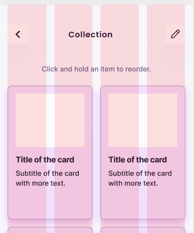
- Column grids — the most common for landing pages. The 12-column grid is standard because 12 divides cleanly by 2, 3, 4, and 6. Lots of layout options.
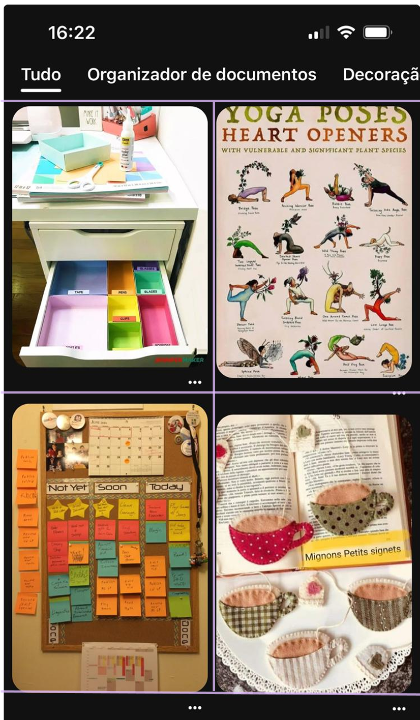
- Modular grids — columns plus rows. Use when you have dashboards, data tables, or product galleries.
- Baseline / pixel grids — every element snaps to a multiple of 8 (or 4). This keeps spacing consistent everywhere.
For most landing pages, you want a 12-column grid plus an 8-pixel spacing system.
2. Set your gutters and margins
The space matters as much as the columns:
- Gutters — the space between columns. 16px or 24px are standard.
- Margins — the space between content and the edge of the screen. Wider on desktop, tighter on mobile.
Pick your values, set them in your CSS or design tool, and don't break the rule.
3. Build for every screen
A 12-column grid that's perfect on desktop fails on a phone. The columns have to collapse:
- Desktop — 12 columns.
- Tablet — 8 columns.
- Mobile — 4 columns.
Test on all three before shipping.
4. Break the grid intentionally — once
A grid is a guide, not a prison. Sometimes you want one element — a hero image, a featured testimonial — to break out of the columns. That contrast draws the eye.
Use this once per page max. If you break the grid five times, you don't have a grid.
Common ways builders break this
Inconsistent gutters
- The mistake: 20px between cards in one section, 15px in the next. The page reads as jittery.
- The fix: Pick a gutter (16px is fine) and apply it everywhere.
Desktop-only thinking
- The mistake: Designing a 12-column desktop layout and shrinking it for mobile. Touch targets get tiny, text gets unreadable.
- The fix: Design mobile first or define explicit column counts at every breakpoint.
No vertical rhythm
- The mistake: Horizontal alignment is sharp, but vertical spacing is random. Headers, paragraphs, and images sit at random distances.
- The fix: Use a baseline grid. Every vertical margin and padding is a multiple of 8.
How real products do this
Bootstrap
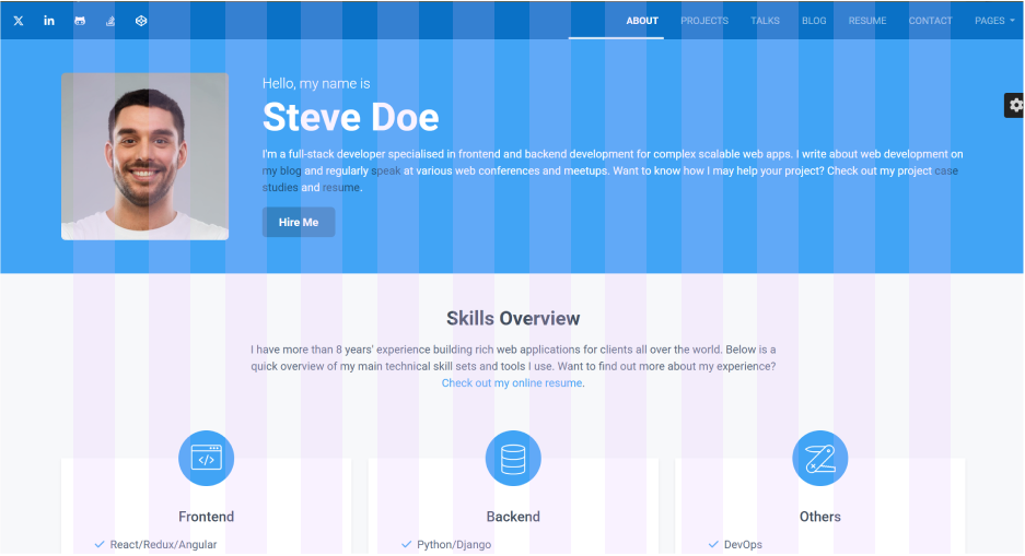
Bootstrap shipped the 12-column grid to the masses. Most early SaaS landing pages were built on it. Even today, the rhythm of "12 columns, 16px gutters, defined breakpoints" is the default that lets developers ship clean layouts fast.
Pinterest's masonry grid is a modular grid where columns are fixed but rows flow. It's why the feed feels infinite and clean at the same time — the grid keeps the rhythm even when the content has wildly different heights.
Bento Grids
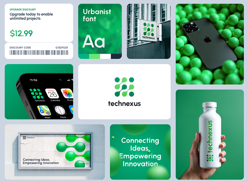
The bento style — boxes of different sizes packing together — feels custom and chaotic. Look closer and they're all snapped to one underlying grid. That's how you get visual variety without losing structure.
See how your site compares
Our AI checks your layout and 80+ other landing page details in under 3 minutes.
Get Your Free ScanRelated principles
Grids work best alongside these:
- Whitespace — grids decide where things go; whitespace decides how much room they get.
- Visual Hierarchy — put the most important elements in high-impact grid positions (top-left, dead center).
- Alignment — a grid is the easiest way to keep everything aligned by default.
Resources & further reading
GridbyExample
Practical CSS Grid examples to take you from design to working code.
Adobe Grid System
A complete guide to designing with responsive grids from Adobe's design team.
Frequently asked questions
Don't Guess Your Page. Scan It.
Paste your URL or upload a screenshot. Get a full landing page review with conversion risks, copy feedback, and what to fix first. It's just 3 minutes.
Start Free ScanRelated Articles
Whitespace: Why your landing page would convert better with less stuff on it
Most landing pages cram too much above the fold. Strategic whitespace makes the CTA pop and the page feel premium. Here is how to use it.
Responsive Design: Why your landing page falls apart on someone else’s phone
Your page looks great on your laptop and breaks on a real phone. Here is how to ship a layout that holds up on any device visitors actually use.
Buttons That Work: Why visitors do not click your CTA and how to fix it fast
Your CTA is right there but the click rate is flat. Buttons fail on contrast, copy, and size — here is the fix that lifts conversion without a redesign.