Modals: Why your popup is killing conversion and how to use them right
Visitors close your popup before reading it. Modals can lift conversion when used right — here is when to fire them and when to leave them off.
Modals: Why your popup is killing conversion and how to use them right
You shipped your landing page. A modal pops up the second a visitor lands — "subscribe!" — covering the hero. They close it, scroll, and leave. Modal got triggered, conversion didn't.
Modals are powerful and overused. Done right, they hold a visitor's attention on one decision and prevent costly mistakes. Done wrong, they feel like a hostage situation. This guide covers how to use them so they help instead of hurt.
What a modal actually is
A modal is a window that opens on top of the page. The background dims, the rest of the page goes inactive, and visitors have to interact with the modal — finish a task or close it — before going back.
Modals are interruptions by design. That's the whole point: full focus on one thing. But interruptions cost trust if you spend them on the wrong moments.
"Design should serve to bring people closer to what really matters to them." — Don Norman
The principle behind a modal is forced focus. Dim the background, kill the noise, leave the visitor with one clear decision.
Why modals matter (when used right)
Stopping a visitor mid-flow sounds bad — but in the right moment, it's the difference between a saved action and a lost one.
- Error prevention. Before deleting an account, confirming a payment, or losing unsaved work, a modal forces a deliberate choice.
- Focused tasks. For quick configurations — invite a teammate, change a setting — a modal keeps the visitor on the same page.
- High-value announcements. Big new feature? A modal can ensure visitors actually see it.
Used sparingly, modals lift conversion. Used as a popup gun, they tank trust.
Is your modal strategy working?
Get an instant AI review of your page against 80+ conversion principles.
Scan Your Site FreeHow to use modals well
Four rules. Get these right and modals feel like a tool, not a tax.
1. One job per modal
Modals are for alerts, quick selections, and confirmations. The copy should be punchy — what's happening, what's the choice, what's the consequence. No marketing fluff inside a confirm modal.
2. Always give an exit
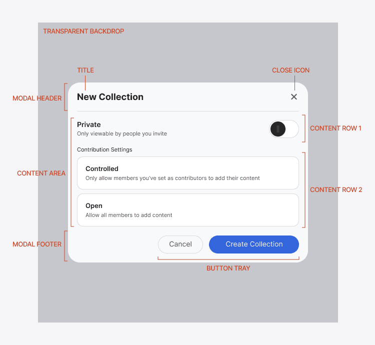
Visitors want their original task back. Every modal needs:
- A visible "X" or close icon (top right).
- A "Cancel" button.
- A clickable dim background.
- ESC key support on desktop.
If any of these are missing, you're trapping visitors. They'll leave the whole site.
3. Dim, but don't black out
The background dim signals "main page is paused." But keep some context visible. Visitors need to remember where they were so the return feels natural.
4. Two actions max
A modal with five buttons is a form, not a modal. Stick to:
- One action: Acknowledgments — "Got it," "OK."
- Two actions: Decisions — primary action filled and bold, secondary muted.
Common ways builders break this
Pop-up avalanches
- The mistake: Modal on load, then a chat modal, then a discount modal, then an exit-intent modal.
- The fix: One modal, tied to a specific user action — not a pageview.
No mobile thought
- The mistake: A 600px modal that overflows on mobile, with the close button off-screen.
- The fix: Use full-screen sheets on mobile, or design the modal to fit a 320px viewport.
Vague labels
- The mistake: "Yes" and "No" buttons for a question visitors didn't read.
- The fix: Action-named buttons. "Delete project" and "Keep editing" tell visitors what each click does without re-reading the body.
How real products do this
ClickUp
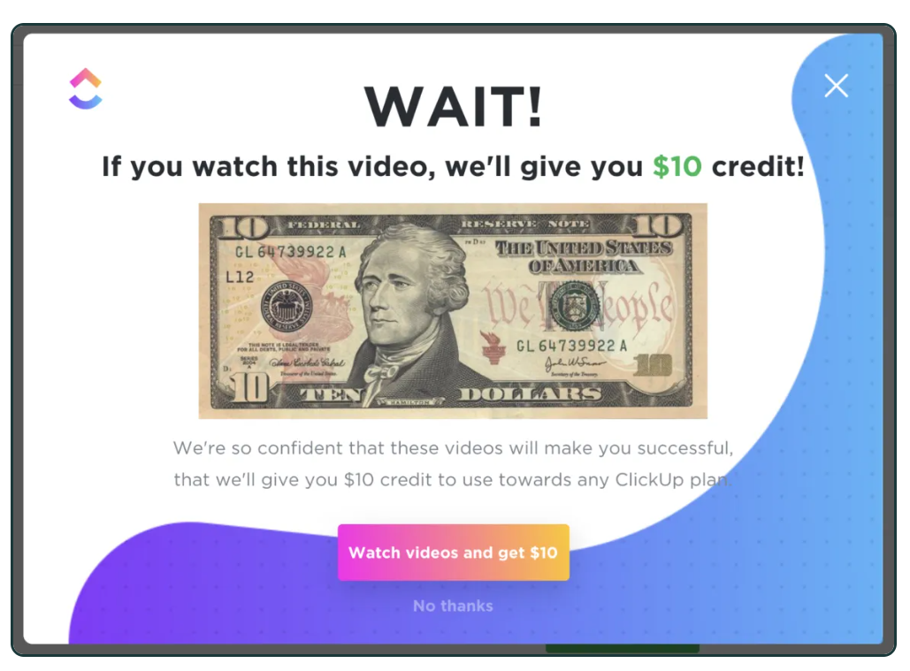
ClickUp uses a modal during onboarding with a $10 incentive image. It's bold but tied to a real action — finishing onboarding videos. Visitors get something for engaging, not a guilt trip for trying to leave.
Trello — feature announcements
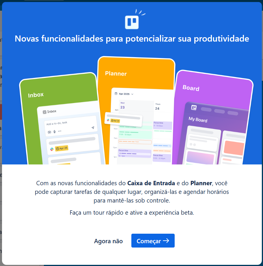
Trello announces new features with one button: "Explore." Clean copy, no clutter, easy dismiss. Visitors get the message and get back to work.
See how your site compares
Our AI checks your page against the same patterns used by ClickUp and Trello.
Get Your Free UX ScoreRelated principles
Modals interact with everything around them. These shape how yours land:
Resources & further reading
Material Design Dialogs
Google's comprehensive reference for modal and dialog design patterns.
Frequently asked questions
Don't Guess Your UX. Scan It.
Upload your screens or paste your URL to get a senior-level page review in under 3 minutes.
Start Free ScanRelated Articles
Buttons That Work: Why visitors do not click your CTA and how to fix it fast
Your CTA is right there but the click rate is flat. Buttons fail on contrast, copy, and size — here is the fix that lifts conversion without a redesign.
Button Structure: Why your CTA blends in and how to build a system that gets clicked
Visitors hesitate at your CTA because the button hierarchy is broken. Here is the structure — primary, secondary, states — that makes pages convert.
Cards: How to turn a wall of features into a grid visitors actually scan
Your feature section reads like a wall of text. Cards break it into scannable units — here is how to design them so visitors stop, read, and click.