Navigation Menus: Why visitors cannot find your pricing and how to fix the menu
Visitors land, glance at your nav, and bounce because they cannot find pricing. Pick the right menu pattern — top bar, hamburger, dropdown, mega.

Navigation Menus: Why visitors cannot find your pricing and how to fix the menu
You shipped your landing page. The product is solid. But visitors land, glance at the nav, and can't find pricing. They leave before they ever reach the page where you actually convert them.
Navigation is the wayfinding system of your site. Get it wrong and even good content stays invisible. Get it right and visitors flow naturally to the page you want them on. This guide breaks down the menu patterns that work — and when to use each.
What a navigation menu actually is
A nav menu is a structured list of links — the visual map of your site. It tells visitors what's available and how to get there. The patterns are well-known: top bars, hamburgers, dropdowns, sticky headers, mega menus.
The principle behind good nav is recognition over recall. Visitors shouldn't have to remember where things are; the menu should make it obvious through clear labels.
"Effective navigation isn't just about organization; it's about anticipating user needs and creating paths that lead them exactly where they need to be." — Steve Krug
Navigation isn't a list of links. It's the spine of how visitors experience your product.
Why menu choice matters
The menu you pick directly affects whether visitors find your offer.
Discovery. Good nav surfaces things visitors didn't know to look for — features, integrations, pricing tiers.
Less thinking. Hick's Law: the more options, the longer the decision. The right menu type breaks complexity into chunks visitors can scan.
Mobile. Over half your traffic is on a phone. A menu that works on a 27" monitor and breaks on a 6" screen is a leak.
SEO. Search engines use nav structure to understand your site. Logical menus help Google index you correctly.
Is your navigation working?
Get an instant AI review of your page against 80+ conversion principles.
Scan Your Site FreeHow to pick the right menu type
It's about fit, not fashion. Match the pattern to your site.
1. Top navigation bar
Horizontal bar across the top. 5–7 main links. The default for most landing pages and SaaS sites.
- When: Shallow site structure (a few main sections).
- Do: Short labels — one or two words. Most important links at the start or end.
- Don't: Cram in 12 items. If you have that many, you need grouping or a different pattern.
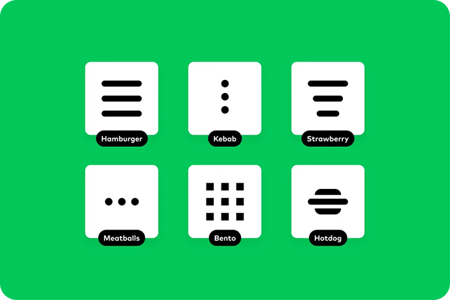
2. Hamburger menu
The three-line icon. Hidden until tapped.
- When: Mobile, almost always. Can work on desktop for minimalist apps.
- Do: 44x44px tap target minimum.
- Don't: Make it your only nav on desktop. Hidden = ignored.
3. Dropdown menu
Hover or click a parent to expand options.
- When: A few categories with short subcategory lists.
- Do: Add a hover delay so the menu doesn't disappear mid-cursor-move. Make it keyboard-accessible.
- Don't: Nest dropdowns inside dropdowns. Nobody wins.
4. Sticky menu
Stays pinned as visitors scroll.
- When: Long pages, e-commerce listings, content-heavy sites.
- Do: Slim it down on scroll to save space.
- Don't: Make it tall enough to eat 15%+ of the screen.
5. Mega menu
Big expandable panel with columns of options, sometimes images.
- When: Lots of categories — e-commerce, news, large product portfolios.
- Do: Group with clear headers. Use weight and size to guide the eye.
- Don't: Just dump every link in. Hierarchy matters more than coverage.
Common ways builders break this
Vague labels
- The mistake: "Solutions," "Resources," "Products" — words that mean everything and nothing.
- The fix: Be specific. "Pricing," "For agencies," "API docs."
Ignoring the thumb zone
- The mistake: Critical mobile nav at the top-left. Hardest spot for thumbs.
- The fix: Move primary actions to the bottom or middle of the screen on mobile.
No active state
- The mistake: Visitors can't tell what page they're on.
- The fix: Bold, color-shift, or underline the current section in the nav.
How real products do this
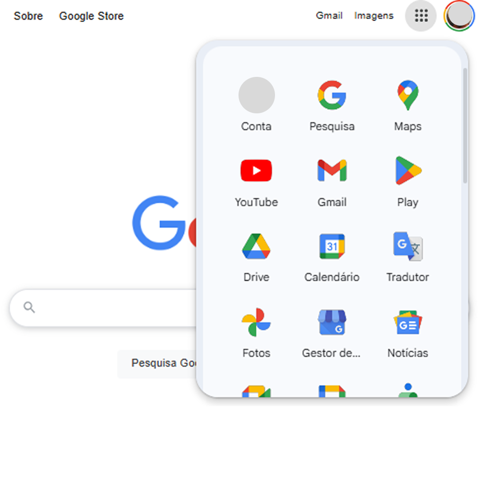
Google uses a clean grid icon for switching between apps. Tap it, see everything available — Gmail, Drive, Calendar — without cluttering the search interface.
Spotify
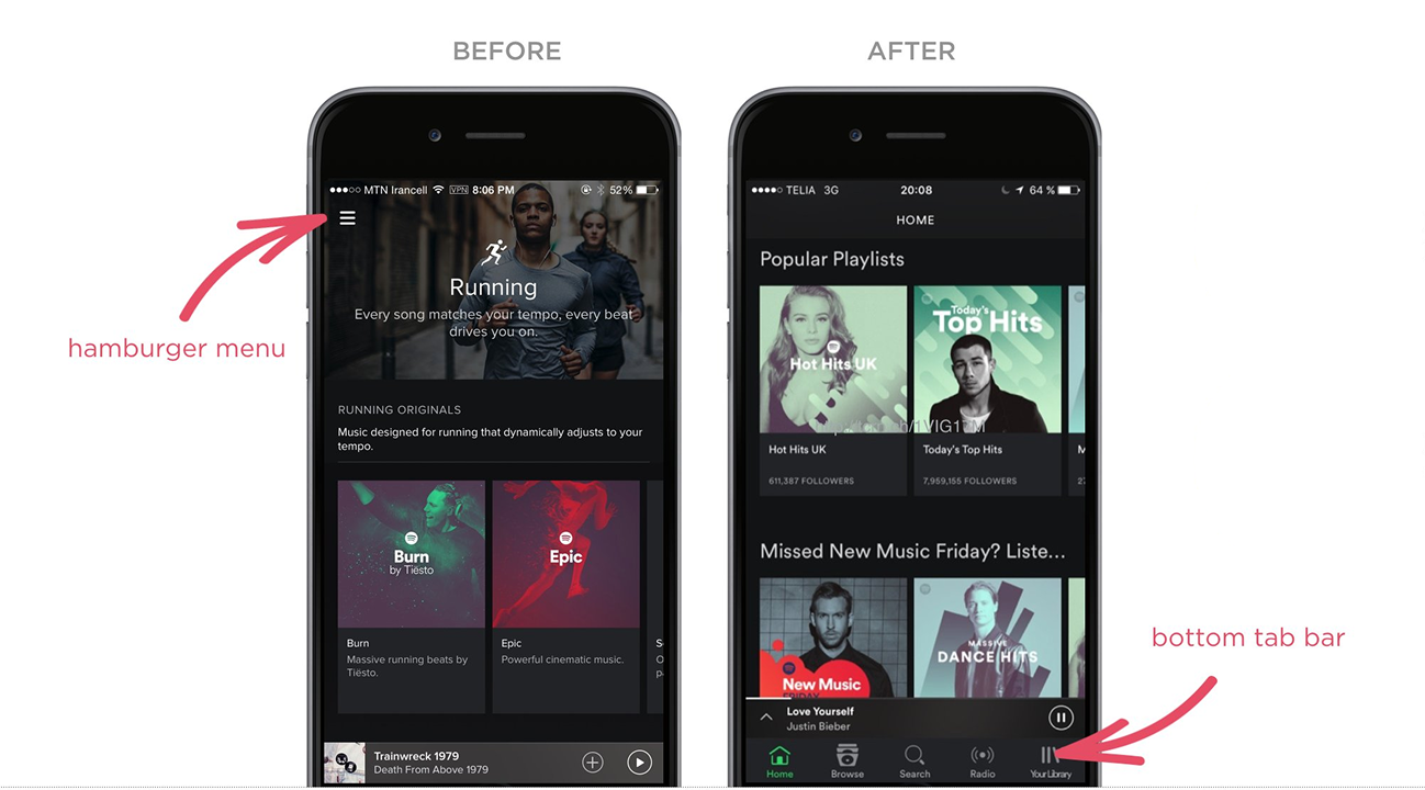
Spotify dropped the hamburger and moved to a fixed bottom nav for Home, Search, Library. Result: every core action is one thumb tap away.
YouTube (desktop)

YouTube's sticky top bar keeps the search field always reachable. Search is the primary action — making it always-visible is a deliberate choice.
See how your site compares
Our AI checks your page against the same patterns used by Google and Spotify.
Get Your Free UX ScoreRelated principles
Nav is part of a bigger system. These shape how yours feels:
Resources & further reading
Material Design: Menus
Google's official guidelines for menu behavior and styling.
NNGroup: Navigation Research
Deep-dive studies on how users interact with different menu styles.
Frequently asked questions
Don't Guess Your UX. Scan It.
Upload your screens or paste your URL to get a senior-level page review in under 3 minutes.
Start Free ScanRelated Articles
Buttons That Work: Why visitors do not click your CTA and how to fix it fast
Your CTA is right there but the click rate is flat. Buttons fail on contrast, copy, and size — here is the fix that lifts conversion without a redesign.
Button Structure: Why your CTA blends in and how to build a system that gets clicked
Visitors hesitate at your CTA because the button hierarchy is broken. Here is the structure — primary, secondary, states — that makes pages convert.
Cards: How to turn a wall of features into a grid visitors actually scan
Your feature section reads like a wall of text. Cards break it into scannable units — here is how to design them so visitors stop, read, and click.