Animations: Why your landing page feels stiff (or like a carnival)
Motion done right makes your page feel polished. Done wrong it makes it feel slow or chaotic. Here is how to use animation without breaking conversion.
Animations: Why your landing page feels stiff (or like a carnival)
You shipped your page with zero motion. Static. Crisp. And it feels lifeless — like a PDF.
So you went the other way and added animations to every section. Hero text floats in. Cards bounce. Icons spin. The page now feels like a slot machine, and visitors leave before reading.
Motion on a landing page is binary: either it makes the page feel polished and confident, or it makes the page feel cheap and slow. There's no middle. The line between the two is mostly about restraint.
What UX animation actually is
Animation in a UI is movement applied to an interface element to communicate something — that a button was clicked, that a menu opened, that content is loading, that the page is responding.
The point is to reduce mental work. Motion explains the relationship between things: "this menu came from there," "this item just got deleted," "this is loading, not broken." Done well, you barely notice it.
"Good design is when you don't even notice it." — Dieter Rams
The best animations on a landing page are the ones a visitor never consciously sees. They just feel that the page works.
Why this matters on a landing page
Motion is doing real work for or against your conversion.
Direct attention
The eye is wired to follow movement. A subtle pulse or scale on the primary CTA, a gentle reveal on a key feature — visitors look there.
Confirm clicks
Tapping a button that doesn't acknowledge the tap feels broken. A 100ms scale or color change tells visitors "yes, we got it."
Set context
Modals that fade up from the bottom, sidebars that slide in — visitors learn how to dismiss them without thinking. Animation builds the mental map.
Mask waiting
A 2-second wait with a spinner feels shorter than a 2-second blank screen. Doesn't change the load time. Changes how it feels.
Is your page motion working for or against you?
Get an instant review of your page against 80+ landing page principles, including motion.
Scan Your Site FreeHow to use this on your page
A few rules and you'll get 90% of the benefit.
1. Less is more
Every animation should justify itself. If it doesn't help the visitor understand what's happening, cut it. Big sweeping motion on a landing page mostly distracts from the message.
2. Be consistent
If the modal slides up from the bottom on one page, it slides up from the bottom on every page. Mismatched motion makes the product feel cobbled together.
3. Hit the timing window
Too fast and visitors miss the cue. Too slow and the page feels sluggish.
- Sweet spot: 150ms to 500ms.
- Scale matters: A small icon morph can be 150ms. A page transition can be 400ms.
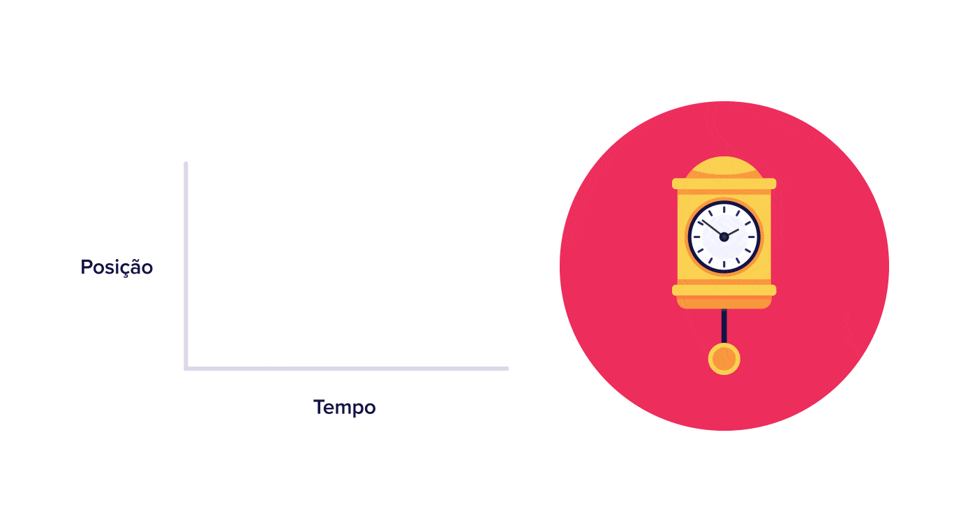
4. Pick the right easing curve
Real things accelerate and decelerate. Easing curves fake that.
a. Ease-in (acceleration)
Starts slow, speeds up. Use for elements leaving the screen — feels like the object is gathering momentum to exit.
b. Ease-out (deceleration)
Starts fast, slows down. The default for UI. Menus, popups, modals, cards — they should feel like they're landing softly.

c. Ease-in-out (standard)
Slow at both ends, fast in the middle. Best for transitions between two static states on the same screen, like an icon morphing.
d. Linear (constant speed)
Feels mechanical. Reserve for subtle changes like a continuous fade or background scroll.
Common ways builders break this
Over-animating
- The mistake: Every element on the page bounces, slides, or fades on scroll. Welcome to the carnival.
- The fix: Pick one or two elements per section. Let everything else be still.
Ignoring "reduce motion"
- The mistake: Some visitors get nauseous from heavy motion. Without respecting
prefers-reduced-motion, your page is unusable for them. - The fix: Honor the CSS media query. Disable or simplify motion when it's set.
Slow blocking transitions
- The mistake: A 1-second animation has to finish before the visitor can click anything else.
- The fix: Keep durations under 500ms and let visitors interact while motion is running.
How real products handle this
Gmail
Gmail's sidebar uses a smooth ease-out. The menu feels light, dismissable, and clearly a layer on top of the inbox — not a new page. Tiny detail, huge polish.
See how your site compares
Our AI reviews your page against the same patterns used by Gmail and other leaders.
Get Your Free UX ScoreRelated principles
Resources & further reading
Material Design - Motion
Google's reference for implementing motion in interfaces.
NN Group: Animation for Attention and Comprehension
How visitors perceive and process motion in interfaces.
Frequently asked questions
Don't Guess Your UX. Scan It.
Upload your screens or paste your URL to get expert-level UX analysis of your animations and design in under 3 minutes.
Start Free ScanRelated Articles
Feedback: Why visitors click your CTA twice (and sometimes leave thinking it is broken)
When a button does not respond, visitors click again, double-submit, or bounce. Here is how to give clear feedback and stop losing conversions to silence.
Buttons That Work: Why visitors do not click your CTA and how to fix it fast
Your CTA is right there but the click rate is flat. Buttons fail on contrast, copy, and size — here is the fix that lifts conversion without a redesign.
Jakob's Law: why your "original" landing page is confusing visitors
Visitors expect your page to work like every other site they use. Jakob's Law explains why being too creative with your UI quietly kills conversion.