Feedback: Why visitors click your CTA twice (and sometimes leave thinking it is broken)
When a button does not respond, visitors click again, double-submit, or bounce. Here is how to give clear feedback and stop losing conversions to silence.
Feedback: Why visitors click your CTA twice (and sometimes leave thinking it is broken)
A visitor lands on your page. Hits "Sign up." Nothing happens for two seconds. They click again. Then they refresh. Then they leave thinking your form is broken — and you'll never see their email in your inbox even though the first click probably worked.
This is the silent killer of forms and CTAs: no feedback. The page took the action but didn't tell the visitor it took the action. So the visitor assumes nothing happened. Even tiny gaps create double signups, refreshes, and bounce rates that look mysterious in your analytics.
The fix is small and reliable.
What dynamic feedback actually is
Feedback is any visual (or audio, or haptic) response that confirms an action was received. Button presses that change color. Spinners that appear after a click. Checkmarks that fade in after a save.
"Design is the interaction the user doesn't notice, because it works." — Alan Cooper
The job is to make the page feel responsive. The visitor clicks, something visibly happens, and they know they're not staring at a frozen screen. That's it. Easy to skip in a busy ship cycle, expensive to leave out.
Why this matters on a landing page
Every CTA, every form submit, every toggle is a feedback moment. Get it wrong and you lose visitors at the exact moment they were about to convert.
Less anxiety
A visitor about to share an email or pay you needs to know it went through. Immediate feedback kills the "did that work?" loop and builds trust.
Fewer duplicate actions
No feedback = double-click = double signup or two charges. Now you've got a support ticket and a refund.
Perceived speed
A spinner during a 2-second wait makes it feel shorter. A blank screen during a 2-second wait feels broken.
Accessibility
Visitors with cognitive differences depend on clear cues. Color change plus icon plus text covers more brains than any single signal.
Is your interface feedback working?
Get an instant review of your page against 80+ landing page principles.
Scan Your Site FreeHow to use this on your page
The goal isn't to add bounces and sparkles — it's to make sure no action goes unacknowledged.
1. Find the high-stakes actions
Audit your page for moments where visitors actually need confirmation:
-
Form submits
-
Adding items to a cart
-
Deleting something
-
Toggling a setting
-
Do: Prioritize feedback for any action that takes more than 100ms server-side.
-
Avoid: Heavy animations on every hover. That's noise.
2. Pick the right feedback type
Success and error
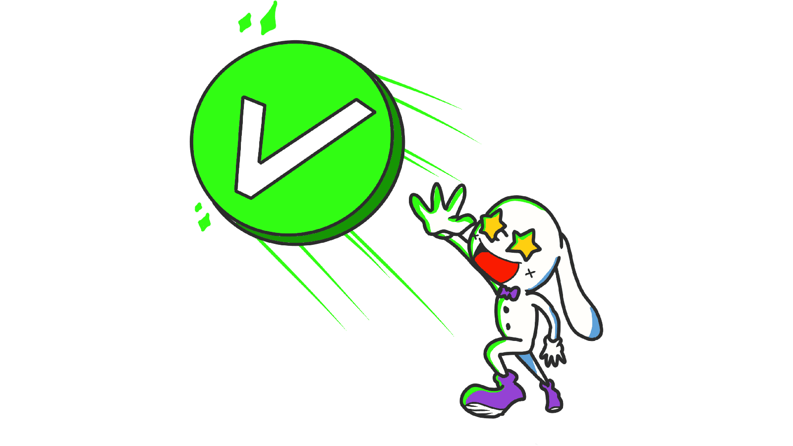
Success deserves a quick confirmation — a green checkmark drawing in, a "Saved" badge fading up. Errors deserve a discreet shake or a red icon plus an explanation. A small horizontal shake reads as "no" instinctively.

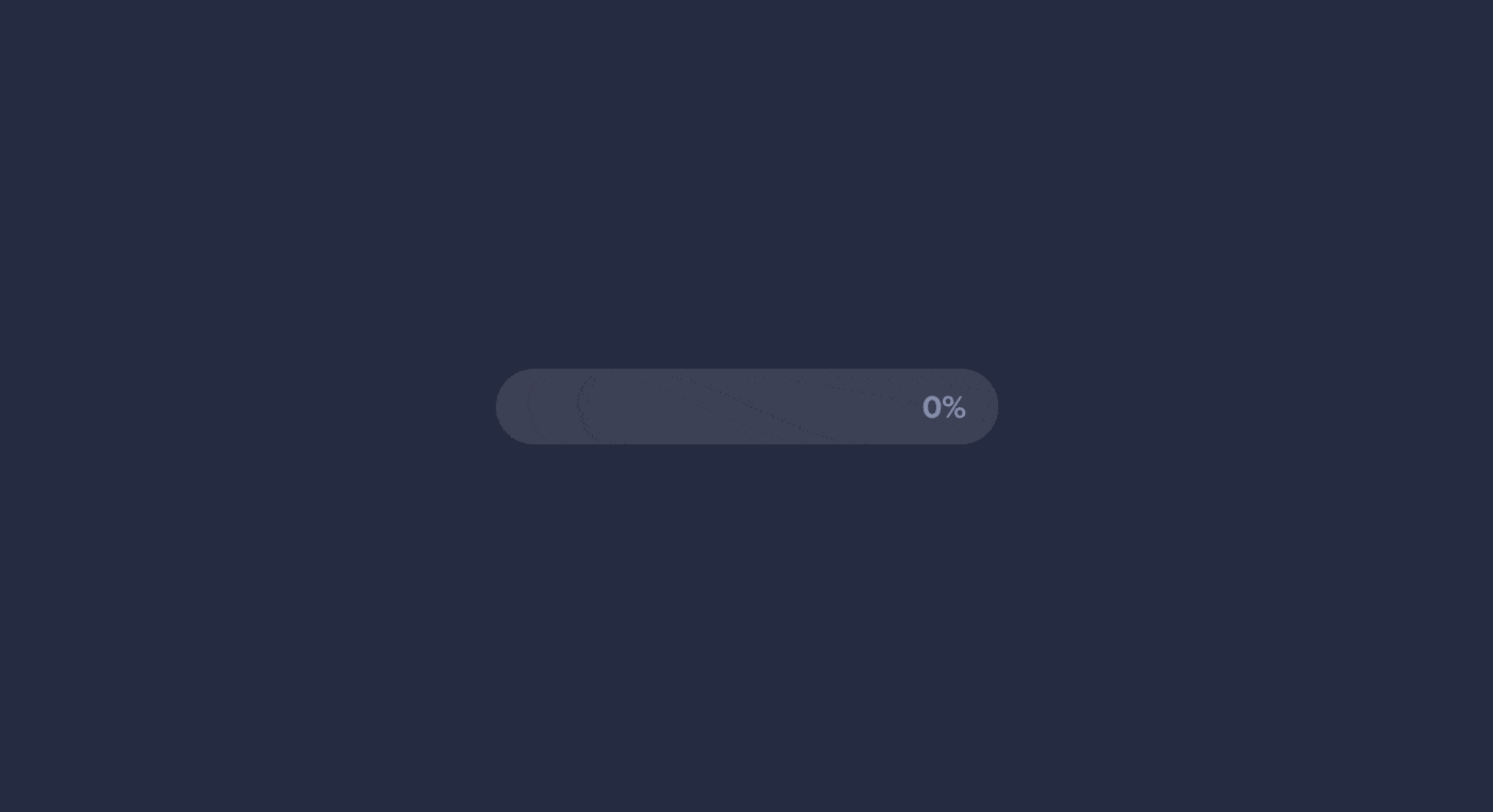
Loading
Anything over 1 second of wait needs a loading state. Spinner, progress bar, skeleton — anything that says "the system is working."
3. Tune the timing
Feedback has to feel instant. Aim for 200-500ms. Slower than that and it feels laggy; faster than 100ms and visitors don't catch it. For more on motion timing, see Animations That Bring Life.
4. Test on slow devices
Animations that look smooth on your laptop can stutter on a midrange phone. Animate transform and opacity, not size and position. Same look, way smoother.
Common ways builders break this
Invisible feedback
- The mistake: A pixel-tiny color shift somewhere the visitor isn't looking.
- The fix: Feedback happens at the point of interaction. The button itself changes — not something on the other side of the screen.
Over-animating
- The mistake: Every action triggers a bouncing celebration. Visitors get tired in 30 seconds.
- The fix: Subtle wins. If the motion is more memorable than the action, it's too much.
Delayed feedback
- The mistake: The animation starts 500ms after the click. Now visitors have already clicked again.
- The fix: Trigger the visual change instantly (under 100ms). The cause-and-effect link breaks if there's any noticeable lag.
How real products handle this
Hit "Send" on a message and a small spinner appears immediately, then transitions to a timestamp. You always know the message went through. No guessing.
Duolingo
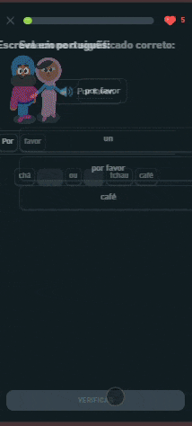
Right answer: button color shifts, satisfying sound, celebratory motion. Wrong answer: subtle shake, color flips to red. Three signals on every interaction. That's why it feels so addictive.
See how your site compares
Our AI reviews your page against the same patterns used by LinkedIn and Duolingo.
Get Your Free UX ScoreRelated principles
Feedback is one piece of motion. These pair with it:
Animations That Bring Life
The general rules for motion and timing in a UI.
Resources & further reading
Material Design Interactions
Google's reference on selection and interaction feedback patterns.
UX Motion: Feedback Principles
A practical breakdown of how feedback animations work in real products.
Frequently asked questions
Don't Guess Your UX. Scan It.
Upload your screens or paste your URL to get expert-level UX analysis in under 3 minutes.
Start Free ScanRelated Articles
Animations: Why your landing page feels stiff (or like a carnival)
Motion done right makes your page feel polished. Done wrong it makes it feel slow or chaotic. Here is how to use animation without breaking conversion.
Buttons That Work: Why visitors do not click your CTA and how to fix it fast
Your CTA is right there but the click rate is flat. Buttons fail on contrast, copy, and size — here is the fix that lifts conversion without a redesign.
Jakob's Law: why your "original" landing page is confusing visitors
Visitors expect your page to work like every other site they use. Jakob's Law explains why being too creative with your UI quietly kills conversion.